
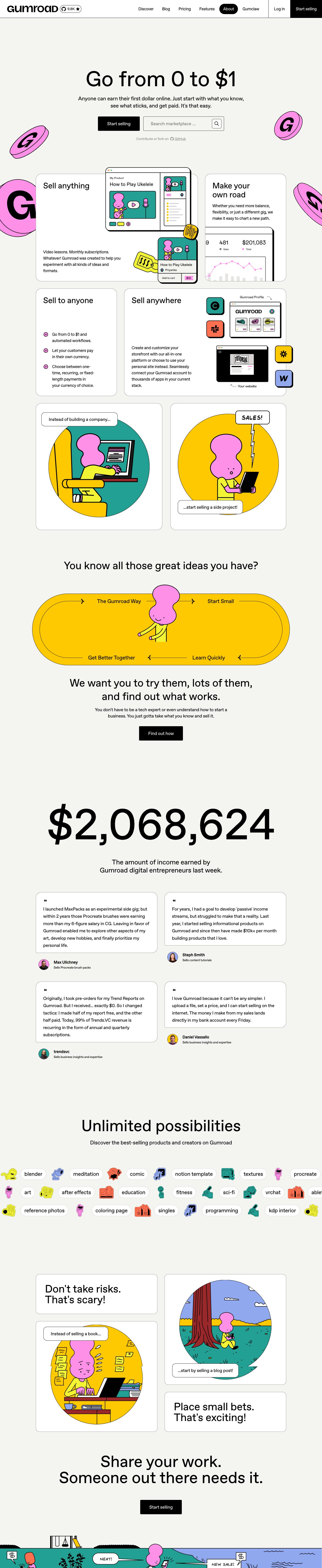
Captured 10 Oct 2026 at 1440px. Scroll the frame to see the whole page.
Gumroad
playful · brutalist · friendly · confident · unpolished
Gumroad pairs a warm off-white canvas, pure black type and 1px black hairlines with loud cartoon illustrations: pink 3D 'G' coins with thick black outlines, plus yellow and red pops further down. It reads like a friendly zine crossed with a neo-brutalist utility site, so the commerce feels approachable rather than corporate.
Palette
Typography
- Headings
- ABC Favorit
- Body
- ABC Favorit
- Free swap
- ABC Favorit (Dinamo) is proprietary. Use Space Grotesk for the closest quirky grotesk feel, or DM Sans / Inter Tight as a more neutral substitute.
One family throughout, mostly at weight 400. The H1 is 96px, weight 400, line-height 1.0, tracking about -0.4%, centred. H2s are 48px/1.25 at weight 400 with -0.8% tracking. Card titles run around 32–36px at weight 400. Bold (700) appears only for small labels such as 18px names, with -2.2% tracking. Body text is 16px/1.5 with -2.5% tracking; the hero subhead is about 20px. Nav items are 16px regular. All text is sentence case. Hierarchy comes from size alone, not weight, which keeps it relaxed and conversational.
More free font pairings →Measured h1: 96px / 400 / -0.004em · body 16px
Signature moves
- Scatter oversized, black-outlined 3D brand-mark coins in saturated pink around the hero, cropped by the viewport edges. They make the hero feel fun without adding a single extra word.
- Build everything else from just warm off-white, white and black with 1px black borders. Saturated colour lives only in illustrations, so it pops hard.
- Split the nav into cells with vertical black rules, and make the primary CTA a full-height black block flush to the edge.
- Mark the active nav item with a solid black pill.
- Use a single quirky grotesk at weight 400 even for a 96px H1, so the voice stays casual and human rather than shouty.
- Let product mockups and illustrations break out of card boundaries so the grid feels hand-assembled.
Layout
Centred content column about 1152px wide on a full-bleed #f4f4f0 canvas. The hero is fully centred: a large H1, a two-line subhead around 620px wide, then a primary button beside a search input, then a tiny GitHub line. Below the hero, white cards with a 1px black border and 16–24px radii sit in a row. A product mockup overlaps and breaks out of those cards. Whitespace is generous, and the illustrations bleed off the viewport edges. The full-width nav is divided into cells by vertical 1px black rules, with a bottom border.
Components
- Navigation
- White bar with a 1px black bottom border. Logo wordmark at left, plus a pill-outlined GitHub star badge (9.8K ★). Text links sit right. The active link is a solid black pill with white text. 'Log in' sits in its own cell, separated by vertical black rules. 'Start selling' is a full-height black block flush to the right edge with square corners.
- Primary button
- Solid black fill, white 16–18px text, 4px radius, about 52px tall, no shadow. It's the only filled element in the hero.
- Search input
- Transparent fill with a 1px black border and 4px radius. Grey placeholder 'Search marketplace ...'. A small outlined square icon button with a magnifier sits inside on the right.
- Feature cards
- White fill, 1px dark border, 16–24px radius, no shadow. Large 32px regular headings sit top-left with lots of empty space. Illustrations or product mockups overflow the card edges.
- Product mockup
- Simplified browser window with a thick black outline, a hard offset shadow-like edge and traffic-light dots. Inside are flat cartoon panels in teal and pink.
- Footnote link
- Small grey 14px text with an inline GitHub icon and an underlined link, centred under the CTAs.
Product UI
The product appears as stylised mockups, not real screenshots: a flat browser frame with a thick black outline and window dots. It shows a product page ('My Product / How to Play Ukelele') with small 12px labels, a large title and cartoon thumbnail tiles in teal and pink. App screens in this style should be flat and white with 1px black borders and 4px-radius controls. Use black primary buttons, pink, yellow or teal for status and highlights, no gradients or soft shadows, and simple outlined icons.
Great for
- Creator economy tools
- Marketplaces for indie sellers
- Open-source or community-driven products
- Consumer fintech aiming for friendliness
- Playful SaaS for non-technical users
Watch out for
- Soft drop shadows, gradients or glassmorphism; they kill the flat brutalist ink look.
- Using pink or yellow for large UI surfaces or body text instead of illustration and highlight moments.
- Heavy bold headings; the charm relies on regular-weight display type.
- Illustrations without thick black outlines, which will clash with the hairline system.
- The ABC Favorit name in production CSS without a licence; substitute Space Grotesk.
- The light grey footnote text at larger contexts or on white without checking contrast.
Design like Gumroad
Read https://pageproofer.com/inspiration/playful-bold/gumroad.md and open its screenshots. To design in this style, set the page background to #f4f4f0, cards to #ffffff and all text to #000000. Draw every container with a 1px solid #000 border and no shadows. Use one grotesk (Space Grotesk as a stand-in for ABC Favorit) at weight 400 everywhere: H1 96px/1.0 with -0.4% tracking, H2 48px/1.25, card titles 32px, body 16px/1.5 with -2.5% tracking, sentence case. Centre the hero, then place a black 4px-radius button (white text, about 52px tall) beside an outlined 4px-radius input. Build the nav as a white bar with a bottom rule and vertical dividers, a black pill for the active link, and a full-height square black CTA flush right. Cards get 16–24px radii and generous padding, with art overflowing their edges. Inject personality only through bold illustrations in #ff90e8 pink, #ffc900 yellow and #dc341e red with thick black outlines, scattered and cropped at the viewport edges. Keep content within 1152px.