
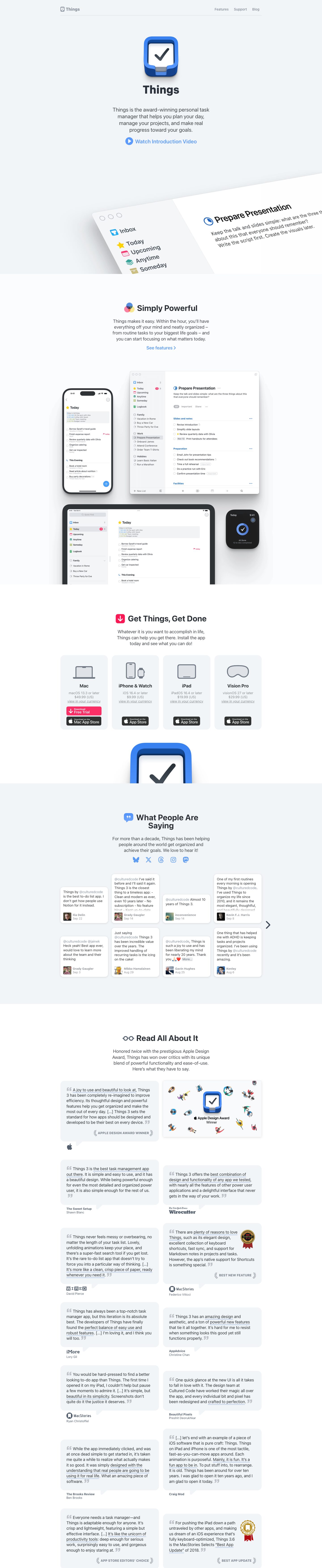
Captured 10 Oct 2026 at 1440px. Scroll the frame to see the whole page.
Things
calm · crafted · native · friendly · restrained
Things presents itself like a well-made Apple app: a cool off-white canvas, the system font (rendering as SF Pro on Apple devices), one glossy app icon as the hero, and real product screenshots tilted and cropped like objects on a desk. Every section repeats the same quiet centred pattern of emoji-style icon plus bold title, a short grey paragraph and one blue link, so the polish of the product screenshots carries the page instead of marketing chrome.
Palette
Typography
- Headings
- ui-sans-serif (system stack, renders as SF Pro on Apple devices)
- Body
- ui-sans-serif (system stack, renders as SF Pro on Apple devices)
- Free swap
- Inter is the closest free substitute for SF Pro. Keep the system stack first: ui-sans-serif, -apple-system, Inter, sans-serif.
The hero wordmark 'Things' is roughly 56px at weight 700, tight and dark. Section h2s are 36px/700 with line-height 1.0 and no tracking, sitting on one line beside a 40px colour icon. Card h3s such as 'Mac' are 20px/700 at 1.2 line-height. The lead paragraph is 24px/400 at 1.25 line-height in #44474b, centred and capped at about 30 characters per line. Section intros drop to about 18–20px. Quote cards use about 17px regular with a 1.4 line-height. Metadata (OS version, price, author name, date) is 13–15px in #8e9196 or #8792a1. Award labels such as 'APPLE DESIGN AWARD WINNER' are small bold uppercase with slight tracking in grey. Links are medium weight in #5c9cf5 or #2576eb, and 'See features ›' ends with a chevron.
More free font pairings →Signature moves
- Make the glossy app icon the hero image and repeat it oversized and cropped at the bottom of the page as a bookend.
- Show the real app UI in perspective, tilted on a diagonal and bleeding off the edge, so the screenshot also forms the section divider.
- Give every section the same opener: a small full-colour emoji-style glyph inline with a bold title, then a narrow centred grey paragraph.
- Use plain blue text links with icons or chevrons as CTAs instead of filled buttons, and keep strong colour for the single 'Free Trial' action.
- Present press quotes as speech bubbles with tails pointing to the publication logo, and highlight praise phrases with a soft blue underline.
- Alternate near-identical cool off-whites (#f2f5f7, #fbfcfe, #ffffff) to separate sections without lines or heavy contrast.
Layout
Content sits in a 1015px centred column with a thin hairline under the top nav. Each section is centred text with lots of vertical air: about 120–160px between sections and a narrow paragraph of roughly 460px. Section backgrounds alternate between #f2f5f7, #fbfcfe and #ffffff. The hero transitions into the next section along a diagonal edge, created by the tilted screenshot. The product showcase breaks the grid with overlapping device frames (phone, Mac window, iPad, Watch) that run wider than the text column. Downloads use a 4-column card grid. Testimonials use a 4-column masonry of tweet cards with a carousel arrow. Press quotes use a 2-column staggered grid of speech-bubble cards. Overall density is low and the alignment is symmetric.
Components
- Nav
- Minimal bar: a small grey app glyph and the word 'Things' in grey bold on the left, and three 14px grey links (Features, Support, Blog) on the right. There is no CTA button. A 1px light hairline underlines it, contained to the content width.
- Hero
- A large glossy 3D app icon (~130px) with a soft drop shadow, the bold product name beneath it, a 24px centred description, and a single text CTA, 'Watch Introduction Video', in soft blue with a filled circular play icon. There are no buttons and no gradients.
- Section header
- A colourful glyph sits inline before the bold 36px title, for example overlapping RGB circles, a pink download arrow tile, a blue speech bubble or reading glasses. Under it is a short grey paragraph and sometimes a blue 'See features ›' link.
- Download cards
- Four equal cards on #f2f5f7 with roughly 12–18px radius and no border. Each has a grey line-art device icon, a bold device name, grey OS-requirement and price lines, and an underlined grey 'view in your currency' link. Black App Store badges sit at the bottom. Mac also gets a hot-pink 'Download Free Trial' button with a down arrow, styled to match the badge.
- Tweet cards
- Small white cards with about 6px radius and a soft shadow (0 2px 8px rgba(0,0,0,.1) plus a 0 0 2px ring). @handles are tinted blue-grey. A footer row holds a square avatar, a bold name and a grey date. Cards sit in a staggered masonry on the mist background.
- Press quote bubbles
- Speech-bubble cards on #f2f5f7 with an 18px radius and a small triangular tail at the bottom-left pointing to the publication logotype and author name below. Grey oversized curly quote marks open and close the text. Key phrases get a light blue underline highlight. Award cards add laurel-wrapped uppercase grey labels or a gold seal badge.
- Footer transition
- The page closes with a cropped, oversized app icon peeking up from the bottom edge before a mist-coloured footer band.
Product UI
The page uses real, pixel-accurate screenshots of the Mac, iPhone, iPad and Apple Watch apps, layered in a device cluster and also shown as a large tilted Mac window. The UI itself is very light and airy. A sidebar on #f2f5f7 lists Inbox, Today, Upcoming, Anytime, Someday and Logbook, each with a distinct colour icon: blue tray, yellow star, red calendar, teal stack, beige box, green book. The main pane is pure white. Rows are compact (~13px text) with hollow circular checkboxes and grey sub-labels for the project name. Small capsule tags read 'Important'. Headings such as 'Slides and notes' are blue with a '•••' menu. A red badge shows overdue counts, and a floating blue '+' button sits on mobile. Calendar events in Today appear in a grey inset block with coloured times. There are almost no borders: hierarchy comes from spacing, weight, tinted sidebars and coloured icons.
Great for
- Native Mac and iOS apps
- Personal productivity and to-do tools
- Premium indie software with a strong icon
- Note-taking, calendar or journaling apps
- Products with polished UI that sells itself
Watch out for
- Adding gradients, big filled CTA buttons or bold colour blocks; the calm comes from restraint.
- Light grey metadata like #8e9196 for anything important: it is low-contrast and only acceptable for tertiary info.
- Relying on ui-sans-serif alone: off Apple platforms it falls back to Segoe or Roboto, so specify Inter as a fallback.
- Using mock or illustrated UI; the style depends on real, high-fidelity screenshots.
- Packing too many colours into icons; colour belongs in small glyphs, never in surfaces.
- Left-aligned, wide paragraphs; the intros only read well centred and narrow.
Design like Things
Read https://pageproofer.com/inspiration/calm-minimal/things.md and open its screenshots. To design in this style: - **Type:** use the system stack (ui-sans-serif, -apple-system, Inter, sans-serif) with text in #303336 and secondary text in #55606e or #8792a1. - **Page structure:** centre everything in a 1015px column. Alternate section backgrounds between #f2f5f7, #fbfcfe and #ffffff, and leave 120–160px of vertical space between sections. - **Hero:** open with a large shadowed app icon, the product name at about 56px/700, a 24px/1.25 lead paragraph capped at about 460px wide, and one blue text link (#5c9cf5) with a filled circular icon. - **Section headings:** 36px/700 with line-height 1, preceded inline by a small colourful glyph, followed by an 18–20px grey paragraph and an optional 'Link ›'. - **Product shots:** use real screenshots inside device frames. Tilt one large window about 10–15° on a diagonal so it bleeds off the edge and doubles as a section divider. - **Cards:** radius 12–18px with no borders. Use either a #f2f5f7 fill on white, or a white fill with shadow `0 2px 8px rgba(0,0,0,.1), 0 0 2px rgba(0,0,0,.1)`. - **Buttons:** 6px radius. Reserve colour for one primary action: a hot-pink trial button or blue #2576eb. - **Testimonials:** speech bubbles with a tail pointing to the source logo, grey curly quote marks, and light blue underlines on key phrases. - **Nav:** grey and minimal with a 1px hairline underneath.