
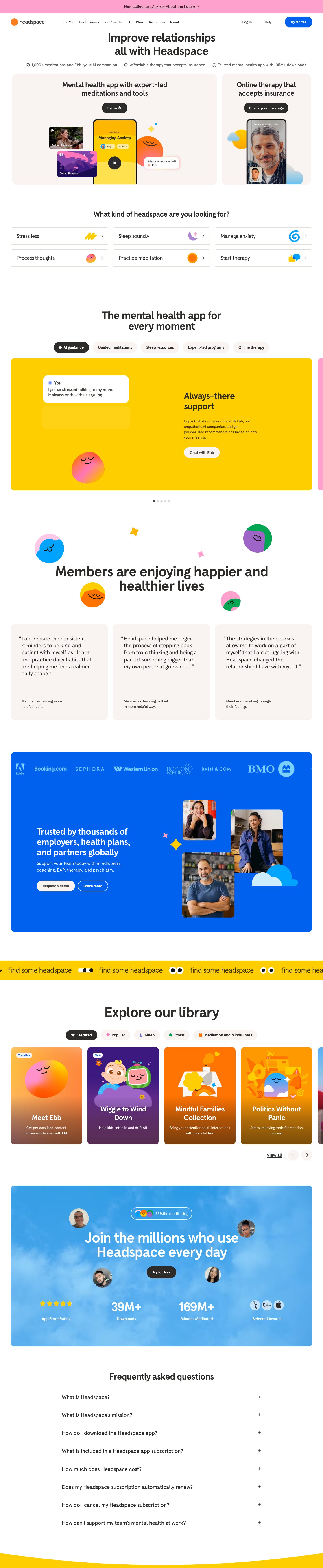
Captured 10 Oct 2026 at 1440px. Scroll the frame to see the whole page.
Headspace
friendly · playful · warm · reassuring · optimistic
Headspace pairs a calm, warm-neutral base (white, #f9f4f2 oatmeal cards, #2d2c2b charcoal type) with loud, flat bursts of saturated brand colour — sunflower yellow, electric blue, bubblegum pink — and round smiling blob characters. The restraint in type and layout keeps the playful colour and illustration feeling friendly and safe instead of chaotic, which suits a mental-health product.
Palette
Typography
- Headings
- Headspace Apercu
- Body
- Headspace Apercu
- Free swap
- Headspace Apercu is a proprietary custom cut of Apercu; use Figtree, Plus Jakarta Sans or DM Sans (Figtree is closest in its rounded geometric-grotesque warmth).
Single family throughout. Section headlines 52px weight 700, line-height 1.1, letter-spacing -0.03em, sentence case, centred, usually broken onto two balanced lines. Sub-headlines/card titles 40px/700, line-height 1.15, -0.03em. Card hero titles ~32px/700. Body 18px weight 500, line-height 1.44, -0.01em — medium weight body gives a soft, chunky voice. Small captions and attributions ~14px, warm grey #63605d. Buttons 14–16px bold. Nav links ~16px regular in charcoal. No uppercase, no italics; hierarchy comes from size and weight only.
More free font pairings →Signature moves
- Wrap each section in a large rounded block of a single flat, fully saturated brand colour (yellow, blue, pink) floating on white, so the page reads as a stack of colourful stickers.
- Use simple blob characters — circles with two closed-eye arcs and a smile — as recurring mascots and decoration around headlines instead of abstract shapes.
- Keep all text in one soft charcoal (#2d2c2b) and one medium-weight rounded grotesk; let colour and illustration carry personality while type stays calm.
- Give pill buttons a crisp 0 2px 0 offset shadow instead of a blur for a tactile, toy-like press affordance.
- Sprinkle small four-point sparkles, dots and clouds around product mockups and photos to make composites feel joyful.
- Offer a self-selection grid of feelings ('Stress less', 'Sleep soundly') with playful icons as the second section, routing users by emotional need.
Layout
Content width ~1344px on a 1440 viewport (very wide, ~48px gutters) for card rows and colour panels; FAQ narrows to ~860px centred. Almost everything is centre-aligned: centred headline, centred filter pills, then a full-width card or colour panel below. Sections are big rounded blocks (16–24px radius) floating on white, separated by generous 120–160px vertical gaps. Grids are 2-up (hero split ~2:1), 3-up (intent tiles, testimonials) and 4-up carousel (library cards). Density is low; one idea per section. Full-bleed only for the yellow scrolling ticker and the pink announcement bar.
Components
- Announcement bar
- Full-width bubblegum pink #ffa1cc strip, ~48px tall, single centred underlined link in charcoal with an arrow.
- Navigation
- White bar, orange-dot logo left, plain charcoal text links, Log in/Help as text, primary 'Try for free' as an electric-blue #0061ef pill (32px radius) with white bold text and a tiny 2px bottom shadow rgba(65,61,69,0.2).
- Buttons
- Full pill shapes. Primary on light: charcoal #2d2c2b fill, white bold text. On colour panels: white/oatmeal fill with charcoal text, or ghost outline with white 2px border. Hard 0 2px 0 shadow instead of blur gives a tactile, sticker-like lift.
- Hero split cards
- Two oatmeal #f9f4f2 cards with 24px radius, centred 40px headline, pill CTA, and a product composite (phone mock + floating media tiles + blob character + chat bubble) bleeding off the bottom edge.
- Intent tiles
- 3×2 grid of white tiles with 1px #e2ded9 border, 8px radius, 20px label left, small colourful 3D-ish icon plus chevron right. Acts as a self-selection quiz.
- Filter pills / tabs
- Oatmeal pills with bold charcoal text; active state flips to charcoal fill with white text and a dot or icon. Category pills carry small coloured glyphs.
- Feature carousel panel
- Huge solid-yellow #ffce00 rounded panel with a chat-UI card and blob on the left, 40px heading and copy right, white pill CTA; next slide peeks in from the right edge; dot pagination below.
- Testimonial cards
- Oatmeal cards, 16px radius, large 22px quote with hanging quotation mark, small grey attribution pinned at bottom.
- Logo/B2B panel
- Electric-blue #0061ef rounded panel with white marquee of client logos, white headline, and offset staggered photo tiles with sparkle and cloud decorations.
- Ticker
- Full-bleed yellow band with repeating 'find some headspace' text and cartoon eyes, scrolling horizontally.
- Content cards
- Tall 4-up cards with saturated illustrated backgrounds (orange, purple), dark gradient at bottom, centred white bold title and small description, tiny white 'Trending'/'New' badge top-left.
- Stats panel
- Sky-photo blue panel with floating circular avatar photos, live counter pill, centred white headline, charcoal pill CTA, and a 4-column row of big white numerals with labels.
- FAQ
- Narrow centred accordion, 20px questions, thin #e2ded9 dividers, plain + icon on the right.
- Footer transition
- Yellow block with a convex curved top edge rather than a straight line.
Product UI
The product is shown as stylised composites: phone frames with simplified app screens (a bright yellow meditation player with large black circular play button, user/duration chips), floating media thumbnails with rounded corners and play icons, a white chat bubble ('What's on your mind? · Ebb') with pinkish glow, and a video-therapy call with picture-in-picture. The app UI itself is low-density and big-touch: full-colour screen backgrounds, centred bold titles, pill chips, round icon buttons, soft rounded cards, minimal chrome and very few borders. Content tiles are illustrated rather than photographic, each with its own saturated colour field.
Great for
- Wellness and mental-health apps
- Consumer subscription apps with friendly tone
- Habit, sleep or meditation products
- Kids and family learning products
- Healthcare brands trying to feel approachable
- Consumer AI companions
Watch out for
- Using saturated yellow #ffce00 behind white text — it fails contrast; use charcoal on yellow.
- Mixing too many brand colours in one section; each panel should own one colour.
- Pure black text — keep warm charcoal #2d2c2b.
- Sharp corners or thin hairline-only cards; the style depends on generous radii.
- Copying the proprietary Headspace Apercu font; substitute Figtree or DM Sans.
- Overusing mascots so they compete with headlines; keep them small and peripheral.
- Light weights for body; the 500 weight is part of the warmth.
Design like Headspace
Read https://pageproofer.com/inspiration/playful-bold/headspace.md and open its screenshots. To design in this style, set a white #ffffff page with warm charcoal #2d2c2b text in one rounded grotesk (Figtree/DM Sans): headlines 52px/700, line-height 1.1, -0.03em, centred and sentence case; sub-heads 40px/700; body 18px/500, line-height 1.44. Build each section as a large rounded block (16–24px radius) inside a ~1344px container with 120–160px gaps: neutral blocks in oatmeal #f9f4f2, feature blocks in flat sunflower #ffce00, electric blue #0061ef or pink #ffa1cc, one colour per block. Buttons are full pills (radius 32px), charcoal fill with white bold text on light backgrounds, white fill with charcoal text on colour panels, plus a hard 0 2px 0 rgba(65,61,69,0.2) shadow; the nav primary CTA is blue #0061ef. Use 1px #e2ded9 borders for tiles and FAQ dividers. Decorate with simple smiling blob characters, four-point sparkles and clouds, show product inside phone frames with floating cards, use pill filters (oatmeal, active = charcoal), and keep layouts centred, airy and calm.