
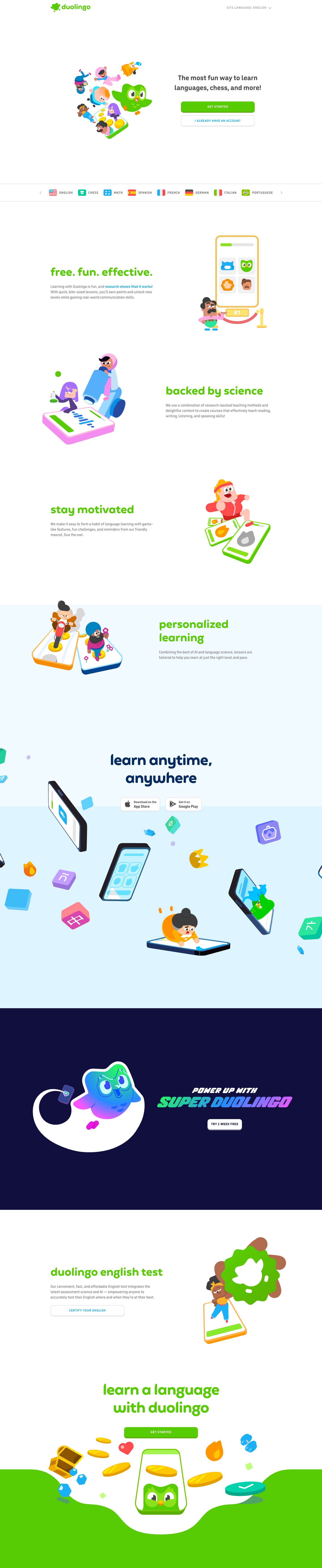
Captured 10 Oct 2026 at 1440px. Scroll the frame to see the whole page.
Duolingo
playful · friendly · bouncy · confident · clean
Duolingo's homepage is a bright, toy-like white canvas built from three things: a single saturated feather green (#58cc02), a rounded custom display face set in lowercase, and big flat 3D-ish character illustrations that carry all the emotion. It works because the restraint in layout (alternating two-column rows on a 988px column, lots of white space, almost no chrome) lets the playful illustration and the chunky 'pressable' buttons make the product feel like a game before you've tapped anything.
Palette
Typography
- Headings
- feather (Feather Bold, custom Duolingo display face)
- Body
- duolingo-sans (DIN Round-style custom sans)
- Free swap
- Both are proprietary. For 'feather' headings use Fredoka (600–700) or Baloo 2 (700); for duolingo-sans body/UI use Nunito (500–800) or DIN Round substitutes like 'Varela Round' for small labels.
Section headings are feather at 48px, weight 700, 0 tracking, tight ~1.1 line height, always lowercase and usually in feather green #58cc02 (navy #042c60 for 'learn anytime, anywhere'). The hero H1 is deliberately smaller and quieter: duolingo-sans 32px/700 in #4b4b4b, centered, two lines. Body copy is duolingo-sans 17px/500 at 1.41 line height in #777777, capped at ~45ch. Buttons and the language strip use duolingo-sans bold ~13–15px, ALL CAPS, with ~0.8px wide tracking. Inline links are bold #1cb0f6. The Super promo breaks the system with a heavy italic gradient wordmark.
More free font pairings →Measured h1: 32px / 700 / 0em · body 17px
Signature moves
- Give every button a solid darker bottom edge (border-bottom 4px, no blur) so controls look like chunky, pressable game pieces.
- Set section headings in a rounded display face, all lowercase, in the brand green, to make marketing copy feel casual and childlike rather than corporate.
- Let large flat-shaded character illustrations with soft isometric depth carry the personality while the layout itself stays plain and white.
- Use one saturated hero colour (#58cc02) everywhere for CTAs and headings, with a single secondary (#1cb0f6) reserved for links and secondary actions.
- Close the page with an organic, blobby full-bleed colour shape instead of a straight section edge.
- Show the product as stylised 3D phones, cards and floating reward objects (coins, gems, flames) rather than real screenshots.
Layout
Single centered column of ~988px. The hero fills the first viewport: illustration left, H1 + stacked full-width CTAs right, vertically centered with generous empty space above and below. A full-bleed 1px-bordered (#e5e5e5) course strip sits pinned at the fold edge. Below, feature rows alternate text-left/art-right and art-left/text-right, each roughly 500–600px tall with headings left-aligned, then a centered 'learn anytime, anywhere' block with floating 3D app icons, a full-bleed #100f3e Super Duolingo band, an English Test row, and a closing centered CTA sitting on a green wavy blob that bleeds into the footer. Density is very low; whitespace and illustration size do the pacing.
Components
- Primary button
- Solid #58cc02, white uppercase bold label with wide tracking, 12px radius, and a darker green (~#58a700) solid 4px bottom 'lip' instead of a blur shadow so it looks physically pressable; full width (~330px) in the hero.
- Secondary button
- White fill, 2px #e5e5e5 border with a thicker 4px bottom border, 12px radius, uppercase label in Macaw blue #1cb0f6. Same 3D-lip logic as the primary.
- Nav
- Minimal: green wordmark logo left, one compact green 'GET STARTED' lip button right, no links, no background or border.
- Course strip
- Full-width band between two #e5e5e5 hairlines with chevron arrows; each item is a small rounded flag/subject icon plus uppercase bold #777 label with tracking.
- Feature rows
- Lowercase green feather heading at 48px, 2–3 lines of grey body text, oversized flat illustration on the opposite side; no cards, no backgrounds.
- Premium band
- Full-bleed midnight #100f3e section with a tilted 3D card holding a gradient heart, italic gradient (green→blue→purple) wordmark, and a small white lip button with dark text.
- Closing CTA
- Centered green heading and button sitting above a 3D phone with coins, gems, and a streak flame, framed by an organic green blob shape that floods into the footer.
- App store badges
- White pill-ish buttons with light grey border and bottom lip, matching the button system rather than official black badges.
Product UI
The interface is never shown as a literal screenshot; it appears as illustrated phones and lesson cards: rounded rectangles with thick coloured outlines and a thicker bottom edge, a green progress bar on a light grey track, 2×2 image-choice tiles on #f7f7f7-style surfaces, streak flames, coins and gems. This implies the real app style: big touch targets, heavy rounded corners (12–16px), 2px borders with a 4px bottom lip, flat fills with no gradients or blur shadows, bright categorical colours (green success, red error, blue info, gold rewards) and chunky rounded iconography.
Great for
- Consumer learning and education apps
- Gamified habit or fitness trackers
- Kids' and family products
- Casual mobile games and reward-driven apps
- Friendly onboarding flows for broad audiences
Watch out for
- Using #777777 body text at small sizes or on tinted backgrounds; it is borderline contrast and only works at 17px on pure white.
- White text on #58cc02 at small sizes fails WCAG; keep labels bold and uppercase or darken the green for text-heavy buttons.
- Shipping 'feather' or 'duolingo-sans' — they are proprietary; substitute Fredoka/Nunito.
- Copying the look without strong custom illustration; the plain layout looks empty with stock icons.
- Adding blur drop shadows, gradients or thin hairline buttons, which break the solid toy-block feel.
- Applying lowercase playful headings to serious finance, health or enterprise contexts.
Design like Duolingo
Read https://pageproofer.com/inspiration/playful-bold/duolingo.md and open its screenshots. To design in this style, start with a white page and a ~988px centered column, and alternate two-column rows of copy and large flat illustrations with 150–200px of vertical space between them. Use one hero colour (#58cc02) for headings and primary CTAs, #1cb0f6 for links and secondary-button labels, #4b4b4b for strong text, #777777 for body, #e5e5e5 for borders, and a single full-bleed #100f3e band for the premium upsell. Set section headings in Fredoka 700 at 48px, lowercase, line-height 1.1, in green; set body in Nunito 500 at 17px/1.41 capped near 45ch. Build buttons at ~48px tall with 12px radius, uppercase bold 14px labels with 0.8px tracking, and a solid darker bottom border (primary: bg #58cc02, border-bottom 4px #58a700; secondary: white with 2px #e5e5e5 border and 4px bottom); on press, remove the lip and translate down 2–4px. No blur shadows. Represent the product with stylised phones, cards, coins and progress bars, and end the page with an organic green blob shape rather than a hard edge.