
6 sites
Playful & Bold
Loud colour, chunky shapes, joy on purpose
Playful & Bold is a calm, mostly neutral canvas (white, warm newsprint or oatmeal) loaded with a few fully saturated colour blocks, chunky pill or toy-like controls with hard offset edges, and illustration or stylised product mockups that carry the personality. The layout and type stay restrained and confident, so the loud colour, characters and tactile buttons read as deliberate joy rather than chaos. Gumroad, Duolingo, Headspace, Mailchimp, Pitch and Lemon Squeezy all use it to make consumer products feel friendly and memorable.
Paste this into your agent
Read https://pageproofer.com/inspiration/playful-bold.md and the site teardowns it links to, and open their screenshots. Then design my [describe the page or app screen] in the Playful & Bold style, following the guide's brief, principles and do/don't lists.
The sites
Gumroad
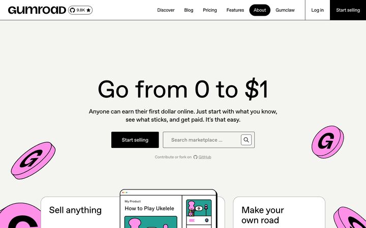
ABC FavoritGumroad pairs a warm off-white canvas, pure black type and 1px black hairlines with loud cartoon illustrations: pink 3D 'G' coins with thick black outlines, plus yellow and red pops further down. It reads like a friendly zine crossed with a neo-brutalist utility site, so the commerce feels approachable rather than corporate.
playful · brutalist · friendly · confident · unpolished
Duolingo
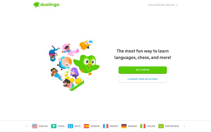
featherDuolingo's homepage is a bright, toy-like white canvas built from three things: a single saturated feather green (#58cc02), a rounded custom display face set in lowercase, and big flat 3D-ish character illustrations that carry all the emotion. It works because the restraint in layout (alternating two-column rows on a 988px column, lots of white space, almost no chrome) lets the playful illustration and the chunky 'pressable' buttons make the product feel like a game before you've tapped anything.
playful · friendly · bouncy · confident · clean

Mailchimp
Means WebMailchimp pairs a warm, editorial serif (Means) with a plain grotesk (Graphik), a near-black peppercorn brown (#231e15) and a single loud Cavendish yellow (#ffe01b), so the brand reads friendly and human instead of corporate-SaaS. A full-bleed, darkened lifestyle photo with the product half-visible on a monitor carries the hero, and yellow is reserved almost entirely for the primary CTA and the italic second line of the headline, which keeps the eye locked on the conversion path.
warm · friendly · editorial · confident · approachable
Headspace
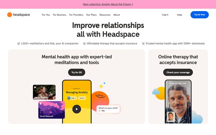
Headspace ApercuHeadspace pairs a calm, warm-neutral base (white, #f9f4f2 oatmeal cards, #2d2c2b charcoal type) with loud, flat bursts of saturated brand colour — sunflower yellow, electric blue, bubblegum pink — and round smiling blob characters. The restraint in type and layout keeps the playful colour and illustration feeling friendly and safe instead of chaotic, which suits a mental-health product.
friendly · playful · warm · reassuring · optimistic
Pitch
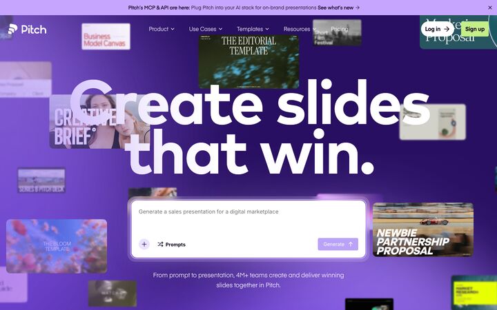
Mark Pro BoldPitch pairs a saturated electric-violet hero, strewn with blurred floating slide thumbnails, with a calm white editorial body where huge geometric Mark Pro headlines, small mono eyebrows and lavender gradients carry the brand. The product's output, real slides, does the decorating, so the page reads as a gallery of what you could make, with one chunky AI prompt box as the single place to act.
energetic · editorial · confident · playful · polished
Lemon Squeezy
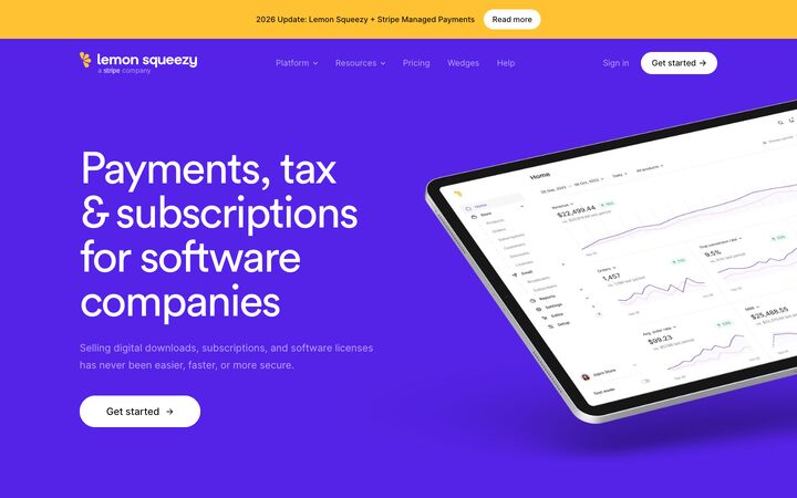
Circular Pro BookLemon Squeezy pairs a saturated electric-violet hero with long stretches of white and near-white editorial space, then breaks the rhythm with full-bleed two-tone colour blocks (hot pink, baby pink, sky blue, pale blue) that frame floating product mockups. Soft, rounded Circular Pro headings at light weight and Inter body copy with selectively darkened phrases keep a payments product feeling friendly and approachable while the real UI screenshots keep it credible.
playful · confident · airy · friendly · polished
Principles
1.
Quiet canvas, loud blocks
About 70–80% of every page is white (#ffffff) or a warm off-white (#f4f4f0 Gumroad, #f9f4f2 Headspace, #f5f5f5 Mailchimp). Saturated colour arrives as whole blocks: full-bleed bands, big rounded panels, illustrations, or the one primary CTA. Examples are Headspace's yellow #ffce00 and blue #0061ef panels, Lemon Squeezy's two-tone #f53d6b/#fbb1c4 and #00acff/#ade4ff bands, and Pitch's #5318eb hero fading to white. Each block owns one hue family. Separate colour bands with neutral sections so the page never turns into a rainbow.
2.
One hero colour, one counterpoint
Each brand commits to one dominant saturated accent and one contrasting pop. Duolingo pairs green #58cc02 with blue #1cb0f6. Pitch pairs violet #5318eb with lime #c4ee87. Mailchimp uses yellow #ffe01b against peppercorn #231e15. Gumroad uses pink #ff90e8 with yellow #ffc900 and red #dc341e only in illustration. Reserve the counterpoint for the sign-up CTA, one testimonial card or a highlight word.
3.
Hard edges instead of blur
Depth comes from solid, offset, unblurred edges. Duolingo buttons have a 4px darker bottom lip (border-bottom 4px #58a700). Headspace pills use box-shadow 0 2px 0 rgba(65,61,69,.2). Gumroad's mockup has a thick black outline with a hard offset edge. Use 0 4px 0 for buttons and 4px 4px 0 #000 for outlined cards or mockups. Soft diffuse shadows are only acceptable under floating product screenshots, as Lemon Squeezy and Mailchimp do, and never on controls.
4.
Chunky, rounded, pressable shapes
Buttons are fully pill-shaped (radius 26–40px, as at Mailchimp, Headspace and Lemon Squeezy) or chunky rounded rectangles (12px at Duolingo). Both are 48–56px tall in heroes. Cards and colour panels use 16–32px radii: 24px at Headspace, 32px for Pitch's step cards. Inputs and small controls use 4–8px. Gumroad shows the outline variant, with 1px black borders on every card and input. Duolingo shows the toy variant, with 2px #e5e5e5 borders plus a 4px bottom lip.
5.
Character carries the emotion
Personality lives in illustration, not in layout tricks. Gumroad has black-outlined pink 3D coins cropped by the viewport. Duolingo uses flat-shaded characters, coins, gems and streak flames. Headspace uses smiling blob mascots, sparkles and clouds. Pitch shows a cloud of blurred, floating real slides. Illustrations are oversized, bleed off edges, and break out of card boundaries. Without strong custom art the style looks empty, so never fall back to stock icons.
6.
Calm type, big but not shouty
Use one friendly sans, or a serif and sans pair, with hierarchy from size. Display headings run 64–96px. Gumroad sets 96px at weight 400, and Pitch goes to 180px at 0.8 line height. Tracking is tight at -0.02 to -0.04em, line height 1.0–1.15. Section headings are 40–52px. Weight is either a relaxed 400 (Gumroad, Lemon Squeezy, Mailchimp) or a soft rounded 700 (Duolingo, Headspace). Body is 16–18px at weight 400–500 with 1.4–1.7 line height. Write in sentence case or lowercase, never shouty all-caps headlines.
7.
Product shown as a toy, not a screenshot dump
Product UI appears as stylised mockups. Gumroad uses a flat browser frame with a thick outline. Duolingo uses illustrated phones with lip-bottomed lesson cards. Headspace builds phone composites with floating tiles and chat bubbles. Lemon Squeezy uses a tilted iPad and floating checkout fragments. The mockups overlap section edges, crop at panel boundaries and sit on a saturated colour field.
Colour
Background: #ffffff, or a warm off-white between #f4f4f0 and #f9f4f2. Secondary surfaces: #f5f5f5–#f7f7f8, or an oatmeal around #f9f4f2. Text: a warm near-black (#231e15, #2d2c2b or #121217), or pure #000 if you choose the brutalist outline variant. Muted text: #63605d–#777777, used only at 16px and up. Borders: 1px #000/#242423 for the outline variant, or #e2ded9/#e5e5e5 for the soft variant. Accents are fully saturated: violet #5318eb–#5423e7, pink #ff90e8 or #f53d6b, yellow #ffc900–#ffe01b, green #58cc02, blue #0061ef or #1cb0f6, lime #c4ee87. Pair each saturated hue with its pastel tint for two-tone bands, e.g. #f53d6b with #fbb1c4, or #00acff with #ade4ff, plus a deep partner for dark bands such as #280f62 or #100f3e. Put dark text on yellow, pink, lime and lavender. Put white text only on violet, blue and navy. Saturated colour should never be body text, except a heading accent in the brand hue (Duolingo green headings, Pitch violet titles).
Typography
Use a geometric or quirky grotesk for everything, or add a warm serif for the top two heading levels only (Mailchimp's style). Free picks: Space Grotesk, Outfit, Figtree, Plus Jakarta Sans or DM Sans, or Fraunces for a serif display. H1 is 64–96px, up to 120px+ for a poster hero, with line height 0.9–1.1 and tracking -0.02 to -0.04em. H2 is 40–52px, line height 1.1–1.2, tracking -0.01 to -0.03em. Card and feature titles are 26–36px. Body is 16–18px, weight 400–500, line height 1.45–1.7, measure about 45–65ch. Choose one heading weight and keep it: 400 for a relaxed tone, 700 for a chunky, rounded one. Never use 800–900 black weights. Eyebrows are 13–14px uppercase with 0.08–0.14em tracking, in mono or sans, tinted per section. Buttons are 15–18px at 500–700. Inline emphasis can flip muted text to near-black instead of bolding it (Lemon Squeezy). An italic serif punchline in the accent colour is an allowed flourish (Mailchimp).
More free font pairings →Layout
Use a centred content column of 1100–1280px with 24–48px gutters, and narrow to about 860px for FAQs and long text. Keep density low: one idea per section and 120–200px vertical gaps between sections. The hero is either fully centred (headline, subhead about 600px wide, CTA row, social proof) or a split of copy left and oversized art right. Follow it with alternating text and art rows, 2-up or 3-up grids, and full-bleed colour bands or large rounded colour panels floating on white. Let illustrations and mockups bleed off viewport and panel edges, overlap the section boundaries, and next to carousels let the next card peek in. Swap some straight section edges for organic blobs or convex curves, as in Duolingo's closing CTA and Headspace's footer. Thin announcement bars in a brand colour sit at the top.
Components
Primary button: full pill (radius 9999px) or a 12px rounded rectangle, 48–56px tall, 20–32px horizontal padding. Fill it with black, the brand colour, or white on a colour field. Give it a hard 0 3–4px 0 bottom edge in a darker shade of the fill and no blur. The pressed state translates down 2–4px and removes the edge. Secondary button: white fill with a 1–2px border in ink or #e5e5e5 and the same lip. Nav: white or transparent, logo left, plain text links. The active link is a solid ink pill with white text. The CTA is a pill, or a full-height black block flush to the edge, divided off with 1px vertical rules (Gumroad). Cards: white or oatmeal, 16–24px radius, either a 1px ink border with optional 4px 4px 0 offset, or borderless on a tinted ground. Inputs: 44–52px tall, 1px border, 4–8px radius, a prominent focus ring in the brand colour. Pills and tags: oatmeal or tinted fill; active flips to ink with white text. Testimonials: tall cards alternating between solid brand colours, with big quote marks. Stats: big numerals in the brand colour, with no boxes. Decorations: sparkles, blobs, coins, cropped mascots, kept to the edges of headlines.
App UI
Keep product screens flat and white so colour stays meaningful. Sidebar: white or #f7f7f8, 240–264px wide, 14–15px items with simple outlined icons. The active item is a solid ink pill with white text, or a brand-tint pill (e.g. #ebe3fe) with brand-coloured text. Top bar: white with a 1px bottom border and one primary pill button with a hard bottom lip. Dashboards: metric cards with 12–16px radius, either 1px borders or no borders on a tinted ground. Use large 28–36px numbers, small delta pills (green up, red down) and thin line charts in the brand colour with a faint fill. Tables: 48–56px rows, 1px #e5e5e5 dividers, no zebra striping, 13–14px muted uppercase headers, and status shown as rounded pills in categorical colours (green success, red error, blue info, yellow pending) with dark text. Forms: 44–48px inputs, 6–8px radius, 1–2px borders, labels at 14px weight 500 above the field, a 3px brand-colour focus ring, segmented toggles for binary choices, and full-width primary buttons in modals. Touch targets are at least 44px. Empty states: a centred character or spot illustration about 160–240px with a thick outline or flat shading, a 24–28px friendly sentence-case heading, one line of muted copy and a single pill CTA. This is where the mascot belongs. Celebration moments such as success, streaks and completion get a full colour panel and a reward illustration. Never use gradients or blur shadows on controls.
Do
- ✓Keep the base neutral (white, #f4f4f0 or #f9f4f2) and spend saturation on whole blocks, illustrations and the primary CTA.
- ✓Give buttons and toy-like cards a solid offset bottom edge (0 4px 0 a darker shade) instead of a blur shadow.
- ✓Use full pills or 12px rounded rectangles for buttons and 16–32px radii for cards and colour panels.
- ✓Let illustrations and mockups bleed off edges and break out of card boundaries.
- ✓Set display headings at 64–96px with -0.02 to -0.04em tracking in one consistent weight.
- ✓Pair each saturated hue with its pastel tint for two-tone bands, and keep one hue family per section.
- ✓Put dark text on yellow, pink and lime fills, and white text only on violet, blue or navy.
- ✓Show the product as stylised mockups on colour fields: outlined browser frames, phones and floating fragments.
- ✓Use one recurring mascot or illustration motif, and give it a starring role in empty and success states.
Don't
- ✕Don't use soft blurred drop shadows, glassmorphism or gradients on buttons and controls.
- ✕Don't spread the accent over many small elements; it loses its pull.
- ✕Don't stack several differently coloured bands back to back without a white or grey section between them.
- ✕Don't set headlines in black 800–900 weights or shouty all-caps.
- ✕Don't use stock icons or generic photos in place of illustration with character.
- ✕Don't put white text on yellow, lime or pastel fills, or muted grey text below 16px.
- ✕Don't use sharp 0px corners on cards or thin hairline-only buttons in the soft variant.
- ✕Don't let mascots crowd the headlines; keep them peripheral and cropped.
The brief, ready to paste
Design this in a Playful & Bold style: a calm neutral canvas with loud, deliberate bursts of saturated colour, chunky pressable controls and illustration with character. Use a white or warm off-white background (#ffffff or #f6f4f0), warm near-black text (#1f1b16), muted text #6b6660 at 16px+, and borders of #e5e2dc, or 1px #000 for an outlined look. Pick one saturated brand colour (electric violet #5423e7) and one counterpoint (lime #c4ee87 or sunflower #ffce00). Use them as whole blocks: full-bleed bands, 24px-radius colour panels floating on white, two-tone bands pairing a hue with its pastel tint, and the primary CTA. Keep one hue per section, with neutral sections between colour bands. Typography: Outfit for headings and Figtree for body. H1 is 72–96px, line height 1.0, tracking -0.03em, weight 600. H2 is 44–52px. Body is 17–18px, weight 400–500, line height 1.55. Eyebrows are 13px uppercase with 0.12em tracking in the brand colour. Write in sentence case. Buttons are full pills, 52px tall, with a hard 0 4px 0 bottom edge in a darker shade, no blur, and press down 3px when active. Cards use 16–24px radius and either a 1px border with an optional hard 4px 4px 0 #000 offset, or no border on a tinted ground. Space sections 120–160px apart in a 1200px centred column. Make illustrations, mascots and stylised product mockups oversized, and let them bleed off edges and overlap section boundaries. Use dark text on yellow or lime and white text only on violet. For app screens: white surfaces, a 248px sidebar with the active item as a solid ink pill, tables with 52px rows and 1px dividers, status pills in green, red, blue and yellow, 46px inputs with 8px radius and a 3px brand focus ring, and empty states with a centred character illustration, a friendly 26px heading and one pill CTA. No gradients, glassmorphism or soft shadows on controls.