
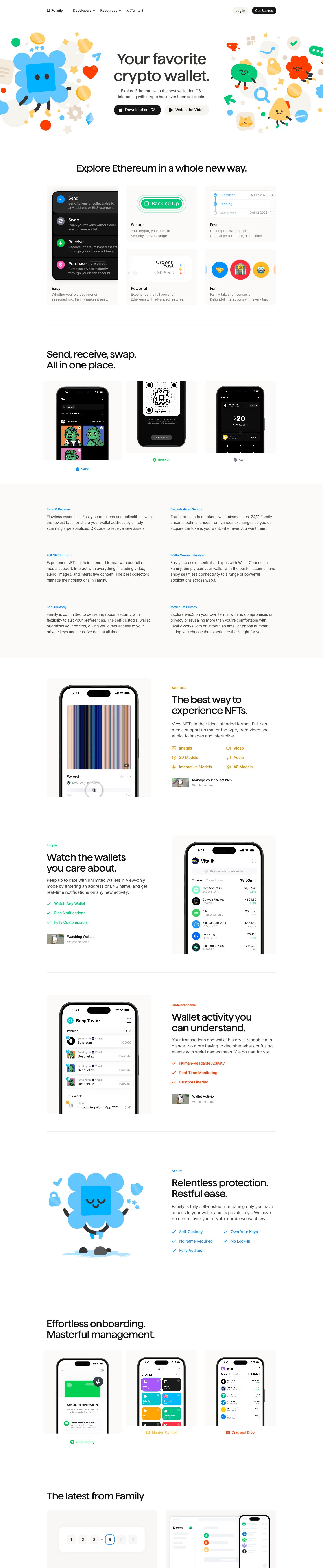
Captured 10 Oct 2026 at 1440px. Scroll the frame to see the whole page.
Family
playful · polished · friendly · calm · premium
Family pairs a near-white, warm-neutral canvas and tight custom grotesk headlines with bursts of saturated, cartoon-mascot illustration, so a crypto wallet reads as friendly and consumer-grade instead of technical. The restraint everywhere else (Inter body at 14px, warm greys, soft #fbfaf9 cards, pill buttons) lets the playful illustrations and colour-coded section accents carry the personality without looking cluttered.
Palette
Typography
- Headings
- Family (custom grotesk)
- Body
- Inter
- Free swap
- Family is a proprietary in-house typeface; use Geist, Inter Tight or Manrope at weight 500 with tight tracking. Inter is free.
H1 is 68px Family, weight 500, line-height 1.1, letter-spacing -0.02em, centered over two lines. Section H2s run ~40–44px in the same face and weight with similar tight tracking, usually two short punchy sentences stacked ('Send, receive, swap. / All in one place.'). Body is Inter 14px/1.43 at -0.006em in #474645; feature-section paragraphs bump to ~16–17px/1.5. Eyebrow labels are ~12px Inter semibold in a section accent colour (blue, green, orange, amber) in sentence case. Card titles are ~14px Inter medium in #121212 with a two-line muted #848281 description. No uppercase, no italics.
More free font pairings →Measured h1: 68px / 500 / -0.02em · body 14px
Signature moves
- Flank a centered headline with dense clusters of flat, cheerful mascot illustrations that bleed off both viewport edges, keeping the middle text zone completely clean.
- Give each feature section its own accent colour and apply it consistently to the eyebrow, checklist ticks and caption icons, while headlines and body stay neutral.
- Put real product UI inside soft warm-grey #fbfaf9 cards with 24px radius and let the phone or UI fragment crop off the card edge.
- Write headlines as two short stacked sentences in a tight 500-weight grotesk ('Relentless protection. Restful ease.').
- Use beige #f6f4ef and near-black #171717 pills as the only button styles—no outlines, no gradients.
- Replace borders with warm off-white fills and hairline dividers; the measured shadow is a near-invisible rgba(0,0,0,0.04) 1px ring.
Layout
Centered 1024px content column on white with very generous vertical spacing (~160–200px between sections). Hero is centered text flanked by two full-bleed illustration clusters that bleed off the viewport edges. Below: a 3×2 feature card grid, a 3-up phone screenshot row with coloured icon captions, a full-width #fbfaf9 band holding a 2-column text-only feature list, then alternating 50/50 rows (phone mockup in a soft card on one side, eyebrow + headline + copy + checklist on the other), separated by hairline 1px dividers. Left-aligned section headings after the hero; density is low and calm.
Components
- Navigation
- Thin white top bar inside the 1024px column: small logo mark + wordmark left, text links with chevrons ('Developers', 'Resources'), and on the right a beige #f6f4ef pill 'Log In' next to a black #171717 pill 'Get Started'. Both pills are compact (~32px tall, 32px radius).
- Hero CTAs
- Pair of ~44px-tall fully rounded pills: primary is #171717 with white text and an Apple glyph; secondary is #f6f4ef with dark text and a play triangle. No borders or shadows.
- Feature cards
- #fbfaf9 fills with 24px radius, no border, a live UI fragment (dark action list, green 'Backing Up' pill, status timeline, emoji circles) in the top two-thirds and a bold title + two-line grey caption bottom-left. UI fragments are cropped by the card edge to imply more.
- Phone mockup cards
- Realistic black iPhone frames with real app screenshots sit inside #fbfaf9 rounded cards, cropped at the bottom edge. A small coloured icon + coloured label caption sits centered beneath (blue Send, green Receive, grey Swap).
- Feature checklists
- Rows of check-mark items rendered entirely in the section's accent colour (green, orange, blue), sometimes in two columns; icon lists for media types use line icons in amber.
- Demo link
- Small video thumbnail (~54×30px, rounded) beside a two-line label: dark title 'Wallet Activity', muted 'Watch the demo'.
- Text-only feature band
- Full-width #fbfaf9 band with a 2-column grid of blue eyebrow labels over 15–16px graphite paragraphs, no icons or cards—pure typographic rhythm.
Product UI
The product is shown with real, crisp iOS screenshots in black iPhone frames plus isolated UI fragments rebuilt in HTML. The app itself is a clean, white iOS interface: SF-style system type, round token icons in bright brand colours, right-aligned dollar values with small green percentage changes, light grey section headers ('Pending', 'This Week'), small grey 'Fee Only' chips, and soft grouped rows with minimal dividers. Wallets appear as a grid of saturated colour tiles (purple, cyan, orange, green, red) with white glyphs. Status uses blue check timelines and green success pills. Density is moderate, iconography is filled and colourful, and accents are reserved for avatars, status and money deltas.
Great for
- Consumer crypto or fintech apps
- Mobile-first iOS products
- Friendly developer tools that want consumer polish
- Personal finance and budgeting apps
- Products that need to make a complex domain feel approachable
Watch out for
- Using the mascot illustration style without a real illustrator—generic clip art kills the effect.
- Spreading accent colours randomly; each section should own one hue.
- Dropping the 14px #848281 captions on tinted backgrounds where contrast fails WCAG.
- Assuming the 'Family' typeface is available—substitute Geist or Inter Tight.
- Adding heavy shadows, borders or gradients to cards; the softness depends on flat warm fills.
- Overcrowding the hero centre—the illustrations must frame, never overlap, the headline.
Design like Family
Read https://pageproofer.com/inspiration/calm-minimal/family.md and open its screenshots. To design in this style, use a white page with a centered 1024px column and 160–200px between sections. Set headlines in a tight grotesk (Geist/Inter Tight) at weight 500, 68px hero and ~42px sections, line-height 1.1, letter-spacing -0.02em, colour #121212, written as two short stacked sentences. Body is Inter 14–16px, line-height 1.45, colour #474645, captions #848281. Buttons are fully rounded pills: primary #171717 with white text, secondary #f6f4ef with dark text, no borders. Cards are #fbfaf9 with 24px radius, no border (at most a rgba(0,0,0,0.04) 1px ring), containing real product screenshots or UI fragments cropped at the card edge, with a 14px medium title and two-line grey caption. Assign each feature section one accent hue (blue #1c8ee8-ish, green, orange #f97316, amber) and use it only for the 12px semibold eyebrow, checklist ticks and caption icons. Frame the hero with bright flat illustrations bleeding off both edges, and divide sections with 1px hairlines or a full-width #fbfaf9 band.