
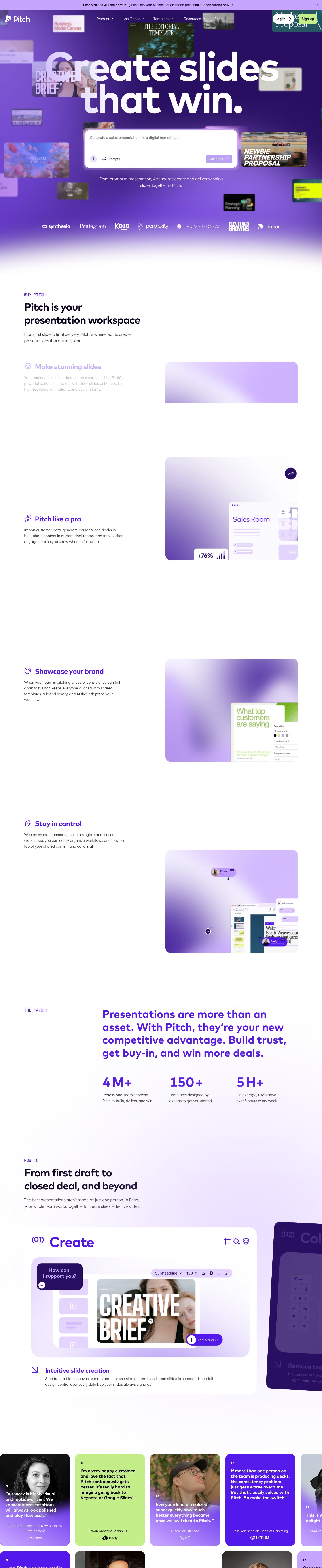
Captured 10 Oct 2026 at 1440px. Scroll the frame to see the whole page.
Pitch
energetic · editorial · confident · playful · polished
Pitch pairs a saturated electric-violet hero, strewn with blurred floating slide thumbnails, with a calm white editorial body where huge geometric Mark Pro headlines, small mono eyebrows and lavender gradients carry the brand. The product's output, real slides, does the decorating, so the page reads as a gallery of what you could make, with one chunky AI prompt box as the single place to act.
Palette
Typography
- Headings
- Mark Pro Bold
- Body
- Eina 03 Regular
- Mono
- Unnamed monospace used for eyebrow labels (e.g. 'WHY PITCH'), not captured in the tokens
- Free swap
- Mark Pro → Outfit or Lexend (700); Eina 03 → Figtree or Albert Sans (400); mono eyebrows → JetBrains Mono or IBM Plex Mono
H1 is 180px Mark Pro Bold at weight 700, with a 0.8 line height and -4% tracking, set in white over violet. The lines nearly touch and overlap the floating thumbnails. Section H2s are about 48px Mark Pro Bold in #0c021c, also tightly tracked. Feature titles are 32px Mark Pro Bold in #5318eb at a 1.2 line height and -4% tracking. Stats like '4M+' are about 56px violet Mark Pro. Body and subheads use Eina 03 Regular at 16–18px, with a 1.6 line height and -2% tracking, in #363636. Eyebrows are about 14px uppercase monospace in violet. Display type does the heavy lifting and everything else stays small and light.
More free font pairings →Measured h1: 180px / 700 / -0.04em · body 16px
Signature moves
- Bury the hero headline in a depth-of-field cloud of blurred, floating examples of what the product makes, so the output itself becomes the backdrop.
- Set the display headline enormous (180px) and crushed (0.8 line height, -4% tracking) so it reads as a graphic object.
- Fade the saturated violet hero into white with a long vertical gradient rather than a section break, then let faint lilac radial blooms recur behind later sections.
- Use a single acid-lime #c4ee87 as the counterpoint to violet, saved for the Sign up CTA and one or two testimonial cards.
- Label sections with small uppercase monospace eyebrows in violet ('WHY PITCH', 'THE PAYOFF', 'HOW TO') above big tight headlines.
- Number process steps as '(01) Create' and show them as a sideways carousel of cards, with the next card peeking in a contrasting dark colour.
Layout
Content is centred at a 1224px max width. The hero is full-bleed: a violet-to-indigo radial gradient with scattered, depth-blurred slide cards behind a centred headline and prompt box. A logo strip sits on the violet, which then fades to white through a soft gradient instead of a hard edge. The body is left-aligned in two columns: copy runs on the left at about 40% width, with sticky imagery on the right in rounded gradient panels. Whitespace is very generous, often 150–250px between sections. A stats row sits in a 3-column grid offset to the right. A 'How to' section uses large numbered white cards on lilac washes in a horizontal carousel, then masonry-like testimonial cards bleed off both screen edges.
Components
- Announcement bar
- Full-width #c6a5ff lavender strip with small dark text: a bold lead-in, then a link with an arrow, and a close X on the right.
- Nav
- Transparent over the hero with white Eina links and chevrons. The right side has a white pill 'Log in →' and a lime #c4ee87 'Sign up' button with a small 4–8px radius and dark text.
- AI prompt box
- Large white textarea card with about a 20px radius, wrapped in a translucent lavender halo frame. Grey placeholder text sits at the top. A circular + button and a 'Prompts' shuffle link sit bottom-left, with a lavender 'Generate ↑' button bottom-right. It carries the soft violet glow shadow rgba(198,165,255,0.35) 0 20px 60px -20px.
- Floating slide thumbnails
- Real template covers at varied sizes and blur levels, scattered around the hero to fake depth of field. They have rounded corners and some overlap the headline.
- Feature list
- Small violet line icon followed by a 32px violet Mark Pro title and grey body text. Inactive items fade to near-invisible as a scroll-driven reveal.
- Step cards
- White cards with a 32px radius on a lilac gradient. Each has a '(01)' small superscript number beside a large violet title and violet line icons top-right. Inside sits a stylised product mockup on a lilac panel, then an ↘ arrow with a violet subtitle and body text. The next card peeks in deep indigo #280f62.
- Testimonial wall
- Tall cards with about a 20px radius that alternate between solid violet #5318eb, lime #c4ee87, lavender, and B&W photos with a violet gradient fade at the bottom. Quotes are bold Mark Pro with big quote marks, and each card ends with a name and a customer logo.
- Stats row
- Three columns, each with a big violet numeral such as '4M+' above a two-line grey caption. There are no dividers or boxes.
Product UI
The product appears as stylised, simplified mockups rather than raw screenshots. Each shows a lilac-tinted editor with a slide thumbnail rail on the left, a large photo slide centre, and a pill-shaped floating toolbar (style dropdown, size 120 with a stepper, text tools). Dark indigo pill tooltips such as 'Add new slide' and 'Add brand kit' have a circular + icon. The UI itself is airy and low-density. It relies on rounded 12–20px panels, lavender fills instead of borders, thin violet line icons and dark indigo bubbles for AI prompts ('How can I support you?'). Real slide content (bold condensed titles, editorial photography) supplies all the contrast.
Great for
- AI creative tools
- presentation and document editors
- design and collaboration SaaS
- template marketplaces
- brand-forward startups targeting creative teams
Watch out for
- Leaving placeholder or inactive text at the near-invisible opacity seen in the scroll-reveal feature list; it fails contrast if the animation doesn't fire.
- Using Mark Pro and Eina 03 without a licence: both are commercial, so substitute Outfit or Lexend plus Figtree.
- Lime text on white, or white text on lavender: lime is only for fills behind dark text.
- Letting the floating hero thumbnails overpower the headline on mobile; reduce their count and increase blur.
- Applying the 0.8 line height to multi-line headings smaller than about 80px, where descenders and ascenders collide.
- Overusing violet everywhere; the white body sections are what make the hero feel loud.
Design like Pitch
Read https://pageproofer.com/inspiration/playful-bold/pitch.md and open its screenshots. To design in this style, open with a full-bleed hero using a radial gradient from #5318eb to #280f62. Scatter 10–15 rounded examples of the product's output around it at varied sizes and blur levels (filter: blur(2–8px)). Centre a white headline in a geometric sans (Outfit 700 as a Mark Pro substitute) at 140–180px, with line-height 0.8 and letter-spacing -0.04em. Below it, place one large white input card with a 20px radius and a lavender halo, using box-shadow rgba(198,165,255,0.35) 0 20px 60px -20px. Fade the hero to #ffffff with a 300px vertical gradient. Body copy is Figtree 16–18px with line-height 1.6, -0.02em tracking and colour #363636. Headings use #0c021c and feature titles #5318eb. Put a 14px uppercase monospace eyebrow in #5318eb above each section heading. Keep content within a 1224px max width, with left-aligned two-column sections and 160px+ vertical spacing. Cards use 20–32px radii with lilac #ebe3fe fills and no borders. Reserve lime #c4ee87 for the primary sign-up button (dark text, 8px radius) and the occasional highlight card. Testimonials are tall cards rotating violet, lime, lavender and photo-with-violet-fade.