
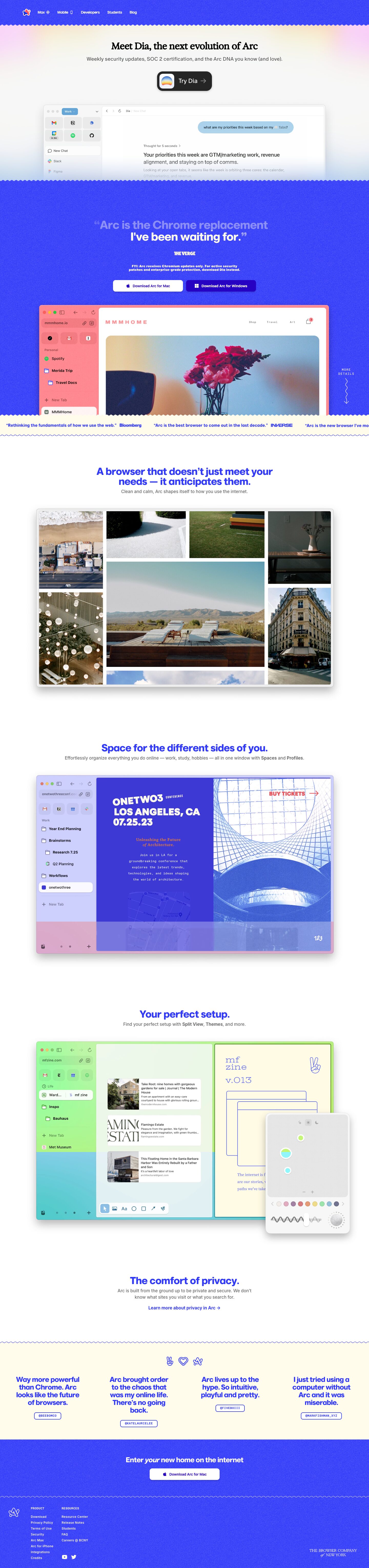
Captured 10 Oct 2026 at 1440px. Scroll the frame to see the whole page.
Arc
playful · warm · confident · crafted · calm
Arc's homepage pairs an electric cobalt (#3139fb) with warm cream (#fffcec) and white, then frames the product with hand-drawn squiggle edges, grainy noise textures and soft pastel gradient blooms, so a serious browser reads as playful and personal. Big, slightly rounded geometric display type in brand blue, quiet grey body copy and large real-product window mockups keep it legible and credible while the details stay whimsical.
Palette
Typography
- Headings
- Marlin Soft SQ (headlines, testimonials); Exposure VAR serif for the Dia hero headline
- Body
- ABC Oracle
- Mono
- Monospaced caps for testimonial handle pills and the 'More details' label (system mono)
- Free swap
- Marlin Soft SQ → Bricolage Grotesque or Nunito Sans Black (rounded geometric bold); ABC Oracle → Inter or Hanken Grotesk; Exposure VAR → Fraunces or Young Serif; mono → Space Mono or JetBrains Mono.
Display headings are Marlin Soft SQ at 700 weight, 46px on desktop (testimonials scale to ~56–64px), with a tight 0.93 line height and -4% tracking. They are set in cobalt #3139fb on white and cream, or in translucent white on cobalt. Section headings are short sentences ending in a period ('Your perfect setup.'). Subheads are ABC Oracle at 16–20px, weight 400, line height 1.2–1.4, in #696969, and they bold the feature names inline (Spaces, Profiles, Split View). The hero uses a high-contrast serif (Exposure) at ~44px in black to set Dia apart from Arc. Everything is centered and sentence case. Small caps-mono is reserved for metadata such as @handles.
More free font pairings →Measured h1: 46px / 700 / -0.04em · body 20px
Signature moves
- Cut colour bands with wavy, zigzag or scalloped SVG edges instead of straight lines, so sections feel hand-made and stitched together.
- Add a fine noise/grain texture over large flat brand-colour fields so the saturated cobalt feels printed rather than digital.
- Commit to one saturated brand colour (#3139fb) for headlines, borders, links and full-bleed bands, and balance it with warm cream #fffcec instead of grey.
- Show the real product UI in large browser-window mockups, but re-skin each one with a different theme colour so the screenshots double as feature demos.
- Hide playful hand-drawn line icons (peace sign, heart, squiggle arrow) as small delights around the testimonials and the 'more details' scroll cue.
- Write headlines as short declarative sentences with full stops, in heavy rounded display type with tight -4% tracking.
Layout
Centered single column with a ~1200px max content width, and product mockups at ~1100px wide. Each section has the same rhythm: a centered heading of 1–2 lines, a one-line grey subhead, then a large browser-window mockup. Generous gaps of 150–200px separate sections. Full-bleed colour bands (cobalt nav and hero quote, cream testimonials, cobalt CTA and footer) break up the long white middle. Band edges are wavy, scalloped lines rather than straight cuts. Testimonials use a 4-column grid of large quote text. The footer is left-aligned with compact link columns.
Components
- Navigation
- Cobalt bar with a grain texture, the multicolour logo mark on the left and white 14px medium links with small inline icons. No CTA button in the bar. The bottom edge is a zigzag that bleeds into the hero.
- Hero
- White hero with blurred pastel blooms (peach, pink, yellow) at the top corners. A black serif headline, a grey subline, then a dark pill CTA. Below sits a real app mockup that fades into a white-to-blue gradient and gets cut off by a wavy cobalt edge.
- Primary CTA
- Near-black #222 rounded rectangle (~22px radius) with a white inner border glow. It holds the Dia app icon as a square tile, 'Try Dia' at ~24px and an arrow. The shadow is rgba(0,0,0,0.25) 0 2px 8px. It reads like a tactile object.
- Download buttons
- On cobalt: one lavender-tint button and one deep violet #2702c2 button, both 8–10px radius with an Apple or Windows glyph and medium-weight label. In the final CTA: a white button with cobalt text, 10px radius and a soft drop shadow.
- Press marquee
- Cream strip with a horizontally scrolling line of italic-free quotes in cobalt bold, each followed by the outlet wordmark, with a wavy bottom border.
- Product mockups
- Large macOS-style browser windows with a ~10px radius, 1px light border and soft shadow (0 5px 5px rgba(0,0,0,0.1)). Each one is tinted with a different theme colour (pink-orange gradient, peach, lavender overlay) to show off Arc's Themes.
- Testimonials
- Cream band topped by three hand-drawn line icons (peace hand, heart, logo). Below are 4 columns of big cobalt Marlin quotes, each with a mono @handle inside a cobalt outlined pill with a ~6px radius.
- Footer
- Cobalt with grain. A white outline logo sits on the left, followed by uppercase mono column labels (PRODUCT, RESOURCES) and white 13px links. A serif 'The Browser Company of New York' wordmark sits bottom right.
Product UI
The page uses real, high-fidelity Arc and Dia interface mockups, not illustrations. The UI is a vertical left sidebar of about 250px. It holds a space switcher pill, a 3×2 grid of pinned favicon tiles on light grey rounded squares, and a list of tabs and folders with 14px labels and small icons; the selected item is a white rounded row. The content area is frameless with a minimal toolbar of back, forward and refresh buttons plus a breadcrumb. Density is moderate and spacious, with almost no borders, and hierarchy comes from soft fills (#f2f2f2-ish tiles, white selected rows). Colour comes from user themes: whole-sidebar gradients in peach, coral and pink. The Dia chat view shows a light-blue user bubble and a large 20px answer heading with grey 'Thought for 5 seconds' metadata. A floating theme picker card (white, ~16px radius, heavy shadow) has a dotted canvas, colour swatches and a squiggle slider, and it shows the playful, tactile control style.
Great for
- Consumer software with personality (browsers, note apps, creative tools)
- Indie and design-led startups
- Productivity apps aiming for 'calm but fun'
- Launch pages for apps with themeable UI
- Brands that want to feel crafted and human rather than corporate
Watch out for
- Lowering the opacity of white text on cobalt (as in the hero quote), which drops contrast below AA; keep body text on cobalt solid #fffcec.
- Using Marlin Soft SQ, ABC Oracle or Exposure without licences; they are proprietary, so substitute Bricolage Grotesque, Inter and Fraunces.
- Overusing squiggle edges, grain and doodles on every element, which turns charm into clutter; keep them at section boundaries and small accents.
- Grey #696969 subheads below 16px on cream, where contrast gets weak.
- Pairing the cobalt with a second saturated brand colour, which dilutes the one-colour identity.
Design like Arc
Read https://pageproofer.com/inspiration/calm-minimal/arc.md and open its screenshots. To design in this style, build around a single electric blue (#3139fb), warm cream (#fffcec) and white, with #696969 for secondary copy and near-black #000/#222 for the hero CTA. - **Type.** Set headings in a heavy rounded geometric sans (Bricolage Grotesque 700/800 as the substitute for Marlin Soft SQ) at 46–64px, with line height 0.95 and letter-spacing -0.04em. Use cobalt on light backgrounds and cream on cobalt. Write headings as short sentences ending in a period. Body is Inter or Hanken Grotesk at 16–20px, line height 1.3, in grey, with feature names in bold. - **Layout.** Center everything in a 1200px container. Repeat a heading, a one-line subhead and a ~1100px browser-window mockup (10px radius, 1px #e5e5e5 border, shadow 0 5px 5px rgba(0,0,0,0.1)), with 160px+ vertical spacing. - **Colour bands.** Alternate full-bleed cobalt and cream bands. Separate them with SVG wavy or zigzag edges, and overlay a subtle noise texture on the cobalt. - **Buttons.** Primary buttons are 10px radius. On cobalt, use white with cobalt text, or deep violet #2702c2. A hero CTA can be a dark #222 pill (22px radius) with an app-icon tile and arrow. - **Small details.** Put @handles and tiny labels in uppercase monospace inside cobalt outlined pills. - **Hero glow.** Add soft pastel radial blooms (peach, pink, butter) at the hero corners. - **Doodles.** Sprinkle a few hand-drawn line icons as delight. Never use more than one saturated hue.