
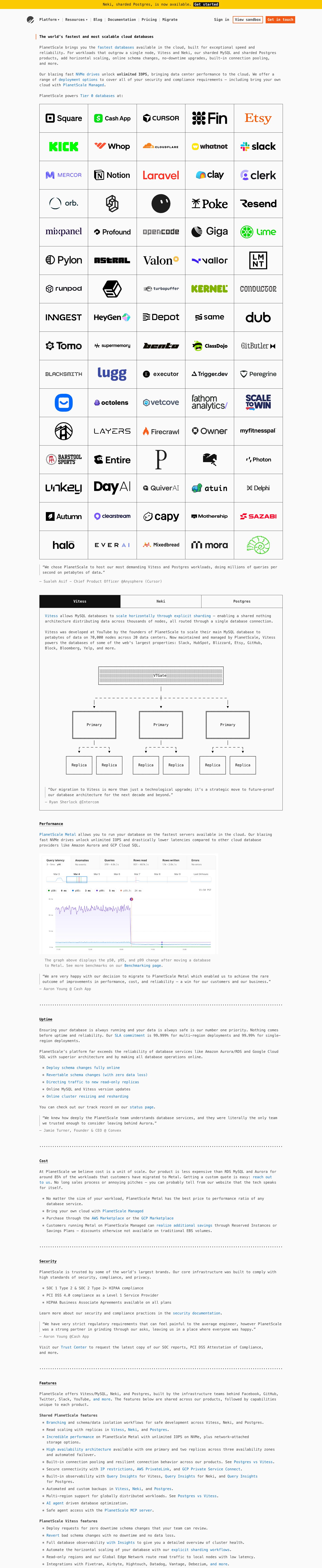
Captured 10 Oct 2026 at 1440px. Scroll the frame to see the whole page.
PlanetScale
austere · technical · confident · utilitarian · dense
PlanetScale's homepage reads like a README rendered in a terminal: every character is set in the system monospace stack at a single 16px size, on near-white #fafafa, with square boxes, ASCII-style diagrams and dotted-rule section breaks instead of hero art. It works because the absence of marketing decoration is itself the pitch: dense, link-rich technical prose and a giant grid of customer logos signal engineering confidence to an audience of database engineers.
Palette
Typography
- Headings
- ui-monospace (system mono: SF Mono / Menlo / Consolas)
- Body
- ui-monospace (system mono: SF Mono / Menlo / Consolas)
- Mono
- ui-monospace
- Free swap
- None needed since it uses the system stack; for a consistent webfont use JetBrains Mono or IBM Plex Mono from Google Fonts.
One size for everything: h1, h2, h3 and body are all 16px with 1.5 line height and 0 tracking. Hierarchy comes only from weight (700 for headings, 400 for body), colour (#000 headings vs #414141 body) and decoration: the h1 has a 2px orange left rule, and section h2s like 'Performance' are bold and underlined. Nav and buttons are bold mono at ~15px. Testimonials use the same size in #414141 with a #737373 em-dash attribution line. Bold inline phrases ('unlimited IOPS') carry emphasis instead of larger type. Sentence case throughout, with no uppercase eyebrows.
More free font pairings →Measured h1: 16px / 700 / 0em · body 16px
Signature moves
- Set the entire site in one monospace face at one size (16px/1.5) and build hierarchy only with bold, black-vs-grey colour, underlines and a single orange left rule.
- Replace hero illustrations with a huge bordered grid of customer logos in full brand colour, so social proof becomes the visual centrepiece.
- Draw architecture diagrams as ASCII/box-drawing art (double-border boxes, dashed connectors, ▼ arrows) instead of SVG illustrations.
- Use plain-text affordances: pipe '|' nav separators, '*' bullets, dotted-character section dividers and em-dash attributions.
- Limit colour to function: blue only for links, orange only for CTAs, yellow only for the announcement bar, with everything else grey on near-white.
- Write the marketing copy as dense, link-saturated technical prose that reads like docs, letting the content carry the persuasion.
Layout
A single centred column with a ~1088px content width. Prose sits inset at roughly 1000px measure (~110 characters per line, which the mono face makes feel like a terminal). There are no multi-column marketing sections. The page is a long document: intro paragraphs, a 5-column bordered logo grid (~12 rows of ~150×88px cells with shared 1px #414141 borders), a pull quote, a 3-tab box with an ASCII architecture diagram, then sections (Performance, Uptime, Cost, Security, Features) separated by full-width dotted rules. Vertical rhythm is plain paragraph spacing (one blank line, ~24px) with ~60px around dividers. Everything is left-aligned except the logos and the diagram.
Components
- Announcement bar
- Full-width #fbca00 strip, ~32px tall, centred black mono text with an inline 'Get started' link styled as a black #111 rectangle with white bold text, like a highlighted terminal selection.
- Top nav
- Monochrome slashed-circle logo at left, bold mono links separated by thin vertical pipe characters '|', and small ▾ carets on dropdowns. On the right: plain 'Sign in', 'View sandbox' as a 0-radius 1.5px #f35815 outlined box with dark text, and 'Get in touch' as a solid #f35815 box with white text. No shadows, no rounding.
- Hero
- No hero image or large headline. A 16px bold h1 with a short orange vertical bar on its left, followed by two paragraphs of body text dense with #0b6ec5 inline links (no underline). It reads as an opening paragraph of documentation.
- Logo wall
- 5-column table of customer logos in their native brand colours, each centred in an equal cell with 1px #414141 borders shared between cells. It runs ~60 logos deep and is the main colour on the page.
- Pull quotes
- Blockquote with a thin grey left border, curly quotes, #414141 text, and an attribution line starting with an em dash in #737373, e.g. '— Name @ Company'.
- Tabbed product box
- Bordered box with three equal tab cells. The active tab is filled #111111 with white bold text; inactive tabs are bordered on #fafafa. The panel holds prose plus an ASCII-art diagram: boxes with double borders, dotted fill on the top node, dashed connector lines and ▼ arrowheads, all in mono.
- Section dividers and headings
- Full-width rows of dots ('.......') as rules between sections, then a bold underlined h2 at 16px.
- Lists
- Bulleted with literal asterisks '*' in mono, many items fully linked in blue. Wrapped lines indent under the text.
- Product screenshot
- An unframed real dashboard screenshot inserted inline at ~730px wide, with a small grey caption below that links to benchmarks.
Product UI
The product appears as a single real screenshot of the PlanetScale Insights dashboard, shown unframed and inline with a caption. The UI is light and data-dense: a row of metric tabs (Query latency, Anomalies, Queries, Rows read/written, Errors) with small grey sub-values, a timeline scrubber with a blue selected range, a legend of coloured dots for p50/p95/p99/p99.9 with mono values in small pills, and a large line chart (purple p99 band with light fill, blue/green lower lines) on a white canvas with faint gridlines. The screenshot uses a sans UI font, thin grey borders and almost no chrome. Elsewhere the product is explained with ASCII diagrams instead of mockups. App screens in this style should be flat and border-defined, with dense metrics and colour reserved for data series.
Great for
- Developer infrastructure and databases
- CLI tools and APIs
- Open-source projects and technical documentation sites
- Engineering-led B2B products with strong customer logos
- Brands that want to signal anti-marketing confidence
Watch out for
- Long 110-character monospace lines strain reading on mobile and for non-technical readers; cap the measure around 80ch on small screens.
- A single type size gives no visual entry point. Without a strong logo wall or bold emphasis the page turns into a flat wall of text.
- Don't add gradients, rounded corners, shadows or a sans display headline. One soft element breaks the terminal illusion.
- Blue links without underlines across dense text can be hard to tell from body text for colour-blind users; consider underline on hover/focus at minimum.
- ASCII diagrams built with characters break when the font falls back or wraps; use pre blocks with fixed widths and test across OS mono stacks.
- This style needs real substance (benchmarks, logos, specifics). Applied to thin copy it reads as empty.
Design like PlanetScale
Read https://pageproofer.com/inspiration/precision-dark/planetscale.md and open its screenshots. To design in this style, set font-family to ui-monospace, 'SF Mono', Menlo, Consolas, monospace (or JetBrains Mono) for everything at 16px, line-height 1.5, letter-spacing 0. Headings are the same 16px at weight 700 in #000000; body is weight 400 in #414141; muted captions and attributions are #737373. Background is #fafafa with no shadows and 0px radius everywhere. Use #0b6ec5 only for inline links (no underline), #f35815 only for CTAs (one solid button with white text, one 1.5px outlined button) and for a 2px left rule on the h1, and #fbca00 only for a top announcement bar whose inline link is a black #111 box with white text. Center a single column at ~1088px max width with prose inset to ~1000px. Separate nav links with '|' characters, use '*' as list bullets, divide sections with a full-width row of dots, and underline section h2s. Show customers in a 5-column grid of equal cells with 1px #414141 borders. Build tabs as bordered equal-width cells with the active tab filled #111111. Draw diagrams in ASCII inside pre blocks, and drop in real product screenshots unframed with a small grey caption.