
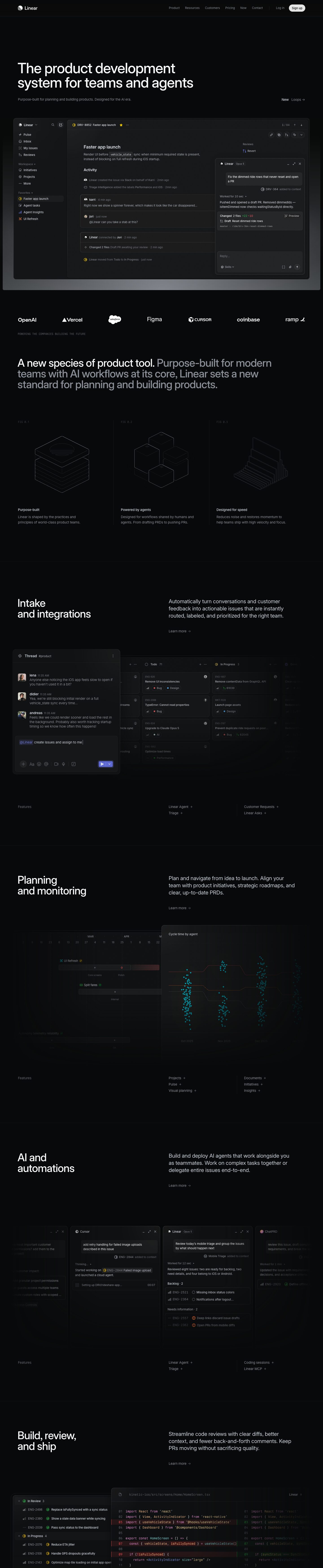
Captured 10 Oct 2026 at 1440px. Scroll the frame to see the whole page.
Linear
precise · restrained · technical · nocturnal · confident
Linear's homepage is a near-black, almost monochrome canvas (#08090a) where nearly all the visual interest comes from a meticulously rendered recreation of the product itself, framed by restrained Inter headlines and hairline #23252a borders. It works because removing colour and decoration makes the product's density, precision and speed the hero, which signals craft to an audience of engineers and designers.
Palette
Typography
- Headings
- Inter Variable
- Body
- Inter Variable
- Mono
- Berkeley Mono
- Free swap
- Inter is free on Google Fonts (use the variable version to hit weights 510/590). Berkeley Mono is commercial; substitute JetBrains Mono, IBM Plex Mono or Geist Mono.
H1 64px, weight 510, line-height 1.0, tracking -2.2%, off-white #f7f8f8, sentence case, set in two balanced lines. H2 48px, weight 510, line-height 1.0, -2.2%; section titles break onto two lines ('Intake / and integrations'). Statement paragraph pairs a white lead clause with the remainder in #8a8f98 at the same size. H3/UI titles 20px, weight 590, line-height 1.33, -1.2%. Body 15px, weight 400, line-height 1.6, -1.1%, in #d0d6e0 or #8a8f98. Section intro copy around 20–22px light silver. Tiny uppercase mono labels (~11px Berkeley Mono, wide tracking, #62666d) for captions like 'FIG 0.1' and 'POWERING THE COMPANIES BUILDING THE FUTURE'. In-between weights (510, 590) avoid the heaviness of 600/700 on dark backgrounds.
More free font pairings →Measured h1: 64px / 510 / -0.022em · body 15px
Signature moves
- Make the product UI the only illustration: rebuild real screens in HTML/CSS at full fidelity and let them bleed off the viewport edges with dark fade masks.
- Use a four-step greyscale text hierarchy (#f7f8f8, #d0d6e0, #8a8f98, #62666d) instead of colour to signal importance, reserving colour for status icons and code.
- Split a single large paragraph into a white lead clause and a grey continuation at the same 48px size to create emphasis without bolding.
- Two-line section headings on the left, explanatory copy on the right, separated from the next section by a single 1px hairline rule.
- Label diagrams with technical mono captions ('FIG 0.1') paired with wireframe isometric line drawings for an engineering-document feel.
- Use variable-font in-between weights (510, 590) with tight negative tracking so large type feels crisp rather than heavy on black.
Layout
Wide container (~1344px content, ~1200px text column) with a strong left edge; headline and subhead are left-aligned with a secondary link ('New Loops →') pushed to the far right. Feature sections follow a strict two-column rhythm: large two-line H2 on the left half, a 20px description plus 'Learn more →' on the right half, then a full-bleed product mockup that bleeds and fades off the edges, then a 'Features' footer row listing sub-features with '+' in columns divided by vertical hairlines. Sections are separated by 1px #23252a horizontal rules and ~160–200px of vertical padding. A three-up 'FIG 0.x' row uses thin vertical dividers and wireframe isometric line illustrations. Density is low on marketing copy, high inside mockups.
Components
- Navigation
- Thin top bar on the canvas with a hairline bottom border; logo left, 13–14px grey #8a8f98 links right, a vertical divider, plain 'Log in' text, and a pill 'Sign up' button in light #e5e5e6 with dark text (9999px radius).
- Hero
- No illustration or gradient blob—just a 64px two-line headline, one grey sentence, and immediately below a large product screenshot inside a 12px-radius frame with a subtle grey radial glow beneath it that fades to black.
- Product mockup frames
- Panels on #0f1011/#161718 with 1px #23252a borders, 8–12px radii, inset white 0.5px highlight (rgba(255,255,255,0.08)) and soft 0 2px 32px rgba(0,0,0,0.25) shadow; overlapping floating panels (agent chat over issue view) create depth.
- Logo strip
- Monochrome white customer logos evenly spaced across full width, with a tiny uppercase mono caption beneath, left-aligned.
- Feature list footer
- Small grey 'Features' label left, sub-features as 14px grey text with '+' affordances in two columns separated by a vertical hairline.
- Text links
- 'Learn more →' in grey #8a8f98, no underline, arrow glyph as the only affordance.
- Code diff panel
- Split view in Berkeley Mono with line numbers, muted syntax colours (peach #f7bf8b, pink #f79ce0), deleted lines on dark red tint and added lines on dark green tint.
Product UI
The page shows the product through pixel-faithful recreations of real Linear screens: issue detail with activity feed, sidebar navigation, floating agent chat panels, a Slack-style thread feeding a kanban board, a timeline/roadmap, a scatter-plot insights chart, multiple agent windows (Cursor, Linear, ChatPRD) and a code diff. The UI is dense and quiet: 13px text, 28–32px row heights, monochrome line icons, 1px #23252a borders, surfaces only a few shades lighter than the background (#0f1011 to #1c1c1d), small rounded chips for labels with a tiny coloured dot (red Bug, blue Design, green Performance), circular status icons in yellow/green, monospace issue IDs (ENG-926) in grey, and indigo #5e6ad2 used sparingly for primary send buttons and @mention highlights. Modal/panel chrome uses minimize/expand/close glyphs and 8–12px radii.
Great for
- Developer tools and IDE-adjacent products
- Project management and issue tracking
- AI agent and automation platforms
- B2B SaaS targeting engineers and designers
- Infrastructure and data products with dense interfaces
Watch out for
- Text in #62666d on #08090a fails contrast for body copy; use it only for captions and disabled states.
- Don't add gradients, glows or saturated accents everywhere—the effect depends on near-total monochrome.
- Berkeley Mono is licensed; swap for JetBrains Mono or Geist Mono.
- Using standard 600/700 weights makes headlines look clunky on black; use variable Inter at 510/590.
- Low-fidelity or generic mockups will expose the emptiness of the layout—this style only works if the product screens are genuinely polished.
- Borders brighter than ~#2e2e32 will break the hairline subtlety and make the page look gridded.
Design like Linear
Read https://pageproofer.com/inspiration/precision-dark/linear.md and open its screenshots. To design in this style, set the page background to #08090a and build surfaces in barely-lighter steps (#0f1011, #161718, #1c1c1d) separated by 1px #23252a borders. Use Inter Variable throughout: H1 64px/1.0 weight 510 with -0.022em tracking, H2 48px/1.0 weight 510, UI titles 20px weight 590, body 15px/1.6 weight 400 with -0.011em tracking. Colour text by hierarchy only: #f7f8f8 headlines, #d0d6e0 body, #8a8f98 secondary, #62666d captions; use a monospace (JetBrains Mono as a Berkeley Mono substitute) at ~11px uppercase with wide tracking for figure labels. Left-align everything in a ~1344px container; structure sections as a two-line H2 on the left, 20px description plus a grey 'Learn more →' on the right, then a large high-fidelity product mockup that bleeds off the edges and fades to black, then a hairline rule. Frame mockups with 12px radius, inset rgba(255,255,255,0.08) 0.5px highlight and 0 2px 32px rgba(0,0,0,0.25) shadow. Keep buttons minimal: a light #e5e5e6 pill for the primary CTA, plain grey text for secondary. Reserve colour (#5e6ad2 indigo, small red/green/yellow status dots) for inside the product UI.