
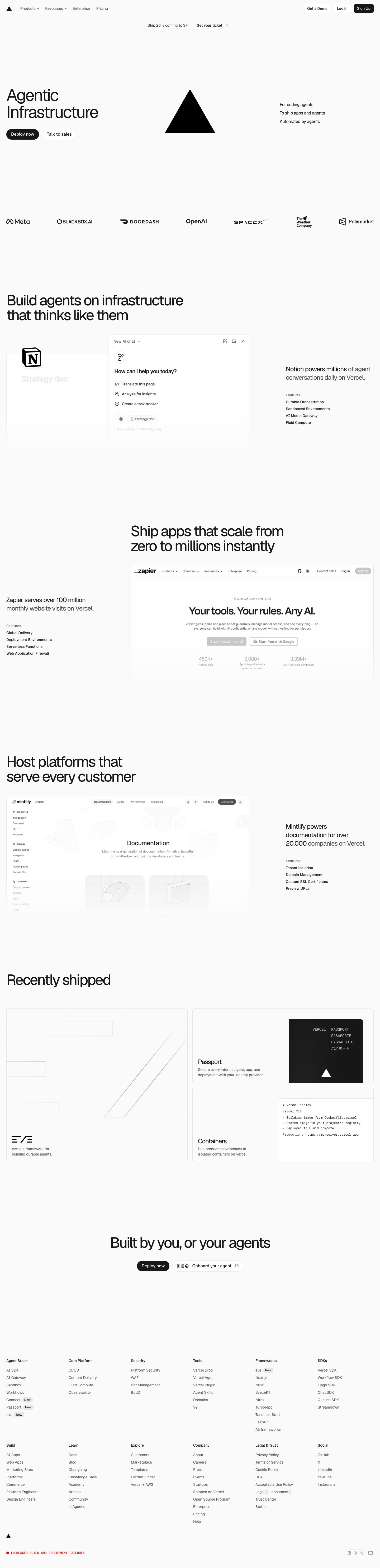
Captured 10 Oct 2026 at 1440px. Scroll the frame to see the whole page.
Vercel
austere · confident · technical · editorial · calm
Vercel's homepage is near-monochrome editorial minimalism: a #fafafa canvas, Geist set large with tight negative tracking, a single glowing black triangle as the hero object, and real customer product screenshots floating in vast whitespace. It works because the restraint signals infrastructure-grade confidence, so the logo, the type and the customer UIs carry everything without decoration.
Palette
Typography
- Headings
- Geist Sans
- Body
- Geist Sans
- Mono
- Geist Mono
- Free swap
- None needed. Geist and Geist Mono are free, open-source fonts on Google Fonts. Inter Tight is a fallback.
H1 is 64px at weight 400, line-height 1.0, tracking -0.06em (about -3.8px), sentence case, broken across two lines. H2 is 56px at weight 450, the same 1.0 line-height and -0.06em tracking, and wraps to two lines within roughly 700px. Body and UI text is 14px at weight 400 with 1.43 line-height. Nav links are 14px #4d4d4d. Customer callouts are about 20px and split the sentence colour: the key phrase is #171717 and the rest is #4d4d4d. Feature lists use an 12px muted 'Features' label above 12–13px #171717 items. The scale jumps straight from 14px to 56–64px with almost nothing in between, and that gap creates the editorial contrast. Weights stay at 400–500 and never go bold.
More free font pairings →Measured h1: 64px / 400 / -0.06em · body 14px
Signature moves
- Set huge headlines (56–64px) at weight 400–450 with -0.06em tracking and 1.0 line-height so the type feels engineered and dense without going bold.
- Use the brand mark itself as the hero illustration: one solid black geometric shape with a soft glow and shadow on an off-white field.
- Write two-tone sentences, with the claim in #171717 and the continuation in #4d4d4d, to create emphasis without changing weight or size.
- Prove the product with real customer interfaces in hairline-bordered panels that fade out at the bottom, paired with a terse list of the features used.
- Drive hierarchy entirely through scale and greyscale: blue #0070f3 is reserved for inline links, and black pills are the only strong fills.
- Use asymmetric layouts that alternate sides and leave aggressive empty space, letting sections breathe rather than filling the grid.
Layout
Content is full-bleed with 24px gutters and a measured content width of about 1392px at a 1440 viewport, so headlines sit hard-left against the page edge. The hero uses three columns: headline and CTAs on the left, the triangle mark centred, and a stacked three-line value list on the right that is vertically centred. A seven-logo customer strip spans the full width below. Feature sections alternate their asymmetric placement. One has the H2 left with a product mockup centre-left and the testimonial and feature list right. The next has the H2 and mockup offset right with the callout on the left. Whitespace is extreme, with 200px+ between sections and long empty stretches of canvas. Density is very low and the alignment is strictly left-edged.
Components
- Top nav
- Transparent over #fafafa. A triangle logomark sits at left, followed by 14px #4d4d4d links (Products and Resources with small chevrons). On the right are three compact buttons about 32px tall with 6px radius. 'Get a Demo' and 'Log In' are white with a 1px rgba(0,0,0,0.08) ring shadow. 'Sign Up' is solid #171717 with white text.
- Announcement bar
- Centred, borderless, plain 14px text: a grey event line followed by a darker 'Get your ticket ›' link. There is no pill and no background.
- Hero CTAs
- Two fully rounded pills about 40px tall at 16px text. The primary is #171717 fill with white text. The secondary is #ffffff with a hairline #ebebeb ring. There are no icons and no gradients.
- Hero visual
- A single large black equilateral triangle with a soft drop shadow, sitting inside concentric, barely-visible white radial glows. The brand mark itself serves as the hero image.
- Logo wall
- Seven monochrome black customer logos evenly distributed across the full width. They have no container and no label.
- Customer case block
- A real customer UI (Notion AI chat, Zapier homepage) is shown in white panels with 1px #ebebeb borders and 6px radius, fading out at the bottom edge. Beside it sits a two-tone sentence quote and a small 'Features' list of the Vercel products used.
- Borders
- Borders are drawn with box-shadow rings (0 0 0 1px #ebebeb or rgba(0,0,0,0.08)) rather than CSS borders, which keeps them crisp at 1px and avoids layout shift.
Product UI
Product is shown through real customer screenshots rather than Vercel's own dashboard: a Notion AI chat panel and the Zapier marketing site, each in a white card with a 1px #ebebeb ring and 6px radius, partially faded or cropped. The UI language they model is light and sparse. It uses 13–14px text, thin-stroke outline icons, round avatar badges, pill-shaped inline chips (an '@' chip and a 'Strategy doc' chip), soft grey placeholder text (#c9c9c9) and minimal chrome. For app screens, use white surfaces on #fafafa, hairline ring borders, 6px radii, monochrome icons and black primary buttons, with colour reserved for status (green #297a3a) and links (blue #0070f3).
Great for
- Developer infrastructure and cloud platforms
- AI and agent tooling
- API products and SDKs
- Premium B2B SaaS with strong customer logos
- Technical product launches and event pages
Watch out for
- Low-contrast #c9c9c9 text for anything beyond placeholders. It fails accessibility at small sizes.
- Applying -0.06em tracking to body text. It only works at 40px+.
- Leaving huge empty canvas stretches without content or lazy-loaded visuals. Below the fold it can read as a broken page.
- Adding colour gradients, heavy shadows or bold weights. They break the monochrome restraint.
- Copying the hero-logo trick without a strong, simple brand mark to carry it.
- Using thick 1px solid borders in mid-grey. Keep rings at #ebebeb or 8% black.
Design like Vercel
Read https://pageproofer.com/inspiration/precision-dark/vercel.md and open its screenshots. To design in this style, use a #fafafa page background with #ffffff surfaces, #171717 primary text and #4d4d4d secondary text. Set everything in Geist Sans, with Geist Mono for code. Headlines are 56–64px at weight 400–450, line-height 1.0 and letter-spacing -0.06em. Body and UI text is 14px with 1.43 line-height. Avoid the sizes between 20px and 56px except for 20px quote text. Lay out at roughly 1392px width with 24px side gutters, left-align headlines to the edge, and use asymmetric three-column heroes. Leave 160–240px between sections. Primary CTAs are fully rounded pills about 40px tall in #171717 with white text. Secondary CTAs are white pills with a 0 0 0 1px #ebebeb box-shadow. Nav buttons are 32px tall with 6px radius. Draw all borders as 1px box-shadow rings and never use drop shadows on cards. Show the product with real screenshots in 6px-radius white panels that fade out at the bottom, next to a two-tone sentence (the key phrase in #171717, the rest in #4d4d4d) and a small 'Features' list. Keep logos monochrome. Use #0070f3 only for links and #297a3a only for success states.