
6 sites
Precision Dark
Crisp, technical, quietly premium
Precision Dark is a near-monochrome, engineering-grade style. It uses near-black canvases (#000–#0f1011), hairline 1px borders, tight regular-to-medium grotesk type and almost no decoration, so pixel-faithful product UI becomes the only illustration. Colour is withheld from the chrome and spent on a single accent, semantic status and the content inside product shots. Linear, Raycast and Resend show the dark form directly. Vercel, Cursor and PlanetScale apply the same restraint on light canvases and are the reference for hierarchy, copy and border discipline.
Paste this into your agent
Read https://pageproofer.com/inspiration/precision-dark.md and the site teardowns it links to, and open their screenshots. Then design my [describe the page or app screen] in the Precision Dark style, following the guide's brief, principles and do/don't lists.
The sites
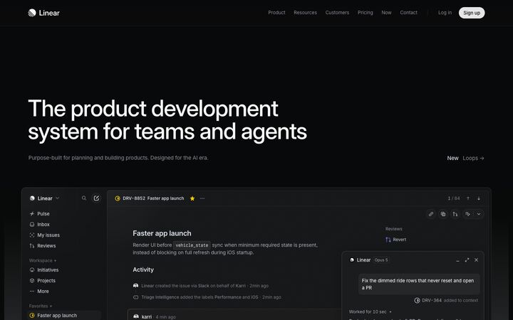
Linear
Inter VariableLinear's homepage is a near-black, almost monochrome canvas (#08090a) where nearly all the visual interest comes from a meticulously rendered recreation of the product itself, framed by restrained Inter headlines and hairline #23252a borders. It works because removing colour and decoration makes the product's density, precision and speed the hero, which signals craft to an audience of engineers and designers.
precise · restrained · technical · nocturnal · confident
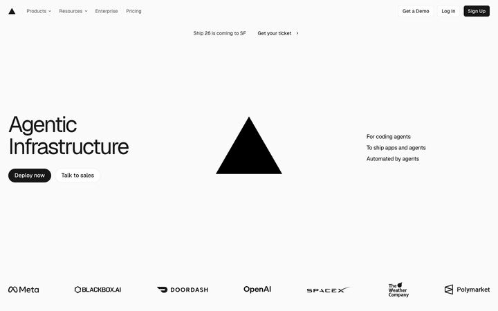
Vercel
Geist SansVercel's homepage is near-monochrome editorial minimalism: a #fafafa canvas, Geist set large with tight negative tracking, a single glowing black triangle as the hero object, and real customer product screenshots floating in vast whitespace. It works because the restraint signals infrastructure-grade confidence, so the logo, the type and the customer UIs carry everything without decoration.
austere · confident · technical · editorial · calm
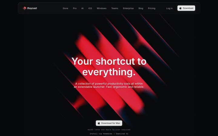
Raycast
InterRaycast is a near-black (#07080a), almost monochrome dark site where a single warm red (#ff6363) appears only as glowing, grainy diagonal light streaks and small product details, so every coloured moment reads as an event. Real macOS-native product UI, rendered at full fidelity inside device frames and tactile cards, carries the page, and restrained Inter typography plus vast empty space make it feel like premium native software rather than a SaaS template.
cinematic · tactile · restrained · premium · nocturnal
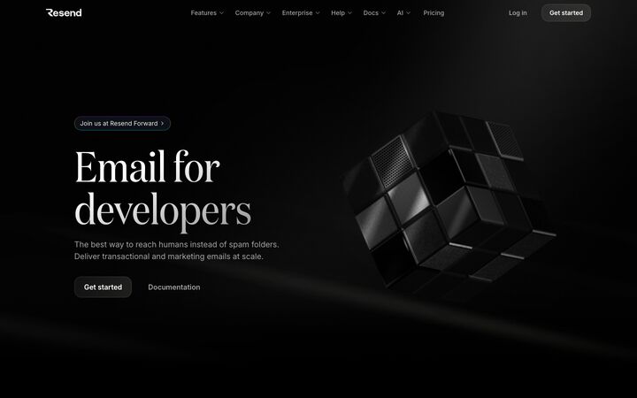
Resend
Domaine DisplayResend is a near-pure black (#000000) developer site that pairs an editorial serif hero (Domaine at 96px) with a tight grotesk (ABC Favorit) for section headings and Inter for body, so it reads as both premium and technical. Colour is almost entirely withheld: grey text, hairline #262a2d borders and soft white light-leaks carry the page, and the only saturated colour lives inside product mockups, glossy 3D app-style icons and one iridescent gradient headline word.
luxurious · nocturnal · precise · restrained · developer-centric
Cursor
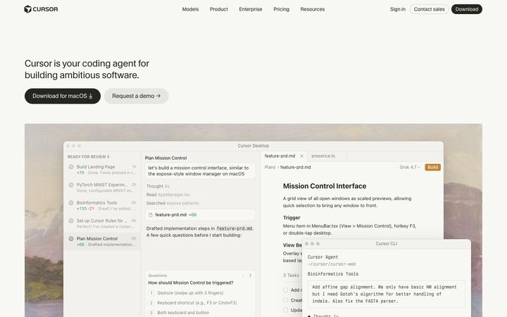
CursorGothicCursor's homepage is a warm, paper-toned, almost editorial page where small regular-weight type, near-black ink (#26251e) and a single orange link colour (#f54e00) frame large, meticulously faithful macOS-style product windows floating over muted oil-painting landscapes. The restraint works because the product UI does all the persuading: the chrome stays quiet, headings never shout, and the painted backdrops add craft and humanity without competing with the interface.
calm · editorial · warm · restrained · crafted
PlanetScale
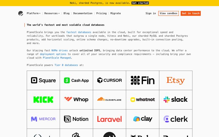
ui-monospacePlanetScale's homepage reads like a README rendered in a terminal: every character is set in the system monospace stack at a single 16px size, on near-white #fafafa, with square boxes, ASCII-style diagrams and dotted-rule section breaks instead of hero art. It works because the absence of marketing decoration is itself the pitch: dense, link-rich technical prose and a giant grid of customer logos signal engineering confidence to an audience of database engineers.
austere · technical · confident · utilitarian · dense
Principles
1.
The product is the illustration
Skip blobs, stock art and generic gradients. Rebuild real screens in HTML/CSS at full fidelity, with 13px text, 28–32px rows, real IDs, chips and status icons. Let them bleed off the viewport or fade to the background with masks. Linear (issue view, kanban, diff, agent panels), Raycast (macOS launcher inside a ~20px-radius bezel) and Cursor (layered desktop + CLI windows) do this best. Low-fidelity mockups expose the empty layout, so polish matters more here than anywhere else.
2.
Greyscale carries the hierarchy
Use a 3–4 step grey text ladder instead of colour or bold. On dark: headline #f7f8f8–#ffffff, body #d0d6e0 or #a1a4a5, muted #8a8f98–#9c9c9d, captions only #62666d–#6a6b6c. Linear's four-step ladder is the model. Reserve the darkest greys for captions, line numbers and disabled states, because they fail contrast for body copy.
3.
Two-tone sentences instead of bold
Write emphasis as one sentence split by colour: the claim in white, the continuation in muted grey, both at the same size and weight. Linear does this at 48px, Vercel at 20px (#171717 / #4d4d4d), Raycast in 20px section couplets ('Take shortcuts, not detours. / One interface…') and Cursor in 22px feature lines. This replaces heading + paragraph pairs and bold emphasis.
4.
Light, tight, never bold display type
Set display type at 56–64px (up to 96px for a single hero line), weight 400–510, line-height 1.0–1.1, tracking -0.02em to -0.06em. Linear uses 510/590 variable Inter at -2.2%. Vercel uses Geist at 400–450 and -0.06em. Resend keeps its grotesk H2s at weight 400 and -5%. Avoid 700. The scale jumps straight from 14–15px UI text to 48–64px headings with little in between.
5.
Hairlines, not boxes
Every edge is a 1px line a few steps above the canvas: #23252a (Linear), #262a2d (Resend), #2f3031 (Raycast), or rgba(255,255,255,0.06–0.10). Never go brighter than ~#2e2e32. Draw borders as box-shadow rings (0 0 0 1px) the way Vercel does. Separate sections with a single 1px horizontal rule (Linear) or 150–250px of empty canvas (Resend, Raycast), never with coloured bands.
6.
One accent, spent rarely
Keep a single brand colour and confine it to one job: Linear indigo #5e6ad2 for primary actions and @mentions, Raycast coral #ff6363 only as diffuse grainy glow, Vercel blue #0070f3 only for links, Cursor orange #f54e00 only for text links. Other colour appears only as semantic state (mint #43fea4 delivered, green #297a3a ok, red bounced) and inside product content such as label dots, app icons and code syntax.
7.
Depth from light, not surfaces
Surfaces sit only 1–3 shades above the canvas (#08090a → #0f1011 → #161718 → #1c1c1d). Create depth with soft radial glows under the hero product (Linear), a top-edge glow on cards (Resend), an inset 0.5–1px white highlight at rgba(255,255,255,0.08) and broad soft shadows (0 2px 32px rgba(0,0,0,0.25)). Raycast's layered keycap buttons are the most tactile version and should be used sparingly.
Colour
Canvas #000000–#0a0a0b. Prefer #07080a–#08090a so glows and shadows stay readable; reserve true #000 for a Resend-style light-leak look. Surfaces: #0f1011 / #111214 (panel), #161718 / #1b1c1e (raised, selected row), #1c1c1d max. Borders #1f2023–#2e2e32, or white at 6–10% alpha. Text: primary #f1f3f5–#ffffff (slightly cool off-white such as #f7f8f8 reads more refined than pure white), secondary #c8ccd4–#d0d6e0, muted #8a8f98–#a1a4a5, faint #62666d (captions only). Accent: one hue, e.g. indigo #5e6ad2, coral #ff6363 or blue #3b9eff, covering under 2% of pixels. Semantic: green #43fea4/#4cb782, amber #f2c94c, red #eb5757, each used as small dots, chip tints or 10–15% alpha fills. Code syntax uses low-saturation peach #f7bf8b, pink #f79ce0 and blue #8ab4f8. Diffs use dark red/green line tints at ~12% alpha. Neutrals lean cool (blue-grey). Keep primary buttons light-on-dark (#e5e5e6 fill, near-black text) rather than accent-filled.
Typography
Use one neo-grotesk for everything: Inter (variable, so you can use 510/590), Geist or Inter Tight. Add a mono (JetBrains Mono, Geist Mono or IBM Plex Mono) for code, IDs, keycaps and tiny labels. Scale: H1 56–64px, weight 500–510, line-height 1.0–1.05, tracking -0.022em to -0.04em. H2 40–48px, weight 500, line-height 1.0–1.1, same tracking, broken deliberately onto two lines. Section lede 18–22px, weight 400, in secondary grey. Card/UI titles 16–20px, weight 590/600, tracking -0.01em. Body 15px/1.6 on marketing pages, 13–14px/1.45 in product UI. Mono eyebrows and captions 11–12px, uppercase, tracking +0.08–0.12em, faint grey (Linear's 'FIG 0.1', Raycast's 'AI AGENT'). Tight tracking applies only at 32px and above; body text keeps 0 to -0.01em. Use sentence case throughout and never bold body emphasis. One editorial serif hero line is allowed (Resend, Instrument Serif or Playfair at weight 400, 80–96px) but only once per page.
More free font pairings →Layout
Max content width 1200–1344px, with a text column ≤ 720px and 24–32px gutters. Use a strong left edge: left-aligned headline with the secondary link pushed far right (Linear, Vercel). The hero is a two-line H1, one grey sentence, one or two small CTAs, then a large product frame immediately below with a radial glow fading into the canvas. Feature sections follow a fixed rhythm: two-line H2 on the left half, a 18–20px description plus 'Learn more →' on the right half, a full-bleed mockup, then a small 'Features' row of sub-items in columns divided by vertical hairlines. Vertical spacing between sections is 160–240px (Raycast goes to 300px+ only when each beat has a strong visual). Separate sections with 1px hairline rules or pure space, never alternating background bands. Bento grids are 2 columns, 20–24px card radius and 16–24px gaps. Mono-captioned 3-up figure rows use vertical dividers. Copy density stays low; density inside mockups stays high.
Components
Nav: 56–64px tall, transparent or #0f1011 at 80% with backdrop blur and a 1px bottom hairline. Logo left, 13–14px muted links, a vertical divider, a plain 'Log in' link, and a light pill 'Sign up' (#e5e5e6, dark text, 32px tall, 9999px or 8px radius). Buttons: primary is a light fill with dark text, or a dark glass fill (#1a1a1a, 1px white-10% border, inset top highlight). Height 32–40px, 13–15px weight 500, radius 6–10px or full pill. Secondary is a text link with a trailing '→' or '›', in muted grey with no underline. Cards: #0f1011–#111214, 1px #23252a, radius 12–24px (marketing) or 8–12px (UI), optional top radial glow, with the visual on top and title + grey copy bottom-left. Announcement pill: full radius, 1px tinted hairline, 13–14px text plus '›'. Logo wall: monochrome white logos evenly spaced, no containers, with a tiny uppercase mono caption. Code blocks: radius 12–16px, black or #0b0e14 fill, framework tabs, copy button, dim line numbers, 13px mono. Chips: 20–24px tall, 6px radius, 1px border, a 6px colour dot plus a grey label. Keycaps: mono 11px in 18–20px bordered boxes (⌘ K, ↵). Icons: 16px monochrome line icons at 1.5px stroke.
App UI
Linear's and Raycast's product shots are the blueprint. Shell: canvas #08090a, sidebar 220–240px on the same or one-step-lighter surface (#0f1011), separated by a 1px #23252a line rather than a shadow. Sidebar items are 28–30px tall at 13px, with 16px line icons in #8a8f98. The active item gets a #1c1c1d fill, 6px radius and white text. Group labels are 11–12px muted, optionally uppercase. Top bar is 44–48px with breadcrumbs, a search/command trigger showing a ⌘K keycap, and view toggles as a segmented control (active segment #1b1c1e). Tables and lists: no zebra striping or vertical grid. Use 1px horizontal hairlines, 32–36px rows, 13px text, a mono grey ID column (ENG-926), circular status icons, label chips with coloured dots and right-aligned grey metadata. Hover state is a #ffffff05–#ffffff08 fill. Detail panes use key/value tables with muted keys and white values, divided by hairlines (Raycast). Forms: inputs 32–36px tall, #0f1011 fill, 1px #23252a border, 6–8px radius, 13–14px text, placeholder #62666d, labels 12–13px secondary grey above. Focus is a 1px accent ring plus a 3px accent glow at 25% alpha. Composers are rounded 12px boxes with pill selectors ('Model ▾') and a round send button. Metrics show large numbers at 32–40px weight 400 with small uppercase 12px labels; charts use thin lines on faint gridlines with colour only for series. Modals and command palettes: #111214, 12px radius, 1px border, inset 1px white-8% highlight, shadow 0 16px 48px rgba(0,0,0,0.5), and a bottom action bar with keycap hints. Empty states: a centred 1.5px-stroke wireframe or isometric line drawing in #3a3c42, a 15–16px white title, one grey sentence, one small secondary button and a keyboard-shortcut hint. No mascots or colour illustrations. Toasts are compact dark pills with a status dot.
Do
- ✓Start from #08090a canvas, #0f1011 panels and #23252a hairlines, and keep surfaces within 3 shades of the canvas.
- ✓Build real, dense product screens in HTML/CSS as the main visuals, with 13px text, mono IDs, chips and status dots.
- ✓Split key sentences into a white clause and a grey continuation at the same size.
- ✓Set headings at weight 400–510 with -0.02 to -0.06em tracking and line-height ~1.0.
- ✓Use one accent colour for one job (primary action or links) and colour only semantic state elsewhere.
- ✓Use 11–12px uppercase mono captions for eyebrows, figure labels and system notes.
- ✓Show keyboard shortcuts as keycap chips throughout the UI.
- ✓Fade large mockups into the canvas with gradient masks and add a soft radial glow beneath the hero frame.
- ✓Separate sections with a 1px rule or 160–240px of empty space.
Don't
- ✕Don't use 600–700 weights for display headlines or bold for body emphasis.
- ✕Don't fill buttons, backgrounds or large areas with the accent colour.
- ✕Don't use borders brighter than #2e2e32 or mid-grey outlines that make the page look gridded.
- ✕Don't add decorative gradients, colourful blobs, stock photos or 3D mascots.
- ✕Don't put body text in #62666d-level greys; they fail contrast on near-black.
- ✕Don't apply tight negative tracking to text below ~32px.
- ✕Don't use pure #000 everywhere unless light comes from glows; prefer #07080a–#0a0a0b.
- ✕Don't ship generic, low-fidelity wireframe mockups as the hero.
- ✕Don't use zebra-striped tables, heavy drop shadows on cards or coloured section bands.
The brief, ready to paste
Design this in a Precision Dark style, modelled on Linear, Raycast and Resend: crisp, technical, quietly premium, with near-monochrome surfaces and the product UI as the hero. Colours: canvas #08090a; panels #0f1011, raised/selected #161718–#1c1c1d; 1px hairline borders #23252a (never brighter than #2e2e32, or rgba(255,255,255,0.08)). Text ladder: #f7f8f8 headings, #d0d6e0 body, #8a8f98 muted, #62666d captions only. Use one accent, indigo #5e6ad2, only for primary actions, focus rings and @mentions. Other colour appears only as semantic dots and chips (green #4cb782, amber #f2c94c, red #eb5757) and inside product content. Type: Inter for everything, JetBrains Mono for code, IDs, keycaps and 11–12px uppercase captions with +0.1em tracking. H1 56–64px weight 500–510, line-height 1.0, tracking -0.022em to -0.04em, two lines, sentence case. H2 40–48px weight 500. Lede 18–20px grey. Body 15px/1.6 on marketing pages, 13px in app UI. Never bold. Create emphasis by splitting a sentence into a white clause and a grey continuation at the same size. Layout: 1200–1344px container with a strong left edge. Hero is a headline, one grey sentence and a small light pill CTA (#e5e5e6 fill, dark text, 32–40px tall), followed by a large, faithful product screenshot built in HTML/CSS in a 12px-radius frame with a soft radial glow beneath that fades to black. Feature sections pair a two-line H2 on the left with a description and 'Learn more →' on the right, then a full-bleed mockup masked to fade at the edges. Separate sections with 1px rules and 160–240px of space. Cards use 12–24px radius, 1px hairline, an inset rgba(255,255,255,0.08) top highlight and shadow 0 2px 32px rgba(0,0,0,0.25). App UI: 232px sidebar with 28–30px rows, 16px line icons and the active row filled #1c1c1d with 6px radius. Tables use 32–36px rows with horizontal hairlines only, mono grey IDs, dot-label chips and hover fill rgba(255,255,255,0.04). Inputs are 32–36px tall, #0f1011 fill, 1px #23252a border, 6–8px radius, with a 1px indigo focus ring plus a 25% glow. Command palette and modals use 12px radius with keycap hints (⌘K, ↵). Empty states have a thin wireframe line drawing, a white title, one grey sentence and one quiet button. No gradients, blobs, stock imagery, zebra stripes or saturated fills.