
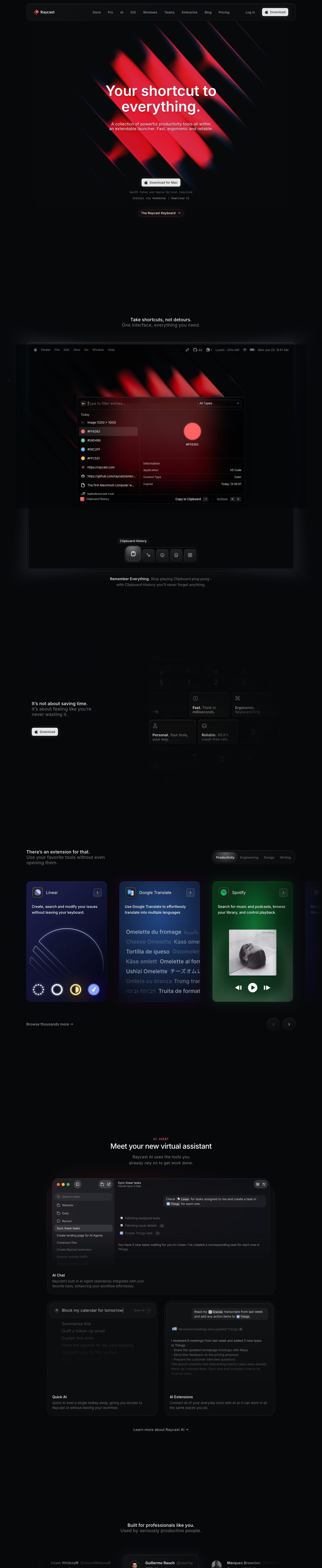
Captured 10 Oct 2026 at 1440px. Scroll the frame to see the whole page.
Raycast
cinematic · tactile · restrained · premium · nocturnal
Raycast is a near-black (#07080a), almost monochrome dark site where a single warm red (#ff6363) appears only as glowing, grainy diagonal light streaks and small product details, so every coloured moment reads as an event. Real macOS-native product UI, rendered at full fidelity inside device frames and tactile cards, carries the page, and restrained Inter typography plus vast empty space make it feel like premium native software rather than a SaaS template.
Palette
Typography
- Headings
- Inter
- Body
- Inter
- Mono
- GeistMono
- Free swap
- None needed: Inter and Geist Mono are both free on Google Fonts. SF Pro Text (used in UI mockups) can be swapped for Inter.
H1 is 64px Inter weight 600, line-height 1.1, zero tracking, centred over two lines. Section headings are deliberately small: 20px weight 500 with +0.01em tracking, set as a two-line pair where line one is white and line two is muted grey (#6a6b6c or #9c9c9d), e.g. 'Take shortcuts, not detours. / One interface, everything you need.' H3 is 24px weight 500. Body copy is 18px weight 400 with +0.011em tracking in the hero, dropping to 13-14px in cards and captions. Mono (Geist Mono) appears at about 11-12px for system-requirement notes and the tiny uppercase red eyebrow ('AI AGENT') with wide tracking. Hierarchy comes from colour (white vs grey) more than from size.
More free font pairings →Measured h1: 64px / 600 / 0em · body 18px
Signature moves
- Keep the page almost entirely monochrome and spend the single brand red only on light: blurred, grainy diagonal glow streaks behind the hero and inside product shots.
- Write every section heading as a small two-line couplet: a white statement followed by a grey elaboration, at about 20px, instead of a large display heading.
- Make buttons feel like physical keys using layered inset highlights (rgba(255,255,255,0.2) top inset, dark bottom inset, black outer ring).
- Show the actual product UI at 1:1 fidelity inside a device bezel with a real menubar, then caption it with 'Bold phrase. Grey sentence.'
- Let integration cards borrow the colour identity of the third-party app (indigo, blue, green glows) so colour comes from content, not chrome.
- Use huge black gaps between sections so each beat lands alone, cinematic rather than dense.
Layout
Content width is 1200px, centred on a 1440 viewport, with the nav in a floating rounded container of the same width. Sections are centred and separated by very large voids of 300-500px of pure black, so each section is a single cinematic beat: one heading pair, one product visual, one caption. Density is low on the marketing layer and high inside the product shots. Alignment is mostly centred, with occasional left-aligned text beside a right-hand visual (the keyboard grid section, the extension carousel header with tabs on the right). Feature grids use 2-column bento cards inside a roughly 700-900px inner column.
Components
- Navigation
- A floating bar about 64px tall with a roughly 16px radius, a subtle #111214-ish fill and a 1px low-opacity white border. Logo sits left, 9 centred links in 14px grey Inter, 'Log in' as plain text, and a light #e6e6e6 'Download' pill with an Apple glyph and dark text.
- Primary button
- A light (#e6e6e6) button with dark text, 8-10px radius and a compound shadow: an outer black ring, a 1px inset white highlight on top and an inset dark bottom. It reads like a physical macOS key. It is small (about 32-36px tall, 13-14px text) and always paired with the Apple logo.
- Secondary pill link
- A dark capsule ('The Raycast Keyboard →') with a faint red-tinted border and glow (#452324 / #130d0e fills). It is used sparingly to point to promos.
- Hero
- A centred headline over blurred, film-grain diagonal red light bars that fade into the black. Below sit a single CTA and two lines of tiny mono microcopy ('macOS Tahoe and Apple Silicon required', 'Install via Homebrew | Download V1').
- Product frame
- A full-width rounded laptop or screen bezel (about 20px radius, dark border, soft outer glow) containing a real macOS menubar and the Raycast window. A dock of icon buttons sits below it, the active one raised, with a tooltip. A bold-white-then-grey caption is placed under the frame.
- Extension cards
- Horizontal carousel cards about 250×370px with a 12-16px radius. Each is tinted with the brand colour of its integration (deep indigo for Linear, blue for Google Translate, green glow for Spotify) and has an app icon, an arrow chip, a description and an interactive illustration. Circular prev/next buttons and category tabs in a segmented pill control (active segment filled #1b1c1e) complete the carousel.
- Bento AI cards
- Dark #0b0c0e-#111214 cards with a 20px radius and 1px #2f3031 borders. A visual demo fills the top and the title plus grey description sit bottom-left. A nested input bar inside uses a 12px radius.
- Testimonials
- A horizontal row of name chips (avatar, bold name, grey @handle, role). The centre card is lifted with a border and soft glow and the neighbours fade toward the edges.
Product UI
The product is shown as real, high-fidelity macOS UI rather than illustration. The launcher window is dark translucent with a search field on top ('Type to filter entries…'), a type dropdown at the right, a left list of items with 16px icons and colour swatches, a selected row in a lighter #1b1c1e fill with an 8px radius, and a right detail pane with a key/value 'Information' table separated by hairline dividers. The bottom action bar shows the context name on the left and 'Copy to Clipboard ↵ | Actions ⌘ K' on the right, with keycap chips. The AI chat app uses traffic-light window controls, a sidebar with search, folders and chat history whose items fade out, a model label ('Claude Opus 5 High'), a right-aligned user message with inline app-mention chips, and tool-call steps with count badges. Everything is 12-13px, dense and keyboard-first, using greys #9c9c9d/#6a6b6c on #111214, and colour appears only in content such as swatches and app icons.
Great for
- Developer and productivity tools
- macOS or desktop native apps
- Keyboard-first utilities and launchers
- AI assistants and agent products
- Premium prosumer software with a polished UI to show
Watch out for
- Using red as a UI fill or button colour: it only works as diffuse glow and tiny accents.
- Copying the #434345 or #2f3031 text tones for anything readable, since they fail contrast on #07080a and are only acceptable for decorative fade-outs.
- Large empty black gaps without strong visuals to anchor them, which on a weaker product just look broken.
- Pure #000000 backgrounds: the base is #07080a, which keeps glows and shadows readable.
- Fake or low-fidelity mockups: the style depends on pixel-real product UI.
- Oversized section headings, which break the quiet two-tone couplet rhythm.
Design like Raycast
Read https://pageproofer.com/inspiration/precision-dark/raycast.md and open its screenshots. To design in this style, set the page background to #07080a with surfaces at #111214 and #1b1c1e, 1px borders in #2f3031 (or rgba(255,255,255,0.08-0.1)), white primary text and #9c9c9d or #6a6b6c secondary text. Use Inter throughout: H1 at 64px/600/1.1 centred, section headings as 20px/500 two-line couplets (line one white, line two grey), body at 18px in the hero and 13-14px in cards, and Geist Mono at 11-12px for microcopy and small uppercase eyebrows. Pick one saturated accent (#ff6363) and use it only as blurred, grain-textured diagonal glows and tiny details. Build primary buttons as light #e6e6e6 keys with an 8-10px radius, dark text and stacked inset shadows (inset 0 1px 1px rgba(255,255,255,0.2), inset 0 2px 1px rgba(0,0,0,0.25), 0 0 0 1px #000). Float the nav in a rounded 1200px bordered container. Present the product as real, dense 12-13px UI inside a rounded device frame with a soft outer glow (0 4px 40px 8px rgba(0,0,0,0.4)). Cards use a 12-20px radius and hairline borders. Separate sections with 300px+ of empty black so each one is a single focused beat.