
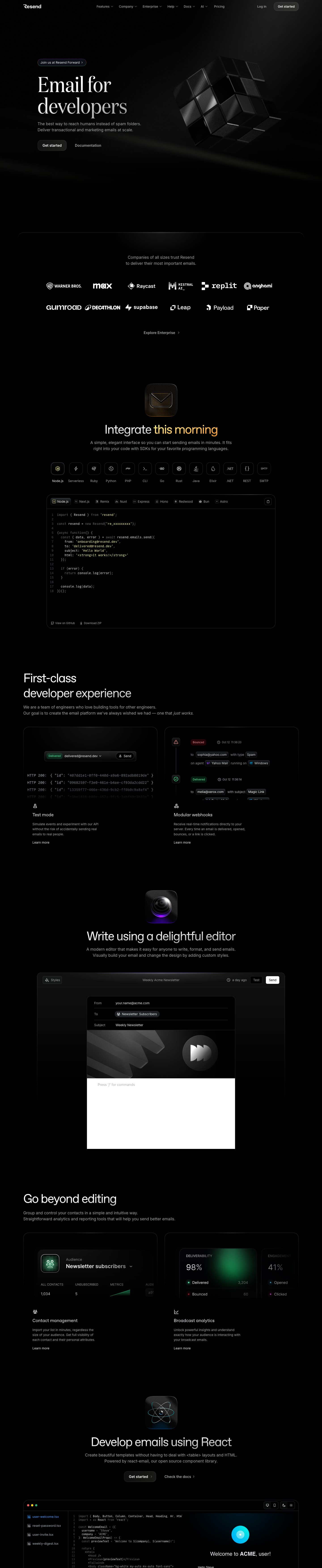
Captured 10 Oct 2026 at 1440px. Scroll the frame to see the whole page.
Resend
luxurious · nocturnal · precise · restrained · developer-centric
Resend is a near-pure black (#000000) developer site that pairs an editorial serif hero (Domaine at 96px) with a tight grotesk (ABC Favorit) for section headings and Inter for body, so it reads as both premium and technical. Colour is almost entirely withheld: grey text, hairline #262a2d borders and soft white light-leaks carry the page, and the only saturated colour lives inside product mockups, glossy 3D app-style icons and one iridescent gradient headline word.
Palette
Typography
- Headings
- Domaine Display (hero H1) + ABC Favorit (section H2s)
- Body
- Inter
- Mono
- Commit Mono
- Free swap
- Domaine Display → Playfair Display or DM Serif Display (light/regular weight); ABC Favorit → Space Grotesk or Inter Tight at weight 400; Commit Mono is free (or use JetBrains Mono / Geist Mono).
Hero H1 is 96px Domaine, weight 400, line-height 1.0, -1% tracking, sentence case, filled with a white-to-grey vertical gradient so the second line fades. Section H2s are 56px ABC Favorit, weight 400, line-height 1.2, tight -5% tracking, often with a subtle white→grey gradient fill and one gradient-coloured keyword (purple→teal on 'this weekend'). Body/lede is 18px Inter 400, line-height 1.5, in #a1a4a5; feature card titles ~18px Favorit/Inter in white, card body ~14px Inter grey. Code is ~13px Commit Mono with low-saturation syntax colours. Never bold headings; hierarchy comes from size and grey value, not weight.
More free font pairings →Measured h1: 96px / 400 / -0.01em · body 18px
Signature moves
- Set the hero headline in a light editorial serif at 96px with a white-to-grey gradient fill, then switch to a tight grotesk for every other heading — the serif is used exactly once for maximum contrast.
- Keep the page true #000000 and create depth only with soft diagonal light-leak streaks and radial top-edge glows instead of grey surfaces.
- Introduce each major section with a glossy, dark 3D app-icon tile with a coloured underglow, centred above the H2.
- Withhold colour from the chrome entirely; let saturation appear only in product UI states (mint 'Delivered', purple 'Clicked', red 'Bounced') and in one gradient keyword per heading.
- Show the product as live, interactive-looking code and UI fragments that fade into black at their edges rather than full framed screenshots.
- Make every border a 1px #262a2d hairline with generous 16–24px radii so cards feel like etched glass on black.
Layout
1280px max content width on a 1440 canvas, hero left-aligned at ~140px offset with huge vertical padding (hero occupies a full viewport plus ~200px of empty black). Below the hero the rhythm alternates: centred sections (logo wall, 'Integrate this weekend', editor, React) each introduced by a ~100px glossy 3D icon tile, a centred H2 and two-line grey lede; and left-aligned sections ('First-class developer experience', 'Go beyond editing') that use a 2-column grid of large 24px-radius feature cards with an illustrated UI vignette on top and title/copy/'Learn more' below. Sections are separated by 150–250px of pure black rather than dividers. Density is low on marketing copy, high inside the product mockups.
Components
- Navigation
- Transparent bar over black: wordmark left, centred 14px grey links with small chevrons for dropdowns, 'Log in' text link and a 'Get started' pill-ish button (dark #1a1a1a-ish fill, 1px subtle white-alpha border, ~16px radius) on the right.
- Buttons
- Primary is a dark translucent fill with a faint light border and inner highlight, white 16px Inter medium text, ~8–16px radius — glassy rather than bright. Secondary is plain grey text, sometimes with a › chevron. In-product 'Send' uses solid white with black text for the one bright action.
- Announcement pill
- Small fully rounded chip above the H1 with a tinted blue-violet hairline border, 14px text and a › chevron.
- Logo wall
- Two rows of six monochrome white customer logos inside a section whose top edge is a rounded 24px border with a glowing light streak, introduced by a centred two-line grey sentence and an 'Explore Enterprise ›' link.
- SDK selector + code window
- Row of 13 square icon tiles (~40px, 12px radius, #262a2d border) with grey labels; active tile gets a mint/green tinted border. Below, a 16px-radius black code panel with framework tabs (small icon + label), copy button, line numbers in dim grey and footer links 'View on GitHub' / 'Download ZIP'.
- Feature cards
- Pure black cards with 1px #262a2d border and 24px radius, a soft radial glow at the top edge, an inset UI vignette (event timeline, HTTP 200 log, audience stats, deliverability gauge) that fades out at the bottom, then a small line icon, 18px title, 14px grey copy and 'Learn more' link.
- 3D icon tiles
- ~100px app-icon squircles rendered as glossy dark glass with a coloured underglow (purple, cyan, green) that sit above centred section headings like chapter markers.
Product UI
The product is shown through high-fidelity, stylised recreations rather than raw screenshots: a tabbed code editor with Commit Mono syntax highlighting, an email composer (From/To/Subject rows separated by hairlines, a recipient chip, 'Test' outline and 'Send' solid-white buttons), an event timeline with small coloured status badges (purple Clicked, red Bounced) and inline grey bordered chips for values like 'charlotte@gmail.com', 'Gmail', 'macOS', audience stat columns with uppercase 12px labels, and deliverability cards with large 40px light-weight percentages, coloured status dots and a blurred green glow. The UI is dense, dark, borderline monochrome, uses 1px #262a2d dividers, 6–8px radius chips, tiny line icons and colour only for semantic state. A React-email playground shows a file tree, code pane and live email preview with macOS window dots.
Great for
- Developer tools and APIs
- Infrastructure and backend SaaS
- Premium technical products wanting an editorial edge
- CLI/SDK-first platforms
- Dark-mode-native dashboards
Watch out for
- Using grey surfaces like #1a1a1a for whole sections — the look depends on true black with light coming from glows, not panels.
- Domaine and ABC Favorit are licensed; substitute rather than referencing them without a licence.
- #6c6c6c text on black fails contrast for body copy — keep it to line numbers and placeholders.
- Overusing the serif or the gradient keyword; more than one per screen turns elegant into gimmicky.
- Bright saturated buttons or brand-coloured backgrounds that break the monochrome restraint.
- Gradient-filled heading text can turn illegible on light or busy backgrounds; only use on solid black.
Design like Resend
Read https://pageproofer.com/inspiration/precision-dark/resend.md and open its screenshots. To design in this style, use a #000000 page with #f1f7fe primary text, #a1a4a5 secondary text and 1px #262a2d borders. Set a single hero H1 at 96px in a light serif (Playfair Display/DM Serif Display, weight 400, line-height 1.0, -1% tracking) with a linear-gradient text fill from #ffffff to ~#9a9a9a; all other headings use a grotesk (Space Grotesk or Inter Tight) at 56px, weight 400, line-height 1.2, -0.05em tracking, optionally gradient-filling one keyword purple→teal. Body is Inter 18px/1.5 grey; code is Commit Mono 13px. Constrain content to 1280px, left-align the hero, and leave 150–250px of empty black between sections. Build cards as black boxes with 24px radius, 1px #262a2d border and a soft radial white glow at the top edge; put a fading UI vignette inside and title/copy/'Learn more' below. Buttons are dark translucent fills with a faint white-alpha border and 8–16px radius; reserve solid white for one critical in-app action. Add soft blurred diagonal light streaks behind the hero, glossy 3D icon tiles above centred section headings, and restrict colour to semantic states (#43fea4 success, #ff6465 error, #3b9eff info).