
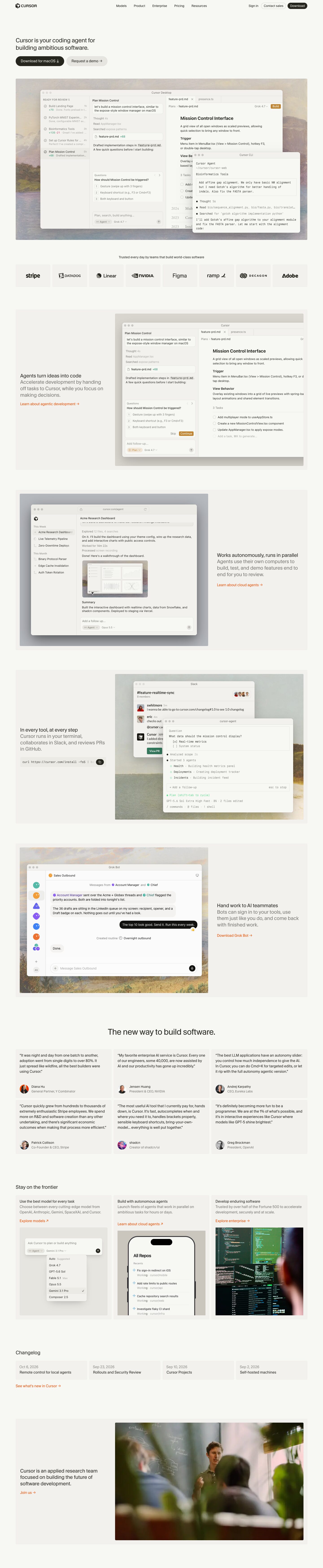
Captured 10 Oct 2026 at 1440px. Scroll the frame to see the whole page.
Cursor
calm · editorial · warm · restrained · crafted
Cursor's homepage is a warm, paper-toned, almost editorial page where small regular-weight type, near-black ink (#26251e) and a single orange link colour (#f54e00) frame large, meticulously faithful macOS-style product windows floating over muted oil-painting landscapes. The restraint works because the product UI does all the persuading: the chrome stays quiet, headings never shout, and the painted backdrops add craft and humanity without competing with the interface.
Palette
Typography
- Headings
- CursorGothic
- Body
- CursorGothic (marketing) / system-ui (product mockups)
- Mono
- Berkeley Mono
- Free swap
- CursorGothic → Inter Tight or Geist (a neo-grotesk at weight 400); Berkeley Mono → JetBrains Mono or IBM Plex Mono.
Everything sits at weight 400. The H1 is only 26px with a 1.25 line height and -1.2% tracking, set in sentence case across two lines. The centred section title ('The new way to build software.') is about 36px. Feature headings are 22px at weight 400 with a 1.3 line height and -0.5% tracking, and the line directly below continues at the same size in muted grey, so heading and lede read as one sentence. Card titles are about 16px, and body and quotes run 15–16px. The product mockups use system-ui at 13px with a 1.55 line height, plus Berkeley Mono at about 12px for the CLI. Hierarchy comes from colour (ink vs grey) and placement, not from size jumps or bold weights.
More free font pairings →Measured h1: 26px / 400 / -0.012em · body 13px
Signature moves
- Float pixel-perfect macOS-style app windows over muted oil-painting landscapes so the software feels crafted and timeless rather than techy.
- Write each feature as a single 22px sentence split into an ink headline and a grey continuation, instead of a heading plus a separate paragraph.
- Keep all marketing type at weight 400 and modest sizes (a 26px H1). Confidence comes from restraint and the product visuals.
- Use a warm off-white system (#f7f7f4 page, #f2f1ed slabs, #26251e ink) with no pure white or pure black in the chrome.
- Reserve one saturated orange (#f54e00) for text links, and echo it inside the product UI as the 'Build/Continue' amber button.
- Layer two app windows (desktop plus CLI, Slack plus terminal) at an offset to show the product working across surfaces in one image.
Layout
Content is 1300px wide and left-aligned, with generous empty space. The hero is plain text and two pill buttons at the top left, followed by a full-width painted panel holding the app window. Feature sections are full-width oat (#f2f1ed) slabs with about 4px radius on the paper background. Each slab splits 1/3 copy to 2/3 visual, and the side alternates from section to section. Copy is vertically centred or bottom-aligned within its column. Sections are spaced roughly 80–120px apart. A logo strip of eight equal oat tiles sits below the hero. Testimonials use a 3-column grid of oat cards, followed by a 3-column feature card row, a 4-column changelog row, and a closing careers slab with a photo. Overall density is low and the rhythm is very even.
Components
- Nav
- Thin and transparent on paper. The wordmark sits at the left and five 14px text links are centred. On the right are a 'Sign in' text link, a 'Contact sales' outlined pill with a hairline border, and a 'Download' solid ink pill. There is no border and no blur.
- Buttons
- Full pills. The primary is ink #26251e with paper-coloured text. The secondary is an #ebeae5 fill with ink text. Both are about 44px tall in the hero, with trailing glyph arrows (↓ →) instead of icons.
- Text links
- Signal orange #f54e00 with a trailing → or ↗ and no underline. They are the only saturated colour in the marketing chrome.
- Feature slab
- An oat rectangle with about 4px radius. A painting or flat grey/putty canvas fills one side, and a realistic app window floats inside it with a large soft shadow (0 28px 70px rgba(0,0,0,.14) plus 0 14px 32px rgba(0,0,0,.1) plus a 1px ink ring at 10%).
- Logo wall
- Eight equal oat tiles with tiny gaps. Each tile holds a monochrome ink logo, and there are no borders.
- Testimonial cards
- Oat cards with 16px quote text in ink. A small circular avatar sits at the bottom left with the name in ink and the title in grey. There are no quote marks as decoration, no stars and no shadows.
- Changelog cards
- A 4-up row of small oat cards. Each has a grey date over an ink title and nothing else.
- Install snippet
- An oat-filled mono 'curl …' field with a round black copy button at the right edge, and the text fading out under the button.
Product UI
The page shows real-looking, hand-built product mockups rather than screenshots: a Cursor Desktop agent view, a web agent dashboard, a Slack thread, a terminal CLI, a Grok Bot chat app, a model picker and an iPhone repo list. The UI is light (#fcfcfc and #f2f1ed panes) with traffic-light window chrome and a centred grey title. Layouts are three-pane: a sidebar grouped under small-caps labels ('IN PROGRESS 1', 'READY FOR REVIEW 4'), a chat/agent log, and a document or editor with tabs and breadcrumbs. Text is dense 12–13px system-ui with grey secondary lines. Status uses thin outlined circle and check icons, and diffs are green +135 / red −21. Composers are rounded input boxes with small pill chips ('Plan ▾', 'Grok 4.7 ▾') and a round send arrow. The one strong colour is a small amber 'Build/Continue' button, plus a green 'View PR'. The CLI uses mono with bold function names and green status dots.
Great for
- Developer tools and AI agents
- Productivity and desktop apps
- Premium B2B SaaS that wants craft over hype
- Research-led startups
- Editors, terminals and workflow tools
Watch out for
- Pure #ffffff backgrounds or #000 text, which break the warmth.
- Bold or oversized headlines. The calm depends on weight-400, modest sizes.
- Using orange for fills, backgrounds or large areas. It is a link colour only.
- Generic stock gradients behind mockups. Use painterly or muted, texture-rich imagery, or flat putty grey.
- Grey continuation text lighter than about #8a8880 on #f2f1ed, which drops below readable contrast.
- Shipping CursorGothic or Berkeley Mono without a license. Substitute Inter Tight or Geist and JetBrains Mono.
- Fake, low-fidelity mockups. The style only works if the UI looks real and dense.
Design like Cursor
Read https://pageproofer.com/inspiration/precision-dark/cursor.md and open its screenshots. To design in this style, set the page background to #f7f7f4, section slabs to #f2f1ed with a 4px radius, and text to #26251e, with a muted grey around #8a8880 for secondary copy. Use #f54e00 only for text links that end in → and carry no underline. Use a neo-grotesk (Inter Tight or Geist) at weight 400 everywhere: H1 at 26px/1.25 with -0.012em tracking, section titles at about 36px, and feature headings at 22px/1.3, where the ink headline runs straight into a grey continuation sentence. Make buttons full pills, with the primary in ink #26251e and paper text and the secondary in an #ebeae5 fill. Constrain content to 1300px, left-aligned. Build each feature as a 1/3 text, 2/3 visual slab and alternate sides. Place realistic three-pane app windows (13px system-ui, traffic-light chrome, #fcfcfc panes, hairline #e6e5e0 dividers, a small amber primary button) over a painterly or flat putty (#d9d5cf) backdrop. Give the windows a shadow of 0 28px 70px rgba(0,0,0,.14), 0 14px 32px rgba(0,0,0,.1) and a 1px rgba(38,37,30,.1) ring. Make testimonials and changelog borderless oat cards in 3- and 4-column grids, with no shadows, gradients or bold weights.