
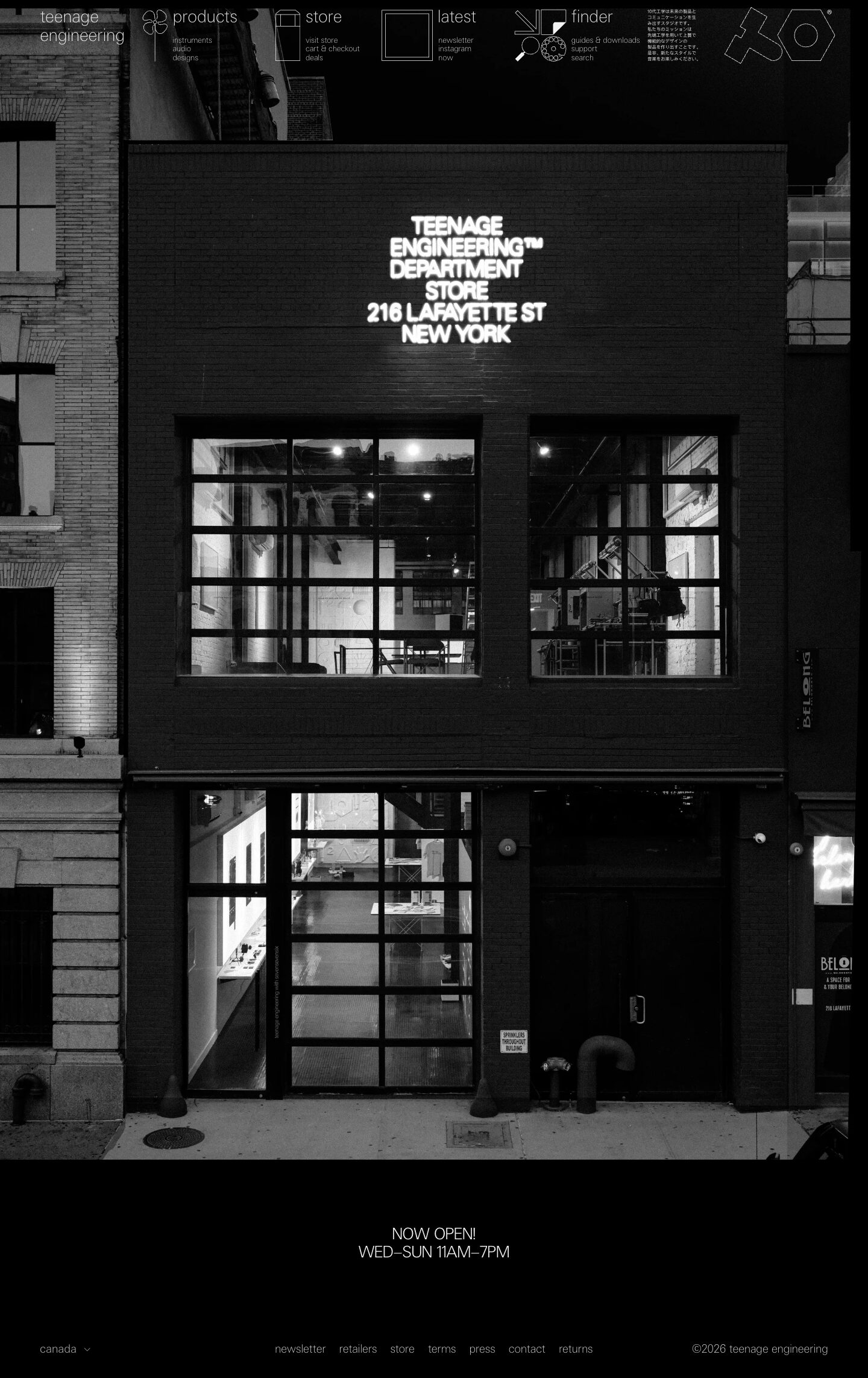
Captured 10 Oct 2026 at 1440px. Scroll the frame to see the whole page.
Teenage Engineering
austere · monochrome · architectural · confident · minimal
Teenage Engineering's homepage is a single full-bleed black-and-white photograph of their New York store, with a hairline-thin white navigation of outline pictograms and lowercase labels floating across the top, and almost nothing else. It works because the restraint reads as confidence: pure black, one off-white, ultra-light type and line-drawn icons make the brand feel like a design object rather than a shop.
Palette
Typography
- Headings
- te-40 (Teenage Engineering custom grotesk)
- Body
- te-20 (custom, light/hairline grotesk)
- Free swap
- te-20/te-40 are proprietary. Use Inter Tight or Inter at weight 100–300 for the hairline nav, or Manrope ExtraLight. For a closer geometric feel, try Archivo at weight 100.
There are no h1–h3 headings. Hierarchy comes from size alone. Primary nav labels ('products', 'store', 'latest', 'finder') are about 26–28px in weight 100–200, lowercase, with tight 1.15 line height. Sub-links under them are about 12–13px, lowercase, stacked as plain text lists. Body and footer links are 19px te-20 at weight 100, letter-spacing 0. The one announcement ('NOW OPEN! WED–SUN 11AM–7PM') is the only uppercase type, set centred at about 24px in the same thin weight. A tiny block of Japanese copy at about 7px works as a texture element. Everything is lowercase except announcements, and there are no bold weights anywhere.
More free font pairings →Signature moves
- Let one full-bleed monochrome photograph be the entire homepage, and put the headline inside the image (signage) instead of in HTML type.
- Pair every nav item with a custom single-stroke outline pictogram the same off-white as the text, so navigation reads like a technical diagram.
- Set all UI type lowercase at hairline weight (100) and create hierarchy only through size jumps (about 13px to about 27px), never bold.
- Use strict two-tone colour, #000000 and #f1f2f2, with zero radius, zero shadows and zero borders.
- Drop in a block of tiny Japanese text as graphic texture next to the logo, signalling a design-object sensibility.
- Float the nav transparently over the image with no bar, blur or gradient, relying on dark photo areas for contrast.
Layout
The page is one full-bleed photograph (about 1440×2100) with the navigation absolutely positioned over its top edge. Below it is a short black band holding a centred announcement, then a single-row footer. The nav is a horizontal row of six modules spread across a roughly 1308px content width: the wordmark at left, four icon-plus-label clusters, a Japanese text block and the outline logo at right. Each module pairs a square line icon with a large lowercase label and a 3-line link list, all top-aligned. There are no cards, columns or section rhythm, and whitespace is pure black. The footer has three zones: region selector left, inline links centred, copyright right, about 45px side margins.
Components
- Pictogram navigation
- Each top-level section gets a thin white outline icon of about 60px (flower, battery-like box, empty square, abstract arrow/gear collage). A lowercase 26px hairline label sits beside it, with 3 small sub-links stacked below. There is no background bar; it floats directly on the photo.
- Hero
- An edge-to-edge black-and-white architectural photo carries all the messaging. The store name and address appear as a neon sign inside the image itself, with no HTML headline.
- Announcement band
- A black strip with two centred uppercase lines in thin weight and generous vertical padding (about 80px). It has no button.
- Footer
- A single line of 19px weight-100 lowercase links ('newsletter retailers store terms press contact returns') spaced about 15px apart. A 'canada ⌄' region dropdown sits left and '©2026 teenage engineering' right. There are no dividers.
- Logo
- An outlined geometric monogram drawn with a single stroke, matching the icon line weight. It sits top right with a tiny ® mark.
Product UI
No product interface or product renders appear on the homepage. The product is represented by the retail space in a desaturated photo. The UI language you can extract: monochrome line icons at a consistent stroke, lowercase micro-labels, flat black surfaces, no containers. For app screens, this translates to an instrument-panel feel. Use black backgrounds, off-white 1px outline icons, small lowercase labels grouped in tight stacks, square corners, and no fills or elevation.
Great for
- hardware and consumer electronics brands
- design studios and architecture firms
- fashion and lifestyle retail with a flagship story
- music and audio products
- portfolio or editorial landing pages with strong photography
Watch out for
- Using weight-100 type on busy or light image areas, where it disappears; it needs dark, calm zones behind it.
- Shipping the proprietary te-20/te-40 fonts. Substitute Inter Tight or Archivo at thin weights.
- Hiding critical info (address, hours) only inside an image, which breaks accessibility and SEO. Add alt text or hidden headings.
- Adding accent colours, gradients or rounded buttons, which instantly breaks the austerity.
- Generic stock icons. The style depends on custom, consistent single-stroke pictograms.
- Colour photography. It must be black-and-white to stay in the two-tone system.
Design like Teenage Engineering
Read https://pageproofer.com/inspiration/calm-minimal/teenage-engineering.md and open its screenshots. To design in this style, set the page background to #000000 and use #f1f2f2 for all text and icons (#e5e5e5 for secondary). Use no other colours, no borders, no shadows and 0px radius. Build the hero as a single full-bleed black-and-white photograph. Avoid an HTML headline, or keep it very small, and let the image carry the message. Float a transparent nav over the top: wordmark at left, then 4 modules each made of a 60px single-stroke outline icon, a lowercase label at 26px weight 100, and three 13px lowercase sub-links stacked beneath with 1.15 line height. Put an outline logo far right. Use Inter Tight or Archivo at weight 100–200 in place of te-20/te-40, keep everything lowercase except short uppercase announcements, and create hierarchy by size only. End with a black band holding a centred uppercase two-line notice at about 24px, then a one-row footer: region selector left, 19px thin lowercase links centred, copyright right, about 45px side margins and roughly 1308px content width.