
Captured 11 Oct 2026 at 1440px. Scroll the frame to see the whole page.
Daylight
calm · warm · editorial · organic · tactile
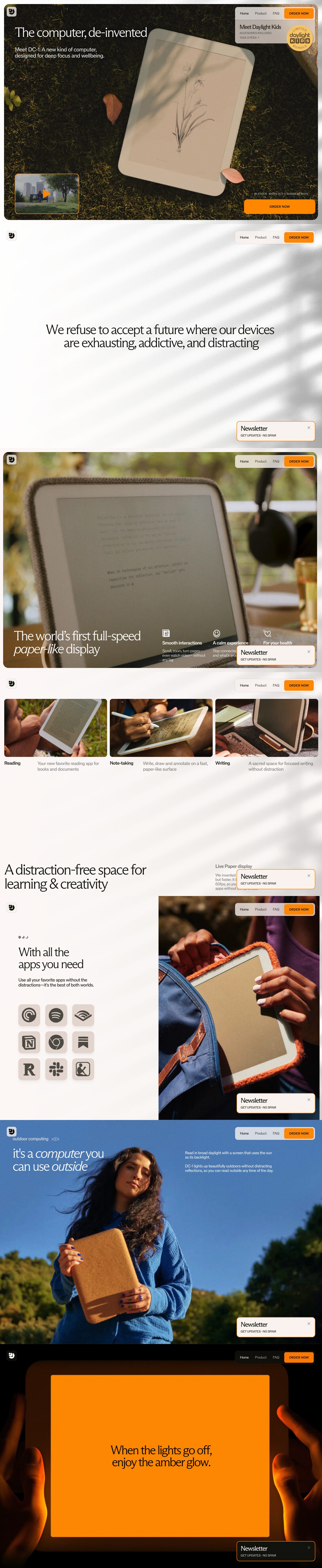
Daylight presents a calm-technology product as a warm, editorial object: a full-bleed, rounded-corner photograph of the tablet lying in sunlit grass, set on a warm-paper page with thin serif headlines in ABC Arizona Flare and a single saturated marigold orange for every action. The result feels like a lifestyle magazine rather than a gadget launch, which suits a product sold on focus and wellbeing; the below-fold content renders blank in the capture, so the hero carries the whole identity.
Palette
Typography
- Headings
- ABC Arizona Flare (Dinamo)
- Body
- ABC Room (Dinamo), with Arizona Flare for larger body copy
- Free swap
- Arizona Flare → Newsreader or Fraunces at light weights (Instrument Serif for display). ABC Room → Inter Tight, Instrument Sans or Geist.
H1 and H2 are 60px Arizona Flare at weight 300, line-height 1.0 (0.97 on multi-line H2), with slightly tight tracking (-0.07px). The thin weight reads as quiet and expensive. Card titles such as 'Newsletter' are 27px Arizona at weight 500, line-height 1.25. The hero subhead is about 22–26px, weight 400–500, white on the photo and limited to 2 short lines. Utility text (nav, 'GET UPDATES · NO SPAM', 'IN STOCK · SHIPS IN 3-5 BUSINESS DAYS', button labels) is set in ABC Room at about 11–13px, uppercase, weight 500–600, with slight positive tracking. That gives a two-voice system: a soft serif for emotion and a small grotesk caps for logistics. The scale is used in only three steps: 60px display, about 26px lead or card title, and about 12px caps.
More free font pairings →Measured h1: 60px / 300 / -0.07em · body 26px
Signature moves
- Shoot the hardware as a natural still life (grass, sunlight, fallen leaves, dappled shadow) instead of a studio render, so the device feels like paper or wood rather than electronics.
- Inset the full-bleed hero as a rounded card on a warm off-white page (#faf5f2) so even immersive photography feels framed and gentle.
- Use one saturated marigold (#ff9d00) for everything actionable: buttons, card borders, play icon. Keep the rest of the palette earthy and desaturated.
- Pair a light-weight (300) serif display with tiny uppercase grotesk utility labels, separating emotion from logistics.
- Pin interactive UI to the four corners of the hero and leave the centre to the product image.
- Use olive-black (#17190f) instead of pure black for text, keeping contrast warm and organic.
Layout
The page is a warm-paper canvas with a full-bleed hero card inset about 16px from the viewport edges, with large radius corners (about 16–20px), so the photograph reads as a framed object rather than a background. The hero fills the full first screen (about 900px). The headline sits top-left at roughly 56px inset. UI is pinned to the four corners of the photo: logo tile top-left, nav and order capsule top-right, video thumbnail bottom-left, and newsletter card plus order CTA bottom-right. The centre is left empty for the product. Content width below is 1080px. Density is low and whitespace is generous, with one idea per screen.
Components
- Floating nav capsule
- Top-right cluster on a translucent warm-grey panel with about 14px radius and a backdrop blur. It holds three text links (Home, Product, FAQ) at about 14px in olive ink plus a solid marigold 'ORDER NOW' button. An expandable promo row sits beneath ('ACCESSORIES INCLUDED / TAKE A PEEK ↗') in small grey caps.
- Primary CTA
- Solid #ff9d00 fill with dark olive uppercase label at about 13px weight 600, 8px radius. The bottom-right CTA is wide (about 260×52px). A tiny reassurance line in white caps sits directly above it.
- Newsletter card
- Warm-paper card with about 14px radius and a 2px marigold border. It pairs a 27px serif title with a small caps subline and a thin × close icon in the corner. The shadow is very soft: 0 10px 15px -3px at 5% black.
- Video thumbnail
- Small landscape video card in the bottom-left with a marigold 2px border and rounded corners. A solid orange triangular play glyph is centred on the footage.
- Promo sticker
- Circular pale-yellow 'LIMITED · daylight KIDS · BUNDLE' badge that overlaps the nav panel edge. The text follows a circular path and the inner word uses chunky letter tiles, like a playful printed seal.
- Logo tile
- Small square, rounded white-ish tile with the glyph mark in the top-left corner of the hero, mimicking an app icon.
Product UI
The product appears only physically: a cream-bezelled tablet photographed from above in grass, its paper-like display showing a pencil botanical sketch in soft greys. This conveys a monochrome, low-glare, reflective screen with no visible app chrome. If designing app screens in this spirit, go grayscale and paper-toned with no colour on the content surface. Use sketch-like or typographic content, generous margins and serif reading text. Reserve marigold for the single primary action.
Great for
- Calm or wellbeing technology hardware
- E-ink and reading devices
- Premium consumer products sold on lifestyle
- Mindfulness, journaling or focus apps
- DTC brands with strong photography
Watch out for
- ABC Arizona Flare and ABC Room are licensed Dinamo fonts; substitute Newsreader/Fraunces and Inter Tight/Instrument Sans.
- White text directly on busy photography fails contrast unless the image is dark and evenly toned there; add a subtle gradient scrim if your image differs.
- Weight-300 serif headlines collapse below about 40px; increase weight for smaller sizes.
- Don't introduce extra bright colours; a second accent breaks the single-orange action system.
- Avoid stock studio product renders; the style depends on natural, sunlit, tactile photography.
- Tiny 11px caps in muted grey on translucent panels can become illegible; keep them short and non-critical.
Design like Daylight
Read https://pageproofer.com/inspiration/old-school-vintage/daylight.md and open its screenshots. To design in this style, set the page background to #faf5f2 and text to #17190f, and use #ff9d00 as the only accent: primary buttons, 2px card borders and play icons. Make the hero a full-viewport natural-light photograph of the product, inset 16px from the edges with about 18px radius. Place a 60px serif headline (Newsreader or Fraunces, weight 300, line-height 1.0, tight tracking) in white top-left, with a 22–24px two-line subhead under it. Pin UI to the corners: a blurred translucent nav capsule top-right with links and an orange 'ORDER NOW' button (8px radius, uppercase 13px weight 600 sans), a bordered video thumbnail bottom-left, and a newsletter card plus wide orange CTA bottom-right. Keep the centre empty for the product. Style cards in warm paper with a 14px radius and a soft 0 10px 15px -3px rgba(0,0,0,.05) shadow. Set all utility copy in an 11–13px uppercase grotesk (Inter Tight) with slight tracking. Keep below-fold sections within 1080px, with one idea per section and generous vertical space.