
Captured 10 Oct 2026 at 1440px. Scroll the frame to see the whole page.
mymind
serene · editorial · warm · private · dreamy
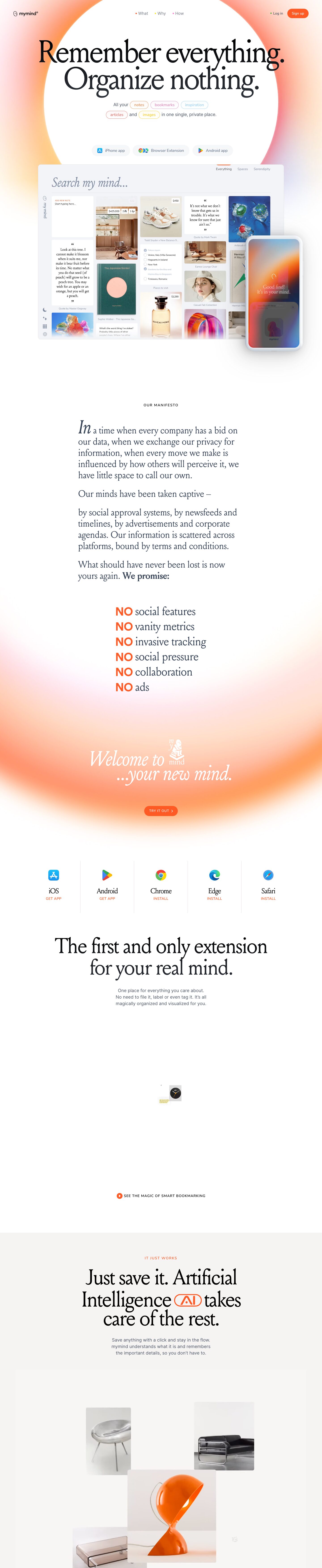
mymind pairs a high-contrast editorial serif (Louize, 140px, tight -6% tracking) with a soft, glowing orange-to-pink radial gradient and generous white space, so a productivity tool reads like a calm, private art book rather than SaaS software. The warmth comes almost entirely from blurred gradient halos and one hot orange (#ff5924), while the actual UI stays near-white and quiet, letting saved images and quotes carry the colour.
Palette
Typography
- Headings
- Louize (205TF)
- Body
- Inter (UI text); Avenir for small labels
- Free swap
- Louize → Cormorant Garamond or EB Garamond (Cormorant is closest in contrast and narrowness); Avenir → Nunito Sans or Figtree; Inter is free.
Hero headline is Louize Regular at ~140px, line-height 0.85, letter-spacing -0.06em, centered, black/near-black on two lines. Section headlines drop to ~72–80px with the same tight tracking and ~1.0 line height. Italic Louize is used for poetic moments ('Search my mind…', 'Welcome to …your new mind.') and a drop-cap-sized italic 'In' opens the manifesto. Manifesto body is Louize at ~32px, line-height ~1.35, slate #3a475a. Supporting copy is Inter ~18–20px, weight 400, line-height ~1.6, #4a5465, centred in narrow ~420px columns. Eyebrows are 13px uppercase sans with ~0.1em tracking, in orange or black ('IT JUST WORKS', 'OUR MANIFESTO'). Emphasis words like 'NO' switch to bold orange sans uppercase next to serif text.
More free font pairings →Signature moves
- Set the hero headline in a huge, tightly tracked high-contrast serif (140px, 0.85 line-height, -6% tracking) over a white circle carved out of a blurry orange-pink radial gradient.
- Embed coloured outlined pills inside running sentences to name content types, turning copy into a visual tag cloud.
- Use italic serif for product-voice moments (search placeholder, sign-off lines) to make the software feel personal and literary.
- Keep the palette almost monochrome and let a single hot orange (#ff5924) do all CTA, eyebrow and emphasis work, with gradient glows supplying warmth.
- Write a manifesto section in large serif prose with orange 'NO' statements to sell values rather than features.
- Prefix nav links with tiny coloured dots instead of icons or underlines.
Layout
Fully centred, single-column composition with a ~1300px max container for product shots and much narrower text measures (~500px for manifesto, ~420px for sublines). Very low density: each section is one headline, one short paragraph, one visual, separated by 150–250px of white space. Backgrounds alternate between white, cool #f9fafc and warm #f6f4f2 full-bleed bands. Large radial gradient halos (orange/coral/pink with lavender edges) frame the hero and the 'Welcome' section, acting as section dividers instead of lines. Platform downloads sit in a 5-column row separated by hairline vertical rules.
Components
- Nav
- Minimal: small logo left, three centred links each preceded by a tiny coloured dot (orange, yellow, pink), 'Log in' with green dot and an orange (#ff5924) pill 'Sign up' button with white text on the right. No background bar.
- Tag pills inline in copy
- Words like notes, bookmarks, inspiration, articles, images are set inside outlined pills (1px borders in pink #e48abf, sky #99d2fb, coral #ea726b, yellow, orange) with matching coloured text, embedded mid-sentence.
- Platform buttons
- Soft grey (#f5f7f9-ish) fully rounded pills with a brand icon and grey Inter label; no border, no shadow.
- Product window
- A large rounded (12px) near-white panel with a faint wide shadow (0 0 120px rgba(0,0,0,0.15)), containing an italic serif search field and a masonry grid of saved items; a phone mockup overlaps the bottom-right corner.
- Platform install grid
- Five columns divided by 1px #e2e2e2 vertical rules, each with an app icon, serif platform name (~28px) and a tiny uppercase orange 'GET APP' / 'INSTALL' link.
- Manifesto list
- Stacked lines of 'NO' in bold orange uppercase sans followed by serif text, left-aligned in a centred block.
- Inline AI badge
- An orange outlined pill containing 'AI' dropped into the middle of a serif headline as a glyph.
- CTA
- Small orange pill 'TRY IT OUT >' in uppercase tracked sans, sitting at the base of a glowing orange gradient.
Product UI
Shown as a stylised but realistic app screenshot in a large rounded panel plus an overlapping phone mockup. The UI is a borderless masonry grid of cards on a pale #f9fafc canvas: images, products with small white price tags ($450), serif-set quotes with big curly quote marks, checklists with strikethroughs, and book covers, each with a tiny grey caption below. A slim left rail holds a vertical 'my mind' wordmark and a few line icons (moon, sparkle, grid, gear). Top-right tabs (Everything, Spaces, Serendipity) are plain grey text with an orange marker for the active one. The search field is a giant italic serif placeholder over a hairline rule. Density is moderate, chrome is near-invisible, and colour comes only from user content. Later sections show floating product photos on warm #f6f4f2 with 8–12px radii.
Great for
- Personal knowledge and note apps
- Bookmarking or inspiration-board tools
- Privacy-focused consumer software
- Journaling, wellness or mindfulness apps
- Design-literate creative tools
Watch out for
- Using Louize without a licence; substitute Cormorant Garamond and re-tune tracking since it is lighter.
- Applying -6% tracking to serif at small sizes; it only works above ~60px.
- Over-saturating gradients or using hard-edged blobs; the halos must be heavily blurred and fade to white.
- Adding many accent colours to buttons; the rainbow is reserved for small tag pills and nav dots.
- Grey Inter body text (#4a5465 / #748297) at small sizes on tinted gradient areas, which loses contrast.
- Dense feature grids or icon rows that break the slow, single-column editorial rhythm.
Design like mymind
Read https://pageproofer.com/inspiration/calm-minimal/mymind.md and open its screenshots. To design in this style, centre everything in a single column on white (#ffffff) with alternating full-bleed bands of #f9fafc and #f6f4f2, and leave 150–250px between sections. Set headlines in a high-contrast serif (Louize, or Cormorant Garamond as a free substitute) at 120–140px for the hero with line-height 0.85 and letter-spacing -0.06em, and 72–80px for section heads; use italic serif for personal or product-voice lines. Body copy is Inter 18–20px, line-height 1.6, colour #4a5465, in narrow ~420px centred columns; headings use #000 or #3a475a. Use one accent, #ff5924, for pill buttons (fully rounded, white text, small uppercase tracked labels for secondary CTAs), eyebrows (13px uppercase, 0.1em tracking) and emphasis words. Frame the hero with a large blurred radial gradient (orange #ff8a3d → coral/pink → faint lavender) behind a white circle. Put coloured 1px outlined pills (#e48abf, #99d2fb, #ea726b, yellow, orange) inline in sentences to name categories. Show the product as a 12px-rounded near-white window with a soft 0 0 120px rgba(0,0,0,0.15) shadow and a borderless masonry grid of content cards; use 1px #e2e2e2 hairlines for any dividers.