
6 sites
Calm & Minimal
Quiet, spacious, every pixel considered
Calm & Minimal is a quiet, light, spacious style for focused productivity tools and premium consumer software. Near-white tinted canvases, one restrained accent, and refined type with hierarchy carried by size rather than weight let real product UI do the persuading. Depth is soft and almost invisible, and each brand confines its personality to one contained device: a glossy icon, a gradient halo, a paper collage, or a set of line pictograms.
Paste this into your agent
Read https://pageproofer.com/inspiration/calm-minimal.md and the site teardowns it links to, and open their screenshots. Then design my [describe the page or app screen] in the Calm & Minimal style, following the guide's brief, principles and do/don't lists.
The sites
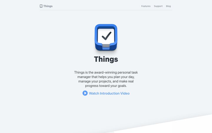
Things
ui-sans-serifThings presents itself like a well-made Apple app: a cool off-white canvas, the system font (rendering as SF Pro on Apple devices), one glossy app icon as the hero, and real product screenshots tilted and cropped like objects on a desk. Every section repeats the same quiet centred pattern of emoji-style icon plus bold title, a short grey paragraph and one blue link, so the polish of the product screenshots carries the page instead of marketing chrome.
calm · crafted · native · friendly · restrained
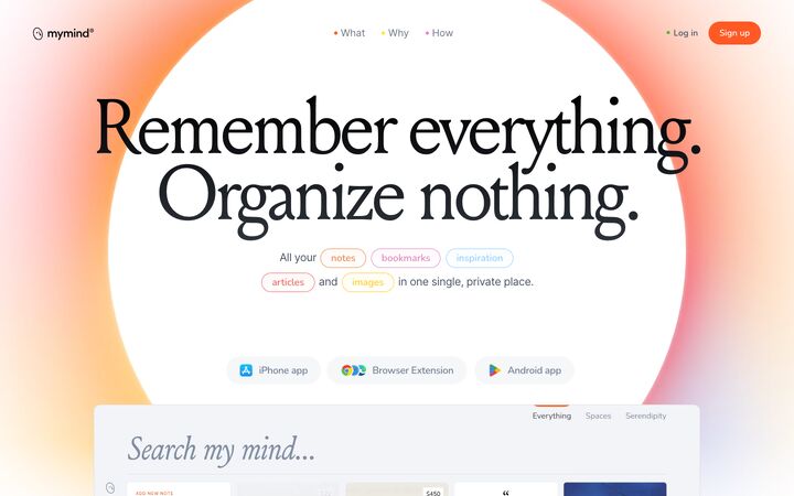
mymind
Louizemymind pairs a high-contrast editorial serif (Louize, 140px, tight -6% tracking) with a soft, glowing orange-to-pink radial gradient and generous white space, so a productivity tool reads like a calm, private art book rather than SaaS software. The warmth comes almost entirely from blurred gradient halos and one hot orange (#ff5924), while the actual UI stays near-white and quiet, letting saved images and quotes carry the colour.
serene · editorial · warm · private · dreamy
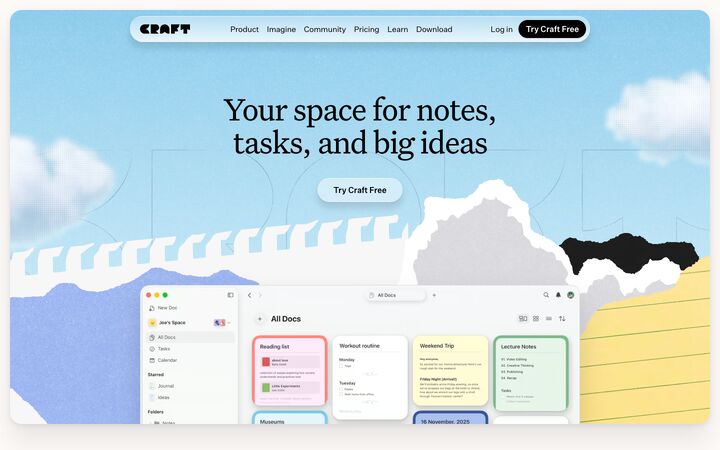
Craft
UntitledSerifFontCraft pairs a warm off-white canvas and an elegant editorial serif with a tactile, scrapbook-like collage of torn paper, halftone clouds and grainy pastel feature panels. It works because the playful collage carries the brand personality while the product UI stays crisp, white and Apple-native. The result reads as both premium and approachable.
warm · tactile · editorial · playful · calm
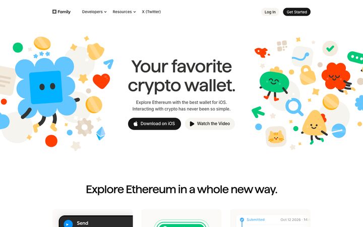
Family
FamilyFamily pairs a near-white, warm-neutral canvas and tight custom grotesk headlines with bursts of saturated, cartoon-mascot illustration, so a crypto wallet reads as friendly and consumer-grade instead of technical. The restraint everywhere else (Inter body at 14px, warm greys, soft #fbfaf9 cards, pill buttons) lets the playful illustrations and colour-coded section accents carry the personality without looking cluttered.
playful · polished · friendly · calm · premium
Arc
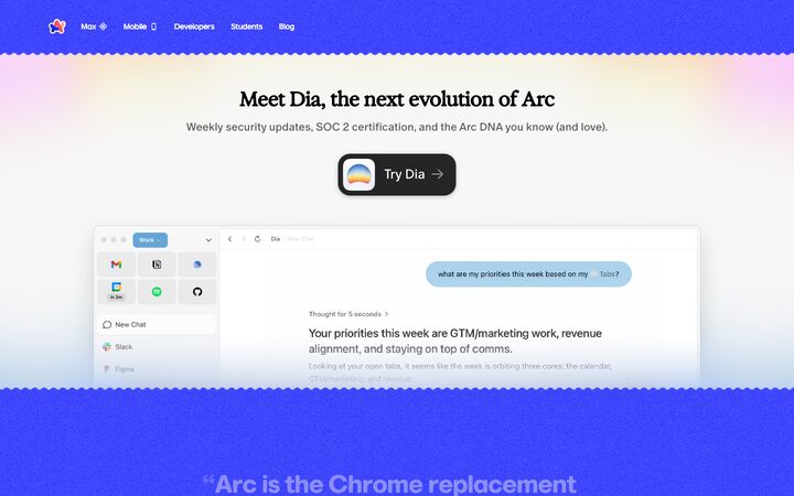
Marlin Soft SQArc's homepage pairs an electric cobalt (#3139fb) with warm cream (#fffcec) and white, then frames the product with hand-drawn squiggle edges, grainy noise textures and soft pastel gradient blooms, so a serious browser reads as playful and personal. Big, slightly rounded geometric display type in brand blue, quiet grey body copy and large real-product window mockups keep it legible and credible while the details stay whimsical.
playful · warm · confident · crafted · calm
Teenage Engineering
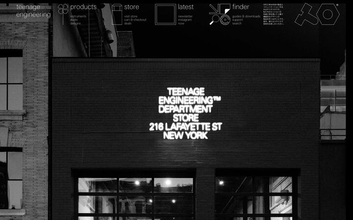
te-40Teenage Engineering's homepage is a single full-bleed black-and-white photograph of their New York store, with a hairline-thin white navigation of outline pictograms and lowercase labels floating across the top, and almost nothing else. It works because the restraint reads as confidence: pure black, one off-white, ultra-light type and line-drawn icons make the brand feel like a design object rather than a shop.
austere · monochrome · architectural · confident · minimal
Principles
1.
Tinted near-whites instead of lines
Separate sections by alternating near-identical off-whites rather than drawing borders or using strong contrast. Things alternates #f2f5f7, #fbfcfe and #ffffff. mymind alternates #ffffff, cool #f9fafc and warm #f6f4f2. Family uses #ffffff with #fbfaf9 bands. Craft sits on warm #fcf9f7, and Arc balances white against cream #fffcec. Keep the lightness difference between adjacent bands within about 2–4%. Where a divider is unavoidable, use a 1px hairline in #e1e1e1–#e2e2e2.
2.
One accent, used sparingly
Give a single colour all CTA, link, eyebrow and emphasis work, and keep surfaces neutral. Examples: Things blue #2576eb, mymind ember #ff5924, Arc cobalt #3139fb, and Family's near-black #171717 pills. Allow other colours only in small glyphs, tag pills, nav dots or user content. Things' coloured sidebar icons and mymind's dotted nav links show how. Teenage Engineering takes this to its extreme with only #000000 and #f1f2f2.
3.
Real product UI is the hero
Show pixel-accurate screenshots and live UI fragments, never illustrated mockups. Things tilts a real Mac window so it also forms the section divider. Family and Craft crop UI fragments at the card edge to imply more. Arc re-skins each browser window to demo a feature. mymind places a big rounded app panel with a 0 0 120px rgba(0,0,0,.15) shadow. The product chrome itself is airy and nearly borderless, so the screenshots read as calm.
4.
Slow, centred, narrow rhythm
Each section follows the same pattern: one headline, one short paragraph, one visual. Separate sections by 120–250px of space. Containers run 1000–1300px (Things 1015, Family 1024, Craft 1080, Arc 1200, mymind 1300). Text measures stay at 420–500px and are centred. Things, mymind and Arc repeat this cadence with almost no variation, and the repetition is a large part of why they feel calm.
5.
Hierarchy through size, not weight
Use either a regular-weight editorial serif with tight tracking or a tight medium/bold grotesk, then let size jumps do the work. The serif route: mymind's Louize at 140px, line-height 0.85, -0.06em, and Craft's Untitled Serif at 400 weight, 66px, -3%. The grotesk route: Family at 500 weight, 68px, -0.02em, and Things' system font at 700 weight, 36–56px. Body copy is 16–20px with line-height 1.4–1.6 in a soft graphite. Teenage Engineering builds its whole hierarchy from hairline weight 100 at 13px versus 27px, with no bold anywhere.
6.
Soft depth only
Prefer flat fills over shadows. When a shadow is needed, keep it long, wide and faint. Family uses a 1px ring at rgba(0,0,0,.04). Things' tweet cards use 0 2px 8px rgba(0,0,0,.1). Craft's layered shadows sit at 5–8% opacity. Card radii run 12–24px (Things 12–18, Craft and Family 24). Buttons are fully rounded pills. Never use hard offsets, heavy borders or glossy gradients on UI chrome.
7.
Personality in one contained device
Each site picks a single expressive motif and keeps it at the edges: Things' glossy app icon as hero and footer bookend, mymind's heavily blurred orange-pink radial halos, Craft's torn-paper hero and grainy pastel panels, Family's mascot clusters that bleed off the viewport edges, Arc's wavy band edges and grain, and Teenage Engineering's single-stroke pictograms. Choose one, place it at section boundaries or around the hero, and keep the content zone clean.
Colour
Canvas: #ffffff to #fcf9f7. Alternate bands: cool #f2f5f7–#f9fafc or warm #f6f4ef–#fbfaf9. Pick one temperature per product; warm (paper, oat, cream #fffcec) reads more personal, and cool (mist) reads more native and Apple-like. Headline text: #000000–#121212 or graphite #303336. Body text: #3a475a–#474645. Muted text: #55606e–#848281, and only for metadata at 13px or larger on white; never put it on tints or gradients. Hairlines: #e1e1e1–#e2e2e2. Accent: one saturated hue, for example blue #2576eb, orange #ff5924, cobalt #3139fb, or near-black #171717 used as the CTA. Secondary pills use oat #f6f4ef or #f5f7f9. Optional pastels (periwinkle #b8caf5, mint #9bd8a9, butter #fde99b) only for large feature panels, all at similar lightness, one per pillar. Dark variant: #000000 with #f1f2f2 and no accent.
Typography
Choose one route. (A) Editorial: a high-contrast or regular serif (Newsreader, Source Serif 4, Instrument Serif, Fraunces) at weight 400. H1 is 64–140px with line-height 0.85–1.0 and tracking -0.03 to -0.06em. Only apply that tight tracking above about 60px. H2 is 46–80px, and italic is reserved for one word or for product-voice lines. (B) Native grotesk: Inter or Manrope at weight 500–700. H1 is 56–68px with line-height 1.0–1.1 and -0.02em tracking. H2 is 36–44px, often written as two short stacked sentences ending in full stops. In both routes, body text is a crisp sans (Inter) at 16–18px with line-height 1.4–1.6, and lead paragraphs are 20–24px. Eyebrows are 12–13px, either uppercase with 0.08–0.1em tracking or sentence-case semibold in the accent. Metadata is 13–15px muted. Avoid bold serifs, and keep mixed weights to two per page.
More free font pairings →Layout
Use a centred single column with a 1000–1200px container and 420–500px text measures. Leave 120–250px between sections and 80–120px inside bands. Default to symmetric, centred alignment, and switch to 50/50 rows only for feature detail (Family). Let product visuals break the grid: tilted windows, device clusters and carousels that bleed off the edges. Grids stay sparse: 3×2 feature cards, a 4-column download or testimonial row, or a 2×2 card grid inside a panel with 16px gaps. The nav is minimal: logo left, 3–4 links at 14–15px, at most one pill CTA, and either no bar or a 1px hairline. A floating frosted pill nav (Craft, about 20px radius) is also acceptable. Close the page with a bookend that echoes the hero, such as an oversized cropped app icon.
Components
Buttons are fully rounded pills, 32–44px tall, with 15px labels at weight 500–600. Primary is the accent or #171717 with white text; secondary is a #f6f4ef or #f5f7f9 fill. Neither has a border. Plain text links with a chevron or play icon, such as 'See features ›', often replace buttons entirely. Cards use #fbfaf9 or #f2f5f7 fills with 16–24px radius, no border, and a UI fragment cropped by the card edge, with a 14–15px title and a 2-line muted caption in the bottom-left. Section openers are a small full-colour glyph (about 40px) inline with or above the title, followed by a narrow grey paragraph. Tags are small outlined or tinted capsules. Testimonials are large italic serif quotes (about 28px) with a hairline leading to a small avatar, or small white cards with a 6px radius and a soft shadow. Product frames have a 10–12px radius, a 1px light border and a wide faint shadow. Download rows use 4–5 columns split by 1px vertical hairlines.
App UI
Carry the calm straight into the product. The sidebar is a tinted pane (#f2f5f7 or #f9fafc) about 220–260px wide. Each nav item gets its own small coloured icon (blue tray, yellow star, red calendar) and a 13–14px label. The selected item is a white or slightly darker rounded row with an 8px radius, not an accent bar. The main pane is pure white. Rows are compact (13–14px text, 32–36px tall) with hollow circular checkboxes, grey sub-labels, capsule tags and right-aligned values. Separate rows with whitespace or #eee hairlines rather than full borders. Tables need no vertical rules: use 12px uppercase or muted headers, right-aligned numbers, and green or red reserved for deltas and status. Forms use #f5f7f9 filled inputs with a 10–12px radius or full pill, no border at rest, and a focus ring of 2px accent at 30–40% opacity. Labels are 13px medium. Search can be a large italic serif placeholder over a hairline (mymind). Floating panels (pickers, popovers) are white with a 12–16px radius and one soft shadow. Use accent colour only for the primary action, active tab markers, counts and the floating '+' button. Empty states are a small colour glyph, a bold 17–20px title, one muted line of at most 60 characters, and a single text link or pill, all centred with plenty of space. For a dark or instrument mode, follow Teenage Engineering: #000000 background, #f1f2f2 text, 1px outline icons, lowercase labels, 0 radius and no elevation.
Do
- ✓Alternate near-identical off-whites (#ffffff / #f2f5f7 / #fbfaf9) to separate sections.
- ✓Use one accent colour for every interactive element.
- ✓Show real, high-fidelity product screenshots, cropped or tilted so they bleed past the edges.
- ✓Keep paragraphs centred and 420–500px wide.
- ✓Leave 120–250px between sections.
- ✓Set serif headlines at weight 400 with negative tracking, or grotesk headlines at 500–700 with -0.02em.
- ✓Use pill buttons with flat fills, or plain text links with chevrons.
- ✓Keep shadows at 4–15% opacity and wide, around 8–120px blur.
- ✓Confine colour to small glyphs, tags and user content.
- ✓Pick one personality motif and keep it at the hero and section edges.
Don't
- ✕Don't use gradients, glossy effects or heavy borders on buttons and cards.
- ✕Don't add a second saturated brand colour.
- ✕Don't use illustrated or fake UI where the real product could be shown.
- ✕Don't bold serif headlines or apply tight tracking below 60px.
- ✕Don't put #848281-level grey text on tinted panels or gradients.
- ✕Don't pack dense feature grids or icon walls into one section.
- ✕Don't use hard drop shadows or offset shadows.
- ✕Don't stack multiple decorative motifs (grain, squiggles, halos, mascots) on one page.
- ✕Don't use wide, left-aligned intro paragraphs.
- ✕Don't fill large surfaces with saturated colour unless it is one deliberate brand band.
The brief, ready to paste
Design this in a calm, minimal, premium-software style. Use a light canvas of #ffffff alternating with near-identical tinted bands (warm #fbfaf9/#f6f4ef or cool #f2f5f7/#f9fafc), and separate sections by tint and space, never heavy lines. Hairlines, when needed, are 1px #e2e2e2. Text is #121212 for headlines, #3a475a–#474645 for body and #6b7280 for metadata. Use exactly one accent, #2576eb blue, for CTAs, links, active states and small eyebrows. Allow other colours only in tiny glyphs, tag capsules and user content. Typography: headlines in a regular-weight serif (Newsreader, weight 400) with H1 at 64–96px, line-height 0.95–1.0, tracking -0.03em, and H2 at 44–56px. Body is Inter at 16–18px with line-height 1.5, and lead paragraphs are 20–24px. Eyebrows are 12–13px uppercase with 0.1em tracking. Build hierarchy through size, not bold. Layout: centred single column with a 1080–1200px container, text measures of 420–500px, 120–200px between sections, and each section built from one headline, one short paragraph and one large visual. Show the real product UI as high-fidelity screenshots that are tilted, cropped or bleeding off edges, never illustrations. Components: fully rounded pill buttons 40–44px tall (accent or #171717 primary, #f6f4ef secondary), no borders. Cards use #fbfaf9 fills with a 16–24px radius and UI fragments cropped at the edge. Shadows are wide and faint (0 2px 8px rgba(0,0,0,.08), or a 1px rgba(0,0,0,.04) ring). App UI: a tinted #f2f5f7 sidebar about 240px wide with a small coloured icon per item and a white rounded selected row, a white main pane, 13–14px rows with hollow circular checkboxes and capsule tags, borderless filled inputs with a 12px radius and an accent focus ring, and empty states made of a small colour glyph, a bold title, one muted line and a text link. Add exactly one personality motif, such as a blurred radial glow behind the hero or an oversized app-icon bookend, and keep everything else quiet.