
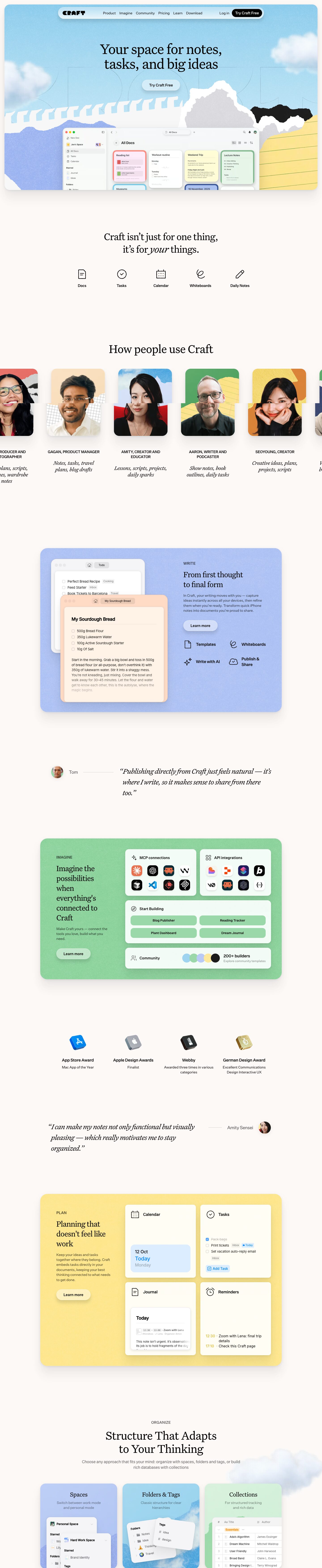
Captured 10 Oct 2026 at 1440px. Scroll the frame to see the whole page.
Craft
warm · tactile · editorial · playful · calm
Craft pairs a warm off-white canvas and an elegant editorial serif with a tactile, scrapbook-like collage of torn paper, halftone clouds and grainy pastel feature panels. It works because the playful collage carries the brand personality while the product UI stays crisp, white and Apple-native. The result reads as both premium and approachable.
Palette
Typography
- Headings
- UntitledSerifFont (Klim Untitled Serif)
- Body
- UntitledSansFont (Klim Untitled Sans)
- Free swap
- Headings: Newsreader or Source Serif 4 at regular weight. Body: Inter or Geist (weight 500).
Headings are always weight 400 serif with tight negative tracking: H1 66px, line-height 1.0, -3% tracking; H2 54px, 1.1, -2%; H3 46px, 1.22, -3%. Feature-panel titles run around 32-36px serif in sentence case. An italic serif emphasises single words ('your') and sets pull quotes at about 28px. Body is 16px Untitled Sans at weight 500, line-height 1.4, -2% tracking. Panel descriptions are 14-15px in a softer dark grey. Eyebrows are small uppercase sans (WRITE, IMAGINE, PLAN, ORGANIZE) at about 13px with mild tracking. Testimonial role captions are uppercase sans at 14px, followed by italic serif descriptors.
More free font pairings →Measured h1: 66px / 400 / -0.03em · body 16px
Signature moves
- Make the hero a torn-paper collage: rip-edged shapes in white, grey, black, periwinkle and lined notepaper frame the real app window as if it is emerging from a scrapbook.
- Add visible grain, noise or halftone texture to flat pastel panels and cloud imagery so digital surfaces feel like paper.
- Set every headline in a regular-weight serif with tight negative tracking, and italicise one word ('your') for voice. Keep all UI and body text in a crisp sans.
- Rotate one pastel panel colour per feature pillar (periwinkle = Write, mint = Imagine, butter = Plan). Tint each panel's pill button to match.
- Show product features as small, real, working UI fragments (a task list with tags, a calendar 'Today' tile, an integrations icon grid) inside white cards, never as abstract illustrations.
- Use pull quotes as editorial interludes: large italic serif, with a hairline rule leading to a tiny avatar, alternating sides.
Layout
The page uses a centred 1080px content column on a 1440 canvas. The hero is a full-bleed rounded panel (about 24px radius) inset from the viewport edges. Below it, sections alternate between centred serif headlines over icon rows or carousels and large 750px-wide rounded colour panels (periwinkle, mint, butter). Each panel uses a left text column of about 35% and a right column of product cards or mockups. Whitespace is generous, roughly 160-200px between sections. Density inside panels is moderate: 2x2 card grids with 16px gaps. The 'How people use Craft' portrait carousel bleeds off both edges to signal horizontal scroll. Single-line testimonials sit between panels and alternate left and right alignment, each with a hairline rule connecting the quote to an avatar.
Components
- Floating nav
- A centred pill bar of about 760px sits inside the hero. It is translucent white with a frosted gradient, a soft shadow and roughly 20px radius. A blocky black CRAFT wordmark sits on the left, plain 15px links in the middle, and on the right a 'Log in' text link plus a solid black pill CTA with white text.
- Hero
- A sky-blue photographic background with grainy, halftone clouds. A faint giant outlined wordmark sits behind a centred two-line serif headline. Below it is a frosted pale-blue pill CTA with a soft drop shadow. The bottom half is a collage of torn paper (white, grey, black, periwinkle, lined yellow notepaper) with a macOS app window rising out of it.
- Buttons
- Primary is a fully rounded pill (999px). In nav it is solid #030302 with white text. On coloured panels it is a lighter tint of the panel colour with dark text, a subtle top highlight and a soft shadow, so it reads like a slightly raised glossy pebble. Labels are 15px sans at weight 500-600.
- Feature panels
- Large 24px-radius blocks in a flat pastel with visible paper grain/noise texture and a long, very soft layered shadow. Each has an uppercase eyebrow, a serif headline, a short grey paragraph and a 'Learn more' pill. Inside sit white or near-white cards with 16px radius, line icons and real UI snippets.
- Feature icon row
- Five evenly spaced, hand-drawn-feeling outline icons of about 36px (doc, check, calendar, whiteboard scribble, pencil). Each has a 15px weight-500 label beneath. No containers.
- People carousel
- Square portrait cards with 16px radius. Each is a cutout portrait over a collage background of torn paper, grid or colour. Below is an uppercase name and role, then an italic serif list of use cases.
- Testimonials
- A large italic serif quote at about 28px with curly quotes. It is paired with a small circular avatar and name, joined by a thin horizontal hairline. Placement alternates left and right.
- Awards row
- Four columns, each with a glossy 3D icon (App Store blue, silver Apple, black Webby, gold German Design), a bold 15px title and a small grey caption.
- Organize cards
- Three tall 24px-radius cards with pastel gradient or cloud-photo backgrounds. Each has a centred serif title, a grey subtitle and tilted overlapping white UI cards (sidebar, folder/tag lists, a database table) bleeding off the bottom edge.
Product UI
The product appears as real, high-fidelity UI crops: a macOS window with traffic lights, a light sidebar (New Doc, space switcher, All Docs, Tasks, Calendar, Starred, Folders) and a grid of document cards. Each card has a thick coloured border and a matching pastel fill (pink, white, yellow, green, blue), like sticky notes. The UI is Apple-native and airy: 13px system sans, #e1e1e1 hairline borders, 12-16px radii, small grey line icons, and tiny pill tags (Inbox, Cooking, a blue Today flag). Colour comes almost entirely from user content (card tints, emoji, a #0087ff checkbox), not from the chrome. Overlapping, slightly tilted windows show layered depth in the feature sections.
Great for
- Notes and writing apps
- Personal productivity and planning tools
- Creative and journaling software
- Consumer SaaS with a lifestyle angle
- Apple-platform native apps
- Template and community marketplaces
Watch out for
- Untitled Serif and Untitled Sans are licensed Klim fonts; substitute Newsreader or Source Serif 4 and Inter.
- Don't bold the serif headlines; the elegance depends on weight 400 and tight tracking.
- Collage and texture overload: keep torn-paper effects to the hero and portrait backgrounds, with panels flat plus subtle grain.
- Saturated or neon panel colours; the system only works with soft pastels at similar lightness.
- Light grey paragraph text on pastel panels drops below good contrast at small sizes; keep descriptions at #1f2225 or darker.
- Heavy hard shadows; shadows here are long, layered and around 5-8% opacity.
Design like Craft
Read https://pageproofer.com/inspiration/calm-minimal/craft.md and open its screenshots. To design in this style, set the page on warm off-white #fcf9f7 with ink text #030302 and a centred 1080px column. Use a regular-weight serif (Newsreader as a stand-in for Untitled Serif) for all headlines: H1 66px, line-height 1.0, letter-spacing -0.03em; H2 54px, 1.1; italicise a single key word. Use Inter weight 500 at 16px, line-height 1.4, -0.02em for UI and body. Build feature sections as 24px-radius panels in pastel #b8caf5, #9bd8a9 or #fde99b with a subtle noise texture and a soft layered shadow (0 3px 10px rgba(0,0,0,.08), 0 20px 40px rgba(0,0,0,.05)). Give each panel a left column (uppercase eyebrow, serif title, short paragraph, tinted pill 'Learn more' button). Put a 2x2 grid of white 16px-radius cards on the right, each holding real UI snippets with #e1e1e1 hairlines. Make every button a 999px-radius pill; the main CTA is solid black with white text. Use a floating frosted pill nav, and a hero with a textured sky or collage image that frames a real app screenshot. Separate sections with 160px or more of whitespace and italic serif pull quotes joined to small avatars by hairline rules.