
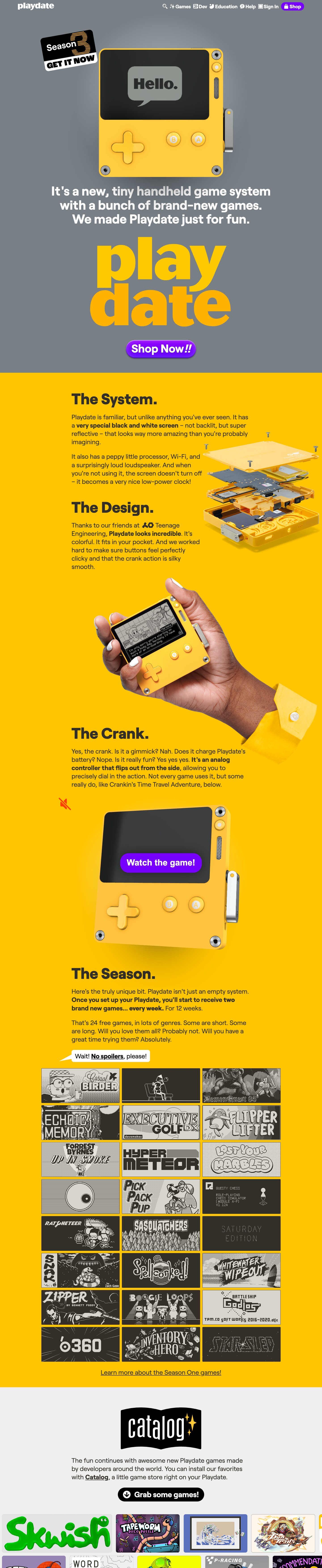
Captured 11 Oct 2026 at 1440px. Scroll the frame to see the whole page.
Playdate
playful · tactile · cheeky · bold · friendly
Playdate's homepage is a toy box: a cool grey stage for a glossy 3D render of the yellow console, then a full-bleed saturated-yellow story section with chunky 800-weight Roobert headings, cut-out product photography and a wall of 1-bit game title cards. It works because the yellow device is the brand. The page lets the hardware's colour, the screen's monochrome pixel art and a chatty, jokey voice carry everything, and uses only a single bubble-gum purple button as the call to action.
Palette
Typography
- Headings
- Roobert
- Body
- Roobert
- Free swap
- Roobert (Displaay) is commercial. Use Figtree or Hanken Grotesk at 800 for headings and 400/700 for body. Plus Jakarta Sans is a close second choice.
There is one family throughout. The hero statement is 57px at weight 700 with a 1.1 line height, centered and white on grey, and one word ('handheld') is tinted lighter grey for emphasis. Section headings ('The System.', 'The Design.') are 68px at weight 800 with a 1.0 line height and default tracking. They always end with a period, which makes them read like confident little announcements. The giant stacked 'play / date' wordmark runs about 250px per line at weight 800 with negative leading, filled with a yellow-to-amber gradient. Body copy is about 26px at regular weight with a roughly 1.4 line height, in warm charcoal. Key claims are set in 700 bold inline, and a few phrases are underlined links. Nav labels are about 20px semibold, each paired with a small pictogram. Nothing is uppercase except the sticker graphics.
More free font pairings →Measured h1: 0px / 800 / 0em · body 57px
Signature moves
- Make the product's own colour the page's colour: a full-bleed #ffc600 band matches the yellow device so photos melt into the background.
- Stage the hero render on flat cool grey with a radial spotlight, so the saturated hardware pops like a museum object.
- End every section heading with a period and write body copy as Q&A banter ('Is it a gimmick? Nah.'), with one bolded key claim per paragraph.
- Use one tactile, glossy purple pill CTA with layered inset shadows as the only skeuomorphic element on an otherwise flat page.
- Slap on rotated sticker badges and speech-bubble asides so the page feels hand-assembled and jokey.
- Show the content library as a dense grid of strictly 2-tone pixel-art tiles, letting a constraint (1-bit screen) become a visual identity.
Layout
The design runs on a 1100px content width, but text sits in a narrow column of about 560 to 780px, left-aligned and offset to the left of center. Large cut-out images (an exploded device, a hand holding the console, a crank render) overlap into the right side and bleed off the edge. The page is built from three full-bleed colour bands: a grey hero with a radial spotlight behind the render, a long yellow narrative band, and a light-grey #efefef catalog band. Whitespace is generous and vertical. Each feature gets a heading, two short paragraphs and one big image, which gives a slow, scroll-to-reveal rhythm. The game wall is a tight 3-column grid of 2:1 tiles with about 8px gutters. The catalog band ends in horizontally scrolling rows of colourful cover art that bleed off both edges.
Components
- Nav
- This is a transparent bar over the hero. The lowercase 'playdate' wordmark sits on the left, and the right side holds white semibold links, each prefixed with a tiny custom pictogram (sparkle, grid, hand, question bubble). 'Shop' is the only filled element: a purple pill with a bag icon.
- Primary CTA
- 'Shop Now!!' is a fat purple pill with about a 34px radius and white 800-weight text. A layered glossy shadow makes it feel like a physical candy button: an inset white highlight at the top, an inset dark shade at the bottom, and a soft 25px inner glow, plus a 2.5px/5px drop shadow.
- Secondary CTA
- 'Grab some games!' is a black pill with white bold text and a circular down-arrow icon. It sits on the light catalog band.
- Hero
- A huge, slightly tilted 3D render of the console, showing a game title on its screen, sits center stage under a soft radial light on flat grey. A rotated black 'Season 3 GET IT NOW' sticker with orange striped numerals is slapped on at the top-left. Below the render come a three-line white statement, the giant gradient wordmark and the purple CTA.
- Speech bubble
- 'Wait! No spoilers, please!' is set in a white rounded rectangle with a sharp tail. It works as an inline aside before the game grid and adds the brand's conversational aside voice.
- Game tile grid
- Tiles are 2:1 rectangles with about 2.85px radii and a hairline dark edge. They show only 1-bit title art in charcoal #312f28 and LCD grey #b1aea7, and the monochrome reads as a deliberate texture against the yellow.
- Catalog carousel
- A black book-shaped 'catalog' logo carries yellow sparkles. Below it, staggered rows of full-colour cover cards with small radii scroll horizontally and are cropped at the viewport edges.
Product UI
The interface appears only through the device's screen in photoreal 3D renders and hand-held photography: a 1-bit memory LCD with charcoal pixels on warm grey, dithered illustrations and pixel fonts. Game title cards reuse that exact two-tone palette at a 2:1 aspect ratio. The hardware itself is drawn as a flat yellow body with rounded corners, chrome screws, round A/B buttons and a metal crank. Any app UI should borrow this: monochrome #312f28 on #b1aea7, chunky pixel type, thin rules, no gradients inside the screen, and colour reserved for the chrome around it.
Great for
- Consumer hardware and gadgets
- Indie game studios and game stores
- Playful creative tools
- Toy and hobby brands
- Single-hero-product launches
Watch out for
- Setting white text directly on yellow: contrast fails. Use #312f28 charcoal on yellow.
- The white hero copy on #7b8087 grey sits around 3.9:1 and only passes because it is 57px bold. Don't use it for small text.
- Adding multiple accent colours. Purple works because it is the only non-product colour.
- Using thin or light weights. The voice depends on 700 to 800 chunky geometric type.
- Using generic stock imagery. The style needs cut-out renders or photos of a real object that bleed across sections.
- Shipping Roobert without a license.
Design like Playdate
Read https://pageproofer.com/inspiration/old-school-vintage/playdate.md and open its screenshots. To design in this style, use a single chunky geometric grotesk (Figtree/Hanken Grotesk at 800 as a Roobert stand-in). Set section headings at 68px/1.0 weight 800, each ending in a period, and body at about 24 to 26px/1.4 in #312f28. Open with a #7b8087 grey hero that has a soft radial white glow behind one large cut-out product render, a rotated sticker badge, a centered 57px/1.1 bold white statement and a single glossy purple (#7a1fff) pill CTA. Give the pill a 34px radius and inset shadows: 'rgba(255,255,255,.6) 0 2.5px 2.5px inset, rgba(0,0,0,.5) 0 -2.5px 4px inset, rgba(0,0,0,.4) 0 2.5px 5px'. Follow with a full-bleed brand-colour band (#ffc600) that holds a narrow left-offset text column of about 600 to 780px inside 1100px, with oversized cut-out photos overlapping to the right. Show content in tight 3-column grids of 2:1 tiles with about 3px radii, using a strict two-tone palette (#312f28 / #b1aea7). Finish on a #efefef band with edge-bleeding horizontal card rows and a black pill secondary button. Write copy that is short, conversational and self-aware, with one bolded claim per paragraph.