
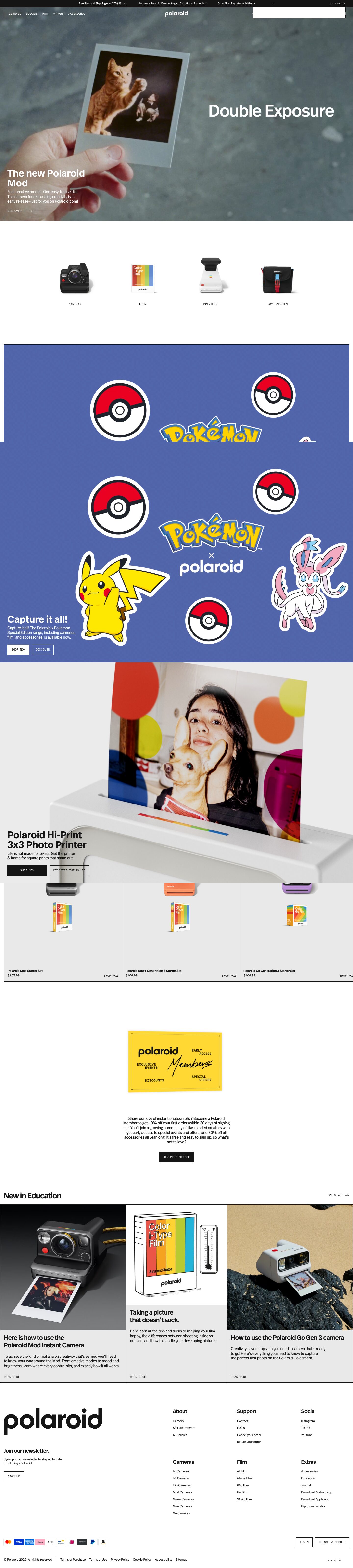
Captured 11 Oct 2026 at 1440px. Scroll the frame to see the whole page.
Polaroid
analog · editorial · restrained · graphic · tactile
Polaroid's store reads like a gallery catalogue: full-bleed analog film footage up top, then flat #e9e9e9 and white panels framed by 1px near-black hairlines, square corners everywhere, and a tight grotesk set against small monospaced uppercase labels. Colour comes almost entirely from photography, products and the Polaroid rainbow, so the chrome stays neutral and the merchandise reads as the brand.
Palette
Typography
- Headings
- FF Real Header Offc Demibold (REAL_HEADER_OFFC_DEMIBOLD)
- Body
- FF Real Header Offc Regular (REAL_HEADER_OFFC_REGULAR)
- Mono
- Unnamed monospaced face used for uppercase labels and buttons (not exposed in tokens)
- Free swap
- FF Real is proprietary (Spiekermann). Use Inter Tight or Schibsted Grotesk at 600/400 for headings and body. For the mono labels use IBM Plex Mono or Space Mono.
Hero and section headlines are 40px demibold (600) with a 1.0 line height and no tracking, in short 2-line blocks. Section titles like 'Product highlights' sit at about 28–32px with visibly tight negative tracking. Card titles are 13px/600 at 1.2 line height and -0.016em. Body copy is 16px regular at 1.2 line height and -0.02em, set in narrow measures of about 280–300px so paragraphs read as compact captions. All CTAs, category labels, 'READ MORE' and 'VIEW ALL' are tiny (11–12px) uppercase monospace with wide spacing, often followed by a thin arrow. Nav is 14px regular in sentence case. The jump from 40px headlines to 11px mono labels does the hierarchy work, so no intermediate weights are needed.
More free font pairings →Measured h1: 40px / 600 / 0em · body 16px
Signature moves
- Separate everything with 1px #151515 hairlines and zero gaps, so grids read like a contact sheet or printed catalogue rather than floating cards.
- Set every CTA and label in tiny uppercase monospace with a thin arrow ('DISCOVER IT →'), against a tight grotesk for headlines, creating a technical/archival voice.
- Keep the UI chrome strictly black, white and #e9e9e9, and let the brand rainbow appear only in product, packaging, badges and campaign panels.
- Anchor banner copy bottom-left in a narrow column, with the product or footage owning the rest of the frame.
- Use grainy, imperfect analog film footage as the hero instead of polished product renders, which reinforces the 'beautifully imperfect' brand promise.
- Close the page with a giant wordmark in the footer as a graphic element.
Layout
Full-bleed video hero (about 900px tall) with copy bottom-left over the footage. Below it, content sits in a 1382px container with about 29px side margins. Promo banners are stacked full-container panels, each about 620–720px tall, with headline and buttons anchored bottom-left and the product image centred. Panels butt directly against each other, separated only by a 1px #151515 rule, and there are no shadows. Grids (3-up product highlights, 3-up education cards) are edge-to-edge tiles sharing 1px black borders like a contact sheet. Whitespace is generous between modules (120–200px around the category row and membership block) but zero inside grids. Alignment is mostly left, with the membership block centred as a deliberate pause. The footer uses a giant black wordmark at left and a 3×2 link-column grid at right.
Components
- Announcement bar
- #151515 strip about 24px tall carrying three 12px white promo messages in a row, a chevron, and a 'CA · EN' locale switch at far right.
- Navigation
- Transparent over the hero with white text. Product categories sit left, the lowercase Polaroid wordmark is centred, and Journal/Education/Apps/Support plus thin-line account, search and bracketed cart '[0]' icons sit right. No background, no border.
- Hero
- Autoplaying grainy film footage, full-bleed. A white 40px demibold headline, 16px caption and 'DISCOVER IT →' mono text link sit bottom-left at about 25px inset. No button box, no overlay gradient beyond what the footage provides.
- Buttons
- 0px radius, about 30px tall, with 11px uppercase monospace labels. Primary is solid #151515 with white text, or solid white on coloured panels. Secondary is a 1px outline in the contrasting colour with a transparent fill. Primary and secondary are paired side by side with an 8px gap.
- Category row
- Four cut-out product photos on white with soft natural drop shadows baked into the imagery, each captioned with a centred 11px mono uppercase label (CAMERAS, FILM, PRINTERS, ACCESSORIES).
- Product cards
- #e9e9e9 tiles bordered with 1px #151515, holding a square-ish product composite (camera plus film box). Tag chips sit top-left: tiny 11px labels on #151515, #d60026 or #78be20 fills with no radius. The 13px demibold title and price sit bottom-left, with a 'SHOP NOW' mono link bottom-right.
- Membership block
- A yellow 'Polaroid Me' card graphic styled like a physical membership card, followed by centred 16px copy and a single black 'BECOME A MEMBER' button.
- Editorial cards
- Three tiles with photo or line-illustration on top and a #e9e9e9 text area below. The text area holds a 24px demibold title, 16px excerpt and a 'READ MORE' mono link pinned to the bottom. Tiles are divided by black hairlines.
- Footer
- White background with an oversized black lowercase wordmark (about 290px wide), a 'Join our newsletter.' prompt with an outlined SIGN UP button, 18px demibold column heads over 12px links, payment-logo chips, and outlined LOGIN / BECOME A MEMBER buttons above a hairline-separated legal row.
Product UI
No software interface is shown. The product is physical, presented as studio cut-outs on flat #e9e9e9 or white with soft cast shadows, as hero lifestyle footage, and as a black-outline line illustration (film box plus thermometer) for education content. If you translate this to app screens, the look is: flat grey surfaces, 1px black borders, no radius, no shadows, small mono uppercase labels for actions and metadata, rectangular colour chips for status, and dense tiled grids with shared borders.
Great for
- Consumer hardware and camera/audio brands
- Design-led ecommerce with strong product photography
- Fashion, objects and lifestyle stores
- Editorial or archive-style content sites
- Creative tools that want an analog, crafted feel
Watch out for
- Rounded corners, drop shadows on UI elements, or gradient buttons, which break the printed-catalogue flatness.
- Using rainbow accents for UI chrome. Keep them for badges and product.
- Sizing mono labels below 11px or spacing them loosely enough that they read like a disclaimer, since they carry all the CTAs.
- Shipping FF Real without a license. Substitute Inter Tight or Schibsted Grotesk.
- White hero text over bright or busy footage without checking contrast. The site relies on muted footage.
- Long body measures. The 1.2 line height only works in short, narrow caption blocks.
Design like Polaroid
Read https://pageproofer.com/inspiration/old-school-vintage/polaroid.md and open its screenshots. To design in this style, use a white (#ffffff) page with #e9e9e9 panels and #151515 for text, borders and primary buttons. Set every radius to 0 and use no shadows. Divide sections and grid tiles with 1px #151515 lines and no gutters, so cards share borders. Set headlines in Inter Tight 600 (substitute for FF Real) at 40px with a 1.0 line height. Set body at 16px/1.2 with -0.02em tracking, in columns about 300px wide. Set all buttons, labels and links in 11–12px uppercase IBM Plex Mono with about 0.05em tracking, adding a thin '→' to text links. Buttons are about 30px tall: solid black with white text for primary, 1px outline for secondary. Make the hero full-bleed photography or video with white copy bottom-left at about 25px inset, and keep nav transparent with a centred wordmark. Inside a 1382px container, stack tall banners with copy anchored bottom-left. Limit colour to product imagery, campaign panels and small square tag chips (#d60026, #78be20, #ffb500). End with an oversized wordmark in the footer.