
Captured 11 Oct 2026 at 1440px. Scroll the frame to see the whole page.
Panic
playful · confident · handmade · minimal · friendly
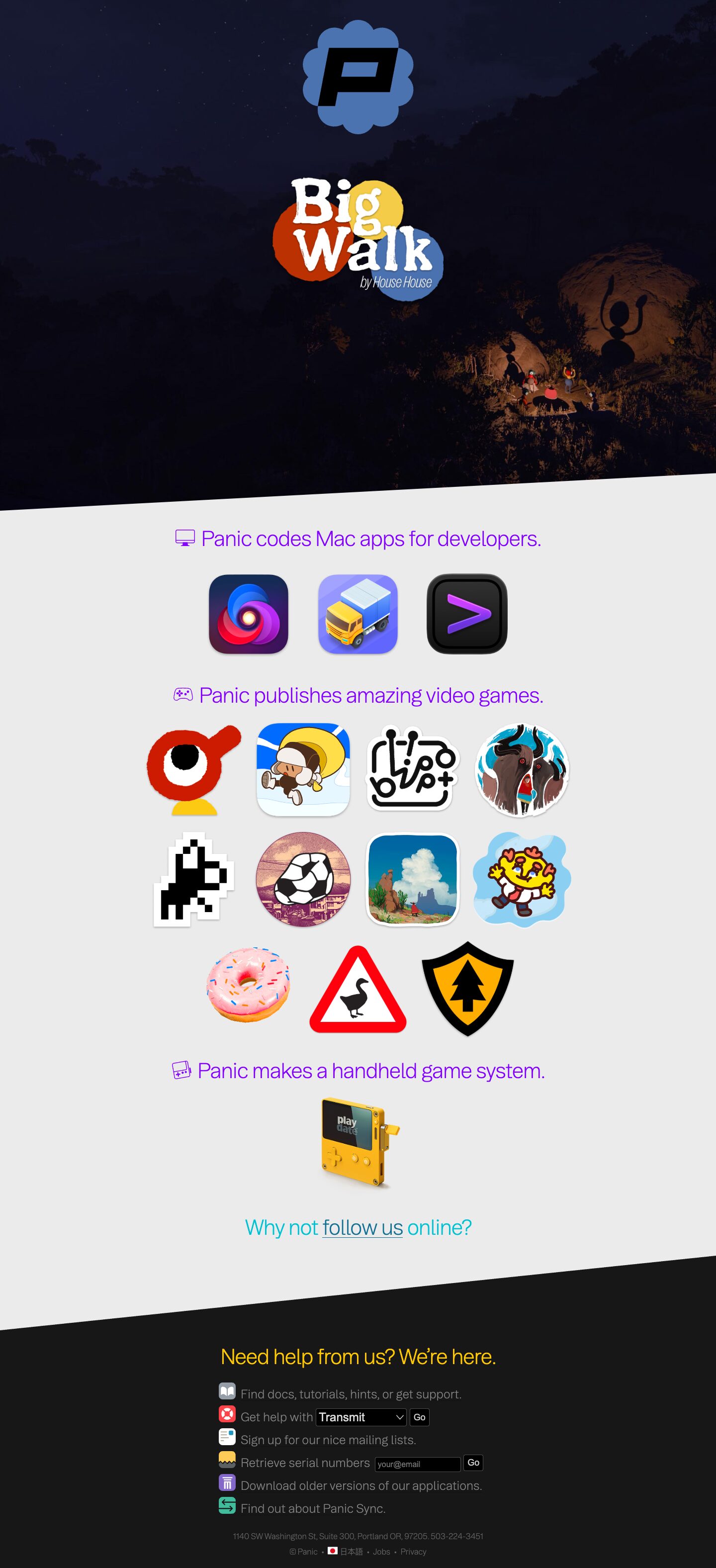
Panic's homepage is a playful, almost toy-like index of everything the company makes: a full-bleed dark game-art hero with a featured logo, then a pale grey (#ebebeb) field of large app and game icons grouped under light-weight, coloured one-line headlines, ending in a near-black help footer. It works because the product artwork does all the visual talking while the chrome stays minimal and centred, and two slanted section edges plus per-section headline colours give a quiet, friendly personality with no cards, shadows or buttons.
Palette
Typography
- Headings
- Booton
- Body
- Booton
- Mono
- Space Mono
- Free swap
- Booton is a commercial grotesk; use Hanken Grotesk or Figtree at weight 300 instead. Hellix (used for the lowercase product wordmark) can be replaced with Outfit or Plus Jakarta Sans at 700. Space Mono is already free on Google Fonts.
The whole page runs on one light grotesk at weight 300, never bold. Section headlines (h2) are about 42px Booton 300 with tight -0.05em tracking and a 1.07 line height, in sentence case, written as complete plain-English sentences ending in a period ('Panic codes Mac apps for developers.'). Each is prefixed by a small line icon in the same colour. The h1 slot is about 80px at 300, but in practice the hero shows a logo image instead of live text. Footer copy is about 22px Booton 300 in #808080 on charcoal, the address line is about 14px, and the legal links are about 13px. Product promo text uses Space Mono at large sizes, around 40px at 300. Hierarchy comes from colour and size rather than weight; nothing is uppercase except within logos.
More free font pairings →Measured h1: 80px / 300 / -0.006em · body 40px
Signature moves
- Write every section heading as a complete, plain sentence in a light-weight grotesk ('Panic publishes amazing video games.'), led by a matching outline icon.
- Let real product icons and key-art stickers at about 120px be the entire content of a section, with no cards, captions or shadows, floating on a flat grey field.
- Separate full-bleed bands with diagonal edges instead of horizontal rules, so the page feels tilted and lively.
- Give each section headline its own saturated colour (violet, teal, yellow) while body text stays neutral grey.
- Use a no-nav, no-copy hero: one darkened game screenshot with the brand badge and a featured product logo stacked in the centre.
- Embed tiny functional forms (select plus 'Go', email plus 'Go') inside footer sentences, each line led by a coloured app-icon bullet.
Layout
The page is a single centred column, with content capped near 1050px and most elements far narrower. There are three bands. The first is a roughly 1000px tall full-bleed dark game-art hero with the scalloped blue 'P' badge and a featured game logo stacked dead centre. The second is the light #ebebeb body. The third is a #1c1c1c footer. Band transitions are diagonal: the hero's bottom edge rises from left to right, and the footer's top edge also rises from left to right, which gives a sense of tilt and motion. In the body, each section is a centred headline followed by a centred row of large icons (about 110–130px) with about 40px gutters. Apps sit in a row of 3, and games wrap in rows of 4, then 4, then 3, all centred. Vertical rhythm is generous but even, with about 60–80px between groups. There are no containers, cards, borders or shadows, only icons floating on grey.
Components
- Hero
- The hero is a full-bleed, darkened in-game screenshot of the featured title (#171717-ish night tones). The brand badge (blue scalloped circle with a black italic 'P') sits at the top centre, and the featured game's logo is centred below it. There is no nav bar, no copy and no CTA button, so the art and logo alone are the call to action.
- Section headline
- Each headline is a single centred sentence in light 42px grotesk, preceded by an outlined pictogram (monitor, gamepad, handheld) in the same hue. Apps, games and hardware headlines use violet (#9844f6), and the social prompt switches to teal (#1f95c1) with an underlined inline link.
- Product icon grid
- Products appear as their real app icons and game key-art stickers at about 120px. Squircle Mac icons keep their native shapes, and game icons keep irregular die-cut sticker silhouettes such as the circles, the pixel shape, the donut and the shield. There are no labels, captions or hover cards, and each icon links straight through.
- Hardware showcase
- A single isometric product render of the yellow Playdate sits centred under its headline, at roughly the same visual weight as one icon row.
- Help footer
- The footer uses a #1c1c1c background with a centred heading in warm yellow, about 36px at weight 300. Below it is a left-aligned list of utility links, each led by a small coloured rounded-square app-style icon (grey book, red lifebuoy, white mail, yellow, violet columns, green sync arrows) with grey #808080 text. Small address and legal lines sit underneath, separated by bullets.
- Inline forms
- Forms are tiny and embedded mid-sentence: 'Get help with [select] Go' and 'Retrieve serial numbers [input] Go'. Controls are black fields with white text and a 4px radius, and the 'Go' button is a small black box with a thin light border. They read like system UI rather than marketing buttons.
Product UI
The page shows no interface screenshots at all. Products are represented entirely by their icons: glossy Mac squircles for Nova, Transmit and Prompt, and die-cut illustrated sticker art for the games. Hardware appears as one 3D render. In the footer, the only 'UI' is native-looking dark controls (black select and input, 4px radius, small 'Go' buttons) and colourful rounded-square glyph icons. For app screens inspired by this, favour icon-led navigation, flat neutral grounds and light type. Use colour only in icons and a single accent per area, and use compact inline controls instead of large buttons.
Great for
- Indie software studios and game publishers with a multi-product portfolio
- Company homepages acting as a hub that links out to product sites
- Creative tools with strong icon or illustration assets
- Hardware or gadget makers with characterful product renders
- Personal or studio portfolios
Watch out for
- Using this with weak or generic icons, since the layout has nothing else to carry it
- Light-weight 42px headlines in pale colours; violet and teal pass at this size but fail at small sizes or on mid-grey
- Grey #808080 text on #1c1c1c for anything long or important, because contrast is marginal
- Shipping Booton or Hellix without a licence; substitute Hanken Grotesk or Figtree (300) and Outfit (700)
- Adding cards, drop shadows or big CTA buttons, which would break the flat sticker-board feel
- Using too many diagonal dividers; two is the limit before it turns gimmicky
Design like Panic
Read https://pageproofer.com/inspiration/old-school-vintage/panic.md and open its screenshots. To design in this style, build a single centred column with content up to about 1050px. Open with a full-bleed dark image hero (about 1000px tall, darkened to roughly #171717) that holds only a centred brand badge and one featured product logo, with no nav or CTA. Clip the hero's bottom edge with a diagonal that rises left to right, for example clip-path: polygon(0 0,100% 0,100% 92%,0 100%). Set the body on #ebebeb. Each section is a centred one-sentence headline in Hanken Grotesk (or Booton) at weight 300, 42px, line-height 1.07, letter-spacing -0.05em. Colour it #9844f6, or #1f95c1 for the social section, and lead it with a 28px outline icon in the same colour. Under each headline, place a centred flex-wrap row of 120px product icons with 40px gaps, keeping their native shapes, with no labels, borders or shadows. End with a #1c1c1c footer whose top edge is also slanted, a centred yellow 36px light heading, and a left-aligned list of 22px #808080 lines. Lead each line with a 24px coloured rounded-square icon, and embed small black inputs and selects (4px radius, white text) with compact 'Go' buttons inline. Finish with 13–14px grey address and legal lines. Use body text #444444, keep everything weight 300, and let product art supply all the colour.