
Captured 11 Oct 2026 at 1440px. Scroll the frame to see the whole page.
Criterion
cinematic · curatorial · editorial · restrained · moody
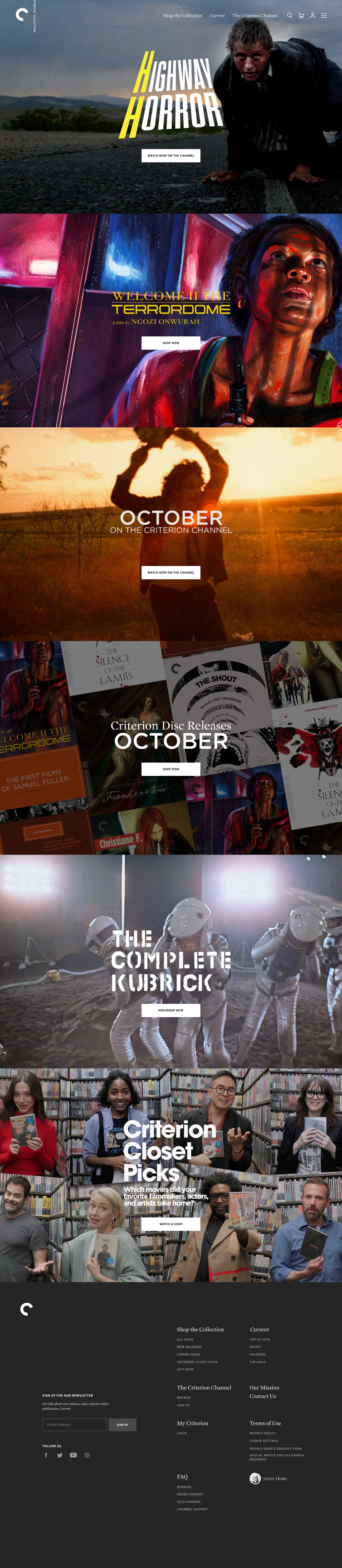
Criterion's homepage is a stack of full-bleed, edge-to-edge cinematic panels, each one a film still or poster art with bespoke title lettering and a single small white rectangular button, sitting over a near-black #252525 frame. The chrome is deliberately quiet so the films carry the page: a literary serif (Mercury) for navigation and section names, tracked uppercase Gotham Narrow for utility text, and zero radii, shadows or decoration.
Palette
Typography
- Headings
- Mercury Text G1 (Regular and Italic), with custom per-campaign display lettering baked into artwork
- Body
- Gotham Narrow Bold (uppercase utility) + Mercury Text G1
- Free swap
- Mercury Text → Source Serif 4 or Newsreader; Gotham Narrow → Montserrat (semi-condensed feel via Montserrat at tight width) or Barlow Semi Condensed SemiBold; geometric section titles like 'OCTOBER' → Montserrat Medium.
Two-voice system. Serif voice: Mercury at ~17-20px regular for nav ('Shop the Collection', 'The Criterion Channel') and footer column heads, with italic reserved for the publication name 'Current' — italics signal a title, as in print. Utility voice: Gotham Narrow Bold 11-13px, uppercase, ~0.077em tracking, line-height 1.15, used for buttons ('WATCH NOW ON THE CHANNEL'), footer links in #8e8e8e, and labels like 'SIGN UP FOR OUR NEWSLETTER'. Small italic serif (~13px) for helper copy. Large headlines are not live type: each hero's title is custom lettering matched to the film (stencil for Kubrick, slanted condensed caps for Highway Horror, didone serif for Terrordome), so the scale jumps straight from ~20px UI text to 100px+ artwork.
More free font pairings →Signature moves
- Let each feature carry its own custom title lettering in the artwork, while the UI chrome stays identical and neutral around it.
- Use one unchanging white, square-cornered, small-caps button on every panel so the CTA reads consistently over wildly different imagery.
- Pair a bookish serif for names and navigation with tight, tracked uppercase sans for actions — and italicise publication titles as in print.
- Stack full-viewport, gapless image panels with a single centred message each, like a sequence of film frames.
- Set the wordmark vertically beside a circular mark in the top-left corner, as on a disc spine.
- Keep the frame a soft charcoal (#252525) rather than pure black so photography reads as projected rather than boxed.
Layout
Full-width vertical stack of roughly 1440×860px panels (about one viewport each), no gutters or gaps between them, each centered on a single headline-plus-button lockup placed at the horizontal centre. Nav floats transparently over the first panel: logo top-left with 'CRITERION COLLECTION' set vertically beside it, serif links and four line icons top-right. Content width for the footer is ~1274px; footer is a generous dark field with newsletter at left and a 2-column serif-headed link grid at right, lots of empty space. Density is extremely low: one message per screen.
Components
- Hero panels
- Full-bleed film still or painted key art, slightly darkened, with campaign lettering centred and one CTA beneath. Each panel has its own typographic identity; the system only fixes the button and placement.
- Primary button
- Solid white #ffffff rectangle, 0px radius, ~240×52px, #252525 Gotham Narrow Bold 11-12px uppercase tracked label. Same button on every panel, regardless of artwork colour.
- Navigation
- Transparent over imagery, white Mercury serif links with one italic item, thin-stroke white icons (search, cart, account, hamburger), circular 'C' logo mark with vertical wordmark.
- Footer
- #252525 field, serif column headings in white ~20px, uppercase tracked Gotham links in #8e8e8e at ~11px with ~22px row spacing, Janus Films seal as partner mark.
- Newsletter form
- Input with 1px #4a4a4a border, transparent fill, grey placeholder, 0 radius; adjacent #4a4a4a filled 'SIGN UP' button with white uppercase label. Squared, flush, minimal.
- Collage panel
- Disc release section tiles tilted cover art behind a dark overlay, with mixed serif ('Criterion Disc Releases') over geometric sans ('OCTOBER') headline.
Product UI
No app UI is shown. The product is the films and editions themselves, presented through stills, painted key art and cover-art collages, plus a lifestyle panel of celebrities holding discs in the Criterion Closet. Interface elements that do appear are sparse and flat: thin-line icons, 1px #4a4a4a borders, square inputs, no shadows, greys for secondary links. For app screens, carry over a dark charcoal canvas, imagery-first cards with zero radius, serif titles and uppercase tracked micro-labels.
Great for
- Film distributors and streaming services
- Publishers, magazines and archives
- Museums, galleries and festivals
- Record labels and premium media retail
- Fashion or lifestyle brands with strong photography
Watch out for
- Using this with weak or stock imagery — the whole layout depends on art-directed, high-quality visuals.
- #8e8e8e text at 11px on #252525 is borderline; don't go smaller or lighter.
- Rendering campaign headlines only as images without accessible text alternatives.
- Adding colourful UI accents; the gold #b4841e is rare and the colour should come from artwork.
- Mercury and Gotham are licensed (Hoefler&Co); substitute Source Serif 4 and Montserrat/Barlow Semi Condensed.
- Overlaying white type on bright image areas without a darkening scrim.
Design like Criterion
Read https://pageproofer.com/inspiration/old-school-vintage/criterion.md and open its screenshots. To design in this style, build the page as a gapless stack of full-bleed image panels (~100vh each, min ~800px) on a #252525 base, each with one centred headline lockup and a single button: solid #ffffff, 0px radius, ~240×52px, #252525 label in uppercase condensed bold sans (Barlow Semi Condensed 600 or Montserrat 700) at 11-12px with 0.08em tracking. Put the nav transparently over the first panel: logo top-left, serif links (Source Serif 4, 18px, white, one italic item for a publication name) and 1.5px line icons top-right. Darken imagery with a 20-40% black scrim so white text holds. Give each feature its own display treatment that suits its subject, but keep chrome identical. Footer: #252525, max-width ~1274px, serif 20px white column heads, 11px uppercase tracked #8e8e8e links, inputs with 1px #4a4a4a borders and square corners. No shadows, no rounded corners, no gradients in UI; reserve #b4841e gold for rare highlights.