
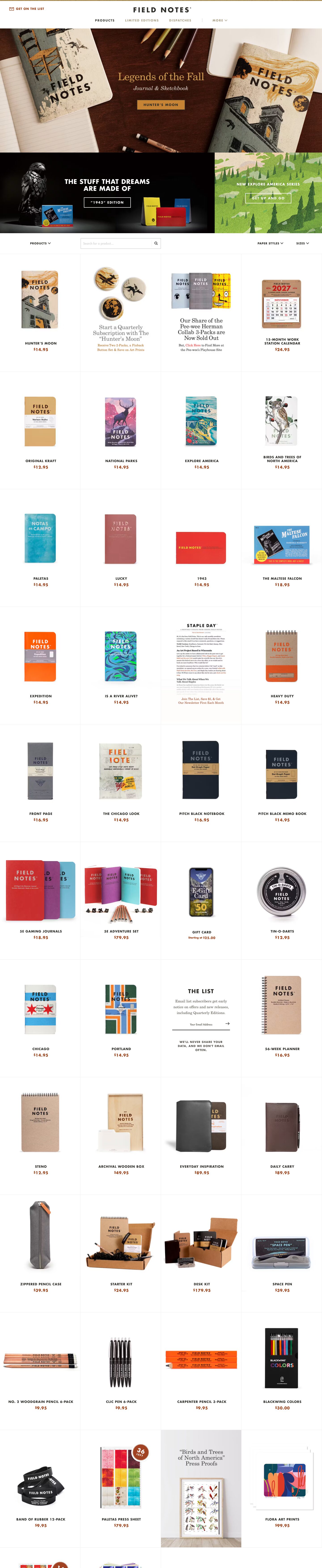
Captured 11 Oct 2026 at 1440px. Scroll the frame to see the whole page.
Field Notes
vintage · utilitarian · crafted · Midwestern · catalogue-like
Field Notes reads like a mid-century American printed catalogue moved to the web: a centred Futura Bold wordmark, tracked uppercase labels, New Century Schoolbook serif for editorial notes, and a hairline-ruled, square-cornered product grid where photographed notebook covers supply nearly all the colour. The chrome stays almost colourless (warm near-black, white, a khaki rule and a rust price colour), so dozens of loud, illustrated covers can sit side by side without the page feeling chaotic.
Palette
Typography
- Headings
- Futura W01 Bold (Futura Bold / Heavy)
- Body
- Futura W01 Bold for labels and UI; New Century Schoolbook W01 for editorial copy
- Free swap
- Futura Bold → Jost 700/800 (or League Spartan 700); New Century Schoolbook → Libre Caslon Text or Old Standard TT (closest free Century-style serifs: 'Century Old Style'-like Libre Baskerville at regular weight also works).
Two-voice system. Futura Bold is used almost exclusively in UPPERCASE with wide tracking: the wordmark ~28px at ~0.15em, h2 'THE LIST' 21px with 0.095em tracking and line-height 1.0, nav and product names ~13–14px at ~0.1em, prices ~15px bold in rust with a superscripted $ sign. The serif (New Century Schoolbook) carries anything that should feel like printed prose: hero h1 46px, weight 400, line-height 1.1, -0.022em tracking, italic subheads, and 15px/1.5 paragraph copy in promo cards ('Start a Quarterly Subscription…' ~22px serif). Nothing is set in sentence-case sans; sans = label, serif = voice.
More free font pairings →Measured h1: 46px / 400 / -0.022em · body 15px
Signature moves
- Let the products be the only colour: keep UI to warm black, white, khaki and one rust accent so busy illustrated imagery never clashes.
- Split the type into two voices — tracked uppercase geometric sans for every label, button and name; an old-fashioned schoolbook serif for anything conversational.
- Use a gapless grid divided by 1px hairlines, like a printed catalogue page, instead of floating rounded cards.
- Insert editorial and signup content as same-size grid cells so marketing reads like ads in a magazine spread rather than interrupting banners.
- Set prices in a rust brown with a superscript dollar sign — a small print-catalogue detail that signals craft.
- Top the page with a thin ochre rule, like the stitched or printed edge of a memo book.
Layout
Full-bleed edge-to-edge sections with a 1200px nominal content width for header and filters. Header is centred: wordmark on top, a single row of tracked uppercase nav below, with 'GET ON THE LIST' pinned top-left, under a 3–4px ochre/khaki rule across the very top of the viewport. Below: a full-width photographic hero (~460px tall), then a split promo band (2/3 dark cinematic photo, 1/3 illustrated green panel), then a filter bar (Products dropdown left, square search input, Paper Styles/Sizes right), then a long 4-column grid of equal square-ish cells (~360px tall) separated only by 1px #dadada hairlines with no gutters or gaps. Each cell centres a product photo on white with the name and price beneath. Editorial cards (newsletter signup, subscription pitch, press proofs) are dropped into grid slots at the same size instead of breaking the grid. Density is high but calm thanks to generous internal cell padding.
Components
- Header
- White bar, centred Futura Bold wordmark with ® mark, nav items 13px uppercase tracked; active item in #302e2a, inactive in khaki #aea288; a thin vertical divider separates 'MORE ⌄'. Top-left utility link in rust with an envelope line icon. A thin ochre rule sits flush above the whole header.
- Hero
- Full-bleed overhead tabletop photo (notebooks, pencils on dark wood) with a low-contrast serif title and italic subtitle overlaid in the centre, nearly blending into the wood — the photo is the message; type is a quiet caption.
- Promo banners
- Side-by-side full-bleed tiles: one dark studio photograph with white uppercase Futura headline (~28px) and a ghost button; one flat illustrated landscape with small tracked white label and ghost button.
- Buttons
- Ghost buttons only: transparent fill, 2px white (or dark) border, 0px radius, uppercase Futura ~13px with ~0.15em tracking, ~44px tall, generous horizontal padding. Quotes in labels use typographic curly quotes.
- Product cards
- No card chrome: a grid cell with 1px hairline borders, product photo with natural soft drop shadow (photographed, not CSS), uppercase tracked name in #302e2a ~13px, price below in rust #9c3e14 bold with a small superscript $. Occasional circular rust sticker badge ('36 LEFT') overlapping the image corner.
- Filter bar
- Uppercase tracked dropdown labels with chevrons, a square 1px-bordered search field with a divided magnifier button, all on white with a hairline beneath.
- Newsletter cell
- Sits in a grid slot: 'THE LIST' Futura heading, centred serif paragraph, underline-only email input (1px dark bottom border) with a thin arrow submit, and a tiny uppercase tracked privacy note.
- Editorial cells
- Serif headlines in grey (~22px, tight leading) with a rust serif sub-line containing inline rust links, mimicking a printed advert.
Product UI
No software UI; the product is physical and shown via real photography: tabletop lifestyle shots in the hero and clean cut-out studio shots on white with soft natural shadows in the grid. The surrounding UI is sparse and print-like: 0px radii everywhere, 1px #dadada dividers, thin line icons (envelope, chevron, magnifier, arrow), uppercase tracked labels, underline-only inputs. For app screens in this style: dense tables or grids with hairline rules, no fills, square corners, uppercase sans labels, serif for notes/body, and a single rust accent for values and links.
Great for
- Stationery and analog goods shops
- Heritage or craft DTC brands
- Small-batch publishers and print studios
- Catalogue-heavy ecommerce with strong product art
- Coffee, outdoor or workwear brands with an Americana voice
Watch out for
- Futura W01 and New Century Schoolbook W01 are licensed; substitute Jost and Libre Caslon/Old Standard rather than shipping fallback Arial.
- Don't copy the nearly invisible hero overlay text — it fails contrast; put real headlines where readability matters.
- Khaki #aea288 nav text on white is low contrast; use it only for secondary items at bold weight, never for body copy.
- Adding rounded corners, gradients or coloured UI fills breaks the printed feel.
- Lowercase or untracked Futura looks generic; the tracking and caps are the identity.
- Without strong, consistent product photography the white hairline grid looks empty.
Design like Field Notes
Read https://pageproofer.com/inspiration/old-school-vintage/field-notes.md and open its screenshots. To design in this style, build a white (#ffffff) page with warm near-black text (#302e2a, secondary #545049), a single rust accent (#9c3e14) for prices and links, and khaki (#aea288) / ochre (#c78334) only for thin rules and inactive nav. Use Jost 700 (Futura substitute) in UPPERCASE with 0.1–0.15em tracking for wordmark, nav (13px), product names (13–14px), buttons and h2s (21px, line-height 1.0); use a Century-style serif (Libre Caslon Text) at 46px/1.1, -0.02em for editorial headlines and 15px/1.5 for paragraphs. Set every radius to 0. Centre the logo with a single nav row beneath and a 3px ochre rule at the very top. Use full-bleed photo heroes and split promo tiles with ghost buttons (2px border, transparent, uppercase tracked). Lay products in a gapless 4-column grid with 1px #dadada dividers, centred cut-out photos, uppercase name and rust bold price with superscript $, and slot newsletter/editorial content into grid cells at the same size. Keep shadows to the photography itself; the only CSS shadow should be a faint 1px 1px 1px rgba(0,0,0,0.1).