
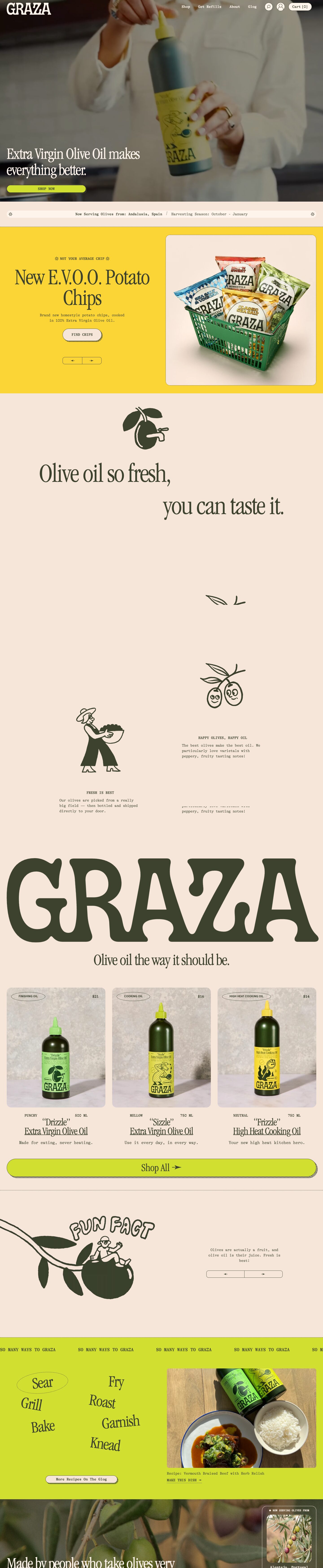
Captured 11 Oct 2026 at 1440px. Scroll the frame to see the whole page.
Graza
playful · warm · editorial · retro · cheeky
Graza feels like a hip deli counter: warm blush-paper backgrounds, a punchy chartreuse block colour, deep olive-green ink, condensed Garamond display headlines paired with a typewriter body face, and hand-drawn olive characters that make a commodity product feel like a personality. It works because one dark ink colour carries all text and line work, so the loud lime and playful illustration never feel chaotic. The page reads as packaging design extended into a website.
Palette
Typography
- Headings
- ITC Garamond Condensed
- Body
- GT Alpina Typewriter
- Mono
- GT Alpina Typewriter (typewriter serif used for all small text)
- Free swap
- ITC Garamond Condensed → 'EB Garamond' with a tight condensed setting, or better 'Instrument Serif' / 'Gloock' for a narrow display serif; GT Alpina Typewriter → 'Courier Prime' or 'IBM Plex Mono'; Apercu → 'Work Sans' or 'DM Sans'. The custom GRAZA wordmark is a groovy soft-serif; 'Shrikhand' or 'Bagel Fat One' are rough stand-ins.
Display: ITC Garamond Condensed weight 400, 72px H1 with line-height 1.0 and -3% tracking, scaling up to ~90px for section headlines like 'Get The Trio' and 'Olive oil so fresh'. Product names use the same condensed serif at ~32px, underlined. Everything else is GT Alpina Typewriter at 16px / 500 / 1.5 line height: nav links, body copy, buttons and uppercase eyebrows ('HAPPY OLIVES, HAPPY OIL', 'THE DO-IT-ALL SET'), with eyebrows sometimes flanked by asterisk glyphs. Small 12–13px uppercase typewriter labels carry metadata (PUNCHY, 500 ML, prices). The contrast is extreme: a tall, elegant, compressed serif set huge against small, flat, mechanical monospace.
More free font pairings →Measured h1: 72px / 400 / -0.03em · body 16px
Signature moves
- Set one dark olive ink (#3c422e) as the only colour for text, borders, icons and illustrations, so loud backgrounds like chartreuse stay cohesive.
- Pair a huge, compressed, high-contrast serif for headlines with a small typewriter face for everything else, so it reads like a menu or packaging label.
- Give pills a hard offset 'shadow' made from a dotted or hatched duplicate shape instead of a blur, which reads as printed rather than digital.
- Fill whitespace with charming hand-drawn line characters (smiling olives, a farmer, an olive with a tap) and stagger headlines left and right across a mostly empty canvas.
- Run the wordmark edge to edge as a giant typographic section, then follow it with a quiet one-line serif tagline.
- Use the product packaging colours (lime, yellow, mint) as section and card backgrounds so the site and the bottle feel like the same object.
Layout
Full-bleed sections stacked vertically, alternating between blush (#f6e6d9) and chartreuse (#d1e030) bands, with full-bleed photography for the hero and the sourcing story. Content sits within ~1092px wide plus ~30px page gutters, but many elements break out to the full 1440px: the giant GRAZA wordmark spans edge to edge, and the 'Shop All' pill button runs the full content width. Two-column split sections (text left, image right) handle feature blocks. The storytelling section is deliberately sparse: headlines staggered across left and right, small illustrations floating in large empty space, short captions offset in odd positions. Sections are separated by dotted 1px olive rules. Overall density is low and the rhythm is loose and magazine-like.
Components
- Navigation
- Transparent over the hero photo: cream groovy wordmark at left, typewriter links (Shop, Get Refills, About, Glog) at right, circular cream icon buttons for search and account, and a cream pill 'Cart [0]' with bracketed count.
- Primary buttons
- Fully rounded 32px pills in chartreuse or cream with a 1px olive border, uppercase or title-case typewriter text, and an offset hard 'shadow' rendered as a dotted/hatched pill shape peeking out below-right, like a printed riso misregistration. There are no soft box-shadows anywhere.
- Announcement ticker
- Cream pill bar inside the blush band carrying monospace text ('Now Serving Olives from: Alentejo, Portugal / Harvesting Season: October – January') with asterisk glyphs at each end.
- Marquee
- Scrolling uppercase typewriter repeat 'SO MANY WAYS TO GRAZA' across a chartreuse band, bounded by dotted rules.
- Product cards
- Three columns, each a 20px-rounded photo of the bottle on concrete/marble, an outlined oval tag pill top-left (FINISHING OIL) and price top-right in small sans. Below: tasting note and volume in tiny uppercase typewriter, the nickname in quotes and the product name underlined in condensed Garamond, then a one-line typewriter description.
- Carousel controls
- Split pill with two halves, left and right arrows, 1px olive outline, transparent fill.
- Word cloud
- Cooking verbs (Sear, Fry, Grill, Roast, Bake, Garnish, Knead) in condensed serif, scattered and slightly rotated, with the active one circled by a dotted hand-drawn ellipse.
- Image frames
- Product imagery sits in 20px-rounded frames with a fine dotted olive border; the sourcing card uses a cream 1px outline over the photo.
Product UI
There's no software UI; the 'product' is shown through studio packshots on textured concrete inside rounded frames, plus lifestyle and recipe photography. The interface chrome is minimal and print-like: 1px olive outlines, dotted rules, pill tags, bracketed counters ('Cart [0]'), arrow glyphs, and monospace metadata. If you apply this to an app, aim for low density and outlined controls rather than filled, with no shadows, typewriter labels for data and condensed serif for titles, and colour blocks for state or category.
Great for
- DTC food and beverage brands
- Pantry, coffee and condiment goods
- Restaurants and delis
- Lifestyle or kitchenware shops
- Playful consumer brands with strong packaging
Watch out for
- Using the typewriter face for long paragraphs; it's tiring beyond 2–3 lines
- Placing thin olive text directly on busy photography without a dark overlay
- Letting chartreuse take over: keep it to alternating bands and buttons
- Adding soft drop shadows or gradients, which break the print aesthetic
- Shipping the licensed fonts (ITC Garamond Condensed, GT Alpina Typewriter, Apercu) without a licence; use free substitutes
- Generic stock icons; the charm depends on bespoke hand-drawn illustration
Design like Graza
Read https://pageproofer.com/inspiration/fun-funky/graza.md and open its screenshots. To design in this style, use a blush background #f6e6d9 with alternating full-bleed chartreuse #d1e030 bands, cream #fff4ec for pills and surfaces, and olive #3c422e for all text, 1px borders, icons and illustrations. Reserve #fbd535 and #9eef80 for product-category accents. Set headlines in a condensed display serif (Instrument Serif as a free stand-in for ITC Garamond Condensed) at 72–96px, weight 400, line-height 1.0, tracking -3%. Set all other text in a typewriter face (Courier Prime) at 16px, weight 500, line-height 1.5, with small uppercase eyebrows framed by asterisks. Make buttons 32px-radius pills with a 1px olive border and a hard offset dotted duplicate as the shadow, never a blur. Round image cards at 20px, add outlined oval tag pills, and separate sections with dotted 1px rules. Keep content at ~1092px max width with ~30px gutters, but let the wordmark and key CTAs span the full width. Leave large empty areas and fill them with hand-drawn line illustrations and staggered headlines. Add a scrolling uppercase marquee and a monospace announcement pill for personality.