
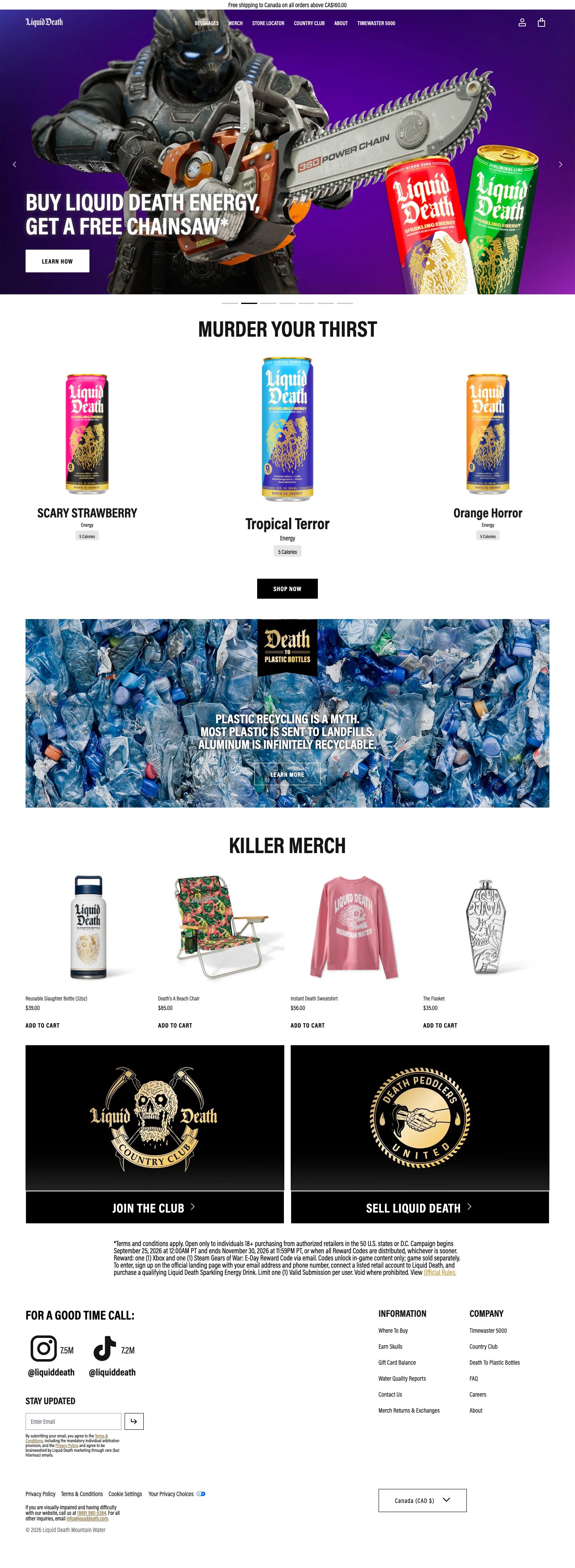
Captured 11 Oct 2026 at 1440px. Scroll the frame to see the whole page.
Liquid Death
brash · deadpan · stark · irreverent · punchy
Liquid Death runs a stark black-and-white retail shell — Acumin Pro Extra Condensed in shouty uppercase, square buttons, no shadows, no radius — and lets loud photography, metal-band can art and deadpan copy carry all the colour and personality. The restraint of the chrome is what makes the joke land: it reads like a serious premium e-commerce site that happens to sell murder-themed water, so the irreverence feels confident rather than gimmicky.
Palette
Typography
- Headings
- Acumin Pro (Extra Condensed / Condensed, bold)
- Body
- Acumin Pro Condensed
- Free swap
- Acumin Pro is an Adobe font. Use Barlow Condensed or Roboto Condensed (bold 700) for headings and Barlow Condensed / Archivo Narrow 400 for body; Oswald works for the heaviest uppercase display lines.
Everything is one condensed family. Section headings ('MURDER YOUR THIRST', 'KILLER MERCH') are ~60px, weight 700, uppercase, line-height 1.0, zero tracking, centred. Hero headline is similar size, white, uppercase, left-aligned over the photo, two lines. h3/footer column heads are 24px 700 uppercase. Nav links and button labels are ~13–14px bold uppercase with slight positive tracking. Body and product meta are 16px and smaller (12–14px) at weight 400 with tight 1.0–1.2 line height, keeping copy compact. Product names mix uppercase and title case at ~28px bold condensed. Legal copy is condensed 14px set in a narrow centred block.
More free font pairings →Signature moves
- Keep the UI chrome strictly black, white and grey with zero radius and zero shadows so loud photography and packaging supply 100% of the colour.
- Set every heading in bold condensed uppercase at ~60px with 1.0 line height and write it as a deadpan threat or pun ('MURDER YOUR THIRST', 'KILLER MERCH').
- Scale up the centre item in a 3-up product row so the grid feels like a stage rather than a catalogue.
- Use a single tarnished gold (#8a6d35) only for inline links and emblem art, giving a metal-band/heavy-metal-merch luxury tint without adding a brand colour.
- Turn even boilerplate (newsletter consent, footer heading) into brand voice copy, letting the typography stay sober while the words do the joking.
Layout
Content width 1312px on a 1440 viewport (~64px gutters). Full-bleed hero slider (~600px tall) with left arrows/right arrows and a row of thin dash pagination indicators below. Below that, every section is a centred uppercase heading followed by a grid: 3-up product showcase with the centre item scaled larger, a contained full-width image banner with a centred badge and white copy, a 4-up merch grid on white with left-aligned meta, then a 2-up black promo card pair. Generous vertical spacing (~80–100px) between sections, tight spacing inside them. Footer is a two-zone split: social/newsletter left, two link columns right. Everything is flat — no shadows, no radius, hard edges.
Components
- Announcement bar
- Thin white strip, ~28px, centred black 14px condensed text for shipping notice.
- Navigation
- Transparent overlay on the hero: white wordmark left, centred row of bold uppercase condensed links, line icons for account and cart right. No background or border.
- Hero slider
- Full-bleed saturated photo (purple gradient, game character, cans), white uppercase two-line headline bottom-left with a white rectangular 'LEARN HOW' button (black text, 0 radius). Pagination is a row of short grey dashes with the active one in black.
- Buttons
- Square rectangles, 0 radius, bold uppercase condensed labels with tracking. Solid black with white text on light backgrounds, solid white on photos, or 1px white outline ghost on imagery. Text-only 'ADD TO CART' links in bold uppercase for product grids.
- Product showcase
- Cut-out can photography on white, no card container. Centre product rendered larger with bigger name; below each: bold condensed name, small category label, grey 'X Calories' pill tag.
- Merch grid
- 4 columns of cut-out product shots on white, small left-aligned product name, price, then bold uppercase 'ADD TO CART' text link.
- Promo cards
- Pair of pure-black panels with gold engraved-style emblem art fading to grey at the bottom, joined to a black bar with white uppercase CTA and chevron.
- Footer
- White, large uppercase 'FOR A GOOD TIME CALL:' with big black social icons and follower counts, square 1px-bordered email input with arrow button, two uppercase-headed link columns, a bordered square region selector, gold underlined inline links in legal text.
Product UI
No app interface — the product is physical. It is shown as high-resolution cut-out packshots on pure white (cans, bottles, apparel) and in lifestyle/campaign photography in the hero. The commerce UI around it is minimal and dense: small condensed metadata, grey pill tags for attributes, text-link add-to-cart, square bordered inputs. For app screens, translate this as flat monochrome panels, 0px radius, 1px black or #999 borders, uppercase bold labels, and colour reserved for content imagery.
Great for
- Irreverent consumer brands and DTC beverages
- Streetwear and merch stores
- Music, gaming or event promotions
- Challenger brands with strong copywriting
- Packaging-led product catalogues
Watch out for
- Adding a brand accent colour to buttons — it dilutes the monochrome contrast the imagery relies on
- Using Acumin Pro without an Adobe licence; substitute Barlow Condensed
- Setting long body copy in condensed type at 1.0 line height — it only works for short labels; use 1.4+ for paragraphs
- Rounded corners, drop shadows or gradients on UI elements
- Edgy copy without strong photography; the flat shell looks empty with weak images
- White text on busy photos without darkening — the plastic-bottle banner headline is barely legible
Design like Liquid Death
Read https://pageproofer.com/inspiration/fun-funky/liquid-death.md and open its screenshots. To design in this style, build a flat monochrome shell: background #ffffff with #f5f5f5 panels, text #000000/#151515, borders 1px #000 or #999, border-radius 0 everywhere and no box-shadows. Use one condensed family (Barlow Condensed as an Acumin Pro substitute): section headings 60px weight 700 uppercase, line-height 1.0, centred; h3 24px 700 uppercase; nav and buttons 13–14px 700 uppercase with 0.05em tracking; body 16px 400. Content width 1312px with ~64px gutters and ~96px between sections. Buttons are square rectangles: black fill/white text on light, white fill/black text on photos, or 1px white outline over imagery. Make the hero a full-bleed saturated photo with a transparent white nav and a bottom-left white uppercase headline. Present products as cut-outs on white with no cards, enlarge the centre item in 3-up rows, and use grey #e6e6e6 pill tags for attributes. Reserve #8a6d35 gold for inline links and emblem art only. Let imagery carry all colour and write headings as bold deadpan one-liners.