
6 sites
Fun & Funky
Weird on purpose, impossible to forget
Fun & Funky sites look odd on purpose, but the oddness sits on a strict base. One dark ink, flat paper or white grounds, hard edges and a disciplined grid carry the structure. Personality comes from deadpan copy, one loud display voice, clashing flat colour fields and hand-made textures or illustrations. The chrome stays sober so the joke lands, and the result reads as confident rather than gimmicky.
Paste this into your agent
Read https://pageproofer.com/inspiration/fun-funky.md and the site teardowns it links to, and open their screenshots. Then design my [describe the page or app screen] in the Fun & Funky style, following the guide's brief, principles and do/don't lists.
The sites
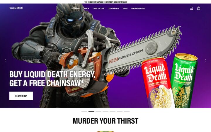
Liquid Death
Acumin ProLiquid Death runs a stark black-and-white retail shell — Acumin Pro Extra Condensed in shouty uppercase, square buttons, no shadows, no radius — and lets loud photography, metal-band can art and deadpan copy carry all the colour and personality. The restraint of the chrome is what makes the joke land: it reads like a serious premium e-commerce site that happens to sell murder-themed water, so the irreverence feels confident rather than gimmicky.
brash · deadpan · stark · irreverent · punchy
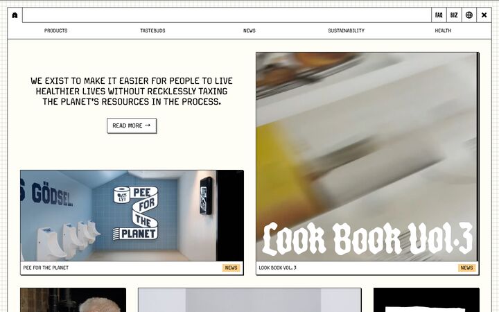
Oatly
Margo Pro RegularOatly's homepage is a cream-paper bulletin board: a hairline-black frame and nav grid hold a masonry wall of square-cornered cards, each with a 2px hard black offset shadow, a tiny uppercase caption bar and a pastel category tag. The UI chrome is deliberately plain and mechanical so the loud, hand-made campaign artwork (posters, packaging, hand lettering) can carry all the personality.
irreverent · editorial · handmade · brutalist · playful
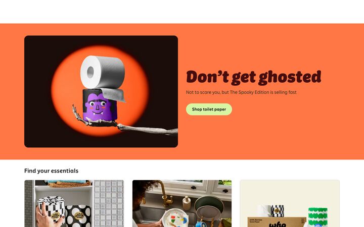
Who Gives A Crap
Crapcase DisplayWho Gives A Crap pairs a chunky, black-italic custom display face with flat, saturated colour fields (tangerine, electric blue, lime, aqua) on a mostly white canvas, so an everyday commodity reads as cheeky, warm and giftable. The structure underneath is a disciplined, shadowless e-commerce layout with 8–12px cards, pill buttons and one cobalt action colour, which keeps the jokes and colour blocks from turning chaotic.
playful · cheeky · bold · warm · friendly
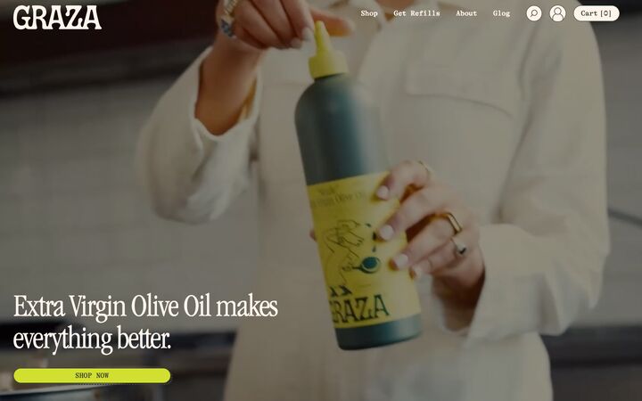
Graza
ITC Garamond CondensedGraza feels like a hip deli counter: warm blush-paper backgrounds, a punchy chartreuse block colour, deep olive-green ink, condensed Garamond display headlines paired with a typewriter body face, and hand-drawn olive characters that make a commodity product feel like a personality. It works because one dark ink colour carries all text and line work, so the loud lime and playful illustration never feel chaotic. The page reads as packaging design extended into a website.
playful · warm · editorial · retro · cheeky
Poolsuite
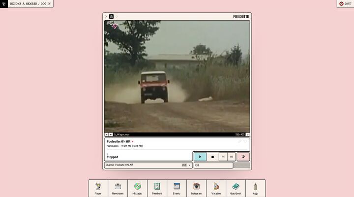
Custom bold condensed retro wordmarkPoolsuite renders its homepage as a retro desktop: one cream, black-outlined Mac OS–style window floats in the centre of a flat salmon-pink field, with a pixel-icon dock pinned to the bottom and two small chips in the top corners. Nothing scrolls and nothing is pitched at you, so the page feels like an object you use rather than a page you read, and that suits a lifestyle music brand built on 80s and 90s nostalgia.
nostalgic · playful · sunny · tactile · cheeky
Partiful
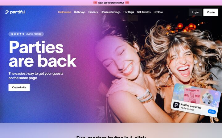
TWK Lausanne PanPartiful pairs a stark black-and-white UI system (black text, black or white rectangular buttons, plain white cards) with a dreamy iridescent backdrop of pastel lavender, sky blue and peach gradients, plus a loud, grainy flash-photo hero. The restraint of the chrome lets the invites, photos and Gen-Z copy carry the personality, so the page feels like a party poster but still reads as a trustworthy tool.
playful · iridescent · youthful · confident · social
Principles
1.
Sober chrome, loud content
Keep UI furniture (nav, buttons, inputs, cards) in black, white or cream with no decoration. Photography, packaging, illustration and copy supply the noise. Liquid Death runs a pure #000/#fff/#999 retail shell under metal-band can art. Oatly frames hand-made posters in plain 1px black cards. Partiful keeps 4px black rectangular buttons over iridescent washes. If the content is weak, this style fails, so invest in imagery and words before decoration.
2.
One ink does all the line work
A single dark colour handles text, borders, icons and illustration. Use #000000–#151515 at Liquid Death, Oatly and Poolsuite, #262626 at Who Gives A Crap, and olive #3c422e at Graza. Because every line shares one ink, chartreuse, tangerine or salmon backgrounds can clash freely without the page falling apart. Never set body text lighter than #5a5a5a.
3.
Flat colour as fields and codes, never as gloss
Colour arrives in solid blocks or as meaning, not as gradients on controls. Who Gives A Crap floods bands with tangerine #ff7744, lime #d7f6a4, aqua #b1e8eb and cobalt #4268ff. Graza alternates blush #f6e6d9 and chartreuse #d1e030 bands. Oatly colour-codes categories with pastel chips (#fdcf85, #f8c8d8, #a67eb1, #fbcccc). Poolsuite uses cyan #a9dde2 only for the active control and pink #f3c4c4 for a secondary action. Allow one action colour at most (cobalt #0f47ff at Who Gives A Crap); everywhere else, black is the CTA.
4.
Extreme type contrast: one shouting voice, one mechanical voice
Pair a huge, characterful display face with small, plain utility type, and keep almost nothing in between. Graza sets 72–90px condensed Garamond against 16px typewriter. Liquid Death uses 60px bold condensed uppercase at line-height 1.0 over 12–14px meta. Who Gives A Crap sets 68px black italic with one statement per section. Partiful runs a 112px H1 at weight ~825, line-height 0.8, tracking -3%. Oatly and Poolsuite invert the idea: all UI type stays at 10–16px uppercase or bitmap size, and the imagery does the shouting.
5.
Hard edges and printed shadows
Avoid blurred elevation. Radii are 0px (Liquid Death, Oatly) or 3–4px (Poolsuite, Partiful buttons), with pills used deliberately as the one rounded object. Depth is printed rather than lit: Oatly uses a 1px black border plus a 2px 2px 0 #000 shadow, and Graza uses a dotted, misregistered duplicate pill offset bottom-right. Separate content with 1px black rules, dotted olive rules or ruled table cells, as in the Oatly nav and footer.
6.
Hand-made texture and retro artefacts fill the gaps
Fill empty space with something tactile rather than leaving it blank. Oatly uses halftone dot blocks and graph-paper margins. Poolsuite uses grey dither for inactive slots and pixel-art dock icons. Graza places hand-drawn olive characters and dotted circling ellipses. Who Gives A Crap has a scalloped lime blob bleeding off the viewport, and Partiful adds Y2K pixel stickers and tilted notification cards. Use one or two of these motifs per site, not all of them.
7.
Deadpan copy in boring places
Put the jokes in functional spots: newsletter headings ('news, promos and fart jokes'), footer heads ('FOR A GOOD TIME CALL:'), section titles ('MURDER YOUR THIRST', 'KILLER MERCH'), empty carts and consent lines. Partiful drops emoji into sentence-case headings ('Stalk the guest list'). Keep the tone straight-faced and the typography serious so the copy does the joking.
Colour
Backgrounds are either pure white #ffffff or a warm paper: oat cream #fffef6, sun-faded cream #faf3ee, kraft #f5f0e0, blush #f6e6d9 or pool pink #f5d6d5. Surfaces sit one step off the background (#f5f5f5, #fafafa, #fff4ec, or white cards on cream). Ink is #000000–#262626, or one tinted dark such as olive #3c422e; it covers text, borders and illustrations. Muted greys run #999999–#c6c6c6 for rules and chips. Accents fall into two families: (1) saturated punches such as cobalt #0f47ff, tangerine #ff7744, chartreuse #d1e030 and on-air red #e04a4a, and (2) chalky pastels such as lime #d7f6a4, aqua #a9dde2–#b1e8eb, apricot #fdcf85, bubblegum #f7c6f0–#f8c8d8, lilac #a67eb1–#e9dcf7 and peach #ffba85. Pick one saturated colour as the action or hero and two to four pastels for bands, tags or state. Always put dark text on pastels and chartreuse, never white. Clashing pairs are fine when they sit in separate blocks divided by ink rules or white space. Gradients are allowed only as blurry pastel backdrop washes (Partiful), never on buttons or cards.
Typography
Use two voices. Display: a font with obvious character at 56–112px, line-height 0.8–1.0, tracking 0 to -4%. Options include bold condensed uppercase (Liquid Death, ~60px/700), compressed high-contrast serif (Graza, 72–90px/400, -3%), heavy black italic used for one line per section (Who Gives A Crap, 68px), or ultra-heavy grotesk at 0.8 line-height (Partiful, 112px). Utility: small and mechanical at 11–16px. Choose a typewriter or mono face (Graza, Poolsuite chips), uppercase single-weight labels (Oatly, 12px/400), or condensed meta (Liquid Death, 12–14px). Nav and button labels are 13–16px, often uppercase with +2–5% tracking. Body copy is 16px with line-height 1.4–1.5 in a readable sans, never in the display face, a bitmap font or condensed type at 1.0. Build hierarchy through the jump between voices, not through many intermediate sizes. Free substitutes: Barlow Condensed or Oswald for condensed uppercase; Instrument Serif for the narrow serif; Bricolage Grotesque, Unbounded or Syne for wide or quirky display; Courier Prime or IBM Plex Mono for typewriter; Pixelify Sans or VT323 for pixel labels; Space Grotesk, Figtree or Inter for body.
More free font pairings →Layout
Use a 1010–1312px content column with 30–96px gutters. Hero bands, colour fields and wordmarks go full-bleed. Keep vertical spacing between sections generous (80–200px) and spacing inside modules tight (4–24px). That contrast between packed blocks and empty space is part of the look. Pick one structural conceit and commit to it: stacked full-bleed colour bands (Who Gives A Crap, Graza), a ruled masonry wall inside a 1px black frame with 24–36px gutters (Oatly), a centred-heading-plus-grid retail rhythm with a scaled-up centre item (Liquid Death), or a single desktop window on a flat pastel field with a dock (Poolsuite). Break the grid on purpose, but only once or twice per page: an edge-to-edge wordmark, a blob bleeding off the viewport, headlines staggered left and right, tilted floating UI fragments, a scrolling marquee between dotted rules. Footers are worth the effort: run them as ruled tables of cells or as a voice-heavy sign-off.
Components
Buttons have three treatments. The first is a square or 4px rectangle in solid black with white uppercase or semibold 14–16px text. The second is white with a 1px black border and a 2px 2px 0 #000 shadow plus a → arrow. The third, used once per page as the deliberate rounded object, is a pill (radius 9999px) in lime, chartreuse, cream or cobalt with dark or white text and padding of about 12×24px. Cards have no container on white for packshots; otherwise use a 0–12px radius, 1px #000 or #d8d8d8 border and a hard shadow or none, with a caption bar of tiny uppercase title and a pastel tag. Tags and chips are small rectangles or ovals, 11–12px uppercase, flat pastel fill or 1px outline. Inputs are square, 1px black or #999 border, with an attached arrow or pill submit button. Announcement bars are 28–36px strips in a pastel (aqua, bubblegum, cream) with a joke or emoji. Nav is either transparent over the hero with uppercase links, or a ruled strip of bordered cells. Counters use brackets ('Cart [0]'). Carousels use dash pagination or outlined split-pill arrows. Icons are simple line or solid glyphs in ink; colourful illustration (pixel art, hand-drawn characters) is reserved for navigation tiles, empty space and storytelling.
App UI
Carry the style into product screens as a ledger or retro-OS system, not a soft SaaS one. Use a cream (#faf3ee or #fffef6) or white canvas with 1px #000 rules dividing every region. The sidebar is a column of bordered cells with 13–14px uppercase or mono labels; the active item gets a flat pastel fill (cyan #a9dde2 or similar), not a glow. An alternative is Poolsuite's bottom dock of square tiles with pixel icons. Panels nest as bordered trays inside bordered windows, with 4–8px insets and a 0–4px radius. Tables look like spreadsheets: full 1px gridlines, uppercase 11–12px headers, mono or typewriter numerals, pastel category chips in a status column, and hover rows tinted with the background's darker step. Forms use square bordered inputs, uppercase labels above, black submit buttons and segmented button groups with shared borders. Show state with one candy colour per state and keep everything else ink-on-cream. Dashboards stay dense (10–14px type, 4–12px gaps) with a single display-face title per page at 32–48px. Fill disabled or empty slots with dither or halftone. Empty states are where the brand speaks: a hand-drawn or pixel illustration, one deadpan line in the display face ('Nothing here. Suspicious.') and a black CTA. Avoid soft shadows, gradients on controls and more than one action colour.
Do
- ✓Pick one ink colour (#000–#262626 or a tinted dark like #3c422e) and use it for all text, borders and illustration.
- ✓Keep buttons black or white rectangles; allow one pill style as a deliberate exception.
- ✓Use 1px black borders and 2px 2px 0 #000 hard shadows for depth.
- ✓Put flat colour in full-width bands, pastel category tags or single state fills.
- ✓Set one display line per section huge (56–112px, line-height 0.8–1.0) and keep all other type small and plain.
- ✓Write jokes into newsletter heads, footers, empty states and error messages.
- ✓Fill dead space with halftone, dither, graph-paper grid or hand-drawn characters.
- ✓Break the grid once or twice per page on purpose: an edge-to-edge wordmark, a bleeding blob or a tilted card.
- ✓Use warm paper backgrounds (#fffef6, #f6e6d9, #faf3ee) so white cards read as paper on paper.
Don't
- ✕Don't add blurred drop shadows, glassmorphism or gradients to buttons and cards.
- ✕Don't put white text on lime, chartreuse, aqua or other pastels.
- ✕Don't set body paragraphs in the display face, condensed type at 1.0 line-height, bitmap or typewriter fonts beyond 2–3 lines.
- ✕Don't introduce a second action colour; black or one accent is the only clickable colour.
- ✕Don't stack every motif (pixel art, halftone, blobs, stickers) on one page.
- ✕Don't rely on stock imagery or generic icon sets, because the plain chrome exposes weak content.
- ✕Don't use black borders thicker than 1–2px or generic neo-brutalist chunkiness.
- ✕Don't let pale grey metadata drop below #5a5a5a on tinted backgrounds.
The brief, ready to paste
Design this in a 'Fun & Funky' style: weird on purpose, with deadpan humour on a disciplined base. Use a warm paper background (#fffef6, #f6e6d9 or #faf3ee) or white, and one dark ink (#111111, or olive #3c422e) for all text, borders and icons. Keep the chrome sober: 1px solid black borders, 0–4px radius, no blurred shadows. For depth, use hard offset shadows (2px 2px 0 #000). Primary buttons are black rectangles with white 14–16px uppercase labels; allow one pill-shaped button (radius 9999px, lime #d7f6a4 or cobalt #0f47ff) as the single rounded exception. Add colour as flat full-width bands or meaning: one saturated accent (cobalt #0f47ff, tangerine #ff7744 or chartreuse #d1e030) plus two to four pastels (aqua #a9dde2, apricot #fdcf85, bubblegum #f8c8d8, lilac #a67eb1) for section bands, category tags and active states. Always put dark text on pastels and use no gradients on controls. Typography has two voices. Display is one huge characterful line per section, 56–112px, line-height 0.8–1.0, tracking 0 to -4% (bold condensed uppercase, a compressed serif or a heavy quirky grotesk). Utility type is 11–16px, plain and mechanical (uppercase labels, a mono or typewriter face for meta). Body copy is 16px at 1.45 line-height in a readable sans. Layout uses a 1100–1300px column with 80–200px between sections and tight spacing inside modules. Break the grid once or twice on purpose (an edge-to-edge wordmark, an organic blob bleeding off-screen, tilted cards, a marquee between dotted rules). Fill empty space with halftone, dither, a faint graph-paper grid or hand-drawn line characters. Build nav and footer as ruled cells. In app screens, use bordered sidebars, spreadsheet-style tables with full 1px gridlines, segmented button groups, pastel status chips and dither for disabled areas. Empty states pair an illustration with one deadpan line. Write straight-faced jokes into functional copy (newsletter heads, footers, errors) while the typography stays serious.