
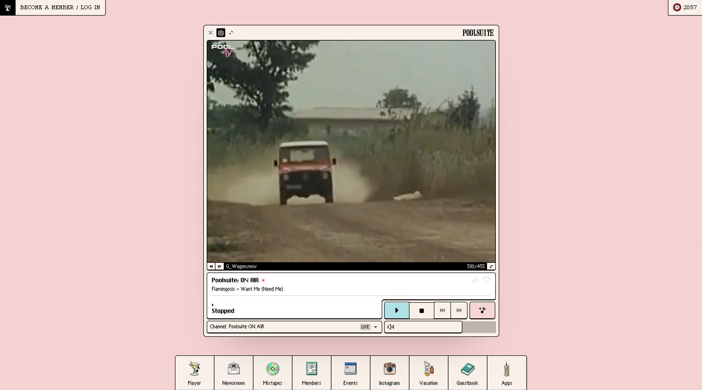
Captured 11 Oct 2026 at 1440px. Scroll the frame to see the whole page.
Poolsuite
nostalgic · playful · sunny · tactile · cheeky
Poolsuite renders its homepage as a retro desktop: one cream, black-outlined Mac OS–style window floats in the centre of a flat salmon-pink field, with a pixel-icon dock pinned to the bottom and two small chips in the top corners. Nothing scrolls and nothing is pitched at you, so the page feels like an object you use rather than a page you read, and that suits a lifestyle music brand built on 80s and 90s nostalgia.
Palette
Typography
- Headings
- Custom bold condensed retro wordmark (POOLSUITE logotype) and a bold pixel-style sans for window titles
- Body
- Small bitmap-style sans (Chicago/Geneva-like system font) for UI labels
- Mono
- Typewriter monospace (Courier-like) for the corner chips, e.g. 'BECOME A MEMBER / LOG IN'
- Free swap
- Pixelify Sans or Silkscreen for the pixel UI labels, VT323 for small bitmap text, Courier Prime for the typewriter chips, and Bebas Neue or Anton approximating the condensed wordmark
There is no marketing type scale. Everything sits at OS-chrome sizes. Track titles like 'Poolsuite: ON AIR' and 'Stopped' are about 13px bold. Metadata such as 'Flamingosis – Want Me (Need Me)', 'Channel: Poolsuite ON AIR' and '591x455' is about 10–11px regular. Dock labels are about 11px, centred under the icons. The corner chips use about 11–12px uppercase monospace with slight letter spacing. The 'POOLSUITE' wordmark in the title bar is about 14px, heavy and condensed. Line heights are tight (about 1.2), and the type stays black on cream throughout. Hierarchy comes from bold vs regular and from placement inside panels, never from size jumps.
More free font pairings →Signature moves
- Make the homepage a desktop: one draggable-looking app window centred on a flat pastel field, with no hero copy, no scroll and no marketing sections.
- Draw every surface with a 1px pure-black outline and a small radius, then nest bordered panels inside bordered windows so the UI reads as physical hardware.
- Use one candy accent per state: cyan fill marks the active control and pink fill marks a secondary action. Everything else stays cream and black.
- Navigate with a bottom dock of colourful pixel-art icons labelled in small type, which turns sections into 'apps'.
- Pin tiny bordered chips to the screen corners for account and clock, and set the CTA in uppercase typewriter mono so it reads like a system menu, not a button.
- Fill empty space and inactive areas with dither or dot textures, which gives retro authenticity without heavy imagery.
Layout
This is a full-viewport desktop metaphor with no scroll. A single window about 505px wide (at 1440px) is centred horizontally, slightly above centre, and holds a 4:3 video pane, a now-playing panel, a transport row and a channel/volume row. A bottom dock about 600px wide holds 9 equal square tiles (about 66px each) separated by 1px black rules and sits flush with the viewport bottom. Two fixed chips sit flush in the top-left and top-right corners. Roughly 60% of the screen is empty pink, and that whitespace is the backdrop. Inside the window, density is high: 4–6px gutters between nested bordered panels, everything left-aligned, controls grouped into bordered clusters.
Components
- Window chrome
- The window is cream (#faf3ee) with a 1px black border and about 4px corner radius, plus a soft diffuse rose shadow. Its title bar holds a close ×, a small app icon and a minimize glyph on the left, with the bold condensed wordmark on the right. There are no gradients or stripes.
- Nested panels
- Each functional zone gets its own white or cream rectangle: video, now-playing and channel selector. Every one has a 1px black border and a 3–4px radius, inset about 5px from the window edge. Panels sit like trays inside the window.
- Video pane
- The video pane carries a dot or scanline texture over vintage footage, with a small 'POOL TV' logo top-left. Below it is a thin black status strip with tiny prev/next buttons, a filename in white ('G_Wagon.mov'), pixel dimensions and a fullscreen glyph, mimicking QuickTime.
- Transport buttons
- Square segmented buttons share black borders. The active Play button is filled pool cyan and the others stay cream. A separate pink-filled button holds a music-note action. Icons are tiny solid glyphs.
- Dropdown/select
- The select is a 1px bordered field showing 'Channel: Poolsuite ON AIR', a small grey 'LIVE' pill badge and a black caret. It is styled like a classic OS popup menu.
- Dock
- The dock is a row of cream square tiles with 1px black borders and shared dividers. Each tile has a full-colour pixel-art icon (martini, CD, camera, book, sunscreen) and a small label underneath.
- Corner chips
- Small rectangles with 1px black borders sit flush to the corners. The left chip has a black square holding a white palm-tree icon followed by the uppercase typewriter CTA. The right chip shows a clock icon and the live time '20:57'.
- Disabled/placeholder texture
- Empty or inactive slots, like the area right of the volume control, are filled with a fine grey dither pattern instead of flat grey.
Product UI
The product is the homepage: a working music and video player rendered as a stylised classic Mac OS window rather than a screenshot. The UI is dense and compact, with 10–13px type, 1px black borders on every control, cream and white fills, and segmented button groups. Colour appears only to signal state (cyan for play, pink for the special action, a red dot for on-air) and in the pixel-art dock icons. Iconography mixes tiny monochrome glyphs for controls with full-colour 32px pixel illustrations for navigation. Status info such as the filename, resolution and LIVE badge appears in miniature system-style strips.
Great for
- Music, radio and streaming apps with a lifestyle brand
- Nostalgia-driven consumer products and membership clubs
- Creative portfolios and playful indie tools
- Event, fashion or summer-themed brand microsites
- Browser toys and web experiences meant to be explored
Watch out for
- Using this for information-heavy products. With no scroll and no copy, value propositions and SEO content have nowhere to go.
- Leaning on bitmap fonts at 10px for real reading, since they get illegible and inaccessible fast. Keep pixel fonts for labels and use a readable font for anything longer than a line.
- Black borders thicker than 1px or larger radii, which turn the retro-OS look into generic neo-brutalism.
- Adding gradients, glassmorphism or modern soft cards. The charm depends on flat fills and hard outlines.
- Too many accent colours. Cyan and pink only work because they mark state sparingly.
- Copying proprietary pixel or wordmark fonts. Substitute Pixelify Sans, Silkscreen, VT323 or Courier Prime.
- Letting the pastel background carry text. The cream window is where all content belongs, for contrast.
Design like Poolsuite
Read https://pageproofer.com/inspiration/fun-funky/poolsuite.md and open its screenshots. To design in this style, set the page background to a flat #f5d6d5 pink (optionally a faint grid or dot texture) and place your core product in a single centred 'window' about 500px wide. Give the window a #faf3ee fill, a 1px solid #000 border, 4px radius and a soft shadow such as 0 10px 40px rgba(150,100,100,.25). Add a 24px title bar with ×, an app icon and a minimize glyph on the left and a bold condensed wordmark on the right. Inside, nest panels with 1px black borders, 3px radius and 5px gaps. Use small type only: 13px bold for titles and 10–11px regular for metadata, in Pixelify Sans or VT323, with uppercase Courier Prime at 11px plus 0.05em tracking for system-menu text. Build controls as segmented square buttons with shared black borders. Fill the active state with #a9dde2 cyan, a special action with #f3c4c4 pink, and use a #e04a4a dot for live status. Pin a bottom dock of equal 66px square tiles with pixel-art icons and 11px labels, and put bordered chips in the top corners for login and a live clock. Fill empty slots with a 2px dither pattern. Skip hero copy, gradients and scrolling sections.