
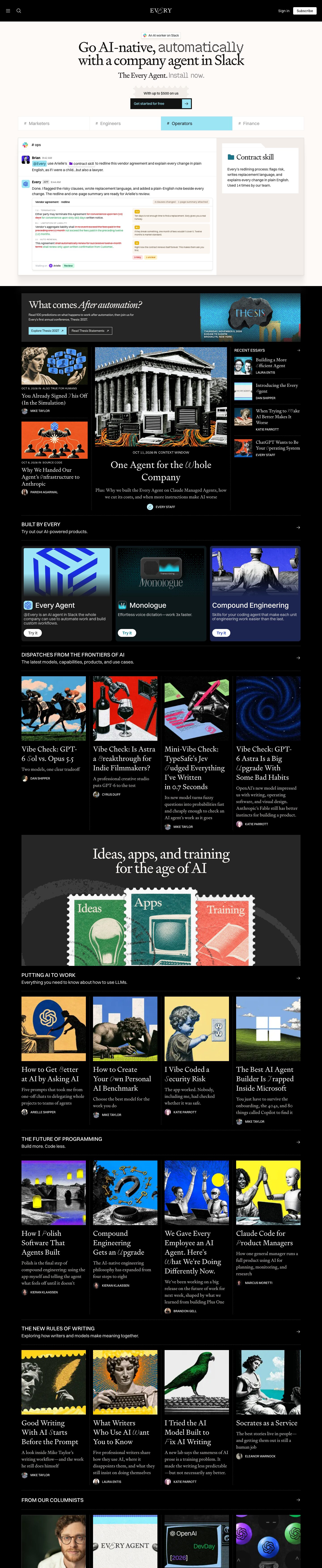
Captured 10 Oct 2026 at 1440px. Scroll the frame to see the whole page.
Every
editorial · literary · confident · nocturnal · witty
Every pairs a literary editorial voice — a high-contrast Signifier serif with ornamental swash initials — against a stark black magazine grid and a warm off-white (#fdfaf7) hero that shows the product as a faithful Slack mockup. The tension between bookish serif, pixel-font accents, collage-style AI illustration and a single icy cyan (#9ce5f5) makes it read like a smart print publication that also ships software.
Palette
Typography
- Headings
- Signifier (Klim Type Foundry)
- Body
- Switzer
- Mono
- Pixel/bitmap display face used for accent words (e.g. 'automatically', 'Install now.')
- Free swap
- Signifier → Newsreader or Source Serif 4 (light/regular optical sizes); Switzer is free via Fontshare, or use Inter; Founders Grotesk → Inter Tight; pixel accent → Silkscreen or Pixelify Sans.
H1 64px Signifier weight 400, line-height 0.9, tracking -4%; H2 44px, line-height 0.86, tracking -4.5%; H3/card titles 32px, line-height 1.1, tracking -4%. Headlines are sentence/title case, never bold — weight stays 400 and size does the work. A signature quirk: the first letter of some words in article titles swaps to a swash/calligraphic italic glyph ('Better', 'Own', 'Trapped'). Article deks are set in Signifier at ~15–16px in stone grey #d6d3d1 with ~1.45 line height. UI text and labels use Switzer 15px; section headers are Switzer uppercase ~17px medium in white with a sentence-case Switzer subtitle below; bylines are tiny uppercase Switzer ~11px with a circular avatar. Datelines like 'OCT 8, 2026 IN SOURCE CODE' are 10–11px uppercase tracked.
More free font pairings →Measured h1: 64px / 400 / -0.04em · body 15px
Signature moves
- Swap one word of a serif headline into a pixel/bitmap font in muted grey to make the 'automated' idea literally visible.
- Replace the first letter of words in article titles with an ornamental swash glyph so every headline feels hand-set and literary.
- Use postage-stamp perforated edges (on the promo ticket, stamps and illustration frames) as a recurring brand motif.
- Flip from a warm paper hero (#fdfaf7) for the product pitch into a pure black editorial index for content, separating 'buy' from 'read'.
- Divide grids with thin dotted graphite rules instead of card boxes, like a printed newspaper.
- Commission consistent collage art — engraved classical figures and halftone photos on saturated flat colour — for every story image.
Layout
1248px content width on a 1440 canvas, centred. Hero is a centred stack on warm paper: pill badge, two-line serif headline, serif subline, ticket-shaped promo, CTA, then a full-width 4-tab strip and a large framed product demo split ~70/30 (Slack thread left, linen sidebar right). Below, the page flips to pure black for the rest — an editorial index: featured promo band, a 3-column front page (narrow left column, wide centre lead story, right 'Recent essays' list), then repeating themed rows of 4 equal cards. Each row is introduced by a header bar with uppercase title, subtitle and right-aligned arrow, bracketed top and bottom by dotted #3c3c3c rules; cards are separated by vertical dotted rules rather than boxes. Density is high but calm thanks to generous 40–60px gaps between sections and square imagery.
Components
- Top nav
- Solid black 80px bar: hamburger and search icons left, centred serif wordmark with a swash 'E', right side plain 'Sign in' text plus a white 4px-radius 'Subscribe' button with black text.
- Hero badge
- Small white pill with thin border, Slack logo and 13px Switzer label, sitting above the headline.
- Mixed-font headline
- Serif headline where one key word is swapped into a grey pixel/bitmap font ('automatically', 'Install now.') to signal machine/automation.
- Primary CTA
- Rectangular black button (0 radius) with ice-cyan text 'Get started for free' and an attached cyan square holding a black arrow, preceded by a postage-stamp-edged light-grey ticket reading 'With up to $500 on us'.
- Persona tabs
- Four equal white cells with thin #e0e0e0 borders, '# Marketers' style Slack-channel labels in grey; active tab fills ice cyan with black text and a thick black underline segment.
- Product demo frame
- White panel with a soft warm multi-layer shadow (rgba(158,153,148) stack), Slack-style messages on the left and a linen #f2ede8 sidebar holding a folder-tab card titled in serif ('Contract skill').
- Editorial cards
- Square full-bleed illustration, then serif title ~28px with swash initials, grey serif dek, and uppercase byline with 20px round avatar; no card background, just dotted vertical dividers.
- Product cards
- Three dark tinted cards (8–10px radius) — charcoal, deep teal, navy #1b2550 — with inset artwork, app icon + Switzer 26px name, short description, and a white pill 'Try it' button.
- Promo band
- Charcoal #262626 block with large serif headline using italic for emphasis ('After automation?'), cyan filled button and outlined white button both with ↗ arrows, image on the right with uppercase event details.
- Brand banner
- Dark panel with centred serif headline over vintage postage stamps labelled Ideas/Apps/Training, reinforcing the stamp motif.
Product UI
The product is shown as a high-fidelity stylised Slack recreation, not a screenshot: '# ops' channel header, avatar + bold name + grey timestamp messages, an '@Every' mention chip in ice cyan, an inline 'contract skill' chip with purple folder icon, and an 'APP' tag. The agent reply embeds a compact document card: tiny uppercase clause labels, red strikethrough deletions and green insertions, yellow numbered annotation notes on beige blocks, small red '3 risky' and yellow '1 unclear' pills, and a footer 'Waiting on Arielle' with a mint 'Review' badge. Density is high, text 11–15px, borders are 1px light grey, radii small (4–8px), colour reserved strictly for semantic meaning (diff red/green, status pills). App screens should feel like this: neutral white surfaces, hairline borders, colour only for state.
Great for
- Media and newsletter publications
- AI tools sold alongside thought leadership
- Content-led SaaS with a strong editorial voice
- Research labs and studios
- Subscription bundles of software plus writing
Watch out for
- Signifier is a licensed Klim font — substitute Newsreader or Source Serif 4, and don't fake swash initials with random script fonts; use a matching italic swash or skip it.
- Bold serif headlines — the look depends on weight 400 with tight -4% tracking; heavier weights become clunky.
- Spreading ice cyan everywhere; it works because it's the only accent and marks CTAs and active states.
- Generic stock or 3D AI imagery — the black grid only works with distinctive, cohesive illustration.
- Grey #d6d3d1 serif deks at small sizes on lighter backgrounds; they rely on pure black for contrast.
- Overusing the pixel font beyond one or two accent words.
Design like Every
Read https://pageproofer.com/inspiration/warm-editorial/every.md and open its screenshots. To design in this style, set headings in a light-contrast serif (Signifier, or Newsreader as a free substitute) at weight 400: H1 64px/0.9 with -0.04em tracking, H2 44px/0.86 with -0.045em, H3 32px/1.1. Use Switzer (or Inter) 15px for UI and labels, with uppercase 11px bylines and uppercase ~17px section titles followed by a sentence-case subtitle and a right-aligned → arrow. Start with a warm paper hero (#fdfaf7, text #121212) containing a centred headline where one word is set in a grey pixel font, a black 0-radius CTA with #9ce5f5 text and a cyan arrow square, and a framed product mockup with a soft warm layered shadow and a #f2ede8 sidebar. Then switch the rest of the page to #000000 with white headings, #d6d3d1 serif deks, #1a1a1a/#262626 panels, and 4-column grids at 1248px max width separated by 1px dotted #3c3c3c rules instead of card boxes. Keep radii at 0–4px for buttons and 8–10px for product cards, use #9ce5f5 as the single accent for CTAs and active tabs, and pair every story with square, saturated collage-style illustration.