
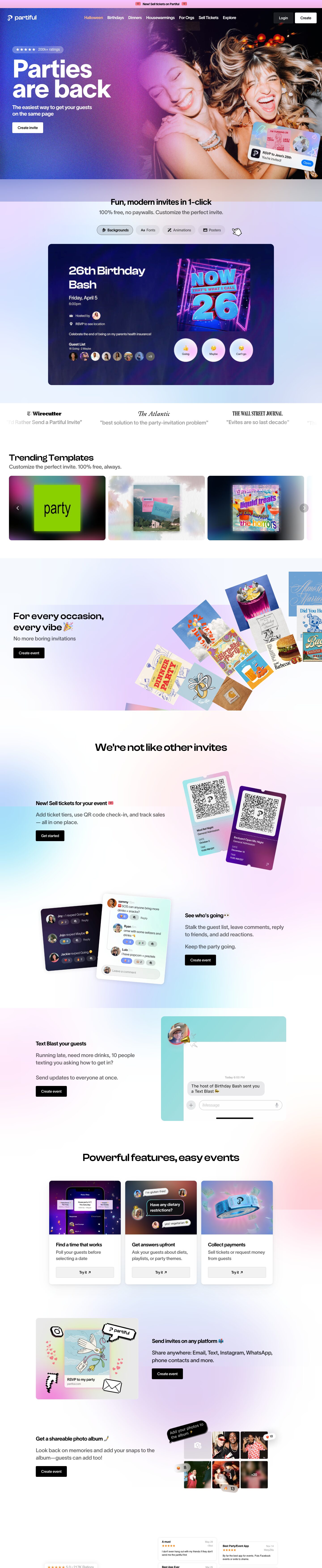
Captured 11 Oct 2026 at 1440px. Scroll the frame to see the whole page.
Partiful
playful · iridescent · youthful · confident · social
Partiful pairs a stark black-and-white UI system (black text, black or white rectangular buttons, plain white cards) with a dreamy iridescent backdrop of pastel lavender, sky blue and peach gradients, plus a loud, grainy flash-photo hero. The restraint of the chrome lets the invites, photos and Gen-Z copy carry the personality, so the page feels like a party poster but still reads as a trustworthy tool.
Palette
Typography
- Headings
- TWK Lausanne Pan (850 for hero, 700 for section heads) plus a wide custom 'Partiful Display Medium' for some section titles
- Body
- TWK Lausanne Pan 550
- Free swap
- TWK Lausanne is proprietary (Weltkern). Use Inter Tight or Inter at 800–900 for the hero and 600–700 for heads; for the wide 'Partiful Display' titles use Unbounded or Syne at 600 with tight tracking.
Hero H1 is 112px at weight ~825, line-height 0.8 and -3% tracking, so the two lines nearly touch and read as one dense block. Section titles run ~36–48px in the extended display face with tight tracking (-4%). Feature heads are 18–24px bold, tracking -4%, line-height 1.2. Body and nav sit at 16–20px weight 550, line-height 1.4, -2% tracking; supporting copy is large (20px) in mid grey. Everything is sentence case and conversational, with emoji inline in headings (🎉, 👀, 📫).
More free font pairings →Measured h1: 112px / 825 / -0.03em · body 16px
Signature moves
- Keep all UI chrome strictly black and white with sharp 4px buttons, and let iridescent pastel gradients (lavender, sky, peach, pink) bleed across section backgrounds to supply the colour.
- Set the hero headline enormous and ultra-heavy with 0.8 line-height and -3% tracking over a grainy, flash-lit lifestyle photo washed with a blue-to-magenta gradient.
- Show the product as tilted, floating UI fragments and notifications (RSVP push, comment thread, tickets) rather than full device screenshots.
- Drop emoji directly into headings and write in casual, joking voice ('Stalk the guest list', 'Evites are so last decade').
- Mix in Y2K/pixel-art stickers and a wide display face for section titles to signal fun without changing the base UI system.
Layout
Centred ~1010px content column on a 1440 canvas, with a full-bleed hero photo and full-bleed gradient washes behind sections. Below the hero, sections alternate text-left/visual-right and visual-left/text-right in a two-column split, each with a 20px bold head, two lines of large grey copy and a black CTA. Generous vertical gaps (~150–250px) between sections; centred headlines introduce grouped modules (tabbed invite demo, three-up feature cards, reviews). A horizontal template carousel and a scrolling press-quote marquee break the rhythm. Density is low and airy.
Components
- Announcement bar
- Thin full-width bubblegum-pink strip (~30px) with centred bold 14px black text flanked by ticket emoji.
- Navigation
- Transparent over the hero: white wordmark left, centred white 16px links with the active/seasonal link in peach #ffba85, right side a dark translucent 'Login' button and solid white 'Create' button, both 4–8px radius.
- Hero
- Full-bleed grainy flash photo of friends partying with a blue-to-magenta gradient wash on the left for text legibility; pill rating badge (translucent white, stars + '200k+ ratings'), giant white H1, white subhead and a white rectangular 'Create invite' button. A tilted iOS-style notification card ('RSVP to Jess's 28th') overlaps the bottom right.
- Buttons
- Rectangular, 4px radius, black fill with white 14–16px text (or white fill on dark). Secondary 'Try it ↗' buttons are full-width light grey fills inside cards. No gradients or rounded pills on primary CTAs.
- Tab chips
- Pill segmented tabs with icon + label in pale grey; active tab gets a slightly darker fill and thin outline; a pixel-art hand cursor sits beside them as a hint.
- Feature cards
- Three white cards, 12px radius, layered soft shadow (0 20px 60px at 5% black), top half a vivid full-bleed product image, bottom half bold title, grey description and grey full-width button.
- Social proof
- Infinite marquee of press logos in their native serif mastheads with grey quotes; app-store review cards as small white tiles with 8px radius, faint shadow, orange stars.
- Product mockups
- Floating, slightly rotated UI fragments (chat threads, tickets with QR codes, photo grids with reaction pills) on iridescent backgrounds, sometimes with pixel-art stickers and speech bubbles.
Product UI
The app UI is shown in fragments: an event page with a huge display title ('26th Birthday Bash'), small grey metadata rows with icons, an avatar stack guest list with '+9' counter, and three glassy circular RSVP buttons (Going / Maybe / Can't go) with emoji. Comment threads use small round avatars, 14px text, and pill reaction chips with emoji counts; a dark navy variant exists. Tickets are rounded cards with QR codes and gradient headers. The UI is medium-light density, borderless, relies on soft shadows and translucent white surfaces over holographic gradient backgrounds, with blue iOS-style accents only in system notifications. Personality lives in user-chosen backgrounds, fonts and poster art; the controls stay neutral.
Great for
- Consumer social apps
- Event, ticketing and RSVP tools
- Gen-Z lifestyle products
- Creator and community platforms
- Playful consumer fintech or payments-for-friends
Watch out for
- Low-contrast light grey copy on pale gradient backgrounds — the faint metadata on the invite demo fails contrast; keep body text at #5a5a5a or darker.
- Saturating the gradients; they must stay pastel and blurry or the black UI loses its calm.
- Using TWK Lausanne without a licence — substitute Inter Tight or Inter.
- Adding coloured primary buttons; the black rectangle CTA is the anchor.
- Overusing tilted mockups and stickers in dense app screens where clarity matters.
Design like Partiful
Read https://pageproofer.com/inspiration/fun-funky/partiful.md and open its screenshots. To design in this style, build a black-and-white UI on #ffffff: text #000000, secondary copy #5a5a5a at 20px, primary buttons solid black with white 16px text, 4px radius, ~12px×20px padding. Behind sections, place large blurred radial gradients in lavender #e9dcf7, sky #cfe3fb, pink #f7c6f0 and peach #ffba85 at low opacity so colour washes rather than fills. Use Inter Tight (stand-in for TWK Lausanne) at 800–900, 96–112px, line-height 0.8, letter-spacing -0.03em for the hero; section titles 40–48px with -0.04em tracking (optionally Unbounded for a wide display feel); feature heads 20px bold; body 16px weight 500–550, line-height 1.4. Constrain content to ~1010px, alternate text/visual two-column sections with 160–240px vertical gaps. Cards are white, 12px radius, shadow 0 20px 60px -2.5px rgba(0,0,0,0.05) layered with smaller ones. Show the product as floating, slightly rotated UI snippets (notifications, chat bubbles, tickets, avatar stacks, emoji reaction pills), and write copy casually with inline emoji. Add a thin pink announcement bar and a peach highlight for the active nav item.