
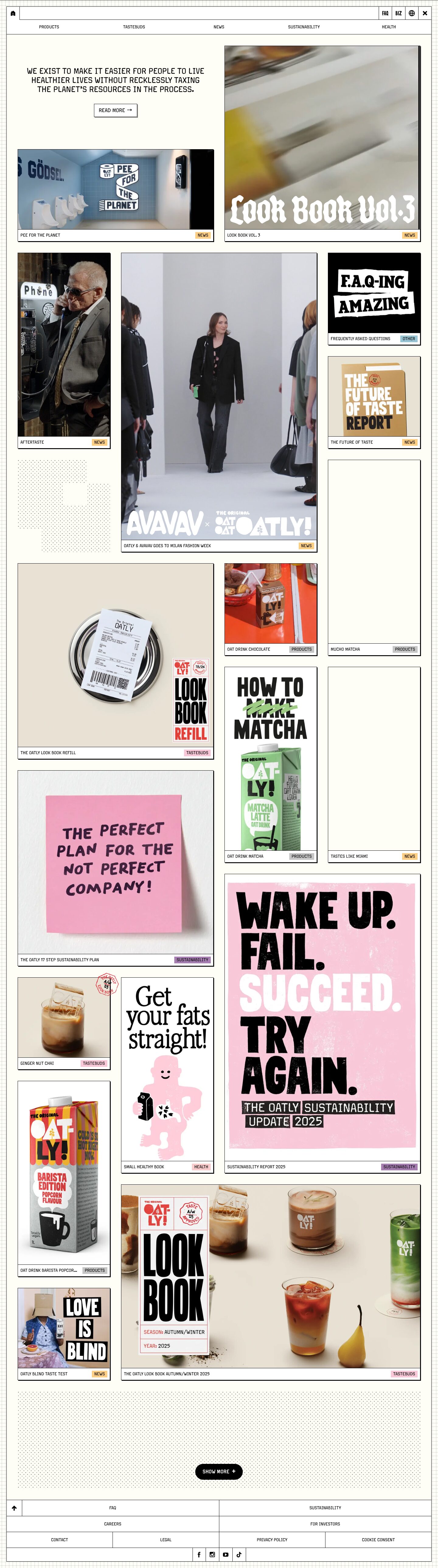
Captured 11 Oct 2026 at 1440px. Scroll the frame to see the whole page.
Oatly
irreverent · editorial · handmade · brutalist · playful
Oatly's homepage is a cream-paper bulletin board: a hairline-black frame and nav grid hold a masonry wall of square-cornered cards, each with a 2px hard black offset shadow, a tiny uppercase caption bar and a pastel category tag. The UI chrome is deliberately plain and mechanical so the loud, hand-made campaign artwork (posters, packaging, hand lettering) can carry all the personality.
Palette
Typography
- Headings
- Margo Pro Regular
- Body
- Margo Pro Regular
- Free swap
- Margo Pro is proprietary; use Chakra Petch or Saira Semi Condensed (Google Fonts) for the squared, slightly condensed uppercase feel. Space Grotesk is a softer fallback.
One typeface, one weight (400), always uppercase. The mission statement H1 is 30px, line-height 1.0, tracking 0, centred over three lines. Card titles and nav items are tiny, 12–16px uppercase at weight 400 with line-height 1.2. The CTA is around 16px. There is no large display type in the UI itself. All expressive, huge type lives inside the imagery (blackletter 'Look Book Vol.3', stencil posters, hand-drawn sticky notes), so the system type stays small and neutral.
More free font pairings →Measured h1: 30px / 400 / 0em
Signature moves
- Give every card a 1px black border plus a 2px 2px 0 solid black shadow, so tiles look like printed cards pinned to paper.
- Keep all UI type tiny, uppercase and in a single weight, and let the content imagery hold the shouting, hand-made typography.
- Colour-code content categories with flat pastel tag chips. This is the only colour in the chrome.
- Build navigation and the footer as ruled table cells with 1px black dividers, like a form or ledger.
- Fill empty masonry gaps with halftone dot-pattern blocks, and put a faint graph-paper grid behind the frame.
- Use cream #fffef6 instead of white for the page, so the white cards read as paper laid on paper.
Layout
Full-bleed page with a faint graph-paper grid texture in the margins. A 1px black-bordered frame (about 1399px wide) contains everything. Inside it is a 3–4 column masonry of cards at mixed sizes: large 2-column landscape tiles, tall portrait tiles and small squares, with roughly 24–36px gutters. Content is dense and continuous, with no section headers or bands, just one scrolling wall. Empty slots are filled with halftone dot-pattern blocks rather than left blank. The hero is only a centred mission sentence and a button sitting in an empty grid cell beside a large video tile. The footer is a table of bordered cells.
Components
- Top bar
- A bordered strip with a square home-icon cell on the left, a long empty bar, then square cells for FAQ, BIZ, a globe and a close X, all divided by 1px black rules. Below it, a full-width row of 5 evenly spaced uppercase links (Products, Tastebuds, News, Sustainability, Health) at about 12px.
- Content card
- 0px radius, 1px black border, 2px 2px 0 black hard shadow. The full-bleed image or video sits on top, with a white caption bar below holding the uppercase title at about 12px on the left and a small pastel tag on the right.
- Category tag
- Small rectangular chip, no radius, about 11px uppercase black text on a flat pastel fill. Colour encodes the category: apricot #fdcf85 for News, pink #f8c8d8 for Tastebuds, lilac #a67eb1 for Sustainability, grey #c6c6c6 for Products, blush #fbcccc for Health.
- Primary button (Read more)
- White box with a 1px black border, square corners and a 2px hard offset shadow, uppercase label plus a → arrow.
- Show more button
- A black pill (9999px radius) with white uppercase text and a '+'. It sits centred over a large halftone-dot panel and is the only rounded element on the page.
- Footer
- A spreadsheet-like grid of bordered cells with centred uppercase links, a back-to-top arrow cell, and a row of small square social-icon cells.
Product UI
There is no software UI. The 'product' is oat drink cartons and campaigns, shown through real photography, packaging shots, autoplaying video and poster artwork inside cards. The interface around them is a low-density, wireframe-like system: black hairline rules, square corners, tiny uppercase labels and pastel tag chips. Icons are minimal solid glyphs (house, globe, X, up arrow, social logos). For app screens, this translates to bordered table-cell layouts, hard-shadow cards and a colour-coded tag system on cream.
Great for
- Consumer brands with strong campaign creative
- Editorial and content hubs
- Food and beverage
- Indie magazines and zines
- Portfolio or agency sites with loud artwork
- Community bulletin or news boards
Watch out for
- Using it with weak or stock imagery: the chrome is intentionally bland and depends on bold content.
- Soft blurred shadows, rounded cards or gradients, which break the print and brutalist logic.
- Making the tiny 12px uppercase captions any lighter than pure black on cream, which kills legibility.
- Licensing assumptions: Margo Pro is proprietary, so substitute Chakra Petch or Saira Semi Condensed.
- Adding many accent colours to buttons or links: colour belongs only in category tags and imagery.
- Leaving masonry gaps empty: fill them with texture or the grid looks broken.
Design like Oatly
Read https://pageproofer.com/inspiration/fun-funky/oatly.md and open its screenshots. To design in this style, set the page background to #fffef6 with a faint 1px graph-paper grid outside a 1px #000 framed container about 1400px wide. Use one squared uppercase typeface (Chakra Petch as a stand-in for Margo Pro) at weight 400 for everything. Hero statements are 30px with line-height 1.0, centred. Nav, captions and tags are 11–14px uppercase. Build nav and footer as rows of cells separated by 1px black borders. Lay content out in a 3–4 column masonry of cards with 0px radius, a 1px black border, `box-shadow: 2px 2px 0 #000`, a full-bleed image on top and a white caption bar below with the title left-aligned and a pastel tag on the right (#fdcf85, #f8c8d8, #a67eb1, #c6c6c6, #fbcccc). Buttons are square white boxes with a black border and the 2px hard shadow, except for a single black pill 'Show more +' button. Fill empty grid cells with halftone dot patterns. Keep all chrome black, white and cream, and let bold imagery supply the colour and the personality.