
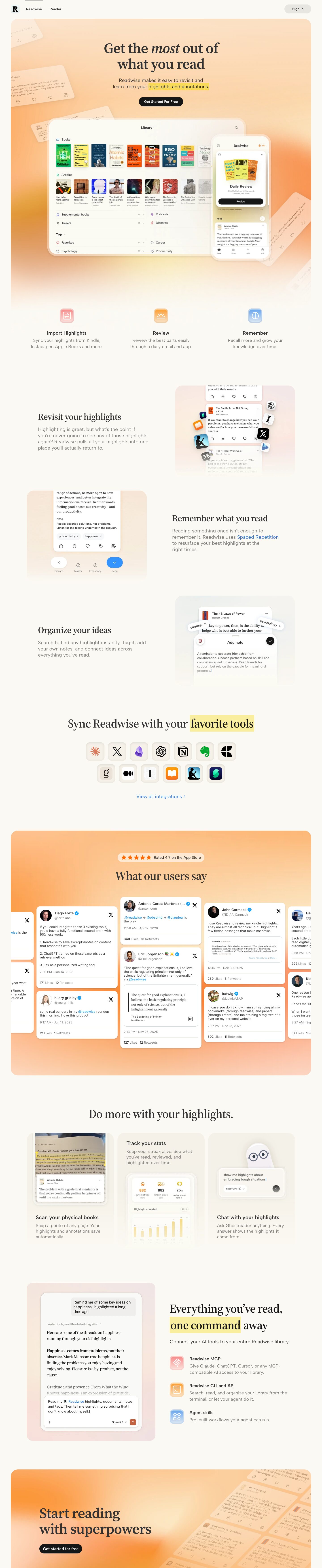
Captured 11 Oct 2026 at 1440px. Scroll the frame to see the whole page.
Readwise
warm · literary · calm · polished · friendly
Readwise pairs a warm off-white paper canvas (#fbf9f3) with a literary serif (Source Serif 4) and soft peach-to-tangerine gradient panels, so the page feels like a well-made book. The product is shown through polished, slightly faded app mockups and a yellow highlighter-swipe motif behind key phrases, which ties every section back to the act of reading and highlighting.
Palette
Typography
- Headings
- Source Serif 4
- Body
- Albert Sans
- Free swap
- None needed. Source Serif 4, Albert Sans and Inter are all free on Google Fonts.
The H1 is 64px Source Serif 4 at weight 600, 1.1 line height and -0.02em tracking, centered over two lines, with one word set in italic ('most') for a literary emphasis. Section headings use the same serif at roughly 40–48px, sentence case. Feature and card titles switch to Albert Sans 22–24px at weight 600 and 1.27 line height. Body copy is Albert Sans around 18–20px in #7b7a79 with generous line height of about 1.5 and slightly open tracking, so paragraphs read light and airy. Mockup reading content is set in the serif to look like book text, while UI chrome inside mockups uses the sans at 11–13px.
More free font pairings →Measured h1: 64px / 600 / -0.02em · body 29px
Signature moves
- Put a flat yellow highlighter rectangle behind one key phrase per section, so the brand's core action becomes a typographic device.
- Set headlines in a bookish serif and italicise a single emotional word, then switch to a clean humanist sans for everything functional.
- Wrap major sections in large rounded panels filled with blurred peach-to-tangerine gradients that dissolve into the paper background instead of ending in a hard edge.
- Show the product through soft, partially faded device mockups with translucent cream bezels, cropped and overlapped so they feel ambient rather than technical.
- Let the social-proof wall bleed past the container edges with real tweet cards in a masonry layout, which implies an endless stream of fans.
- Use glossy gradient icon tiles in coral, amber and sky blue as the only saturated colour outside the gradients.
Layout
The page sits in a roughly 1344px container on a 1440 viewport, with big rounded panels (~30px radius) inset ~40px from the edges. The hero is a single centered column: headline, two-line subhead, pill CTA, then an overlapping tablet-plus-phone mockup that bleeds into a gradient panel that fades to the background at the bottom. Next comes a three-up icon row (Import, Review, Remember), then alternating left/right text-and-image rows with about 50/50 split and large vertical gaps of 150–200px. A centered integrations grid of app icons follows, then a full-bleed gradient testimonial wall of tweet cards that runs off both edges, a three-card 'Do more' bento, an AI/MCP split section, and a gradient closing CTA panel. Density is low, with whitespace doing most of the pacing.
Components
- Navigation
- Minimal top bar on the paper background. Square R logo tile on the left, two plain text links (Readwise, Reader), with the active one marked by a thin dark bar at the very top edge. A light grey (#e8e6e1) pill 'Sign in' button sits on the right.
- Primary button
- Near-black #161616 pill with 40px radius, white Albert Sans ~15px semibold text and compact padding (~12px × 20px). It is the only dark element in its section.
- Hero panel
- Rounded ~30px container filled with a soft blurred gradient that runs from pale peach at the top to saturated tangerine and ochre at the sides. It fades to white at the bottom so the feature row floats on it.
- Device mockups
- A tablet frame and a phone frame with thick translucent cream bezels, a soft multi-layer shadow and an overlapping placement. Content is faded and low-contrast so it reads as atmosphere rather than as a feature to inspect.
- Feature icons
- Rounded-square app-style glyph tiles about 44px, with soft gradient fills in coral, amber or sky blue, a subtle inner highlight and white line icons.
- Highlighter text
- Key phrases in a subhead or headline get a flat yellow rectangle behind them (#f7dc1f in body text, a paler butter tone on serif headlines), like a real highlighter.
- Integration tiles
- About 56px rounded squares on a parchment background, each with a hairline border and an inset shadow so the logos look recessed. Two centered rows, with a blue 'View all integrations >' text link below.
- Testimonial wall
- Real X/Twitter post cards with 16px radius, white fill and a small shadow, arranged in a masonry layout. Cards run past the panel edges and sit on an orange gradient. A cream pill with orange stars says 'Rated 4.7 on the App Store'.
- Bento cards
- Three equal cards with a parchment gradient that fades to the background. Each has a title and grey description, with an embedded mini-UI such as a stats chart in pale yellow bars or a chat input featuring a ghost mascot.
- Final CTA
- A wide gradient panel with a large left-aligned serif headline and a black pill button. On the right, angled faded highlight cards tile diagonally off the edge.
Product UI
The page uses real-looking app screens styled into mockups: a tablet library view, an iOS phone app, review cards, an add-note sheet, a stats chart and an AI chat. The UI is airy and warm. Backgrounds are white or cream, rows are separated by hairline dividers (#efebdf), counts sit in small grey text aligned right, and icons are outline style at 14–16px with occasional colour tints (blue book, red heart, purple podcast). Highlight text inside cards is set in serif to mimic book pages, with sans used for metadata. Tag chips are small rounded pills with an × to remove. Action bars use five evenly spaced outline icons. The primary action is a black or bright-blue (#2675de-like) pill, and secondary actions are white circles. Gradients sit behind the UI, never inside it.
Great for
- Reading, note-taking and knowledge tools
- Consumer productivity apps
- Writing or publishing platforms
- Learning and spaced-repetition products
- Calm, premium mobile-first SaaS
Watch out for
- Grey body text (#7b7a79) on #fbf9f3 is borderline for contrast. Keep it at 18px or above, and darken it toward #5f5e5c for smaller sizes.
- Overusing the yellow highlight. One phrase per section keeps the device meaningful.
- Hard-edged or neon gradients. The peach and orange must be heavily blurred and fade out to paper.
- Pure white page backgrounds and cool greys, which break the warm paper feel.
- Mockups so faded or cropped that users can't tell what the product does.
- Using the serif for UI labels or buttons. Keep it for headlines and reading content.
Design like Readwise
Read https://pageproofer.com/inspiration/warm-editorial/readwise.md and open its screenshots. To design in this style, set the page background to #fbf9f3 with white (#ffffff) cards and #f5f1e8 parchment surfaces, text in #333333, and secondary text in #7b7a79. Use Source Serif 4 at weight 600 for headlines: 64px H1, line height 1.1, -0.02em tracking, sentence case, with one word italicised. Use Albert Sans for everything else: 22–24px/600 for titles, 18–20px for body with line height around 1.5. Make primary CTAs #161616 pills with 40px radius and white semibold text, and secondary buttons #e8e6e1 pills. Place major sections inside 30px-radius panels inset about 40px from a 1344px container, filled with blurred radial gradients from pale peach (#fde3c8) to tangerine (#f9a25a) that fade to the background at the edges. Highlight one key phrase per section with a flat #f7dc1f (or paler butter) rectangle behind the text. Present the product in overlapping device mockups with translucent cream bezels and layered soft shadows (0 6px 10px rgba(0,0,0,.1), 0 12px 48px rgba(0,0,0,.15)). Use 16px-radius cards, #dbd7cd or #efebdf hairline borders, glossy gradient icon tiles in coral, amber and blue, alternating text/image rows, and 150px+ vertical spacing between sections.