
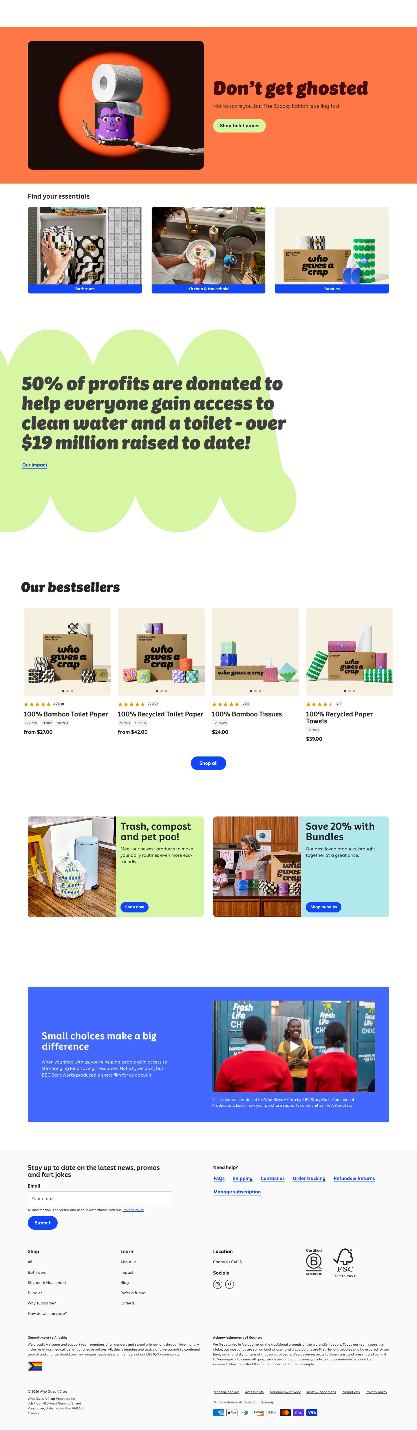
Captured 11 Oct 2026 at 1440px. Scroll the frame to see the whole page.
Who Gives A Crap
playful · cheeky · bold · warm · friendly
Who Gives A Crap pairs a chunky, black-italic custom display face with flat, saturated colour fields (tangerine, electric blue, lime, aqua) on a mostly white canvas, so an everyday commodity reads as cheeky, warm and giftable. The structure underneath is a disciplined, shadowless e-commerce layout with 8–12px cards, pill buttons and one cobalt action colour, which keeps the jokes and colour blocks from turning chaotic.
Palette
Typography
- Headings
- Crapcase Display (Black Italic for hero/statement headings, Medium for section titles)
- Body
- Crapcase Text
- Free swap
- Crapcase is proprietary. Use Bowlby One or Chewy for the heavy display. Lilita One with a synthetic slant also works, though Grandstander Black Italic or Sansita Black Italic come closest. Use Sniglet, Fredoka or Nunito for Crapcase Display Medium, and Figtree or Lexend for Crapcase Text body.
H1 is 68px Display Black Italic at weight 400 (the weight lives in the font file), line-height 1.0, 0 tracking, sentence case, in a deep maroon #450d0d on the orange hero. The impact statement uses the same face at around 60px in #3f3f3f, set over 4 lines. Section titles like 'Our bestsellers' are about 40px black italic. Smaller headings ('Find your essentials', promo card titles) are 24–32px Display Medium, upright, line-height 1.0–1.1. H3s and product names are 18–20px Crapcase Text at weight 600, line-height 1.4. Body is 16px at weight 400, line-height 1.4, in #262626. Microcopy (variant chips, footer legal, captions) is 11–13px. Nav links are 16px at weight 500. Use the black italic only for one statement per section and keep everything else upright.
More free font pairings →Measured h1: 68px / 400 / 0em · body 16px
Signature moves
- Set one hero line per section in a heavy black-italic display face at line-height 1.0 and let it carry the brand voice, while all other type stays upright and quiet.
- Flood whole bands or blobs with flat saturated brand colours (tangerine, lime, aqua, cobalt) instead of using gradients or shadows, and use colour fields as section dividers.
- Break the grid with a giant organic scalloped shape that bleeds off the viewport edge behind the key mission statistic.
- Make cobalt #0f47ff the single action colour for buttons, links, and category label bars. Switch to a lime pill only when the button sits on a coloured field.
- Write UI copy with jokes in functional places, such as the newsletter heading, the empty cart and the hero subline, so the personality lives in the words as much as the visuals.
- Shoot products on a warm kraft-cream backdrop so the patterned packaging pops, and keep these tiles consistent across the catalogue.
Layout
The page centres on a 1248px content column on a 1440 viewport, with roughly 96px gutters. The hero is a full-bleed tangerine band with a two-column split: a large rounded (12px) dark image card on the left and left-aligned headline, subline and CTA on the right. After that comes a three-up category grid, then a giant lime scalloped 'cloud' blob that bleeds off the left edge to carry the impact statement. A four-column bestseller grid follows, then two half-width split promo cards (image left, coloured panel right), then a full-width cobalt-blue (#4268ff) panel with copy and video. The footer sits on #fafafa. Whitespace is generous, with 120–200px between sections, and density inside cards is moderate. Everything is left-aligned except the 'Shop all' button. A thin announcement bar in aqua sits above a white nav with a centred logo.
Components
- Announcement bar
- About 36px tall on #b1e8eb with centred 14px dark text and an underlined cobalt link ('Shop Halloween rolls').
- Navigation
- White, about 64px tall. Text links (Shop, Impact, About us, Refer a friend) sit left in 16px semibold charcoal, the stacked blue wordmark logo is centred, and line-icon account and cart sit right. There is no background colour or shadow, just a hairline separation.
- Primary buttons
- Fully rounded pills (radius 100px). On colour fields the button is lime #d7f6a4 with dark text. On white it is cobalt #0f47ff with white 14–16px semibold text. Padding is about 12×24px, with no shadow or border.
- Category cards
- Lifestyle photo cards with an 8px radius and a 1px #d8d8d8 border. The bottom edge is a solid cobalt label bar holding white 13px centred text ('Bathroom', 'Kitchen & Household', 'Bundles').
- Product cards
- Product shot on a kraft-cream #f5f0e0 tile (8px radius) with carousel dots. Below it: orange star rating plus review count, an 18–20px semibold product name, tiny bordered variant chips (12 Rolls / 24 rolls) and a bold 'from $27.00' price. There are no card borders or shadows below the image.
- Split promo cards
- Two half-width cards with a 12px radius: a photo on the left half and a flat pastel panel (lime or aqua) on the right half. Each panel holds a 32px Display Medium title, 14px body and a small cobalt pill button pinned to the bottom.
- Impact blob
- An oversized lime organic shape with scalloped cloud edges, bleeding off the viewport. It holds a huge black-italic statistic sentence and an underlined cobalt text link.
- Mission panel
- Full-width #4268ff rounded (8px) block with white text on the left and an embedded video thumbnail on the right, plus a small caption.
- Footer
- #fafafa background. The newsletter block ('news, promos and fart jokes') has a 4px-radius bordered input and a cobalt pill Submit button. Help links are underlined cobalt. Below are four link columns, B Corp and FSC badges, allyship and Acknowledgement of Country paragraphs, and payment icons.
Product UI
The product is physical, so the page shows real photography: styled packaging shots on #f5f0e0 cream tiles and lifestyle scenes in bathrooms and kitchens. The commerce UI itself is light and flat: no shadows, 1px #d8d8d8 borders, 8px radii, small rounded variant chips, orange star ratings, carousel dots, line icons, and cobalt for every interactive element. For app screens, carry over white surfaces, charcoal text, flat pastel panels to group content, pill CTAs and playful empty-state copy.
Great for
- DTC consumer goods
- sustainable or mission-driven brands
- subscription household products
- snack and beverage brands
- friendly fintech or utility apps with a humorous voice
- charity and impact storytelling sites
Watch out for
- Using the black-italic display face for body or long UI labels; it is only legible large and in short lines.
- Putting white text on #d7f6a4 lime or #b1e8eb aqua, which gives very low contrast. Keep dark text on pastels.
- Assuming Crapcase is available; it is a licensed custom font and needs a free substitute.
- Adding drop shadows, gradients or glassmorphism, which break the flat, printed-packaging feel.
- Introducing a second action colour; cobalt must stay the only clickable colour on white.
- Overloading every section with colour; the white space between colour blocks is what keeps it calm.
Design like Who Gives A Crap
Read https://pageproofer.com/inspiration/fun-funky/who-gives-a-crap.md and open its screenshots. To design in this style, use a white #ffffff page with #262626 text and a 1248px centred container. Set statement headings in a heavy black-italic display font (e.g. Sansita Black Italic) at 56–68px, line-height 1.0, sentence case, one per section. Use a rounded upright display (Fredoka) at 24–32px for subsection titles and Figtree 16px/1.4 for body. Make every action #0f47ff: fully rounded pill buttons (radius 100px, about 12×24px padding, white semibold text) and underlined text links. On coloured fields, switch to a #d7f6a4 pill with dark text. Build sections as flat colour bands or panels in #ff7744, #d7f6a4, #b1e8eb and #4268ff with no gradients or shadows. Use 8–12px radii on cards and 1px #d8d8d8 borders, and set product imagery on #f5f0e0 tiles. Add one oversized organic scalloped blob that bleeds off the edge behind a key statistic. Leave 120–200px between sections, and write cheeky, human microcopy in the hero subline, newsletter prompt and empty states.