
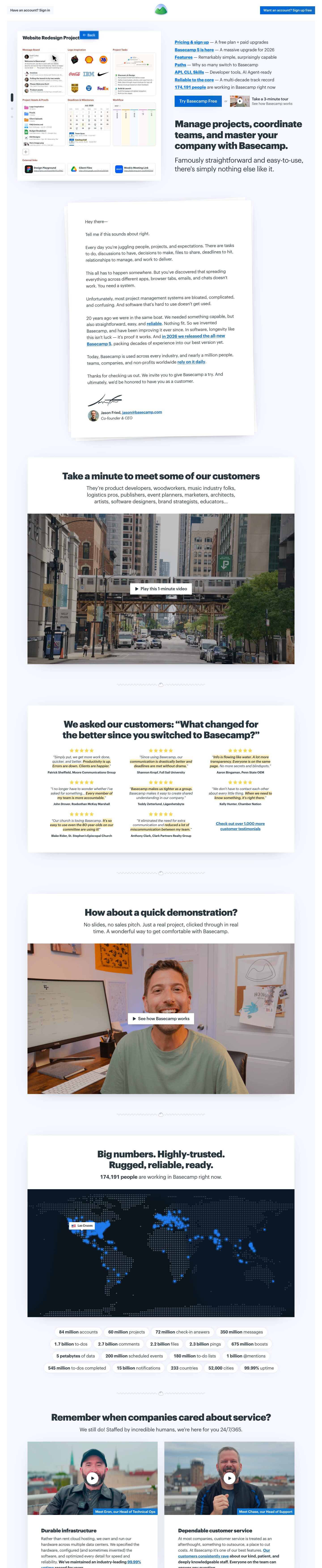
Captured 10 Oct 2026 at 1440px. Scroll the frame to see the whole page.
Basecamp
candid · calm · sturdy · friendly · editorial
Basecamp's homepage reads like a confident, plain-spoken letter. Heavy 800-weight Graphik headlines, a single link blue, and white cards floating on a pale mint field carry a page whose argument is mostly words, real people and real product. It works because every device signals honesty and calm: an underlined index of links instead of a nav bar, a signed founder letter, unpolished customer videos and hard numbers, all framed with almost no decoration.
Palette
Typography
- Headings
- Graphik
- Body
- Graphik
- Free swap
- Graphik is a licensed Commercial Type face. Use Inter Tight at 800 for headings and Inter at 400 for body; Schibsted Grotesk is a warmer alternative.
Graphik carries the entire page. The H1 is 42px (scaled up to roughly 48–56px on wide screens), weight 800, line-height 1.15, tracking -2.6%, sentence case, slate #29353c. Directly under it sits a 31px weight-400 subhead at line-height 1.3 with the same -2.6% tracking, so the heavy/light pairing does the hierarchy work. Section titles are 36–42px at 800, centred, sometimes split over two lines. Card titles (H3) are 23px at 800, line-height 1.5, tracking -1.4%. Body copy runs about 16–18px at 400 with generous ~1.6 leading; the founder letter is set slightly larger. Links are blue #2377d2, bold and always underlined, and the hero link list sets them at about 19px semibold. Testimonials are small (~13px) italic quotes with key phrases bolded on a yellow highlight, followed by a bold ~12px attribution. No uppercase eyebrows anywhere.
More free font pairings →Measured h1: 42px / 800 / -0.026em · body 7px
Signature moves
- Replace the nav bar with an index of underlined bold links, each followed by an em-dash explanation, so the hero doubles as a table of contents.
- Float square-cornered white cards on a faint mint-grey field and separate them with hand-drawn squiggle dividers instead of alternating section colours.
- Pair an 800-weight tightly tracked headline with a large 400-weight subhead in the same family, with no eyebrow and no gradient.
- Make the pitch a signed, slightly rotated paper letter from the founder, complete with email address and handwritten signature.
- Bold the money phrase in each customer quote on a yellow highlighter background so the wall of testimonials is scannable.
- Prove scale with dozens of plain stat pills (bold number plus noun) rather than three giant hero metrics.
Layout
The page sits inside a ~1195px content frame. A pale mint panel fills the viewport width minus ~30px gutters, so the white cards appear to float on a tinted sheet. The hero is a two-column split: a large tilted-free product mockup card on the left (~540px), and on the right a stacked link-index, CTA row, H1 and subhead, all left-aligned. Below the hero everything becomes a single centred column of white cards, ~830px wide, each holding a centred title, a short grey-ish lede, and then a full-bleed media block (video still, dark map) flush to the card edges. Hand-drawn squiggle dividers with a tiny Basecamp mountain separate sections and replace the need for background colour changes. Vertical rhythm is roomy (~100–140px between cards) while content inside cards is fairly dense. Two-column card grids appear only for the service/infrastructure section.
Components
- Top bar
- There is no nav menu. A grey-filled 'Have an account? Sign in' chip sits left, the mountain logo is centred, and a solid blue 'Want an account? Sign up free' button sits right. All three use 0px radius and ~14px medium text.
- Hero link index
- Seven lines, each starting with a bold underlined blue link followed by an em dash and a plain-language explanation ('Pricing & sign up — A free plan + paid upgrades'). This replaces both nav and feature bullets.
- Primary button
- Solid #2377d2 rectangle, 0px radius, white ~18px medium text, ~16×24px padding. An italic grey 'or' links it to a video-thumbnail tour link with a bold title and grey subline.
- Founder letter
- A white page with stacked-paper edges, slightly rotated, with a soft shadow. Plain serif-free letter copy opens 'Hey there—' and contains underlined inline links. It closes with a scanned signature, avatar, name, email and italic title.
- Section cards
- White, square-cornered cards on the mint field with a very soft multi-layer diffuse shadow (≈4% black stacks) and no visible border. The title and lede are centred; media bleeds edge to edge at the bottom.
- Video blocks
- Unpolished real footage stills (a city street, a presenter at a home desk) with a small white rectangular label button carrying a ▶ icon and a plain text label such as 'Play this 1-minute video'.
- Testimonial grid
- A 3-column grid of yellow 5-star rows, short italic quotes with key phrases bolded on a yellow highlighter background, and a bold name and company line. The final cell is an underlined blue link to 1,000 more.
- Stat pills
- Fully rounded white pills with a hairline border, centred and wrapping in rows. Each pairs a bold figure with a regular label ('350 million messages', '99.99% uptime'). They sit under a dark navy dotted world map with glowing blue city dots.
- Team cards
- Two-column cards with a person-video still at top, a white round play button, and a blue corner tag ('Meet Chase, our Head of Support'). Below sit an 800-weight H3 and body copy with bolded claims and underlined links.
Product UI
The hero shows a crisp, flat mockup of a real Basecamp project screen: the title 'Website Redesign Project' with a star, then a 3×2 grid of tool tiles (Message Board, Logo Inspiration, Project Tasks, Project Assets & Proofs, Deadlines & Milestones, Workflow), followed by an External links row. Tile labels are small brick-red #a42d1e text. Tiles are white with hairline #e3e5e5 borders and ~5px radius, and densely packed with tiny real content: avatars plus message previews, brand logos, a checklist with a hill chart, coloured folder icons with file metadata, a month calendar with dot markers and event cards, and pastel kanban columns. The interface is light, information-dense and nearly monochrome, with colour only from content (logos, folders, avatars). A cursor and a vertical dot pager imply interactivity. Elsewhere the product appears only in videos.
Great for
- Opinionated SaaS for small businesses
- Project and team collaboration tools
- Founder-led bootstrapped products
- Products selling simplicity and trust over features
- Long-form persuasive landing pages
Watch out for
- Shipping Graphik without a licence; substitute Inter or Inter Tight.
- Adding rounded buttons, gradients or glassmorphism; the honesty depends on square, plain shapes.
- Letting the mint field become saturated; it must stay barely tinted (#f4f8f4-ish) or the cards stop floating.
- Using the tiny 7–13px mockup and testimonial text sizes for real body copy.
- Overusing highlighter yellow beyond quotes, which turns it into noise.
- Stock photography; the style only works with real staff, customers and product.
Design like Basecamp
Read https://pageproofer.com/inspiration/warm-editorial/basecamp.md and open its screenshots. To design in this style, set the page on a faint mint-grey field (#f4f8f4) with white square-cornered cards (radius 0, product tiles ~5px) and a soft stacked shadow such as 0 0 0 1px rgba(0,0,0,.06), 0 10px 30px -10px rgba(0,0,0,.04). Use one sans family (Inter Tight/Inter as a Graphik substitute). Set H1 at 42–56px, weight 800, line-height 1.15, letter-spacing -0.026em, colour #29353c, followed by a 31px weight-400 subhead. Set body at 17px/1.6, muted text #6d767b and borders #e3e5e5. Use a single accent blue #2377d2 for bold underlined links and solid rectangular buttons with white text. Replace the nav with a list of 'Bold link — plain explanation' lines. Centre section titles inside ~830px cards with full-bleed media at the bottom, and separate sections with a thin hand-drawn squiggle. Show real product UI as dense, flat, hairline-bordered tiles with small red labels. Present proof as highlighted quotes (#fcf9e7 or a slightly stronger yellow behind bold phrases) and wrapping rounded stat pills. Write conversationally, like a letter from a person.