
Captured 11 Oct 2026 at 1440px. Scroll the frame to see the whole page.
Stripe Press
literary · luxurious · restrained · tactile · scholarly
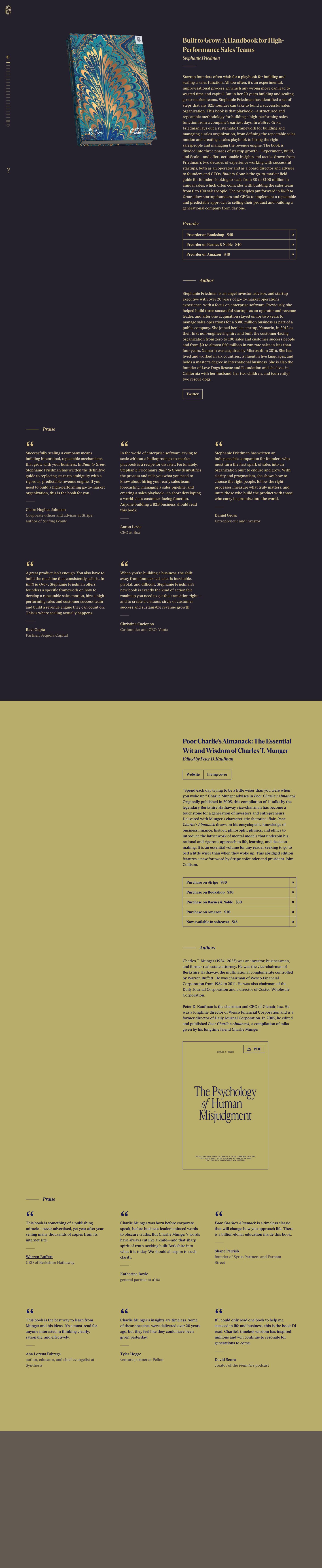
Stripe Press reads like a hardbound catalogue, not a website. Each book gets a full-bleed colour 'chapter' drawn from its cover (plum-charcoal with gold type, mustard with navy type), set in a refined editorial serif with hairline rules and zero rounded corners, so the whole page feels like turning pages in a well-made physical object.
Palette
Typography
- Headings
- Ivar Headline / Ivar Display (Letters from Sweden)
- Body
- Ivar Text (Letters from Sweden)
- Mono
- Small monospace used only on rendered cover art (e.g. 'CHARLES T. MUNGER' caption)
- Free swap
- Ivar is proprietary. Use Newsreader (display optical size) or Libre Caslon Display for headings, Source Serif 4 or Newsreader Text for body; IBM Plex Mono or JetBrains Mono for any mono captions.
Book titles ~32px, weight ~600, tight negative tracking (about -1 to -2%), line height ~1.3, title case, set in the section's accent colour. Author/editor line directly beneath in ~20px italic, regular weight. Body ~18px regular, line height ~1.45, comfortable measure of ~60-65 characters, book titles inside prose set in italic. Section labels ('Author', 'Praise', 'Preorder') are ~18-20px italic, often preceded by a 40px hairline. Buttons/links in ~16px semibold serif, never uppercase, never sans. Testimonial attributions: name in body colour at ~16px, role underneath in muted colour. There is effectively no sans-serif anywhere; hierarchy comes from size, italic and colour, not weight jumps.
More free font pairings →Signature moves
- Give every product/item its own full-bleed background colour sampled from its artwork and swap the text colour to a matching ink (gold on plum, navy on mustard) so scrolling feels like changing books.
- Use a single editorial serif family for everything, including buttons and labels, and build hierarchy with italic, size and colour instead of a sans-serif UI font.
- Replace buttons with ledger-style bordered rows: 1px accent hairlines, square corners, label + price + a tiny ↗ in a divided right cell.
- Mark sections with a short hairline plus an italic word rather than bold headings.
- Show the product as a realistic 3D physical object on a flat field, kept sticky beside long-form text.
- Use a minimal tick-mark rail as both navigation and scroll progress.
Layout
Fixed-width editorial split on a 1440 canvas: a thin left rail (~60px) holds logo, back arrow, a stack of short tick marks as a book-by-book scroll index, and a '?' at the bottom. The content area is two columns: the left half holds a large 3D-rendered book cover (sticky while the text scrolls), the right column (~530px, starting near x=820) holds title, byline, a short gold rule, description, purchase table, author bio and extras. Generous vertical rhythm: ~80-120px between groups, ~200px+ between chapters. Each book is a full-bleed colour band that runs until the next book; praise breaks out into a 3-column grid spanning the full content width (left aligned at ~110px) with quote cards in rows of three. Everything is left-aligned; nothing is centred except the cover art.
Components
- Side rail navigation
- Vertical strip of ~16px horizontal tick marks in muted gold, the active one brighter and longer; a back arrow above, small media icons below, a '?' help glyph near the bottom, and a monogram logo at top-left. It doubles as a progress indicator through the catalogue.
- Book hero
- Photoreal 3D book render at slight perspective with a soft cast shadow, sitting on the flat coloured field with no frame. Title + italic author + 72px hairline rule to the right.
- Purchase table
- Stacked rows with a 1px border in the accent colour, square corners, no fill. Each row: semibold serif label + price separated by a gap, then a narrow divided cell on the right with a tiny diagonal ↗ arrow. Rows share borders like a ledger.
- Secondary buttons
- Same 1px outlined rectangles ('Twitter', 'Website | Living cover') with ~10px vertical padding, semibold serif, segmented when grouped side by side.
- Section label
- A ~40px horizontal hairline followed by an italic word ('Author', 'Praise'), acting as a quiet chapter heading instead of a big H2.
- Praise cards
- No boxes. A large heavy opening quote mark (~40px) in the accent colour, quote in body serif, a ~28px short rule, then name and muted role. Three columns with ~45px gutters.
- Bonus artefact
- An outlined rectangle containing a typographic cover ('The Psychology of Human Misjudgment') with a small outlined 'PDF' download button pinned top-right.
Product UI
There is no software UI; the 'product' is the physical book, presented as high-quality 3D renders with a real shadow, plus one flat typographic cover inside a hairline frame. The interface elements themselves are the lesson for app screens: monochrome per section (one background + one ink + one muted tone), 1px outlined controls, no fills, no radius, no shadows, tiny line icons (arrow, download, play), and dense but airy serif text. Applied to an app, this means outlined table rows as primary actions and theming entire views from a content item's colour.
Great for
- Publishers and book imprints
- Long-form editorial or essay sites
- Premium portfolios and studios
- Cultural institutions and archives
- Luxury or craft product catalogues
- Author and speaker pages
Watch out for
- Licensing Ivar without checking; substitute Newsreader/Source Serif 4 if not.
- Gold-on-plum and gray-on-mustard muted text are low contrast; keep muted text at 16px+ and check WCAG, especially the attribution lines.
- Adding rounded corners, drop-shadowed cards or sans-serif buttons breaks the bookish illusion.
- Picking section colours arbitrarily; they must come from the item's own artwork or the page feels random.
- Dense CTAs: this style has no loud primary button, so it fails for conversion-heavy funnels that need high-visibility actions.
- Overusing the 3D render trick with low-quality mockups.
Design like Stripe Press
Read https://pageproofer.com/inspiration/warm-editorial/stripe-press.md and open its screenshots. To design in this style, set each item in its own full-bleed colour band sampled from its artwork (e.g. background #25212c with #e1c575 headings and #c4b26c body, or #b7ab6b with #1d1b45 text) and use one serif family throughout (Newsreader or Source Serif 4 as a free stand-in for Ivar). Titles ~32px weight 600, tracking -1.5%, line height 1.3; byline 20px italic; body 18px/1.45 with ~60-character measure; italic for titles within prose. Layout: a 60px left rail with logo and tick-mark scroll index, a sticky 3D product render in the left half, and a ~530px text column on the right; 100px+ between groups. Mark sections with a 40px 1px rule followed by an italic label. Build actions as stacked ledger rows with 1px accent borders, 0 radius, semibold serif label + price, and a divided right cell holding a small ↗. Testimonials go in a 3-column grid: big accent quote mark, quote, 28px rule, name, muted role. No shadows except on the product render, no rounded corners, no sans-serif.