
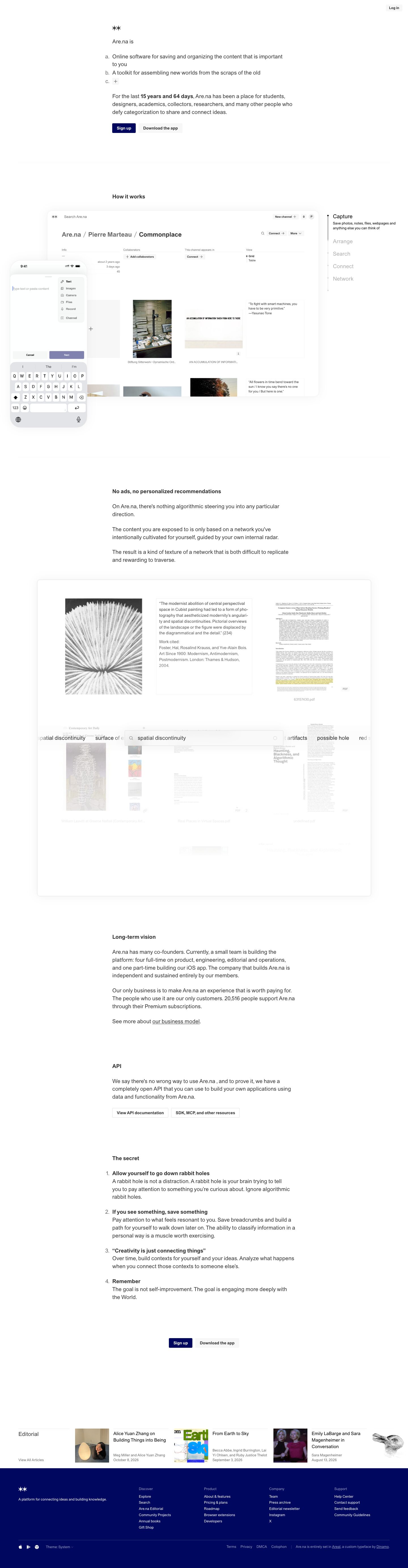
Captured 10 Oct 2026 at 1440px. Scroll the frame to see the whole page.
Are.na
literary · quiet · independent · considered · austere
Are.na reads like a carefully typeset document rather than a marketing page: one typeface (Dinamo's Areal) at a single 19px size, a narrow centred text column, an outlined ordered list as the hero, and almost no colour beyond warm greys and a deep navy. It works because the restraint signals the product's values (no ads, no algorithm, user-owned thinking), and the only visual richness comes from the users' own collected images shown inside a quiet, near-borderless app UI.
Palette
Typography
- Headings
- Areal (Dinamo, custom)
- Body
- Areal (Dinamo, custom)
- Free swap
- Areal is a proprietary custom face by Dinamo; use Inter Tight or Inter (slightly condensed neo-grotesk feel), or Archivo for a closer warmth.
Essentially a one-size system: h1, h2 and body copy in the main column are all 19px with 1.45 line height and 0 tracking. Hierarchy comes from weight only — section headings like 'How it works' are 19px/700, the hero 'Are.na is' is 19px/400. Inline emphasis uses bold (e.g. '15 years and 62 days'). Secondary UI text (step descriptions, captions, footer links, buttons) drops to 13px/1.35, buttons in 13px bold. Side-nav step labels are 19px/400 with 1.2 line height, inactive ones in #999999. Sentence case everywhere, no uppercase, no display sizes.
More free font pairings →Measured h1: 19px / 400 / 0em · body 13px
Signature moves
- Set every heading at body size and distinguish hierarchy only by weight, so the page reads like a letter, not an ad.
- Use an outlined a/b/c definition list as the hero, with the final item left as an empty '+' chip that invites the user to complete the sentence.
- Hang list markers into the left margin of a narrow text column for a typeset, bookish rhythm.
- Keep the whole site monochrome and reserve a single deep ultramarine (#00075f) for the primary CTA and a full-bleed footer block.
- Let user-collected content (photos, quotes, PDFs) supply all imagery, displayed in a hairline-bordered, nearly chrome-less app window.
- Include a precise, living fact in the copy ('15 years and 62 days', '20,516 people') in bold instead of marketing superlatives.
Layout
A single narrow reading column (~600px, roughly 40 characters indented from left of centre) carries all text, set slightly left of the page centre so list markers (a., b., 1., 2.) hang into the left margin. Product visuals break out wider (up to ~1310px content width) as framed app windows, with a sticky step list to the right. Sections are separated by very generous vertical space (150–250px) and occasional full-width 1px #ededed hairlines. Density is low; whitespace does all the structuring. The page ends with a horizontal editorial article strip, then a solid #00075f footer with a five-column link grid.
Components
- Hero
- No headline graphic: a small asterisk-pair logomark, then 'Are.na is' followed by an outlined a/b/c list of definitions, with the 'c.' item being a tiny '+' chip inviting the reader to add their own. Followed by a 19px paragraph with a live-counting bold duration and two buttons.
- Buttons
- Small, compact 13px bold labels, ~10px×14px padding, 3px radius. Primary is solid #00075f navy with white text; secondary is #f7f7f7 fill with #333 text; tertiary (API links) is white with 1px #dedede border. No shadows, no icons.
- Nav
- Virtually none: only a tiny 'Log in' grey chip pinned top-right. The page trusts the scroll.
- How-it-works stepper
- Vertical list on the right (Capture, Arrange, Search, Connect, Network) with a thin vertical line and dots; active item black 19px with a 13px description beneath, inactive items #999. The app mockup on the left changes per step.
- Product frames
- Large white panels with 1px #ededed border, ~18px radius and an extremely soft 0 0 34px rgba(0,0,0,0.05) shadow; a phone mockup overlaps the desktop window offset to the lower left.
- Ordered content lists
- Editorial numbered lists (The secret) with hanging numerals, bold 19px item title and regular 19px body directly underneath, ~30px between items.
- Editorial strip
- Horizontal row of article cards: square thumbnail left, 15px title and 11px grey byline/date right, each topped by a hairline rule; overflows off the right edge.
- Footer
- Solid #00075f navy, white logomark and tagline, four link columns with muted lavender-grey headings and white 12px links, a hairline divider, then app-store icons, a 'Theme: System' switch and a colophon credit for the typeface.
Product UI
Shown via stylised but realistic mockups of the real app: a desktop window and an overlapping iPhone screen, plus an animated search panel where a search field floats over a horizontally scrolling row of past queries, with blurred blocks fading behind it. The UI is a loose grid of 'blocks' — images, text quotes in small serif-less type inside thin #ededed boxes, PDFs with a tiny 'PDF' tag, broken-link placeholders drawn as a box with an X. Chrome is minimal: an asterisk logo, 'Search Are.na' placeholder text, a 'New channel +' grey chip and circular avatar chips. Captions are 10–11px grey beneath each block. No colour accents except a navy 'Done' button; breadcrumbs ('Are.na / Pierre Marteau / Commonplace') and key-value metadata (Started, Modified, Length) in small grey text. Density is airy, borders are hairline, icons are thin-stroke line icons.
Great for
- Note-taking and knowledge tools
- Independent, member-funded software
- Research, archive and library products
- Creative-community platforms
- Editorial or publishing sites
- Anti-algorithm social or curation apps
Watch out for
- Areal is proprietary; substitute Inter Tight/Inter rather than shipping an unlicensed copy.
- Don't add display-size headlines or gradients — the single-size typography is the whole identity.
- Inactive #999999 labels on white fail contrast for body text; keep them for short nav labels only.
- Don't use the navy for anything but primary CTA and footer, or it loses its weight.
- The near-invisible #ededed borders and 5% shadow vanish on low-quality displays; check frames still read.
- Avoid stock imagery — the style only works when visuals are genuine user content.
Design like Are.na
Read https://pageproofer.com/inspiration/warm-editorial/arena.md and open its screenshots. To design in this style, use one neo-grotesk family (Inter Tight as a stand-in for Areal) and set headings and body text at the same 19px size, 1.45 line height, 0 tracking, separating headings by weight 700 vs 400; drop to 13px for captions, buttons and UI labels. Put all prose in a ~600px column, with ordered-list markers hanging in the left margin, and separate sections with 150–250px of whitespace and occasional 1px #ededed full-width rules. Background #ffffff, text #333333, muted #696969/#999999, surface chips #f7f7f7, borders #ededed/#dedede. Reserve #00075f for the primary button (13px bold, white text, 3px radius, compact padding) and a full-bleed footer. Secondary buttons are #f7f7f7 fill or white with 1px #dedede border. Show the product in large white frames with 1px #ededed border, 18px radius and box-shadow 0 0 34px rgba(0,0,0,0.05), filled with real user content and paired with a right-side vertical stepper whose inactive items are #999. Write copy in plain first-person sentences with specific bolded facts; skip hero imagery, icons and decorative colour.