
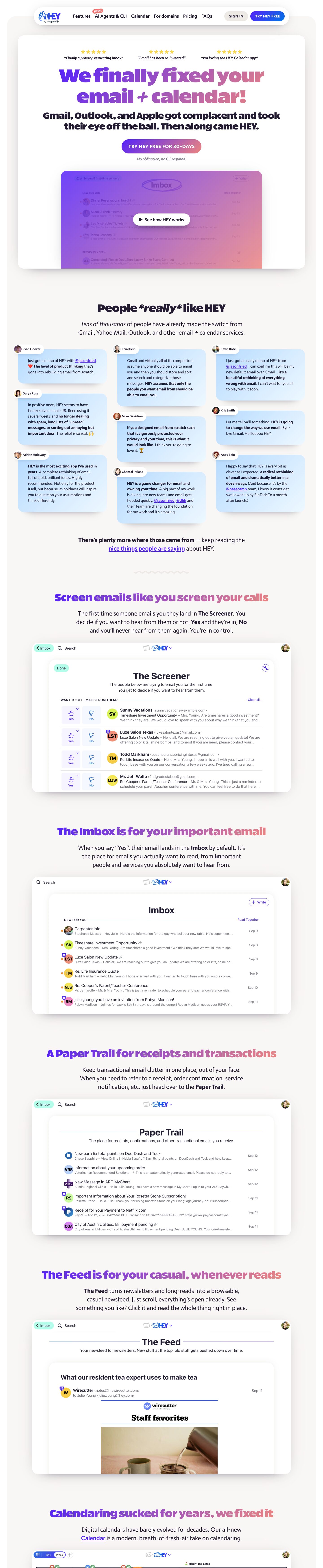
Captured 10 Oct 2026 at 1440px. Scroll the frame to see the whole page.
HEY
bold · cheeky · warm · confident · playful
HEY pairs a warm off-white canvas (#f9f7f5) with ultra-heavy, tightly packed Really Sans Large headlines filled with a violet-to-coral gradient, then lets large, softly shadowed screenshots of the real app carry the argument. The tone is loud, opinionated and funny at the headline level but calm and readable underneath, which makes a mundane category like email feel like a rebellion rather than a utility.
Palette
Typography
- Headings
- Really Sans Large
- Body
- Moniker
- Free swap
- Both are proprietary. For Really Sans Large use Unbounded at 800–900, or Bricolage Grotesque at 800 with -3% tracking. For Moniker use Cabin, Nunito Sans or Source Sans 3 at 400 and 700.
H1 is 83px Really Sans Large at weight 900, line-height 1.1, default tracking that reads very tight because the face is compact. It is filled with a left-to-right #5522fa to coral gradient. The hero sub-headline is 40px at weight 850 in solid #231c33, so the hero is two stacked display blocks with no light body text between them. Section headlines are 48px at weight 850, single line, with the same gradient. Body is 18px Moniker at 400 with -1.2% tracking. Feature descriptions run around 22px, centred, at line-height ~1.5, with bold Moniker for product nouns (The Screener, Imbox, Paper Trail). Italic Moniker carries the testimonial pull quotes and reassurance microcopy ('No obligation, no CC required.'). Buttons and nav CTAs use uppercase Moniker bold with slight positive tracking. Asterisk emphasis ('*really*') is typed literally inside headlines as a typographic joke.
More free font pairings →Measured h1: 83px / 900 / 0em · body 18px
Signature moves
- Fill every major headline with a violet (#5522fa) to coral gradient running left to right across ultra-black 850–900 weight type, so each section reads as a shouted slogan.
- Write headlines as opinionated, conversational jabs ('Calendaring sucked for years, we fixed it') and use typed asterisks for emphasis instead of italics.
- Repeat a strict centred trio for every feature: gradient headline, short centred paragraph with the product noun in bold, then a big real screenshot.
- Use warm off-white #f9f7f5 instead of grey or pure white, and tint every shadow and text colour with the aubergine #231c33 so nothing looks cold.
- Build long, low, multi-layer stacked shadows with negative spread, so cards look lifted off the page rather than outlined; the page uses no borders at all.
- Hang overlapping pill labels off card edges (avatar name tags, a 'NEW!' tag on the nav) for a sticker-like, handmade feel.
Layout
Content sits inside a 1376px rounded wrapper on the warm #f9f7f5 canvas. The hero is a separate white card (≈22–26px radius) floating inside that wrapper, with a floating pill nav overlapping the top edge. Everything is centre-aligned in a single column: centred gradient headline, a centred 2–3 line paragraph capped around 720px, then a full-width app screenshot around 1100px wide. That trio repeats for every feature, about 140px apart. The only multi-column moment is a three-column masonry of testimonial cards. Density is low and the rhythm is deliberately predictable, so the screenshots do the work.
Components
- Floating pill nav
- White capsule with a large soft shadow, overlapping the page wrapper. Logo left, ~20px medium nav links, and a red 'NEW!' tag rotated slightly above one link. On the right sit an oat (#edeae6) 'SIGN IN' pill and a solid violet-to-blue 'TRY HEY FREE' pill, both uppercase bold.
- Gradient CTA button
- Fully rounded pill, ~57px radius, filled with the same violet-to-coral gradient as the headline. White uppercase bold text with letter-spacing. An italic grey reassurance line sits directly underneath.
- Star-rated micro-quotes
- Three tiny testimonials sit above the H1, each a row of five yellow stars over an italic bold quote in quotation marks. The social proof lands before the headline does.
- Tweet-style testimonial cards
- Pale sky-blue gradient cards with ~22px radius and deep layered shadows, set in a staggered three-column masonry. A white pill name tag with a round avatar overlaps each card's top-left corner. Key phrases are bolded and @handles are underlined in violet.
- Screenshot frames
- Real app UI in white rounded frames (~25px radius) with stacked multi-layer shadows tinted with the ink colour (rgba(35,28,51,…)) that sit low beneath the frame. Frames are often cropped at the bottom so the UI bleeds off. The hero screenshot is washed with the brand gradient and overlaid with a white 'See how HEY works' play pill.
- Squiggle divider
- A small pale-lilac hand-drawn wavy line, centred between sections, replaces a horizontal rule.
Product UI
The page shows real, high-fidelity screenshots of the HEY app rather than illustrations. The UI is airy and centred, with a big centred page title (The Screener, Imbox, Paper Trail, The Feed) in a system-like sans. Section labels are small uppercase grey ('NEW FOR YOU') and followed by a thin lilac horizontal rule. List rows have bright pastel initials avatars (yellow, coral, lime, pink), a sender and subject line, a grey snippet, and a right-aligned date. Small orange dots mark unread mail. Mint-green pill buttons ('Imbox', 'Done') and outlined violet pills ('+ Write') carry the controls, and Yes/No thumb icons sit in pale lavender tiles. Colour is used sparingly for avatars and status, there are almost no borders, and a single centred content column sits inside a white sheet. It reads like a calm document rather than a dense three-pane client.
Great for
- Consumer or prosumer apps with a contrarian point of view
- Productivity tools challenging incumbents
- Indie or opinionated SaaS with a strong founder voice
- Product launches that rely on screenshots and testimonials
Watch out for
- Using the gradient on body text or long sentences: it only works on short, heavy display lines at 40px or larger.
- Copying Really Sans Large or Moniker without a licence; substitute Unbounded or Bricolage Grotesque, and Cabin or Nunito Sans.
- Thin or regular-weight headline fonts, because the gradient and the attitude both disappear.
- Cold pure-grey backgrounds or neutral black shadows, which break the warm aubergine-tinted palette.
- Adding borders or dense multi-column feature grids; the style depends on centred single-column rhythm and shadow-only separation.
- Snarky copy without a real product to back it; the boldness only lands because real screenshots follow each claim.
Design like HEY
Read https://pageproofer.com/inspiration/warm-editorial/hey.md and open its screenshots. To design in this style, set the page background to #f9f7f5 and use #ffffff cards with 24px radius. Separate cards with layered, ink-tinted shadows (e.g. rgba(35,28,51,0.1) 0 25px 13px -25px, rgba(35,28,51,0.15) 0 38px 26px -38px, rgba(35,28,51,0.2) 0 51px 38px -51px) and use no borders. Set text in #231c33 and muted text in #736c83. Headlines use an ultra-heavy display sans (Unbounded 900 or similar) at 80px/1.1 for H1 and 48px/1.1 for section titles, filled with a linear-gradient(90deg, #5522fa, #e0868a) via background-clip:text. Write each headline as a short, cocky one-liner. Body copy is 18–22px humanist sans (Cabin or Nunito Sans), centred, max-width ~720px, line-height 1.5, with product nouns in bold. Make primary CTAs fully rounded pills with the same gradient fill and white uppercase bold text, plus an italic grey reassurance line below. Float a white pill nav with a big soft shadow over the top of the page. Build every feature section as a centred headline, a short paragraph, and a ~1100px real product screenshot in a rounded white frame, cropped at the bottom. Add a staggered three-column grid of pale-blue testimonial cards with overlapping avatar name pills, and put a small wavy squiggle between sections.