
6 sites
Old School & Vintage
Honest craft with a little wear
Old School & Vintage treats the web page like a printed catalogue, a film-archive sleeve or a beloved piece of hardware. The UI chrome stays nearly colourless: warm off-black ink, paper-white or studio-grey grounds, hairline rules and square corners. Analog photography, illustrated covers, pixel art and stickers supply the colour, and a single muted or saturated ink accent marks every action. The type works in two voices: a bookish serif or chunky grotesk for the voice, and tiny tracked uppercase sans or mono for labels and logistics.
Paste this into your agent
Read https://pageproofer.com/inspiration/old-school-vintage.md and the site teardowns it links to, and open their screenshots. Then design my [describe the page or app screen] in the Old School & Vintage style, following the guide's brief, principles and do/don't lists.
The sites
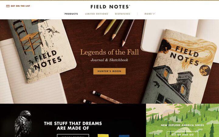
Field Notes
Futura W01 BoldField Notes reads like a mid-century American printed catalogue moved to the web: a centred Futura Bold wordmark, tracked uppercase labels, New Century Schoolbook serif for editorial notes, and a hairline-ruled, square-cornered product grid where photographed notebook covers supply nearly all the colour. The chrome stays almost colourless (warm near-black, white, a khaki rule and a rust price colour), so dozens of loud, illustrated covers can sit side by side without the page feeling chaotic.
vintage · utilitarian · crafted · Midwestern · catalogue-like

Panic
BootonPanic's homepage is a playful, almost toy-like index of everything the company makes: a full-bleed dark game-art hero with a featured logo, then a pale grey (#ebebeb) field of large app and game icons grouped under light-weight, coloured one-line headlines, ending in a near-black help footer. It works because the product artwork does all the visual talking while the chrome stays minimal and centred, and two slanted section edges plus per-section headline colours give a quiet, friendly personality with no cards, shadows or buttons.
playful · confident · handmade · minimal · friendly
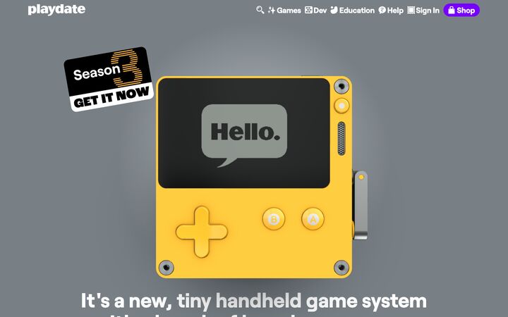
Playdate
RoobertPlaydate's homepage is a toy box: a cool grey stage for a glossy 3D render of the yellow console, then a full-bleed saturated-yellow story section with chunky 800-weight Roobert headings, cut-out product photography and a wall of 1-bit game title cards. It works because the yellow device is the brand. The page lets the hardware's colour, the screen's monochrome pixel art and a chatty, jokey voice carry everything, and uses only a single bubble-gum purple button as the call to action.
playful · tactile · cheeky · bold · friendly
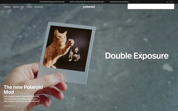
Polaroid
FF Real Header Offc DemiboldPolaroid's store reads like a gallery catalogue: full-bleed analog film footage up top, then flat #e9e9e9 and white panels framed by 1px near-black hairlines, square corners everywhere, and a tight grotesk set against small monospaced uppercase labels. Colour comes almost entirely from photography, products and the Polaroid rainbow, so the chrome stays neutral and the merchandise reads as the brand.
analog · editorial · restrained · graphic · tactile
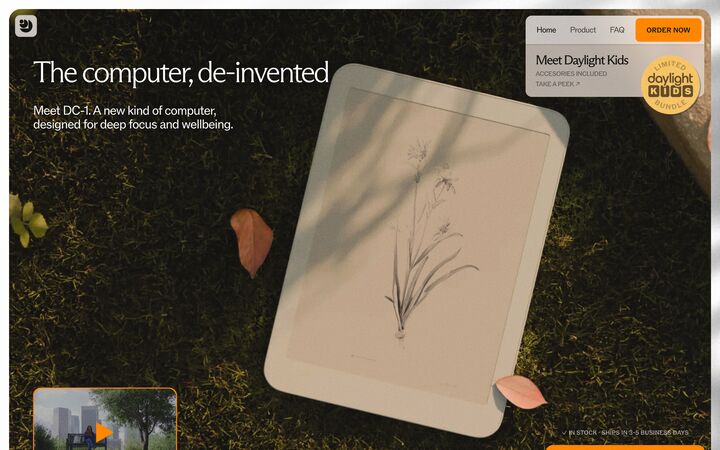
Daylight
ABC Arizona FlareDaylight presents a calm-technology product as a warm, editorial object: a full-bleed, rounded-corner photograph of the tablet lying in sunlit grass, set on a warm-paper page with thin serif headlines in ABC Arizona Flare and a single saturated marigold orange for every action. The result feels like a lifestyle magazine rather than a gadget launch, which suits a product sold on focus and wellbeing; the below-fold content renders blank in the capture, so the hero carries the whole identity.
calm · warm · editorial · organic · tactile
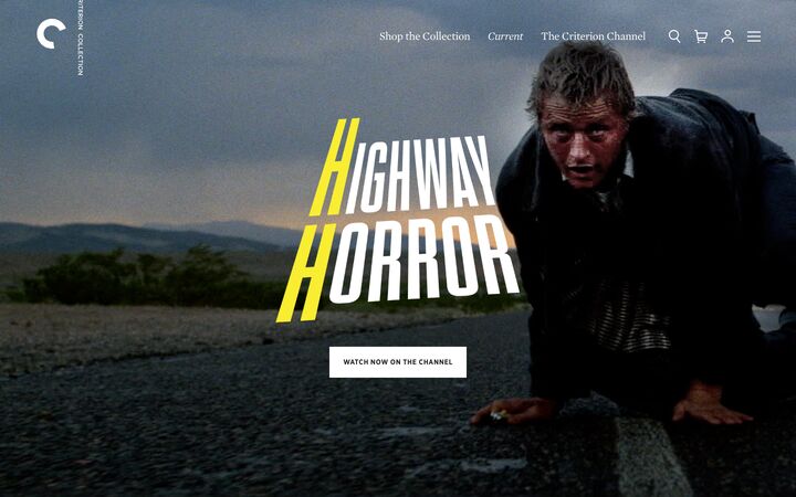
Criterion
Mercury Text G1Criterion's homepage is a stack of full-bleed, edge-to-edge cinematic panels, each one a film still or poster art with bespoke title lettering and a single small white rectangular button, sitting over a near-black #252525 frame. The chrome is deliberately quiet so the films carry the page: a literary serif (Mercury) for navigation and section names, tracked uppercase Gotham Narrow for utility text, and zero radii, shadows or decoration.
cinematic · curatorial · editorial · restrained · moody
Principles
1.
The product is the colour; the chrome is ink and paper
Keep the UI to warm near-black, white or grey paper, a hairline grey and one accent, so loud imagery never clashes. Field Notes runs dozens of illustrated covers on #ffffff with #302e2a text. Polaroid holds its chrome to #151515, #ffffff and #e9e9e9 and lets the rainbow appear only on product and badges. Criterion frames wildly different film art in identical #252525 chrome. Panic floats coloured icons on a flat #ebebeb field.
2.
Two typographic voices: one for feeling, one for logistics
Pair an expressive display voice with a tiny tracked uppercase utility voice. Field Notes sets New Century Schoolbook serif for prose (46px/400 hero, 15px/1.5 body) against Futura Bold caps at 13–14px with 0.1–0.15em tracking. Criterion pairs Mercury serif for navigation with Gotham Narrow Bold caps at 11–13px and 0.077em. Daylight pairs a 60px/300 serif with 11–13px caps at weight 500–600. Polaroid uses a 40px/600 grotesk against 11–12px uppercase mono CTAs followed by a thin arrow. Skip intermediate weights; the jump in scale creates the hierarchy.
3.
Catalogue grids: hairlines, zero gaps, square corners
Build grids as contact sheets rather than floating cards. Tiles share 1px borders and have no gutters. Field Notes uses 1px #dadada hairlines between roughly 360px cells in a 4-column grid. Polaroid uses 1px #151515 rules between #e9e9e9 tiles and between stacked 620–720px banner panels. Criterion stacks gapless full-viewport panels. Radius is 0px for buttons, inputs, tiles and chips. Drop editorial and signup content into a grid slot at the same size, the way Field Notes places magazine-style ads.
4.
Warm, aged neutrals instead of pure black and white
Text sits in the #151515–#312f28 range with a warm bias: #302e2a pencil black (Field Notes), #312f28 screen charcoal (Playdate), #17190f olive ink (Daylight). Dark frames use #1c1c1c–#252525, never #000. Light grounds range across #ffffff, #faf5f2 warm paper, #efefef/#ebebeb/#e9e9e9 newsprint and studio grey. Muted text is #545049–#8e8e8e. Khaki #aea288 and oat #e8ded8 serve as secondary tints.
5.
One ink accent for every action and value
Choose exactly one accent and use it for prices, links, the primary button and focus states. Examples: rust #9c3e14 for Field Notes prices with a superscript $, marigold #ff9d00 for all Daylight actions and card borders, gumdrop purple #7a1fff for Playdate's only CTA, archival gold #b4841e used rarely at Criterion, and exclusive red #d60026 for Polaroid tag chips. A second accent breaks the system.
6.
Analog, tactile imagery does the storytelling
Use grainy film footage (Polaroid hero), overhead tabletop shots on dark wood (Field Notes), hardware in sunlit grass (Daylight), cut-out objects with baked-in natural shadows (Field Notes, Polaroid category row), 1-bit pixel tiles in #312f28 on #b1aea7 (Playdate), and film stills or painted key art (Criterion). Avoid glossy stock renders. Without strong art-directed imagery this style looks empty.
7.
Small print-era flourishes and a human voice
Add one or two hand-assembled details: a 3–4px ochre rule along the top edge (Field Notes), circular rust stickers ('36 LEFT') overlapping product corners, rotated sticker badges and speech-bubble asides (Playdate), a circular-text seal (Daylight), a vertical wordmark beside a round mark (Criterion), italics for publication titles, curly quotes, a superscript $, or a giant wordmark in the footer (Polaroid). Write headings as plain sentences ending in a period ('Panic publishes amazing video games.', 'The System.').
Colour
Light mode is the default. Backgrounds: #ffffff bond white, #faf5f2 warm paper, or #e9e9e9–#efefef studio/newsprint grey for alternating bands and tile fills. Dark bands and footers: #1c1c1c–#252525. Text: warm near-black #151515–#312f28 (prefer #302e2a). Secondary text: #545049–#5a5a4e. Captions: #808080–#8e8e8e, used only at 13px+ on light grounds and never for long copy on dark. Borders: #dadada for hairlines on white, #151515 for a bolder contact-sheet frame, #4a4a4a on dark. Supporting tints: kraft khaki #aea288, ochre #c78334, oat #e8ded8. Pick one accent: rust #9c3e14 (default, most print-like), marigold #ff9d00, gold #b4841e, or a single saturated hardware colour (#7a1fff, #d60026) for a playful brand. Product colours such as Playdate yellow #ffc600 may fill a full-bleed band, but always put charcoal text on them, never white. No gradients in UI chrome.
Typography
Display: an old-style or schoolbook serif (Fraunces, Source Serif 4, Newsreader, Libre Caslon) at 44–64px, weight 300–400, line-height 1.0–1.1, tracking -0.01 to -0.02em. Use italic for subheads and titles of works. For playful hardware brands, a chunky grotesk at 700–800 and 57–68px with line-height 1.0 can replace the serif. Section heads run 28–42px. Labels, nav, buttons and prices use a geometric sans (Jost/Futura-like, DM Sans) or a mono (IBM Plex Mono, Space Mono) in UPPERCASE at 11–14px, weight 500–700, tracking 0.08–0.15em, often followed by a thin → arrow. Body copy is 15–17px serif or sans at line-height 1.4–1.5 with a 60–70ch measure. Caption blocks can tighten to 1.2 at a ~300px measure, as Polaroid does. Never set the utility voice in lowercase or untracked. Never use weight-300 display below 40px.
More free font pairings →Layout
Use full-bleed bands stacked edge to edge, with content capped at 1080–1200px (up to 1380px for catalogue grids) and 24–32px side margins. Heroes are one viewport tall (860–1000px) and carry a photo or footage with a small lockup: centred (Criterion, Field Notes) or anchored bottom-left in a narrow column (Polaroid). Daylight insets the hero as a 16px-margin framed photo. Leave 96–200px between modules and zero gaps inside grids. Product grids are 3–4 columns of equal cells sharing 1px rules, with 24–40px internal padding. A centred header (wordmark above a single row of tracked caps nav) suits catalogue brands. Transparent nav over imagery suits cinematic ones. Use at most two diagonal band edges, if any. Footers sit on a dark or white field with serif column heads, small tracked caps links on 20–24px rows, and optionally an oversized wordmark.
Components
Buttons have a 0px radius and are 30–52px tall with uppercase tracked 11–13px labels. Primary is a solid ink fill (#151515 with white text, or white with #252525 text on imagery) or the accent. Secondary is a 1–2px outline with a transparent fill. Pair them with an 8px gap. Ghost buttons with a 2px white border work over photos. A playful brand may allow exactly one tactile pill CTA (34px radius, inset highlight) as its sole skeuomorphic element. Inputs are square with a 1px border, or underline-only with a 1px dark bottom border and a thin arrow submit. Search uses a divided magnifier cell. Product cards have no chrome: a cut-out photo on white or #e9e9e9, a 13px uppercase tracked name, the price in the accent with a superscript currency, and an optional rectangular tag chip (11px caps on solid ink, red or green). Badges are circular stickers in the accent overlapping an image corner. Use thin 1.5px line icons (envelope, chevron, magnifier, arrow), and show the cart as a bracketed count '[0]'. No CSS drop shadows on UI; shadows only exist inside photographs.
App UI
Carry the printed-ledger feel into product screens. Canvas: #ffffff or #faf5f2. Sidebar: same paper with a 1px #dadada right rule. Section labels are 11px uppercase tracked in #8e8e8e. Nav items are 14px, with the active item in #302e2a at weight 600 and a 2px accent bar at left, and inactive items in #545049. Page titles use the serif at 28–32px. Tables use 1px hairline row rules and no zebra fills; header cells are 11px uppercase tracked sans or mono; numbers and IDs are set in mono, right-aligned; key values and links are in the accent; rows are 40–44px. Dashboard metrics sit in gapless tiles sharing 1px borders, with a 32–40px serif number over a caps label and no cards or shadows. Status uses small square chips with solid fills and white or ink caps text. Forms use square 1px inputs 36–40px tall, caps labels above, and inline compact controls (select + 'Go') where possible. Modals are square, with a 1px #151515 border and a paper fill. Empty states show a single black line illustration, a serif sentence ending in a period ('Nothing filed here yet.'), a short secondary line, and one outline button. Toasts are #252525 strips with white caps text. Dark mode uses #1c1c1c–#252525 with #4a4a4a rules and white serif titles.
Do
- ✓Keep UI chrome to warm ink, paper and one hairline grey; let imagery bring the colour.
- ✓Set every label, button and nav item in uppercase with 0.08–0.15em tracking at 11–14px.
- ✓Use a schoolbook or old-style serif for headlines and conversational copy.
- ✓Divide grids with shared 1px rules and zero gutters, like a contact sheet.
- ✓Use 0px corners on buttons, inputs, tiles and chips.
- ✓Reserve a single accent (e.g. rust #9c3e14) for prices, links and the primary action.
- ✓Use warm off-blacks (#302e2a, #252525) instead of #000.
- ✓Shoot or source analog, tactile photography: film grain, tabletops, cut-outs with natural shadows.
- ✓Add one print flourish: a top rule, a sticker badge, a superscript $ or a giant footer wordmark.
- ✓Write headings as short plain sentences that end in a period.
Don't
- ✕Don't add rounded cards, soft CSS drop shadows or gradient buttons.
- ✕Don't introduce a second accent colour or colour-fill UI chrome.
- ✕Don't set utility labels in lowercase or untracked sans.
- ✕Don't put white text on yellow or on bright photo areas without a scrim.
- ✕Don't use #808080–#8e8e8e text below 13px on dark grounds or for long copy.
- ✕Don't use weight-300 serif display below 40px.
- ✕Don't fill the layout with stock renders or generic icons; weak imagery leaves the grid empty.
- ✕Don't overdo the nostalgia with fake paper-tear textures, distressed fonts or sepia filters everywhere; restraint reads as authentic.
- ✕Don't use more than two diagonal section edges.
The brief, ready to paste
Design this in an Old School & Vintage style, like a mid-century printed catalogue or a film-archive sleeve. Use a paper background (#ffffff or warm #faf5f2), with alternating bands in #ebebeb–#efefef and dark bands or footers in #252525. Set text in warm near-black #302e2a, secondary text in #545049, captions in #8e8e8e, and hairlines in 1px #dadada (#4a4a4a on dark). Use exactly one accent, rust #9c3e14, for prices, links and the primary button, and nothing else. Typography has two voices. Headlines use Fraunces or Source Serif 4 at 44–60px, weight 300–400, line-height 1.05, tracking -0.015em, with italic for subheads and titles. Labels, nav, buttons and table headers use uppercase sans (DM Sans/Jost) or IBM Plex Mono at 11–13px, weight 600, tracking 0.1–0.15em, often ending in a thin →. Body copy is 16px at line-height 1.5. Set every corner to 0px radius and use no CSS shadows or gradients. Buttons are 44px tall: solid #302e2a or the accent with white caps, or a 1–2px outline. Inputs are square 1px boxes or underline-only with an arrow submit. Lay out full-bleed bands with 1200px content, a one-viewport hero built on analog photography with a small centred serif lockup, and 96–160px between sections. Product and content grids are 3–4 columns of equal cells sharing 1px rules with zero gaps; drop signup or editorial blocks into a cell at the same size. Product cards show a cut-out photo, a 13px tracked caps name and the price in rust with a superscript $. Add one print flourish, such as a 4px ochre (#c78334) rule across the top, a circular rust sticker badge or an oversized footer wordmark. Write headings as plain sentences ending in a period. For app screens, use a paper sidebar with caps section labels and a 2px accent bar on the active item, hairline tables with mono numbers and no zebra fills, gapless metric tiles with serif numbers, square solid status chips, and empty states with a line illustration and a one-sentence serif message.