
6 sites
Warm & Editorial
Opinionated, human, written like a magazine
Warm & Editorial treats a product site like a well-made magazine or book. It sets confident type on warm off-white paper (#f9f7f5–#fdfaf7) in warm-tinted ink, adds a few hand-made marks (highlighter swipes, squiggle dividers, stamps, swash initials) and writes copy with a clear opinion, such as a signed letter, a jab at the category or a precise living fact. Colour is rationed to one accent, and the real product does the persuading, shown in calm, hairline-bordered UI.
Paste this into your agent
Read https://pageproofer.com/inspiration/warm-editorial.md and the site teardowns it links to, and open their screenshots. Then design my [describe the page or app screen] in the Warm & Editorial style, following the guide's brief, principles and do/don't lists.
The sites
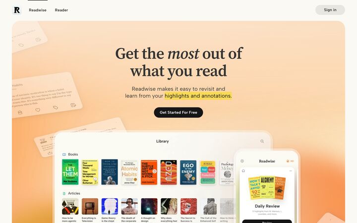
Readwise
Source Serif 4Readwise pairs a warm off-white paper canvas (#fbf9f3) with a literary serif (Source Serif 4) and soft peach-to-tangerine gradient panels, so the page feels like a well-made book. The product is shown through polished, slightly faded app mockups and a yellow highlighter-swipe motif behind key phrases, which ties every section back to the act of reading and highlighting.
warm · literary · calm · polished · friendly
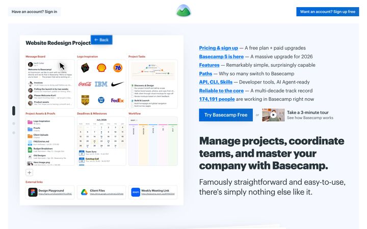
Basecamp
GraphikBasecamp's homepage reads like a confident, plain-spoken letter. Heavy 800-weight Graphik headlines, a single link blue, and white cards floating on a pale mint field carry a page whose argument is mostly words, real people and real product. It works because every device signals honesty and calm: an underlined index of links instead of a nav bar, a signed founder letter, unpolished customer videos and hard numbers, all framed with almost no decoration.
candid · calm · sturdy · friendly · editorial
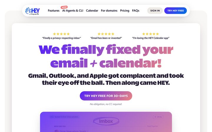
HEY
Really Sans LargeHEY pairs a warm off-white canvas (#f9f7f5) with ultra-heavy, tightly packed Really Sans Large headlines filled with a violet-to-coral gradient, then lets large, softly shadowed screenshots of the real app carry the argument. The tone is loud, opinionated and funny at the headline level but calm and readable underneath, which makes a mundane category like email feel like a rebellion rather than a utility.
bold · cheeky · warm · confident · playful
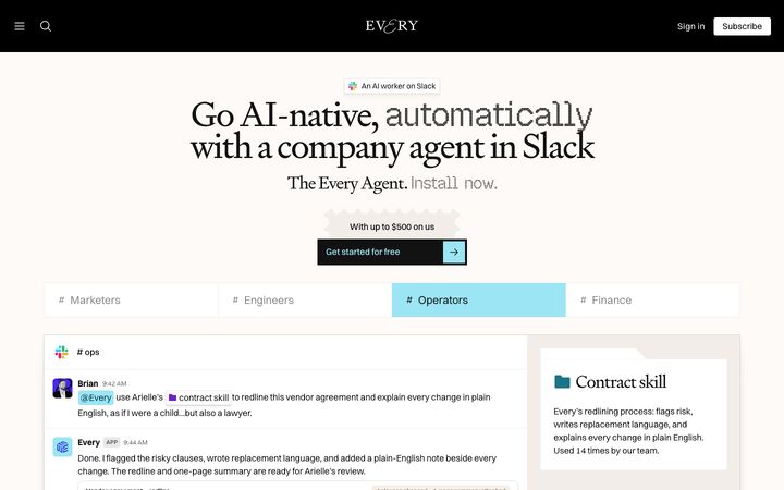
Every
SignifierEvery pairs a literary editorial voice — a high-contrast Signifier serif with ornamental swash initials — against a stark black magazine grid and a warm off-white (#fdfaf7) hero that shows the product as a faithful Slack mockup. The tension between bookish serif, pixel-font accents, collage-style AI illustration and a single icy cyan (#9ce5f5) makes it read like a smart print publication that also ships software.
editorial · literary · confident · nocturnal · witty
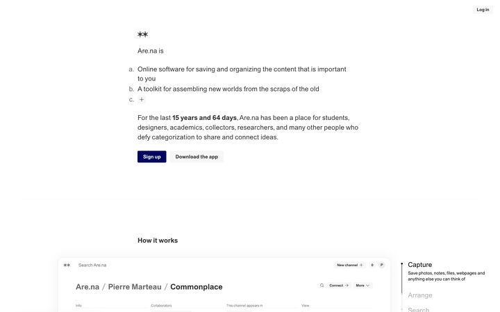
Are.na
ArealAre.na reads like a carefully typeset document rather than a marketing page: one typeface (Dinamo's Areal) at a single 19px size, a narrow centred text column, an outlined ordered list as the hero, and almost no colour beyond warm greys and a deep navy. It works because the restraint signals the product's values (no ads, no algorithm, user-owned thinking), and the only visual richness comes from the users' own collected images shown inside a quiet, near-borderless app UI.
literary · quiet · independent · considered · austere
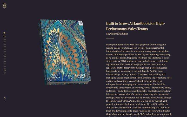
Stripe Press
Ivar Headline / Ivar DisplayStripe Press reads like a hardbound catalogue, not a website. Each book gets a full-bleed colour 'chapter' drawn from its cover (plum-charcoal with gold type, mustard with navy type), set in a refined editorial serif with hairline rules and zero rounded corners, so the whole page feels like turning pages in a well-made physical object.
literary · luxurious · restrained · tactile · scholarly
Principles
1.
Paper, not screen
The canvas is a warm off-white, never pure white or cool grey: Readwise #fbf9f3, HEY #f9f7f5, Every #fdfaf7, Basecamp's barely tinted #f4f8f4 field under white cards. White (#ffffff) is reserved for cards and product frames floating on that paper. Text is a warm or tinted ink rather than black: #333333 (Readwise, Are.na), slate #29353c (Basecamp), aubergine #231c33 (HEY). HEY also tints its shadows with the ink colour (rgba(35,28,51,…)), and Every uses a warm rgba(158,153,148) shadow stack.
2.
Type carries the voice, at one of two extremes
Headlines are either a bookish serif at regular-to-semibold weight (Readwise Source Serif 4 64px/600/-0.02em with one italic word; Every Signifier 64px/400, line-height 0.9, -4%; Stripe Press Ivar ~32px/600 with italic bylines) or a heavy grotesk (Basecamp Graphik 42–56px/800 at -2.6%; HEY 83px/900 with a violet-to-coral gradient fill). Pair the heavy line with a large light subhead in the same family, as Basecamp does with an 800 H1 over a 31px/400 subhead. Are.na shows the quiet end of the range: everything at 19px, with hierarchy from weight alone. Avoid timid mid-weight, mid-size headings.
3.
Copy with a point of view
Words are the main design material. Examples: Basecamp's signed, slightly rotated founder letter ('Hey there—') and its em-dash link index; HEY's jabs ('Calendaring sucked for years, we fixed it') with literal *asterisk* emphasis; Are.na's living bold facts ('15 years and 62 days'); Every's literary titles. Write in sentence case and first person. Make specific claims instead of superlatives, and skip uppercase eyebrows. Basecamp and Are.na use none.
4.
One hand-made mark per section
Each page adds a human touch, used sparingly. Readwise puts a flat highlighter-yellow (#f7dc1f) rectangle behind one phrase per section, and Basecamp bolds the key phrase of each quote on #fcf9e7. Basecamp and HEY replace horizontal rules with hand-drawn squiggle dividers. Every uses postage-stamp perforations and swash initials. HEY adds a slightly rotated 'NEW!' sticker. Pick one or two motifs and repeat them consistently. If they are scattered everywhere, they turn into noise.
5.
One accent, rationed
Each site has a single action colour and uses it almost only for CTAs, links and active states: Basecamp link blue #2377d2 (bold, always underlined), HEY violet #5522fa, Every ice cyan #9ce5f5 on black, Are.na ultramarine #00075f, Readwise near-black #161616 pills. Muted text sits in warm greys between #6d767b and #7b7a79. Gradients, if used at all, are soft and blurred and stay behind content. Readwise's peach-to-tangerine panels fade into the paper, and HEY keeps its gradient to display lines of 40px or larger.
6.
Show the real product, calmly
Every site proves its claims with genuine product: Basecamp's dense flat project mockup, HEY's large real screenshots in 25px-radius frames, Readwise's faded tablet and phone mockups, Every's faithful Slack recreation, Are.na's hairline app window. Frames are white, with 1px #e3e5e5/#ededed borders or very soft shadows (0 0 34px rgba(0,0,0,0.05)). Colour appears only in content and state. Avoid stock photos and generic 3D art. Use real people, real footage and commissioned illustration (Every's collages) instead.
7.
Slow, bookish rhythm
Space is generous between sections and text is set at a reading measure. Section gaps run 100–250px (Basecamp 100–140, HEY ~140, Readwise 150–200, Are.na 150–250). Text columns sit at 600–830px (Are.na ~600, HEY paragraph cap ~720, Basecamp cards ~830), and Stripe Press holds prose to about 60–65 characters. Layouts are mostly a single column, centred (HEY, Basecamp) or slightly left-set with hanging list markers (Are.na, Stripe Press). Sections are separated by hairlines, dotted rules (Every #3c3c3c) or squiggles rather than by alternating background bands.
Colour
Background: warm paper #f9f7f5–#fdfaf7 (Readwise's #fbf9f3 is the midpoint). An alternative is a near-white tinted field (#f4f8f4) with pure-white cards on top. Secondary surfaces: parchment #f5f1e8 or linen #f2ede8. Cards and product frames: #ffffff. Primary text: warm ink #231c33–#333333 (slate #29353c also works). Muted text: #5f5e5c–#7b7a79, darkened toward #5f5e5c below 18px. Borders: #dbd7cd linen, or #e3e5e5/#ededed hairlines. Highlighter: #f7dc1f behind body-sized text, or pale butter #fcf9e7 behind headlines and quotes. Pick exactly one action accent: link blue #2377d2, violet #5522fa, ultramarine #00075f or near-black #161616. Optional soft gradient (peach to tangerine, or violet #5522fa to coral #e08a8a) for one hero panel or display headline only. Dark editorial sections (Every, Stripe Press) use ink #000000–#25212c with stone #d6d3d1 or gold #e1c575 text. Never use cool blue-greys or pure #000 shadows on paper.
Typography
Choose one of two routes and commit to it. (1) Serif route: headlines in Source Serif 4 or Newsreader at 56–72px for H1, weight 400–600, line-height 0.95–1.1, tracking -0.02 to -0.04em. Italicise one emotional word per headline. Section H2 at 40–48px, card titles at 22–32px. Body in a humanist sans (Inter, Albert Sans or Instrument Sans) at 17–20px, line-height 1.5, colour #5f5e5c–#7b7a79. (2) Heavy-sans route: H1 at 48–84px, weight 800–900, tracking -2 to -3%, followed directly by a 28–40px subhead at weight 400 in the same family. Use Bricolage Grotesque or Inter Tight. On both routes: sentence case throughout and no uppercase eyebrows (the exceptions are tiny 10–11px tracked datelines or bylines). Links are bold and underlined. Pull quotes are italic, with key phrases bolded on a highlighter background. Serif can also set reading content inside mockups, but never UI chrome or buttons on the serif route. Stripe Press, the all-serif exception, builds hierarchy with italic, size and colour instead.
More free font pairings →Layout
Content container: 1195–1376px. Text measure: 600–830px. The hero is either a centred stack (headline, 2–3 line subhead, one CTA with an italic reassurance line, then a large product frame) or a two-column split with a product mockup on one side and a left-aligned text or link index on the other (Basecamp). Below the hero, repeat a predictable trio: headline, short paragraph, big real screenshot. Leave 100–200px between sections. Float white cards (0–30px radius) on the paper field instead of switching background colours. Use squiggles, hairlines or dotted rules as dividers. Testimonial walls can be 3-column masonry that bleeds past the container edges. Optional: switch to a dark editorial index for content-heavy areas (Every), or give each item its own full-bleed colour band sampled from its artwork (Stripe Press). Keep density low on marketing pages, and let whitespace and copy set the pace.
Components
Nav: minimal or absent. Use a logo and one or two links with a sign-in chip, a floating white pill (HEY) or a link index in place of a menu (Basecamp). Primary button: one solid accent shape with no icon clutter, about 12–16px × 20–24px padding and 15–18px medium/semibold text. Shape follows the site's character: a 40px pill (Readwise, HEY) or a hard 0–4px rectangle (Basecamp, Every, Stripe Press ledger rows). Secondary actions are an oat/grey fill (#edeae6, #f7f7f7) or a 1px outline. Put an italic grey line under the CTA ('No credit card required.'). Cards are white, with no border and a soft multi-layer diffuse shadow (~4% stacks) or a 1px hairline, never both heavy. Testimonials: real names, short italic quotes, the key phrase on a yellow highlighter background, and star rows in yellow. Stat pills: rounded white pills with a hairline border, a bold number and a regular noun. Section labels: a short 40px hairline plus an italic word, or a sentence-case heading. Add one personal artefact: a signed founder letter, a stamp, a sticker tag or a squiggle.
App UI
Inside the product, the voice gets quieter but the warmth stays. Surfaces are white sheets on a warm paper or parchment shell (#fbf9f3/#f5f1e8). Use 1px hairline dividers (#efebdf, #e3e5e5) instead of boxes, and keep radii small (4–8px for controls, 12–18px for window frames). Colour is used only for state and content: avatars in pastel initials, unread dots, diff red/green, small status pills ('3 risky', mint 'Review'). Sidebar: a linen (#f2ede8) panel with plain sentence-case labels, an active item in ink with an inactive item in #999, and thin 14–16px outline icons. Tables and lists: airy rows of 44–52px with a bold primary label, grey 13px metadata, counts and dates right-aligned, and section labels in small grey text over a thin rule. Keep UI text at 13–15px sans, but set reading content (notes, highlights, documents) in the serif. Forms: white inputs with a 1px #dbd7cd border and a 6px radius, clear sentence-case labels above, and one accent button (accent pill or black). A page title can be large and centred, like HEY's Imbox, so screens read like documents rather than dense three-pane tools. Empty states are where the voice comes through. Use one honest, slightly witty sentence, a small hand-drawn squiggle or spot illustration, and a single underlined link or button ('Nothing here yet — add your first highlight'). Gradients stay behind the UI, never inside it.
Do
- ✓Use a warm off-white page background between #f9f7f5 and #fdfaf7 with white cards on top.
- ✓Tint text and shadows with a warm ink such as #231c33 or #29353c.
- ✓Write headlines as sentence-case opinions or plain claims, and put a precise number in bold.
- ✓Italicise one word in a serif headline, or pair a heavy H1 with a large light subhead.
- ✓Highlight one key phrase per section with a flat yellow rectangle.
- ✓Divide sections with a hand-drawn squiggle or a hairline instead of colour bands.
- ✓Use one accent colour only for CTAs, links and active states. Underline links.
- ✓Show real product screenshots or faithful mockups in white frames with hairline borders or soft shadows.
- ✓Use real people, signatures and customer quotes with full names.
- ✓Keep body copy at 17–20px with line-height around 1.5 and a measure under 75 characters.
Don't
- ✕Don't use pure #ffffff or cool grey as the page background.
- ✕Don't add uppercase eyebrow labels above every heading.
- ✕Don't set headlines in medium weight at medium size. Go big and light, or big and heavy.
- ✕Don't use stock photography, generic 3D blobs or AI-generic illustration.
- ✕Don't put gradients on body text or inside product UI.
- ✕Don't use more than one accent colour, or apply the highlighter more than once per section.
- ✕Don't use the serif for buttons, labels or UI chrome (unless the whole system is serif, like Stripe Press).
- ✕Don't write vague superlatives like 'the best platform for teams'.
- ✕Don't stack heavy borders and heavy shadows on the same card.
- ✕Don't let muted grey text drop below 16px on paper without darkening it toward #5f5e5c.
The brief, ready to paste
Design this in a warm, editorial, magazine-like style. Background is warm paper #fbf9f3 (range #f9f7f5–#fdfaf7), cards and product frames are #ffffff, secondary surfaces are parchment #f5f1e8, text is warm ink #2b2a28–#333333 and muted text is #6b6a68. Borders are 1px #dbd7cd or #e8e4da hairlines. Use exactly one accent, link blue #2377d2, for primary buttons, underlined bold links and active states, plus highlighter yellow #f7dc1f as a flat rectangle behind one key phrase per section. Headlines: Source Serif 4, H1 60–72px at weight 500–600, line-height 1.05, tracking -0.02em, sentence case, with one word italicised. H2 is 40–48px and card titles are 22–28px in Inter 600. Body: Inter 18px, line-height 1.5, max width ~680px. No uppercase eyebrows. Layout: 1200–1340px container, mostly a single centred column, and 120–180px between sections. Each feature repeats the pattern headline, short paragraph, then a large real product screenshot in a white frame with a 16px radius and a soft warm shadow (stacked low-opacity layers, no hard borders). Separate sections with a small hand-drawn squiggle or hairline, not background colour bands. Buttons: solid accent, 15–17px semibold, 12×22px padding, 6px radius (or a full pill if the brand is playful), with an italic grey reassurance line underneath. Copy must have a point of view. Write sentence-case claims, use first person, include specific numbers in bold, use testimonials with real names and bold the key phrase on a pale yellow background. Optionally add a signed founder note. For app screens: white sheets on paper, a linen #f2ede8 sidebar, hairline row dividers, 13–15px UI text, 4–8px control radii, thin outline icons, colour only for status, serif only for reading content, and empty states with one honest, witty sentence and a single action.