If your client feedback looks like this, it might be time for a change.
For a web designer or developer the most treacherous part of a project often starts just after the first client review. That’s when the feedback starts to come in. Sometimes it comes like a gentle trickle, sometimes it comes like a raging river, but it always comes in. Having a good feedback system in place can be the difference between keeping a client and team happy or having a project go completely off the rails with communication breakdowns.
Over the past fifteen years in web development I have seen everything when it comes to clients and teams managing feedback during web projects. I have actually had printed copies of webpages with red marker highlights dropped on my desk. In an effort to give and get feedback as quickly as possible many teams resort to rudimentary, manual processes that quickly breakdown and frustrate everyone on the project. Thankfully there is a good solution available (spoiler alert PageProofer), but let’s look at a few examples* of the bad feedback I have seen and what you should try to avoid.
(* the following descriptions and images have been altered to protect the offending parties)
Spreadsheets
A favorite of every project manager, one list to track everything … with extra tabs to track other stuff. Great in concept, brutal in execution. Spreadsheets become an unruly mess of lists and tabs, hidden columns and half complete rows. Keeping all the information up to date becomes a full time job and eventually information falls through the cracks. Do any other these questions sound familiar? If they do I feel your pain.
- Who has the latest version of the spreadsheet?
- Where is the link to that Google spreadsheet?
- Why are the issues I added to the spreadsheet not there?
- Did anyone fix this issue yet?
- That bug just happened again, where are the notes about it?
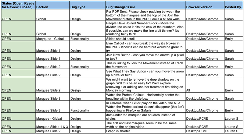
The color coding was a nice feature, open was green, closed was red. Each web page had it’s own tab in the spreadsheet.
Documents and Powerpoint slides
For the desperate team that needs a picture to help explain an issue. The image can certainly help to understand the issue but how much time gets wasted taking a screenshot, adding it to a document, jotting some notes, adding some drawing shapes and then emailing it to the right person.
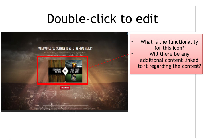
These two examples were taken from the same project. Feedback started out in a Word document and then moved into Powerpoint slides.
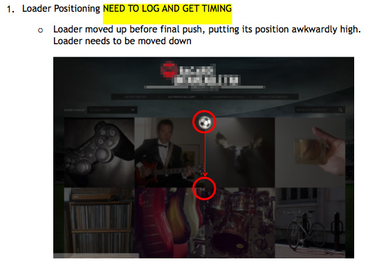
This one was my personal favorite with the default copy still on the slide.
PDFS
PDFs with annotations are a step in the right direction. An entire web page can be captured as an image and annotated with call outs. Unfortunately the communication is one directional, it’s virtually impossible to keep the PDF up to date and most users don’t have the technical know (or software) to create a pdf from a screenshot. On top of those problems there is no way to have a discussion about specific items in the PDF without emailing it back and forth.
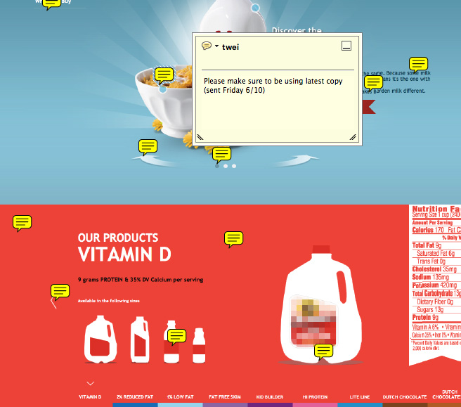
This is where the idea for PageProofer originated. I wanted sticky notes for a webpage … point, click, leave a note.
Bug Tracking Software
A go to for any developer centric organization. Traditional bug tracking systems address most of the problems with the alternatives mentioned above. All of the feedback can be found in a single place, it is up to date, it is searchable and it can contain a lot of useful information (like images, status, comments, person responsible for fixing it). But there are issues with using a bug tracking system for handling website design and development feedback. Most bug tracking software is not overly user friendly, it takes time to get it setup, it requires training to learn how to use (for non technical users), and it is not optimized for tracking visual items like website design. Using a bug tracking system also requires the person giving feedback to be constantly flipping between the website they are checking and the bug tracking software they are logging issues in. In my experience development and QA teams are good at sticking with bug tracking systems but clients and creatives start to loath all the data entry and complex nature of the software and revert to email and spreadsheets.
![]()
This is one of the better bug tracking systems I have worked with. Look closely there are almost 20 fields to fill in when logging an issue.
Visual Feedback Tools
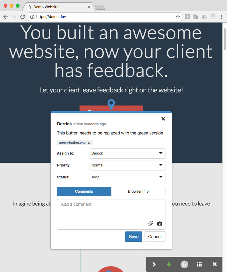
The ideal solution for websites, a visual feedback tool. It’s right on the website. It’s easy to use. It gives the entire team all the information they need. It facilitates back and forth communication. It captures information about the browser, device and operating system. Visual feedback tools (also called visual bug trackers) like PageProofer give web designers, developers and their clients the best solution available. They can be embedded on a website allowing an entire team to easily leave feedback right on the website, no flipping between browsers and apps. In the case of PageProofer you can see the feedback and even reply via comments right on the webpages without opening a different browser tab. Screenshots can be automatically attached to a note to help explain an issue. Comments can be added to notes making it easy to have a conversation around changes that need to be made. Issues can be prioritized and assigned to people, ensuring nothing gets missed.
Wrap up
I’m sure you have similar experiences if you have worked on any web projects. You have probably spent time looking for a better way to leave feedback. You know there must be a better way to do something as basic as telling someone to change a button color, replace an image or fix a typo. I built PageProofer to give teams a better option. If you are tired of the frustration and wasted time caused by bad feedback systems give PageProofer a look.
PageProofer makes it simple to manage visual feedback.
Try it for free!