Hot stock tips
I stumbled across a post on Reddit asking for a website roast .... so here we are, a free public roasting of Stocknear.com
Overall, a great site. The copy is clear and easy to understand. The design is clean, simple and to the point. On the technical side everything looks really good.
Home page fixes
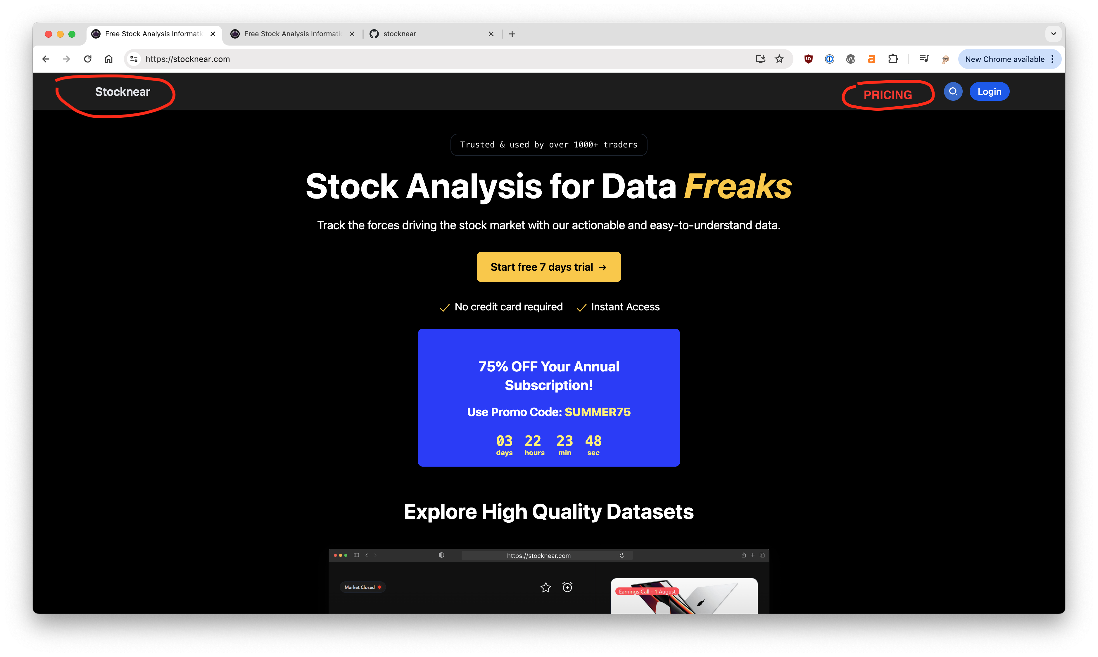
The home page looks great. Just a few things to fix.
- Branding. The 'Stocknear' in the header bar is very generic, consider adding the astronaut helmet that shows up else where in the site
- No Pricing. The only link to the pricing is found at the very bottom in the footer. Get a pricing link in the header.
Branding
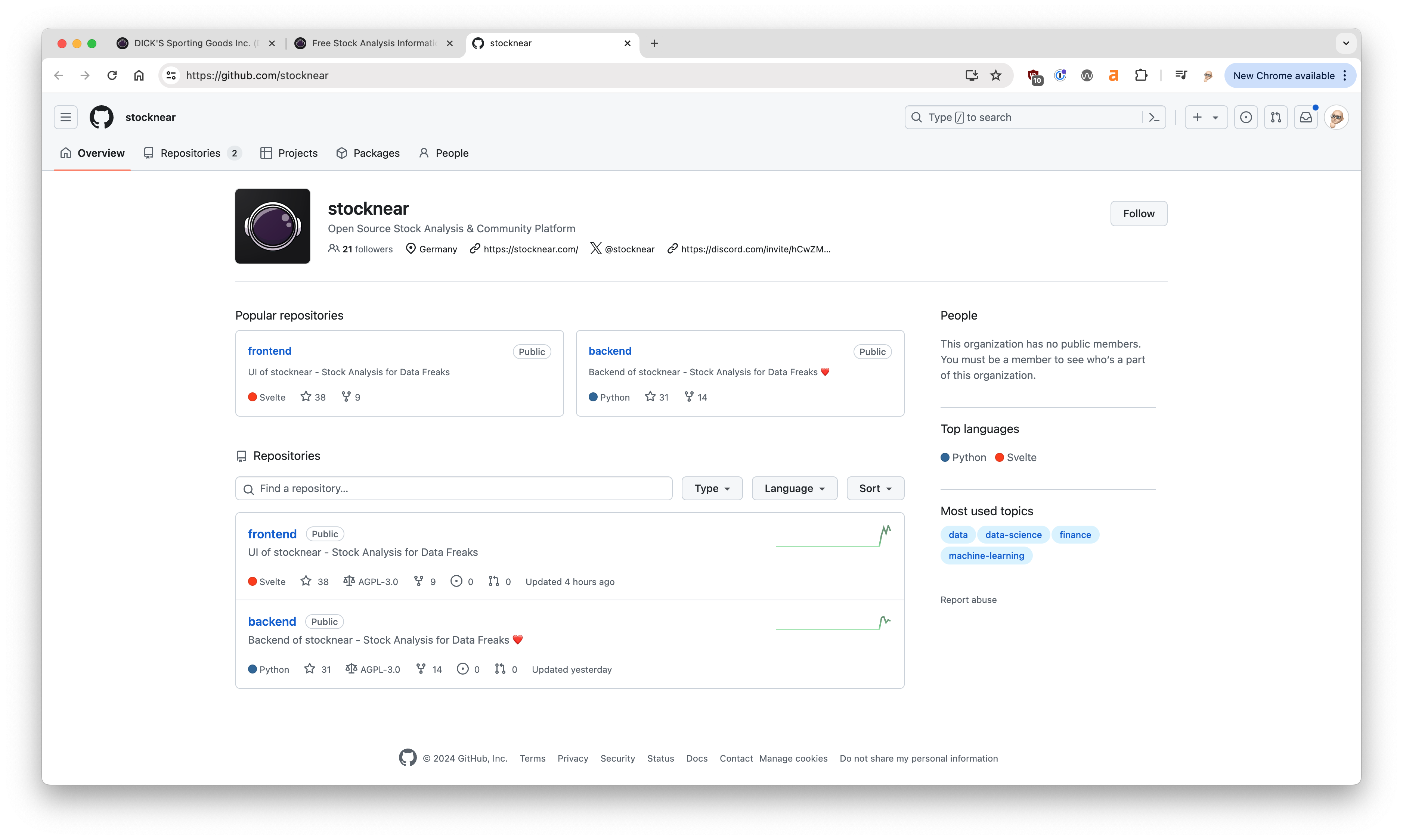
You have this great little helmet logo already incorporated as the favicon for the site and in your GitHub repository. The astronaut theme shows up in a few other spots on your website. Incorporate that into your header and social media branding to make it a little more memorable.
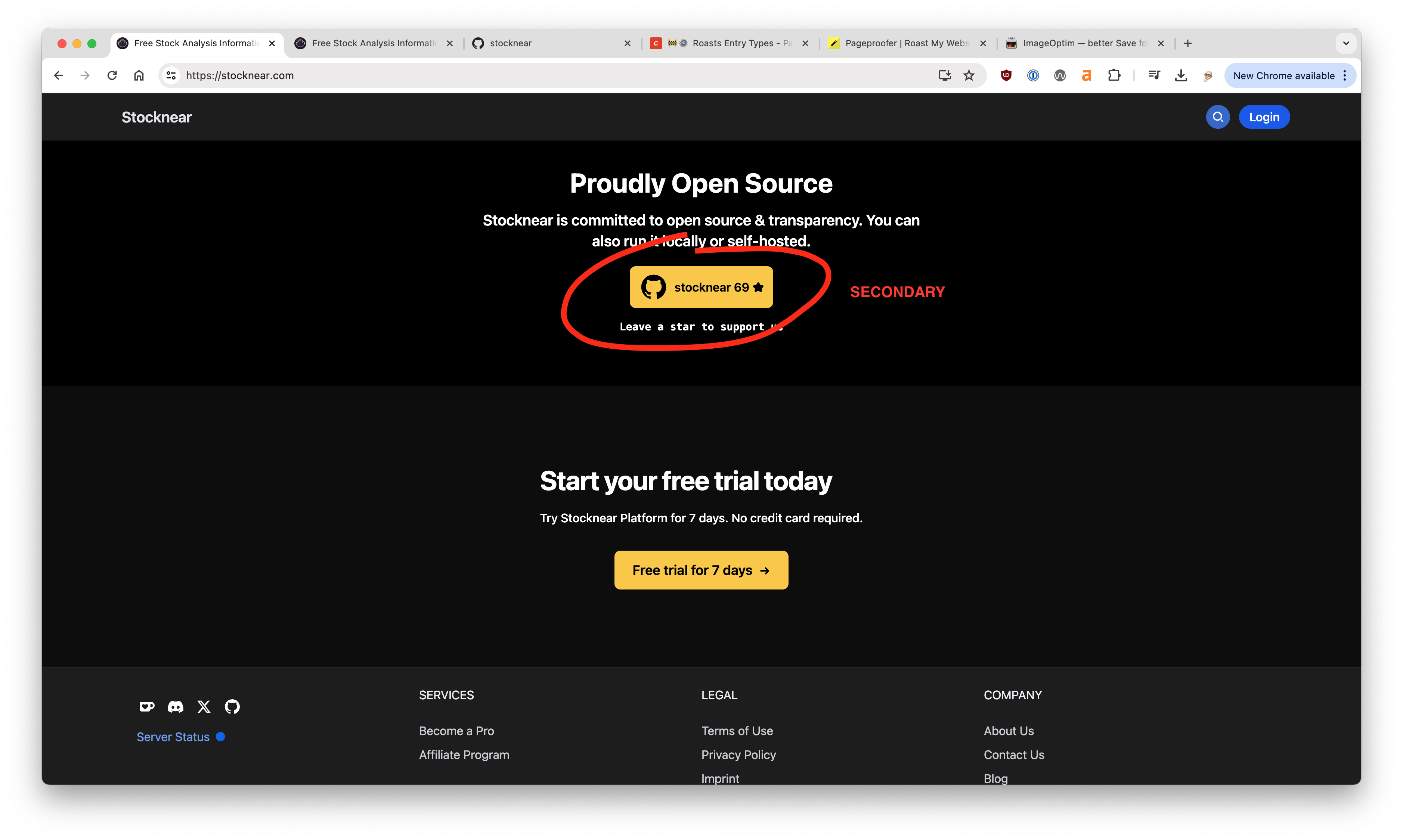
Competing CTAs
On the homepage you do a great job of keeping the headlines and copy clear and to the point. Further down the page there's this conflict between the GitHub and Free Trial CTA. The buttons are identical and spatially very close to the point they compete for your attention. It would be better to dial back the GitHub CTA as page emphasis is about signing up and getting the free trial.
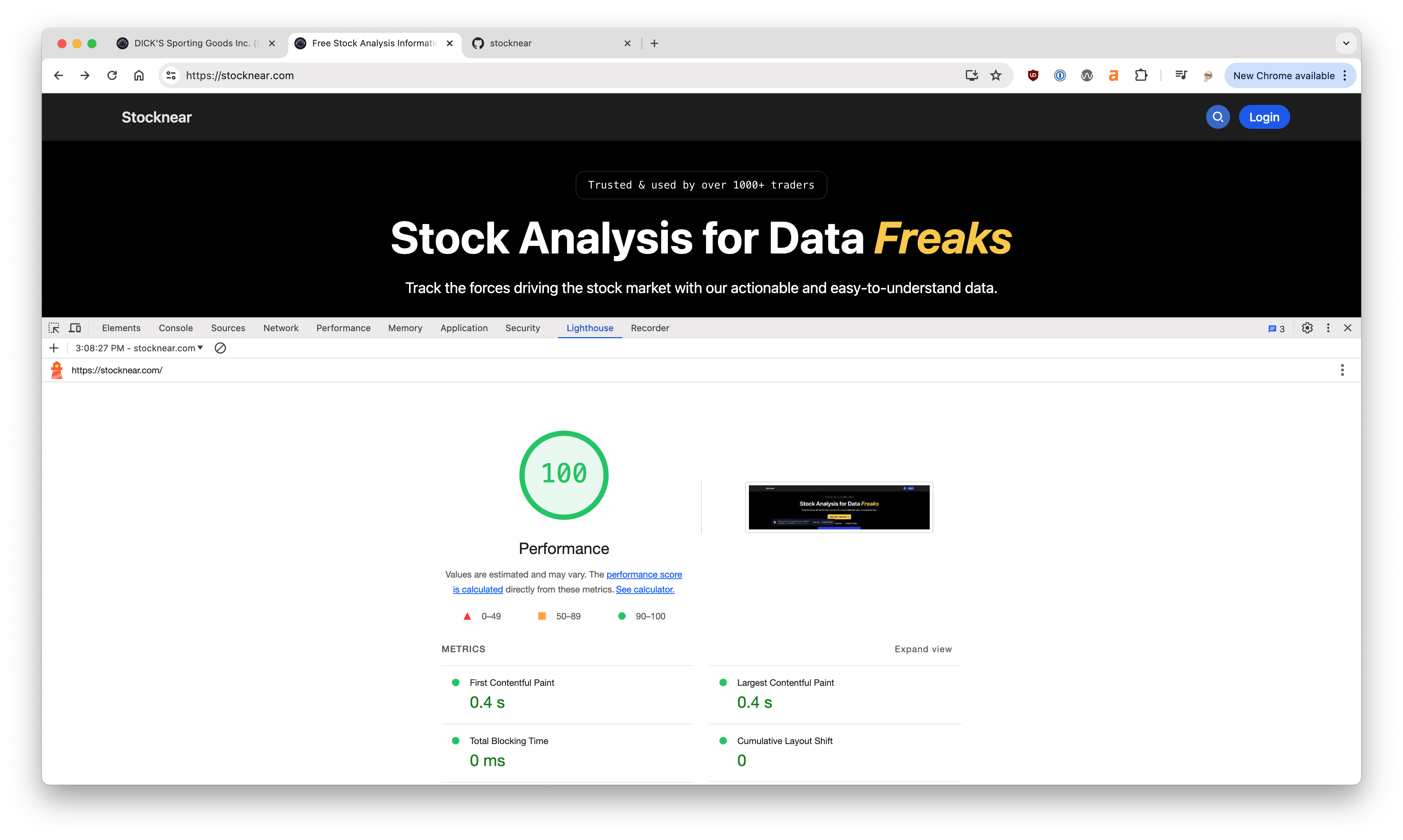
Speed
This site is lightning fast. I was shocked at how fast the search results and individual stock pages came up. Great job on the performance side, it's not often you see a dynamic site with 100% speed scores.
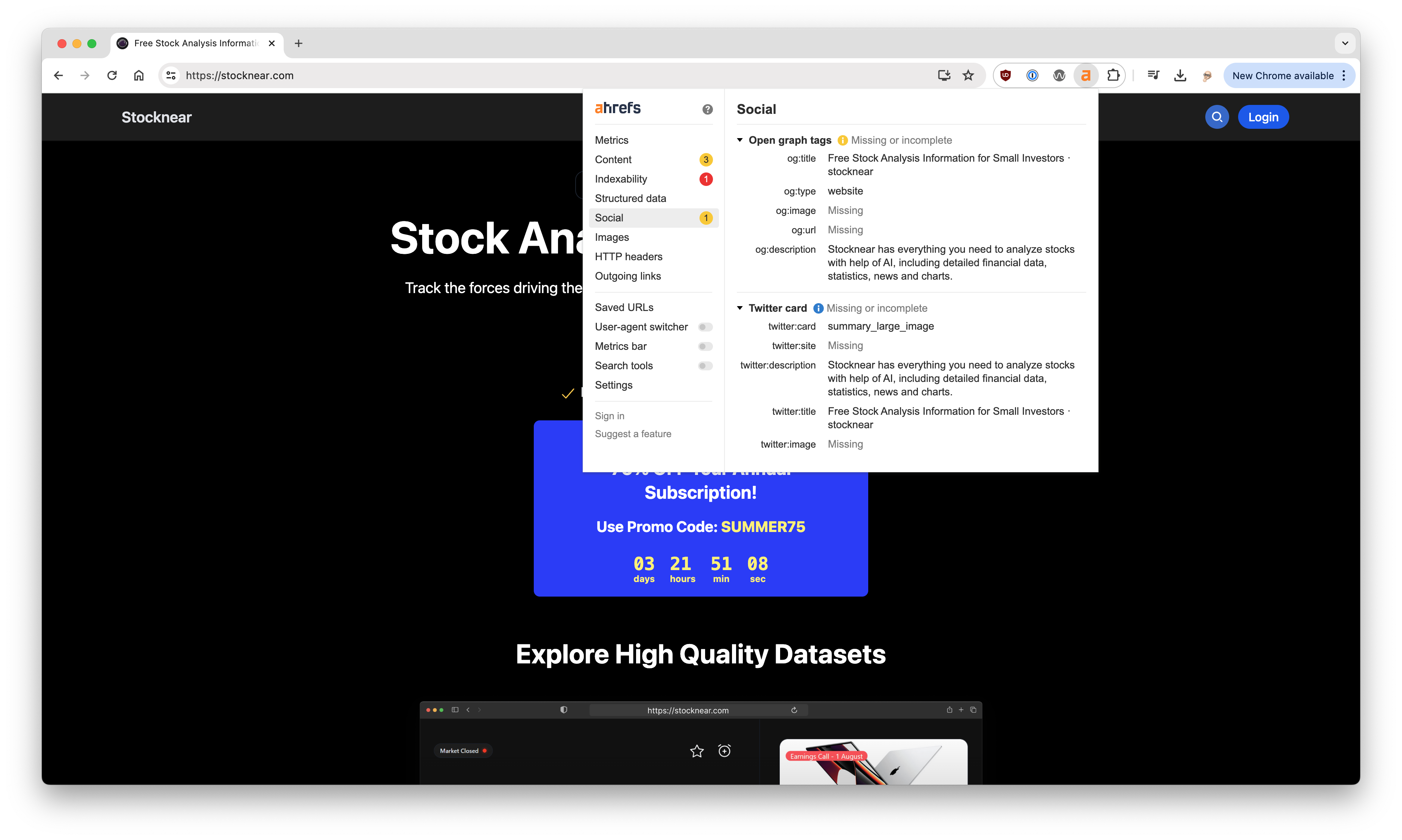
Social Media
Once you get the branding sorted out the next step should be getting the og and twitter tags for images set. Right now you don't have any images set for social media sharing so Facebook, LinkedIn and X shares are going to look pretty blah. You have some great stock/chart graphics, incorporate some branding into that to bump up your social shares.
The good 👍
- Speed - blazing fast site and search results
- Clear concise headlines and copy
- Simple clean design that gets to the point
- Nice crisp images and screenshots
- Very clear CTAs and a sense of urgency
The bad 👎
- Lack of branding site wide
- Missing pricing link
- No social media images
- No social proof, recommendations, etc
- Bland sign up page
- Sitemap ... must have!
Overall this site looks great and gives a fantastic first impression. From what I gathered this was built by one person ... love seeing indie hackers knocking it out of the park.
Does your website need to
Get Roasted 🔥If you have a team working on your website check out our website feedback tool to share feedback, request changes and report bugs, right on your website.