Unlimited development
I stumbled across a post on Reddit asking for a website roast .... so here we are, a free, public, rapid roasting of WGMILabs.com
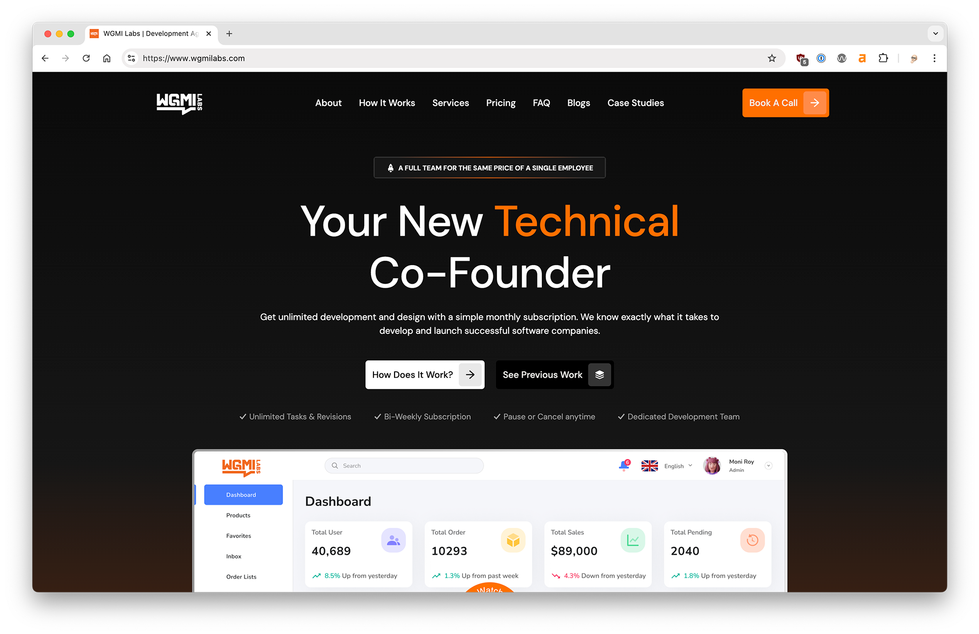
First impressions, the site is really well done. The design is clean and crisp. On the technical side there are a few things to clean up. For the most part the copy is clear and easy to understand.
Clearer headline
The initial headline could be reworked to really capture the visitor's attention and get them intrigued and engaged. The first sentence in the sub copy "Get unlimited development and design with a simple monthly subscription" is probably a better lead in than what is currently in place.
Don't make me think
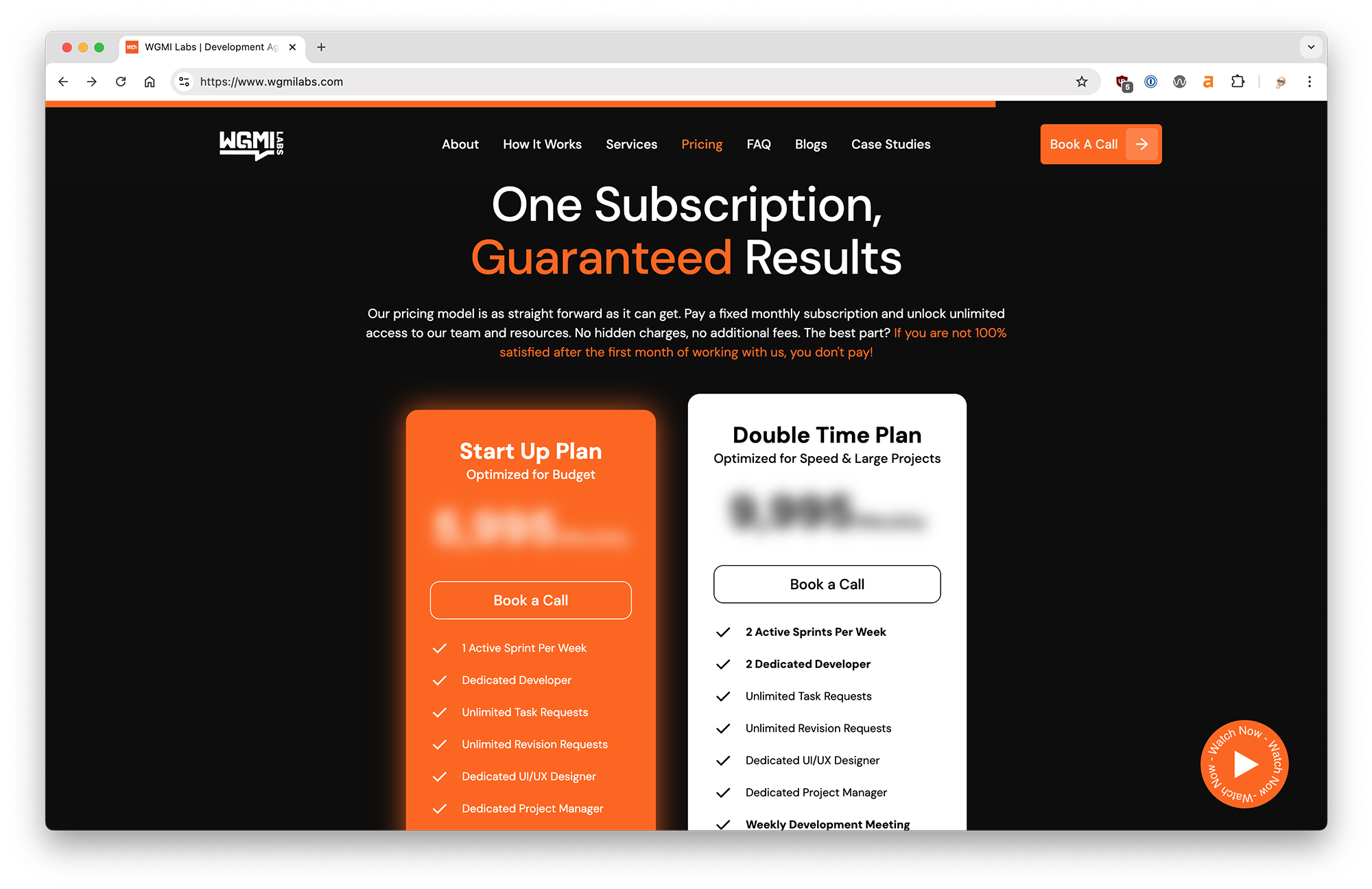
The entire home page does a great job of selling the features and benefits of your subscription development service, and then we get to the pricing ... You have my attention right up until this point, I'm getting interested and then you throw me a curve ball. Why is the pricing blurred? Am I going to get sticker shock? Is there something weird with the pricing model? Just show the price.
Usability clean up
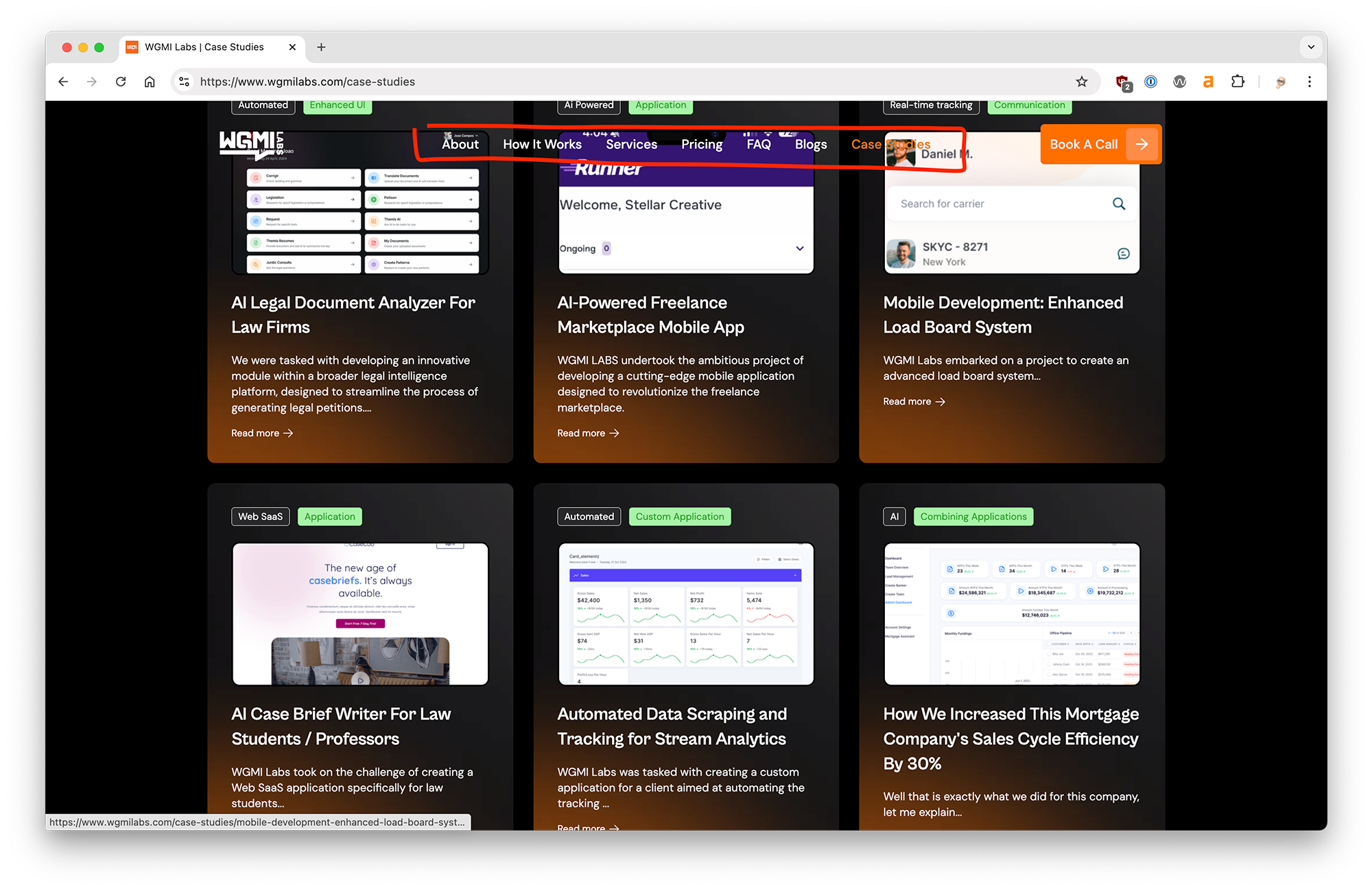
There are a few small usability tweaks that can be quickly fixed to make this site a perfect 10. First, on the secondary pages the navigation bar needs the same treatment as the home page. Either bump it up after scrolling down the page a bit or add a dark background to prevent the copy bleed through. Second, when you open the home page video from the button in the lower right and then close the video you can still hear the audio playing. Those small sore points stick out, especially when selling a development service.
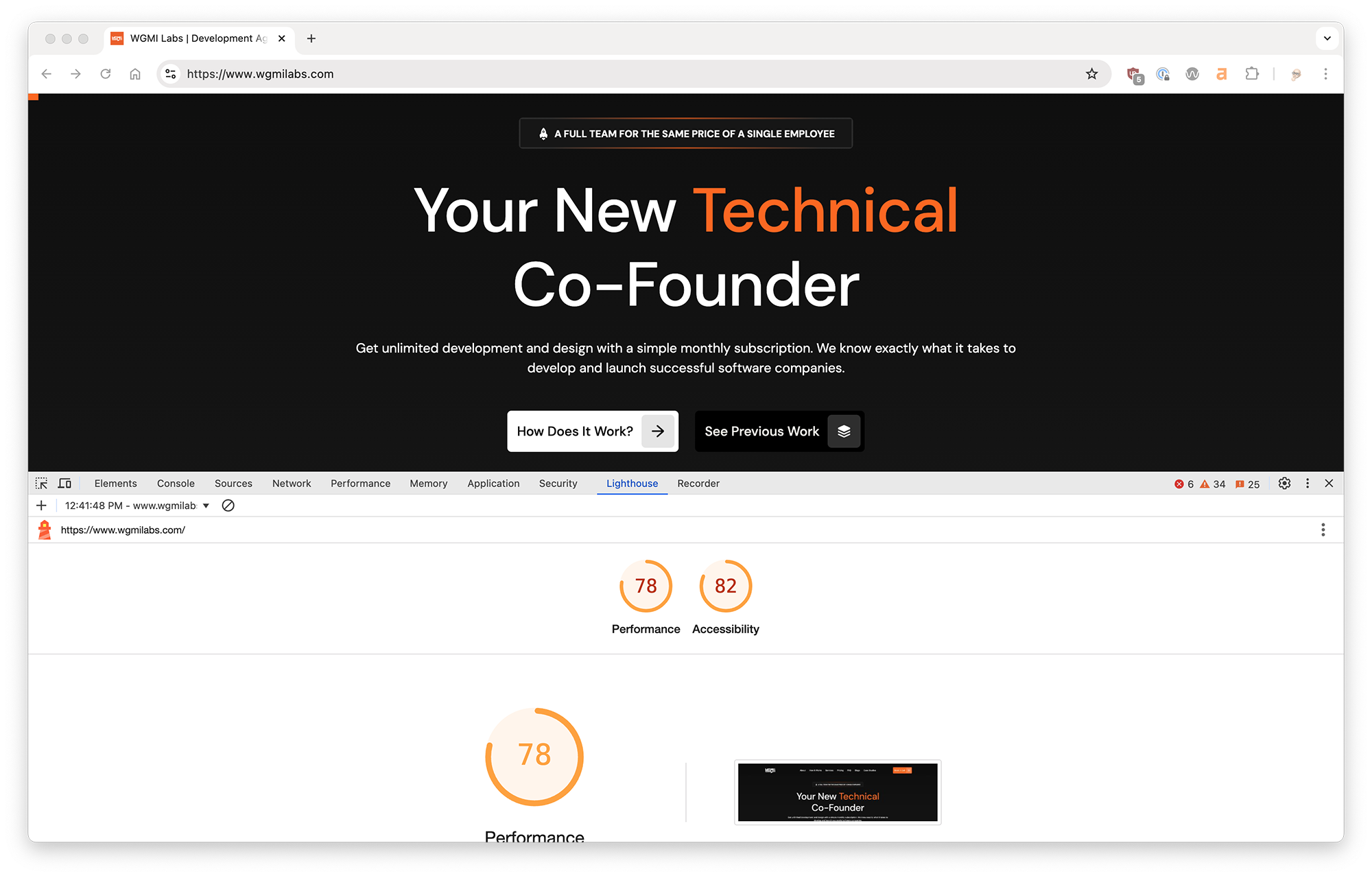
Performance & Accessibility
Overall the site scores about average on speed and accessibility. With a little attention to detail those scores could be significantly higher. Since the site is selling expert development services I would expect it to be 100% dialled in. On the speed side it looks like some better image and javascript optimization could help. For accessibility the biggest issue is white text on orange backgrounds. The contrast is too low for people with visual impairments. Tweaking the orange background would fix the problem immediately.
The good 👍
- Nice professional design that gets to the point
- Clear concise headlines and copy
- Crisp images and high quality videos
- Smooth transitions and subtle animations
The bad 👎
- Headline value proposition
- Blurred out pricing
- Accessibility issues, especially contrast
- Annoying usability issues
Overall this site looks great and does a great job of explaining the benefits of a subscription development service. With a little clean up and some small tweaks it could perform even better.
Does your website need to
Get Roasted 🔥If you have a team working on your website check out our website feedback tool to share feedback, request changes and report bugs, right on your website.