It's all in the details
Macca posted on X that he just launched a new business website for MJWeb and wanted a roast ... so I obliged. The one thing I will say upfront, this is meant to be constructive criticism. You did a great job going from a blank screen to what you have. With a little attention to detail you can have a really dialed in website.
First Impressions
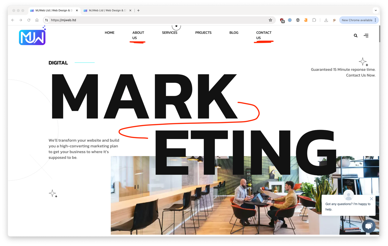
The breaking text instantly grabs my attention ... and not in a good way. It's jarring and a little difficult to follow. It would add non breaking spaces to the header nav to prevent the widowed text and get the 'MARKETING' headline on a single line, bump down the font size if needed. If you want to keep it huge go with a variable font size based on viewport width.
It's Black & White
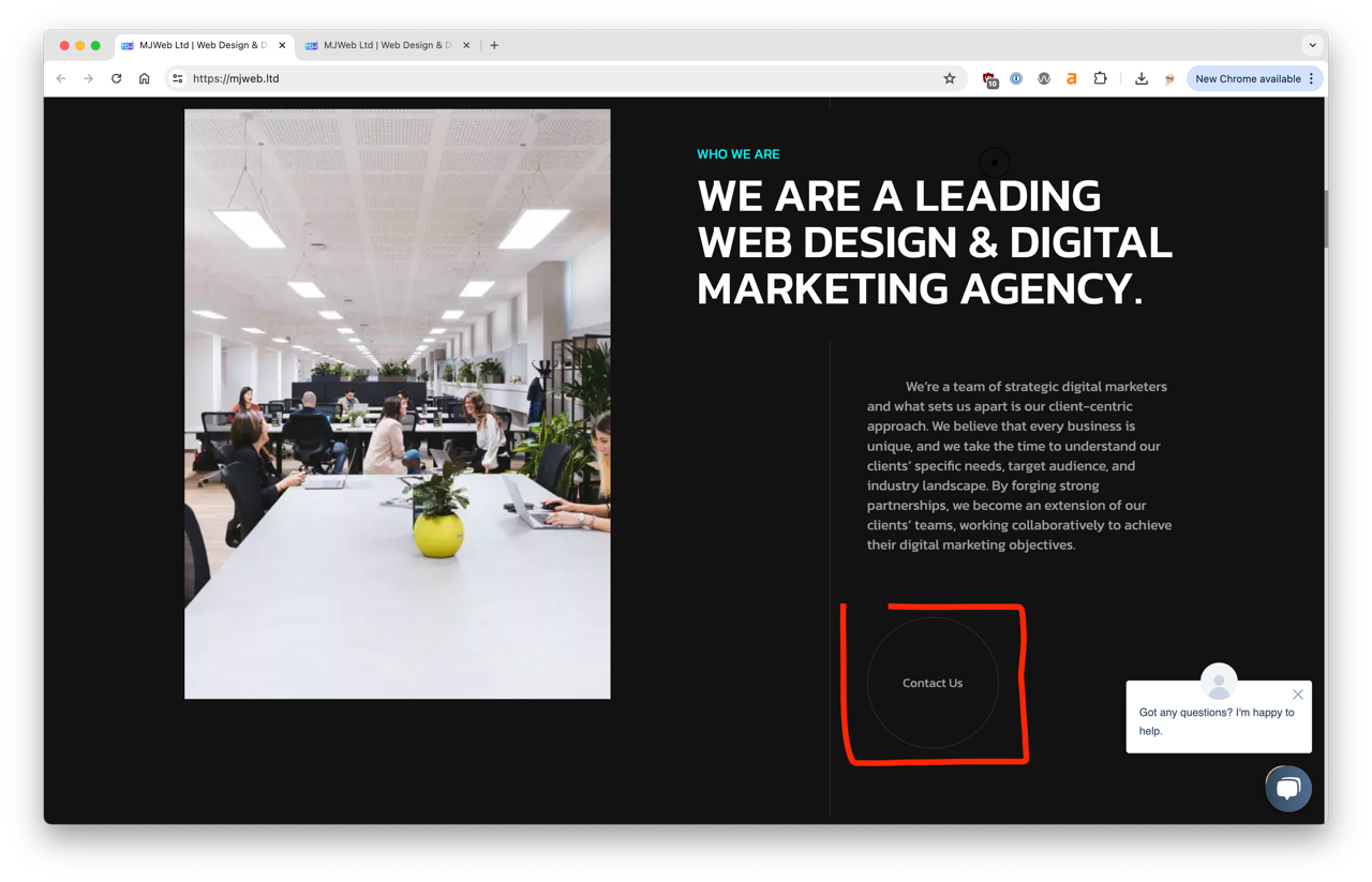
I love the contrast between the white and black sections, it makes it crystal clear you are scrolling into a new area. The images could be sharper to really make them pop and the CTA has a few issues. First it is difficult to see and gets lost. Second, it failed accessibility contrast standards. Checkout this previous roast on the importance of accessibility.
Footer let down
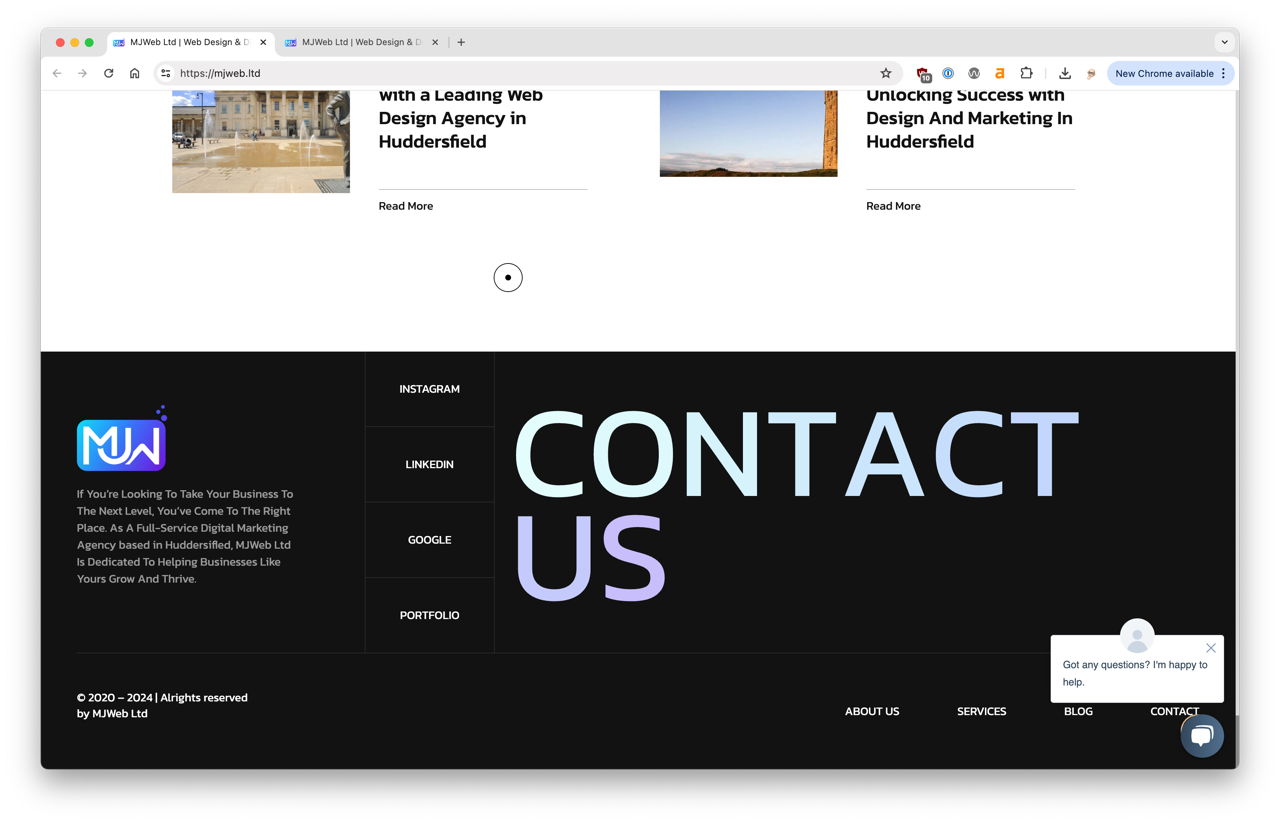
Overall the page has great content and it's visually engaging, it makes you want to keep scrolling down and then you hit this 🤯.
Let's be honest, the 'Contact Us' thing is pretty bad. You get to the bottom of page and it leaves a really bad taste in your mouth. Make it a plain, bold, white text at 24px and your footer is 100% better.
Mobile Experience
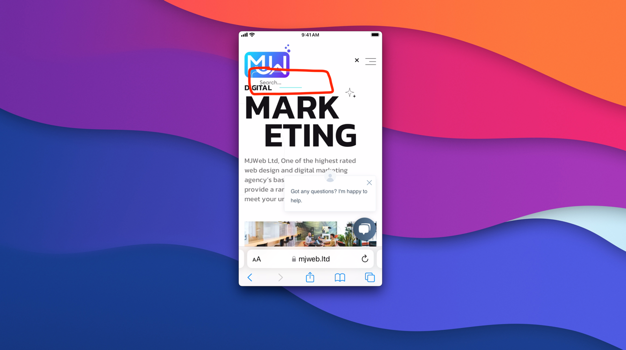
Overall the mobile version looks good. The same suggestions for cleaning up the image quality and odd line breaks.
The one big issue is the search and navigation issues on mobile. The search feature is borderline unusable because it gets hidden under the logo. The navigation modal is partially blocked by the embedded chat widget.
The good 👍
- Engaging content
- Good visuals
The bad 👎
- Weird line breaks
- Hover/drag mouse thingy
- Lighthouse scores across the board
Overall I think it's a great first pass at a website redo. I would highly recommend taking the time to really polish up what you have. It's 80% there, that final 20% will make a huge difference and really elevate your entire website impression.
Does your website need to
Get Roasted 🔥If you have a team working on your website check out our website feedback tool to share feedback, request changes and report bugs, right on your website.